A soccer kit (for the uninitiated, the wee British term for a soccer uniform) creates the identity of the team. The home kit is iconic, centered around a core club color or two, and gives fans a way to be recognized as fans of a particular team instantly.
The away and third kits vary from year to year – it gives designers a landscape for play, clubs a yearly chance to change looks (and sell jerseys), and in some unintentionally entertaining instances, an occasion to celebrate Mistakes That Were Made in lists like this. Though, as we’ll see, it’s easy for designers to screw up home kits as well—especially in the early ‘90s, the Golden Age of Terrible Kits.
30. Cardiff City (Home), 2012-13
Sometimes, a jersey can look just fine, and yet terribly wrong in the eyes of the fans. Since 1910, Cardiff City (Nickname: “The Bluebirds”) had blue jerseys. But new owner Vincent Tan, knowing that red brings good luck, and dragons bring good luck, and that the Welsh flag has a red dragon on it, decided to transform the team’s jersey (from blue to red, and with a dragon hovering above a small bluebird on the crest) to “turn the club’s fortunes around” (read: sell crazy amounts of Cardiff City jerseys in Asia).
You could argue that it worked; in its first year in the red jerseys, Cardiff won promotion to the Premier League, and initially looked like a team that might stay up under the guidance of manager Malky Mackay. But Tan fired Mackay mid-season, the team floundered, and home crowds still showed up in blue jerseys – in part to adhere to tradition, but in larger part in defiance of Tan’s leadership. Next year, Cardiff will be wearing its good luck jerseys in the Championship.
29. Deportivo Wanka (Home), 2003
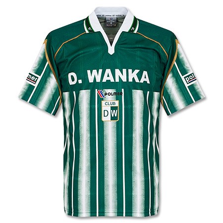
This Peruvian side rolled out this mildly terrible home kit in 2003, with a very unfortunate treatment of the club name, particularly if you’re a Wanka fan in England. Sometimes, the jokes just write themselves.
28. Liverpool (Away and Third Kit), 2013-14
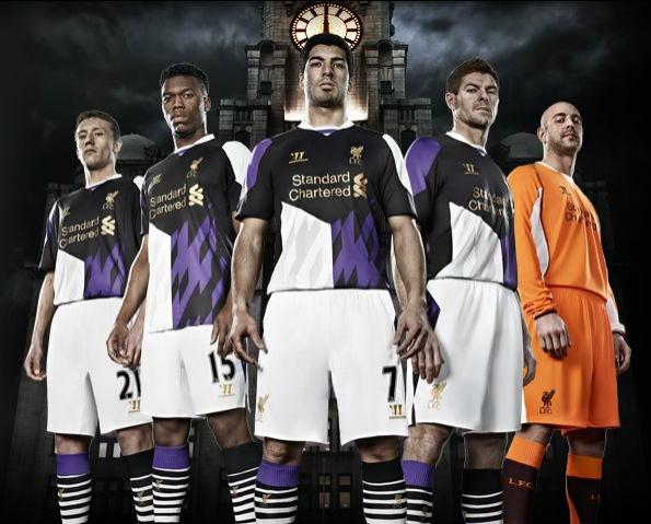
Warrior, fairly new to the soccer kit-making game when it won the Liverpool account, wanted to make a splash with the alternatives to the classic, can’t-possibly-screw-these-up home reds. The away kit featured an awful red and black flecking and bizarre red stripes down the front of the jersey (and on to the shorts!), distracting from what could have been a simple white design, and the third kit was a purple and black quilt of awfulness. The “Rise Up” campaign featured pictures of Liverpool players barely able to conceal their disbelief and disdain for the jerseys.
27. Recreation Huelva (Away) 2012-13
To paraphrase Lil Jon collaborating with LMFAO, “Dots! Dots! Dots! Dots! Dots! EVERYBODY!” Polka dots somehow look great on Tour de France racing jerseys, but something gets lost in the translation to soccer.
26. Shrewsbury Town (Home) 1992-93
Diamonds are forever. Fortunately for Shrewsbury fans, diamonds only lasted one year on this ill-advised home kit.
25. Arsenal (Away), 1991
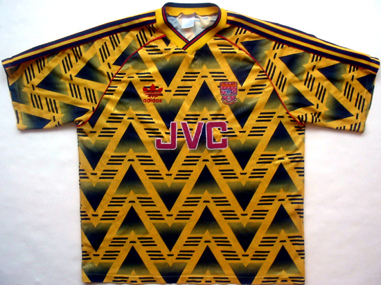
Although Arsenal fans associate yellow away kits with great seasons, this particular jersey is awash in a confusing array of upward and downward pointing chevrons, with Adidas’ three stripes somewhere in the mix. Shockingly, one of Adidas’ last offerings for the club before Nike took over in 1994.
24. Huddersfield Town (Away), 1991-92
Just one question on these red-and-blue tie-dye jerseys: Did they make them themselves?
23. Chelsea (Away), 1994-96
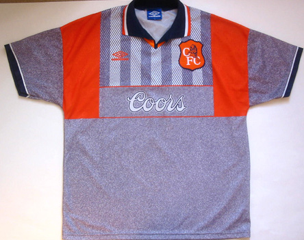
Dismal gray was paired with solar orange and unfortunate stripes to make the magic happen for this mid-’90s offering for a club that typically does better with its away kits (save for the recent blue shoulder grid on black offering).
22. Luton Town (Away), 1994-95
How many stripes is too many stripes? This many.
21. Southend United (Home), 1996-97
When your own fans christen your kit “The Custard Splat” and point out that it looks like you’ve got Bart Simpson in your pants, that’s not good. The yellow striping is … unique.
20. Stoke (Away), 1992-93
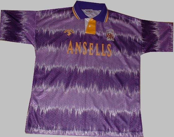
Stoke City seems the least likely team in English football to wear a striped purple psychedelic number, and yet here it is. When Robert Smith sang, “Hanging in a groovy purple shirt” on 1984’s minor hit “Give Me It,” was he in fact seeing into Stoke’s future?
19. Manchester United (Away), 1992-93
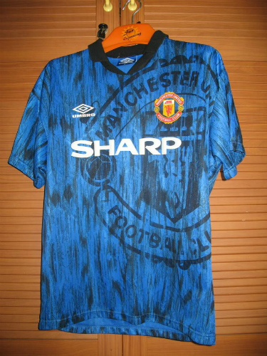
Not to be outdone in the great ugly away-kit off of 1992, Umbro helped Manchester City out with this black-on-blue jersey – thoughtfully reminiscent of its cross-town rivals color scheme – featuring a giant logo over its smaller, more correctly-colored logo. The only thing “sharp” about this kit is the sponsor.
18. Atletico Madrid (Away), 2004-05
Corporate tie-ins are just a fact of life when you play professional soccer and pull on a jersey. Sometimes, it’s a logo for a company that stays standard from year-to-year, and sometimes, it’s this full frontal atrocity advertising Sam Reini’s 2004 superhero movie. Fun fact for Fernando Torres haters: He had to wear this.
17. Reggina Calcio (Home and Away), 2012-13
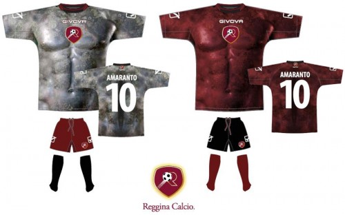
Hey, everyone, check out my six-pack! While some kit makers (hi, Puma) make snug-fitting jerseys that look much better on players than on average fans at the pub, this Reggina shirt with the marble statue details on the front will instantly transform you into Cristiano Ronaldo. (Or Homer Simpson posing as Cristiano Ronaldo.)
16. Airdrie (Home), 2012-13
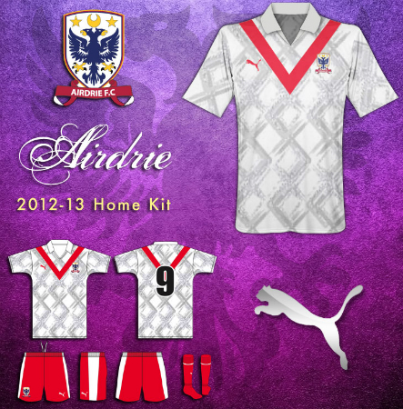
Here’s proof, however, that not everything is form-fitting and sleek in the Puma world. The jersey for this Scottish team combines the casual appeal of a old man’s gold sweater with a giant V dominating the front and back of the design.
15. Australia (Home), 1990-93
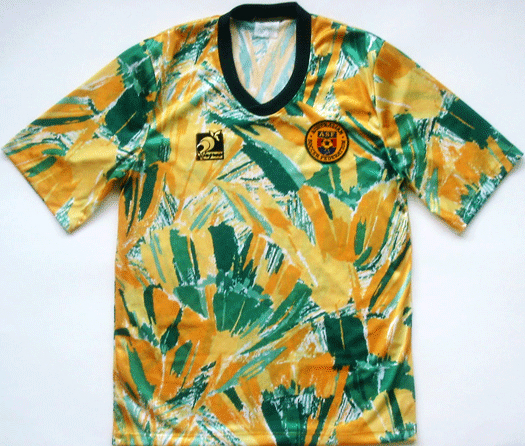
Thankfully for the rest of the world, Australia didn’t qualify for the 1990 World Cup or any other major tournaments during this period, keeping this tropical nightmare confined to the Land Down Under. This jersey of many colors was paired with high-riding black shorts and black socks, because of course they were.
14. Coventry City (Away), 1978
Though the retro Coventry City badge is a masterpiece of simple, efficient design, this retro uniform is considered one of the worst in English football history, and for good reason. The V-neck and unflattering stripes would be bad against any backdrop, but ultimately, this kit shows what brown can’t do for you.
13. Brighton and Hove Albion (Away), 1989-90
If you love swirly pink lines, this shirt is your dream. If you’re like most of us, this is your nightmare.
12. Barcelona (Away), 1995-96
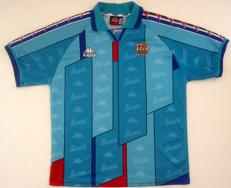
Barca’s blue and red home kit is one of the most iconic in soccer – and generally, the idea with an away kit is to have something distinctive with an entirely different color scheme. So there’s no good explanation for this blue-and-red number, reminiscent of fish scales and resplendent with the Kappa logo, which is bad enough when it shows up on a shirt once, let alone as a repeating fabric pattern.
11. Norway (Home), 1996
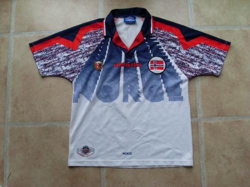
Coming at you in 3-D … NORGE! While the sleeves feature some of the regrettable pattern combos reminiscent of this Golden Age of jerseys, the lettering headed right for you makes it especially worthy of this list.
10. Bochum (Away), 1998-99
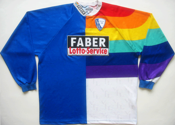
Bochum tried this approach to a jersey in several variants of solid side and rainbow side, but this was the worst permutation of a regrettable effort. Rainbows are awesome in the sky and in songs sung by Kermit the Frog, but they’re not so awesome on jerseys.
9. Athletic Bilboa Centenary Jersey, 2004
Basque artist Dario Urzay helped Bilboa celebrate its 100 years of football with this thankfully-limited edition, inspired by art in the local branch of the Guggenheim, suggesting blood, or ketchup, or a lobster massacre. Club president Jose Maria Arrate helpfully said: “Athletic Bilbao is more than a football club, it is a feeling. And as such its ways of operating often escape rational analysis.” Apparently that extends to their uniforms.
8. Jorge Campos, Lifetime Achievement Award
Since goalkeepers have uniforms that are supposed to distinguish themselves from other players, it’s hard to consider them next to uniforms that are supposed to represent whole teams, collectively and sometimes catastrophically. But Jorge Campos, the Mexican goalie with a penchant for Fiesta-cum-Charlie-Brown outfits, deserves special recognition, and a place in the gallery, for what he did for goalies everywhere. Plus, he designed his own kits, and in his farewell match, his entire team played in one of his creations – distinctive in its use of neon colors and inverted triangles.
7. Scunthorpe (Away), 1994-1996
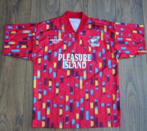
Hey, bud, let’s party! Scunthorpe (and let us pause for a moment to appreciate the most hilariously British of names to American ears) went festive for this 1994 pastel-themed kit, awesomely sponsored by the Pleasure Island amusement park. Color-wise, it’s an analogue of the worst moment the San Antonio Spurs have ever had, but it’s additionally hilarious because it’s representing Scunthorpe, which is exactly what you’d picture it to be based on its name, only worse.
6. Wolverhampton (Home), 1992-93
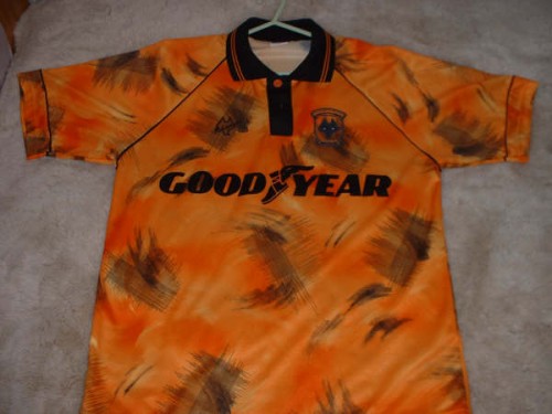
Orange and black is a hard pairing of home colors to live down, unless you have some obvious connection to tigers or Halloween. Wolves took it one step worse in magical 1992, however, by inadvertently underscoring its sponsor Good Year by what appear to be criss-crossing tire marks all over the front of the jersey. Though they’ve had their share of jersey crises over the years (Doritos was a sponsor! This was their away kit for two years!) But the tire-marks kit (or “Tyre-Marks Kit,” because England) is the nadir for a club with a rich history of terrible kits.
5. Norwich City (Home), 1993-1994
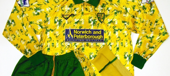
When you’ve created a kit that’s alternately called “the Jackson Pollock” or “the bird poo kit,” you know you’ve created something remarkable. Norwich City starts at a disadvantage in aesthetics by having one of the worst kits in the Premier League, urrrr, Championship, but this integration of green and white into the home yellow that’s been assigned to the Canaries was perhaps ill-advised. It’s almost as if kit sponsors Norwich & Peterborough Building Society would be embarrassed, as if being on such a remarkable kit wasn’t the best publicity they’d ever received.
4. Hull City (Home), 1992-93
As you’re aware from this year’s owner-generated controversy, Hull City’s mascot is the Tigers, and Tigers is a very important part of the club’s identity. But when is a mascot too literal? Well, when it looks like you’ve skinned the mascot and are wearing its pelt on the field, Fred Flintstone-style.
3. Celtic (Away), 1991-92
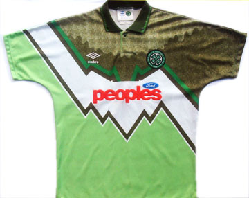
This is the classic case of bad color scheme two separate designs in one shirt doing too much, but what places this in the upper echelon of awful early ‘90s kits is the inadvertent tribute to the era’s financial recession in the form of a downward-sloping graph across the front of the kit. Though there were other bad Celtic away kits in the ‘90s (garnering comments like “an experiment in geometry” and “the bumblebee kit”), this is still the worst.
2. La Hoya Lorca (Third Kit), 2013-14
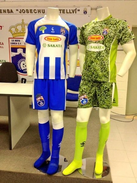
Imagine a horrible hallucination in which you see 11 broccoli packages escape the frozen foods section of your grocery store and run to the nearest soccer field. Now, imagine no longer – for Spanish team La Hoya Lorca, in celebration of the nation’s Murcia region (“the vegetable garden of Spain”), created third kits to look like broccoli packages. Someone signed off on this, and players actually wore this last season. In fact, the team gained promotion to the next tier of Spanish football wearing these kits, which will only (the horror, the horror) encourage them.
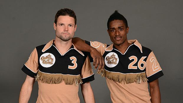
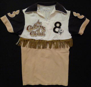
1. The Caribous of Colorado (Away, But Really, Home Too), 1978
This is a masterpiece – easily the worst jersey ever created. Tan and brown is a great color combo for living room furniture, but it’s terrible on soccer players. The logo is a font-rocity. And wait, is that a ball embraced by antlers, dangling on the bottom edge of the number of the back of the jersey? Also, I don’t think anyone likes the cut of those shorts’ jib. But what puts this into the stratosphere of bad uniforms, of course, is the fringe. Yes, it is thematic. Yes, it is well-executed fringe. But it is fringe – and the fact that more than 25 years later, the Colorado Rapids are using it as one of the better-executed 2014 April’s Fools jokes is an indication of how legendary its badness is.