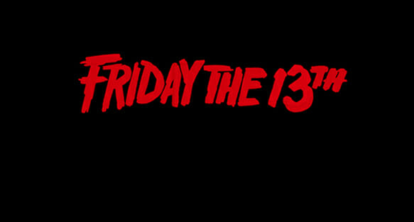
Off with the Trajan! Take us back to the days when horror movie typography bled like the throw-away character who checked what was in the closet.
For all of the flack it receives, Trajan isn’t a bad font. It’s an Adobe Original, which, according to Adobe, makes it a timeless classic. However, Trajan communicates nothing about a movie’s subject to the audience, unless of course it’s a slasher set in Rome. Plus, if you’re trying to scare your audience, why use a font as bland as Trajan? It’s like washing down a steak with Gatorade.
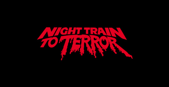
Thankfully for us, designer Christian Annyas has compiled some highlights from the glory years of horror movie identity design in the 1980s. Here you’ll find that the hand-brushed typography from Night Train to Terror is just as over-the-top as the six minute hair band music video randomly in the middle of the movie.
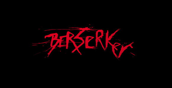
Remember the inky face peering out of the helter skelter letters of The Shining? The intersecting splatter of Berserker? Head over to Annyas’s site to reminisce.
![]()