If you’ve ever cruised through a type database like Dafont or Font Squirrel, you’ll have seen your fair share of wacky font names. For example, how could a font named Girl Scout Bitch not have a great backstory? For some of the names, we wondered if maybe the designer just threw some magnetic poetry up against the fridge until something stuck. Curious to learn some origin stories, we contacted six type designers of popular, weirdly monikered fonts and asked about their naming process.
1. Ostrich Sans, by Tyler Finck
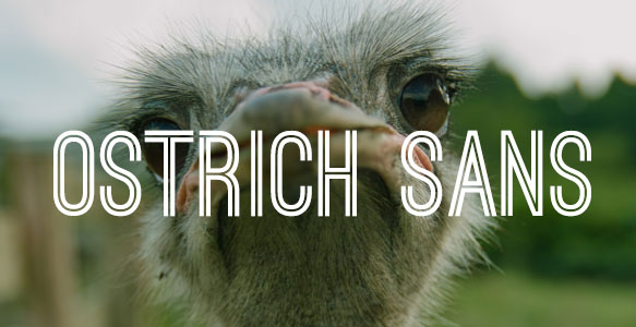
Three years ago, designer Tyler Finck posted a screenshot of a work-in-progress typeface on Dribble requesting name ideas. Micah Rich, of The League of Moveable Type, was first to comment and suggested Ostrich Sans. “I’ve only ever seen an ostrich in a zoo, but their elongated necks move in ways that share characteristics with the curvy glyphs of my typeface,” Finck says. “The harder edges and corners on some characters make for a less literal translation, but I loved the name, so I kept it.” Some other nifty fonts in Finck’s repertoire include Lickety Split, a font made with fat crayons on index cards, and Uncombined, a father/son collaboration.
Ostrich Sans is available for download here.
2. Chicken Butt, by Tom Ledin
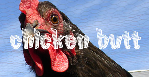
For Tom Ledin, inspiration for Chicken Butt came from the young’uns. “I was having a really difficult time naming my new font,” Ledin recalls. “I knew it should be light, and kind of fun, but after that, I had nothing. I work from home, and with the cursor blinking in the ‘name?’ field, my kids walked in the door from school. The first thing out of one of their mouths was, ‘Dad! Guess what?!’” Yup, we were kids once, we know where this one’s going. “Of course, I fell for it. I always did,” Ledin admits. ”’What?’ ‘CHICKEN BUTT!’ And I had a name for it.” We think that’s pretty darn adorable.
Chicken Butt is available for download here.
3. Bleeding Cowboys, by Guillaume Séguin
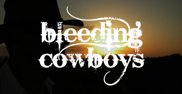
As far as controversially misused fonts go, Bleeding Cowboys ranks right up there with Comic Sans and Papyrus. “I find Bleeding Cowboys to be way overused nowadays since I’m seeing it everywhere and not always for the right concepts. Why would you use Bleeding Cowboys on a kids surprise candy bag in a convenient store in Greece?” designer Guillaume Séguin laments. Séguin created Bleeding Cowboys in a period of his life when he was listening to a lot of heavy metal. He looked to album covers from Maylene and The Sons of Disaster for inspiration. “Pretty much all my fonts were born from a music genre,” Séguin says. “I was listening to lots of bands coming from Texas, and I wanted a raw dirty country look and feel.”
Bleeding Cowboys is available for download here.
4. Girl Scout Bitch, by Martin Lexelius
This font actually comes in three different weights: Sarcastic, Sadistic, and Just Plain Mean. As delicious as Thin Mints are, something really traumatic must’ve happened. “So, I was visiting Chank [a type designer] in the USA,” designer Martin Lexelius begins. “While going into the supermarket, there were some girl scouts in the entrance and they sold boxes of cookies. I had a quick look at the box and realized it was actually one of Chank’s fonts on there. Being kind of new to the font business, I was impressed and quite happy. With spontaneity, I said to a random girl scout, ‘Oh, I know this guy, who made this font!’ To which the girl scout leader replied, with sarcasm, ‘Oh! Then you know somebody, who did something!” Later in the car, I told the little story to Heidi, Chank’s wife, and she said, ‘Sarcastic girl scout bitch!’ I thought this was so funny and also a perfect name for a typeface.” The rest, friends, is history.
Girl Scout Bitch is available for download here.
5. Lobster, by Pablo Impallari
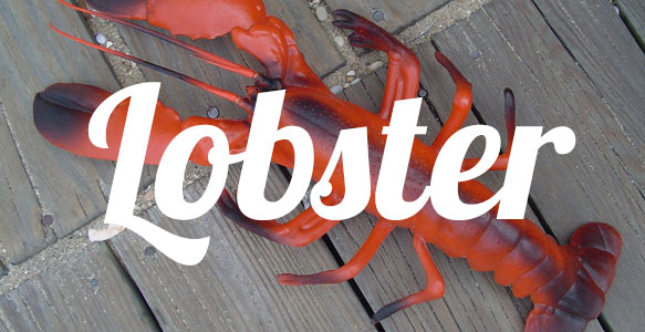
Even the seemingly mundane can serve as the perfect inspiration for a font name. “While working on the font, someone in my house was watching a TV show about cooking,” designer Pablo Impallari says. “The episode was about lobsters, and I liked the name for the font. As simple as that!”
Lobster is available for download here.
6. Orange Juice, by Brittney Murphy
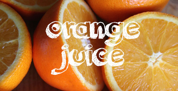
Contrary to how it may seem, designer Brittney Murphy points out that to be successful, a name shouldn’t just be an unrelated quirky phrase. “The title has to sell it, after all,” she says. “I try to choose names that both reflect how the typeface ‘feels’ as well as ones that pleasingly reflect how it looks and functions.” The story behind her font Orange Juice? “When I think of orange juice, I think of sitting in my Grandma’s kitchen as a kid, drinking it from a small glass jelly-jar,” Murphy recalls. “Drinking it now makes me reminisce of being young. A simple pleasure. Non-assuming. I think the typeface evokes the same sort of feeling. Textured. Imperfect. Childish. It doesn’t take itself seriously. It just is what it is. Orange Juice.”
Orange Juice is available for download here.