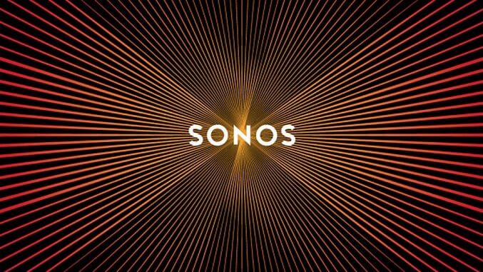
Take a second to repeatedly scroll your mouse up and down while you keep your eye on the Sonos logo above. Eh? Eh? Pretty amazing, right? By complete happy accident, designing firm Bruce Mau Design stumbled onto virtually the perfect logo for the company, with the lines bursting outward from the company’s name in the center, creating the effect of a sound vibration on the screen.
Bruce Mau Design created many stunning designs for Sonos’ newest visual reboot, and they’re all worth a look, but the “sound wave” graphic has caught on in a big way ever since the Verge initially discovered the cool effect.
Laura Stein, the creative director on the Sonos rebranding for Bruce Mau Design, said of the logo that there wasn’t a whole lot of science behind it, and it was a kind of happy accident. “It was meant to be a logo in motion, something radiating, something happening” (via Fast Company).
It worked out perfectly, however, as not only does the logo—and the rest of the rebranding designs—give Sonos a fresh new look, but it feeds into the concept of “amplification” that the company hoped to display through their fresh direction. Sonos has been at the cutting edge of wireless, high-fidelity audio since 2002, but they have been attempting to extend that reach to the streaming of cloud-based audio services as well. It’s an exciting vision for the company and a brilliant, if accidental, visual accompaniment to go along with it.