Writer: Franz Kafka, adapted and translated by David Zane Mairowitz
Artist: Jaromir 99
Publisher: SelfMadeHero
Release Date: November 5, 2013
There are so many pitfalls in the process of adapting someone else’s work that it’s no surprise when an adaptation fails. How often do you hear someone say “the movie was better than the book” (Stephen King adaptations exempt)? The novel format is finely suited to many things, foremost among them complexity, which makes it difficult for anyone to capture what makes a particular story great in a new form. David Zane Mairowitz and Jaromir 99’s attempt to retell Franz Kafka’s The Castle through sequential art isn’t necessarily a bad idea, but stumbles into many a hole along the way.
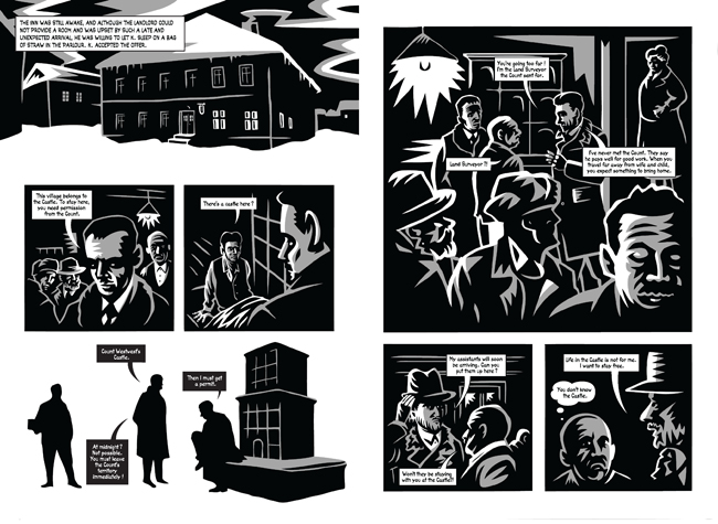
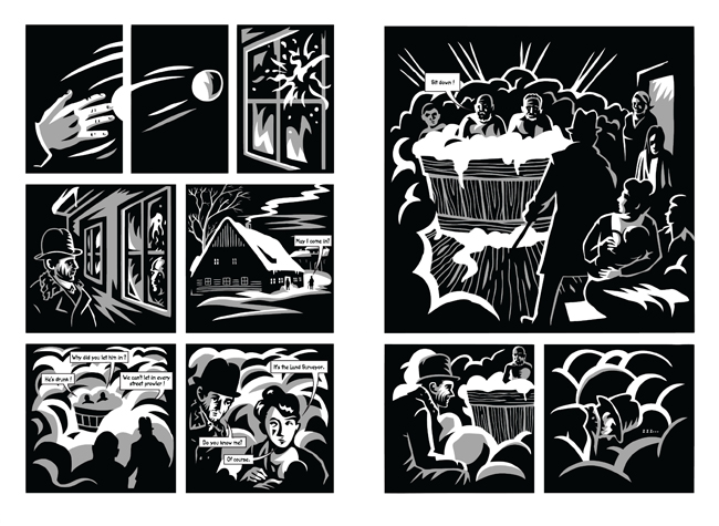
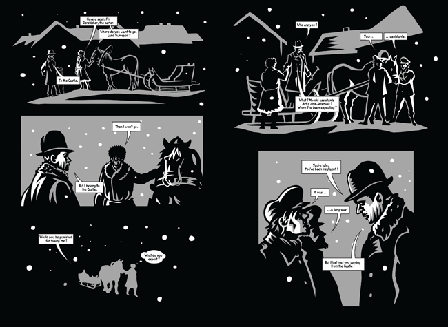
For one thing, we don’t read Kafka for the spellbinding plot. He’s a high-concept guy, with no twists, and his direction is fairly clear from the beginning, no spoiler alert necessary. Gregor Samsa is a bug, forever, and everyone thinks he’s gross in The Metamorphosis. Josef K. doesn’t win his case in The Trial. And even though The Castle remains unfinished — it prematurely concludes in the middle of a sentence — we can be pretty sure that K., the land surveyor protagonist, isn’t going to make it to the titular building. Nonetheless, the inexorability with which the narrative advances toward its inevitable end is a huge part of the appeal, if that’s the right word. This is all to say that David Zane Mairowitz’s translation reads like the work of someone who knows his source material almost too well: The Castle’s comic iteration skips feverishly from incident to incident, leaving the uninformed reader in the dark.
Occasionally, skipping back a few pages will clue you in to who a character is or why K. finds himself in a given situation, but just as often it does no good. Illumination is lacking, too, in Jaromir 99’s illustrations. Although they possess a kind of dark, woodcut-inspired beauty, the renderings seem to take place almost entirely at night. The thick, blocky shapes that comprise each image make it very difficult to distinguish between characters. You may go along for a page or two, thinking K. is in the arms of one woman only to discover it’s an entirely new one, who has just shown up with no introduction.
The panel composition doesn’t help matters. It’s fine to alternate standard top-to-bottom one-page layouts, with two-page spreads read across the top of both pages before shifting to the bottom of both, but it should be clear to your reader when you make that switch. On the whole, the weaknesses of the writing and the weaknesses of the art combine to make the experience of reading this book almost a mirror of K.’s repeated attempts at comprehension: frustrating and unsuccessful.