

Ideally, a movie poster accomplishes a few key things. It should do its best to accurately give audiences an impression of what to expect in a film, while raising excitement and refraining from giving away key information.
What it shouldn’t do is be filled with misleading imagery, inaccurate depictions of the film or outright lies. Now, if you browse the web, you’ll find all kinds of lists of funny DVD covers and movie posters of American films exported to foreign shores or sold on the black market—posters like this classic with Arnold Schwarzenegger apparently appearing in Star Wars: Episode I. Those finds are a dime a dozen.
This list isn’t about those foreign posters. This is about posters presented in American theaters (some for foreign films). All of these posters were designed for U.S. audiences, and they range from the seemingly misinformed to the hilariously fraudulent. Here are some of our favorite misleading American movie posters.
20. Night of the Blood Beast, 1958
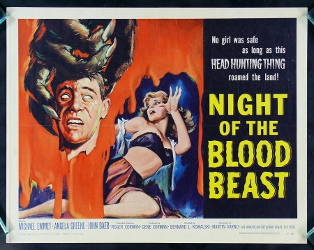
A lot of these classic horror posters look like they were whipped together by someone who was simply told the film’s working title or a vague synopsis and then just told to go nuts. I imagine the Blood Beast guy simply being told “Yeah, uh, there’s a monster, and maybe there’s something about heads in there, I dunno.” Problem is, actually watching the film, there’s literally no headhunting involved. Also, the monster isn’t hairy and looks nothing like the werewolf hand depicted. Even better is the Super 8 cover I own of the same film, which depicts the MONSTER as headless, carrying its own noggin. Apparently, it got confused and hunted its own head. Unreal.
19. The Aviator, 2004
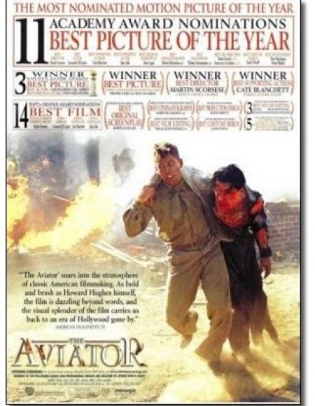
This is a war movie, right? This little-seen poster for Leonardo DiCaprio’s The Aviator takes an out-of-context moment and makes the film look like a spiritual successor to Saving Private Ryan. You can almost hear someone screaming “I’m not leaving you to die in the muck, soldier! Now get up and fight so you can go home to your best gal, sire seven children and live a blandly respectable Midwestern existence!”
18. My Sister’s Keeper, 2009
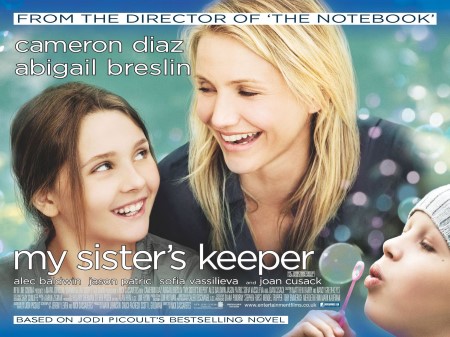
Bubbles! What a great family movie this surely is, with its smiling, wholesome-looking Cameron Diaz and that delightful little girl from Little Miss Sunshine (also smiling). Of course, Abigail Breslin has significantly less to smile about in the actual film, where she learns she was born for the express purpose of having her organs harvested by her dying older sister. Then she goes to court and fights her parents so she won’t have to give up her vital organs to save her cancer-ridden sibling. And, you know, somewhere in there she finds time to smile, like once. And blow a few bubbles, maybe.
17. Kramer vs. Kramer, 1979
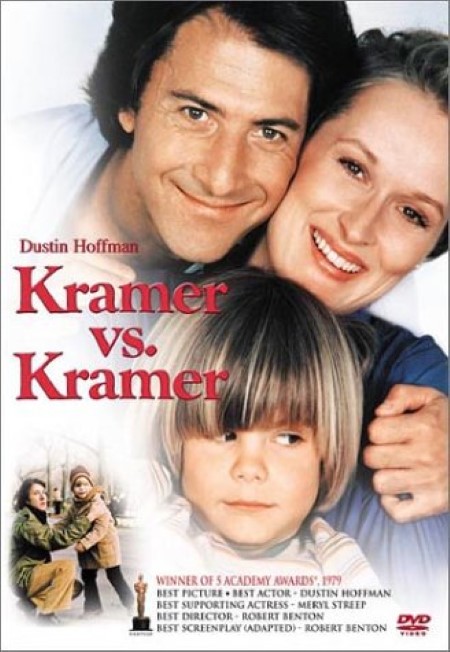
What a happy family! Are we sure this isn’t a lost DVD cover for the secret, alternate pilot of Full House where Danny Tanner was played by Dustin Hoffman? Regardless, it’s weird that this version of the poster doesn’t even seem to hint at the fact that this film is all about the messy, bitter divorce between the parents and the way it tears the lives of everyone involved apart. Nobody looks at this image and thinks: Divorce drama!
16. The Happening, 2008
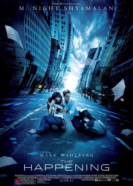
M. Night Shyamalan hadn’t quite lost EVERY shred of credibility in 2008, and considering that plot twists are central to all of his films, you were clearly supposed to look at this poster for The Happening and make an educated guess at what was going on. And you would guess … ummm … that some sort of dimensional shift had destroyed traditional, three-dimensional perspectives? Seriously, what the hell is going on here? I’ll tell you what’s not going on: Any hint at the fact that plants are using pheromones to force the human population to commit suicide, which is what the film is actually about. Perhaps Shyamalan refused to reveal his ultra-secret, ultra-awesome twist to the poster artist?
15. Rocky V, 1990
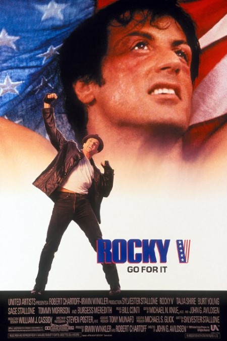
Ah, Rocky. Finally, something dependable. I mean, we know what we’re getting here, right? A hungry young challenger, some self-doubt, a training montage and a climactic boxing match with an inspirational outcome, yeah? The stars and stripes in the background certainly evokes Rocky IV, where Stallone battled for the USA. But this piece of trash film isn’t anything like the previous entries in the series. It features a brain-damaged Rocky training a younger fighter, who then gets lured away by a Don King parody manager. And get this: There’s no climactic boxing match for Rocky. It’s a Rocky movie WITHOUT A BOXING MATCH AT THE END. Let that sink in. Instead, Rocky has it out with his former protege in a down and dirty street fight, which is even less interesting to watch than it is to write about. But I guess that’s this poster’s definition of “Go for it.”
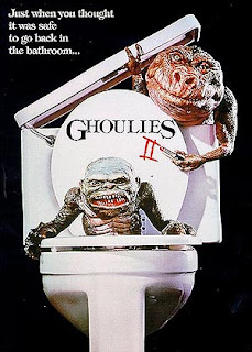
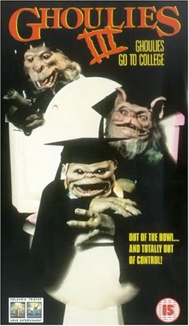
14. Ghoulies series, 1983, 1988, 1991
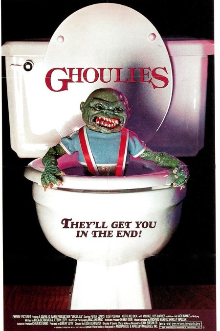
This is the perfect example of just taking a single, random moment from the film, out of context, and then basing the marketing of an entire series around it. I mean look at it—clearly, this is a cheap horror movie, a Gremlins rip-off, about monsters that come out of your toilet, right? But no! The only time a toilet is involved is a two-second shot when a Ghoulie peeks his head out of a toilet bowl … and it happens during a montage, in the first film! That’s it! No toilet attacks. Nothing else involving toilets. And yet, they liked the motif so much in the first poster that they repeated it for TWO MORE MOVIES, and there isn’t a single toilet in either of them. Empire International Pictures just had an inexplicable thing for toilet bowls. Even the tagline, “They’ll get you in the end,” clearly implies that they’ll bite you on your ass. What the hell?
13. The Abyss, 1989
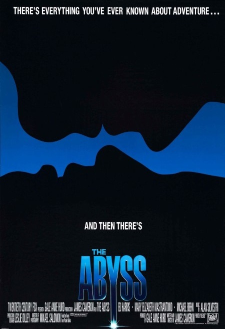
I honestly have no idea what this poster’s designer was thinking. The film, if you don’t know, is about salvage crews at the bottom of the ocean coming into contact with an alien intelligence. I guess it’s probably a visual reference to the scene in the film where the entity presents itself and forms human faces, but that’s a REALLY tenuous link, and something a person who hasn’t seen the film is never going to infer. Even the tagline doesn’t give us any kind of clue—“everything you’ve ever known about adventure?” Looking at this in the context of someone staring at a poster in a movie theater, I don’t even have enough information to make a coherent guess at what this film could possibly be about.
12. Vanilla Sky, 2001
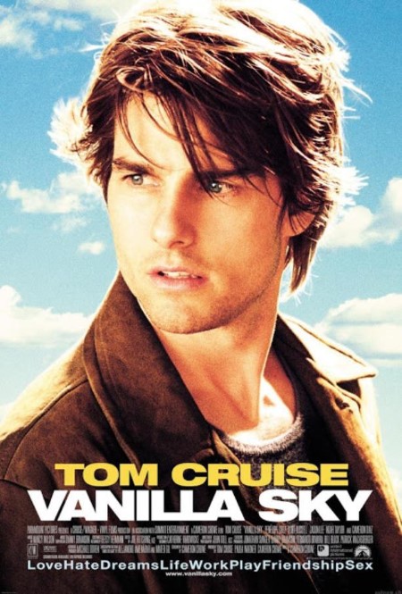
Here’s a case of being way too general. So, it’s a movie about Tom Cruise … just sort of staring off into the middle distance. And honestly, if this was most Tom Cruise movies, that would be an acceptable enough poster, but this is for Vanilla Sky, one of the trippiest, mind-bending films to end up in wide distribution in the 2000s. The possibilities for this poster were absolutely endless, with all the different identities the film contains. But instead of teasing the imaginative quality of the story and cinematography, the only thing it bothers to accomplish is telling us “This is a movie, and Tom Cruise is here. In the movie. Acting, maybe.”
11. Godzilla vs. The Thing, 1964
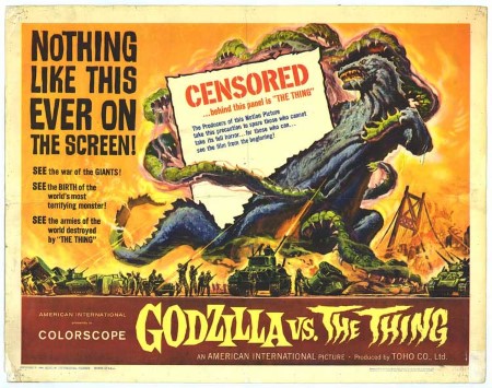
Talk about your classic bait-and-switches. God only knows why, but American producers thought the Mothra vs. Godzilla original title just wouldn’t work. So they renamed one of the most classic Godzilla films Godzilla vs. The Thing for its American release, and simultaneously released this incredibly misleading poster with a “censored” monster, to “spare those who cannot take its full horror.” You know, the horror of a giant moth. Presumably, it’s a moth with lots and lots of tentacles, to look at the poster. This is just an out-and-out lie. To use the MST3k mantra: They just didn’t care.
10. The Creature Walks Among Us, 1956
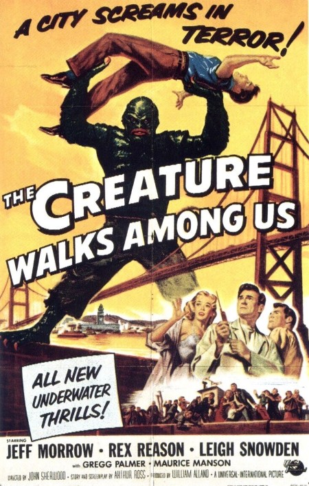
This one is all about a fancifully inflated sense of perspective. The monster is Universal’s classic “Gill-Man,” the titular creature of Creature From The Black Lagoon in this, the series’ third and final installment. Important to note: Gill-Man is exactly the same size as a human being, for practical purposes—he is played by a guy inside a suit, after all. So why is he here shown as a giant, straddling an entire bridge, lifting a likewise massive man? At no point in the movie does he grow larger than he’s ever been before. If you saw this in a theater lobby, you would assume the next Creature movie had a new twist involving the creature growing to the size of a building and wreaking havoc, but you would have been utterly disappointed by the reality. This happens a lot in monster movie posters, such as this one for the 1976 King Kong remake that showed him as large enough to straddle the World Trade Centers, when he’s not nearly that big.
9. The Secret of NIMH, 1982
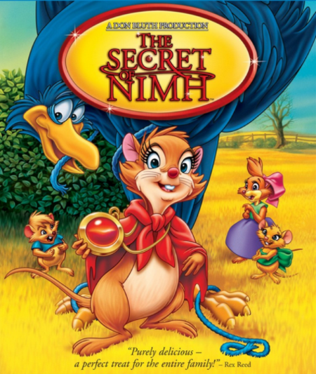
Well, this just looks darling and lovely, doesn’t it? Smiling mice and birds, clearly having a great time, inviting us all to come along for a harmless family picture. Look at their Little House on the Prairie dresses. What could go wrong? Rex Reed even says it’s “a perfect treat for the entire family!” What the pull-quote doesn’t mention, though, is that this movie is about genetic testing and the horrors inflicted on these mice by NIMH, the National Institute of Mental Health. It’s a classic of American animation, but this cover blatantly tries to sell it as inoffensive, little-kid stuff full of cutesy talking animals when in reality it’s a much darker tale of life and death (lots and lots of death, by the way). This image is a cash grab if there ever was one.
8. Terminator 3, 2003
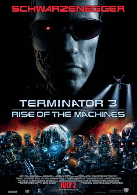
It’s 20 years after the original The Terminator, and finally, we’re going to be able to see what everyone has wanted to see for all this time: The futuristic battle of man vs. the machine armies of Skynet! Except, not really. With its hordes of skinless terminators and flying machine craft, this poster makes a promise it doesn’t deliver on in the least. Instead, Terminator 3 was again set in the present day, with a plot that is essentially just T2: Judgement Day rehashed all over again—another Terminator has come back to the past to kill John Connor and start Judgement Day, and Arnold is back as the protector again. Same old stuff. Eventually of course, we got our futuristic battles in 2009 with Terminator Salvation, then immediately wondered why we’d wanted to see it for so long. Seriously, can someone please make another decent Terminator movie?
7. Night Train to Terror, 1985
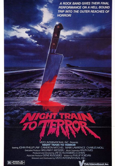
I love this poster—it’s totally awesome, in a gothic/grindhouse sort of way. It reminds me of something I would have seen on a VHS cover in an early ’90s Blockbuster and found endlessly alluring. But what are you going to assume from a bloody knife in the train tracks and the title Night Train to Terror? The only obvious guess is something like “A slasher movie on a train,” especially given that it was coming out in the golden age of the slashers. What else could it possibly be? Would you believe a horror anthology, clipped together from three incomplete features, connected by vignettes of God and the Devil having a conversation on a train? While a synth-rock band fronted by a Rick Astley wannabe in Mall of America pirate gear dances in the adjacent train? Because that’s what actually happens in Night Train to Terror. There’s about 10 minutes on the train in total, and zero knives.
6. Bridge on the River Kwai, 1957
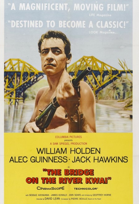
This war movie poster is simply insulting to screen legend Alec Guinness (Obi-Wan Kenobi, if you don’t know him by name), who plays the actual “main character,” Colonel Nicholson. Instead, this poster omits him completely and focuses on William Holden’s Commander Shears, who spends half of the film away from the action. It also captures a very odd moment of the film to put in the poster, when Holden’s character initially escapes from the Japanese prison camp. (He returns later.) In general, it seems to simply imply that he’s the hero at the center of the picture, but it’s Guinness’ character who is the emotional core that makes the film a classic. This poster does the film a great disservice.
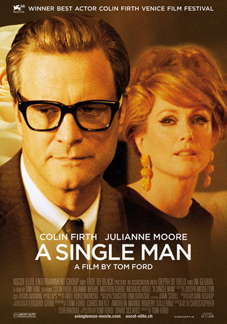
5. A Single Man, 2009
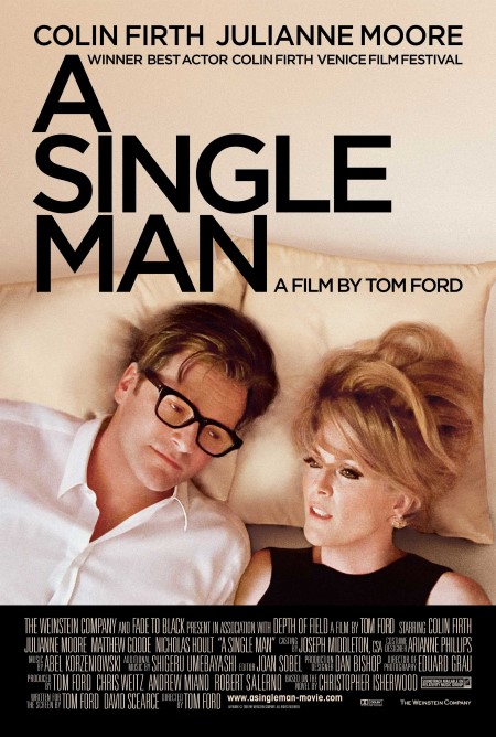
In A Single Man, Colin Firth plays a suicidal gay man reflecting on the death of his longtime partner, in an intense, heartbreaking role—a role that apparently wasn’t conventional enough to sell this film to its target demographic (read: senior citizens). And so, in this first iteration of the film’s poster, the studio completely misrepresents everything about it by putting him in bed with Julianne Moore, who plays a role as a supporting character who appears in the film for about 10 minutes. They never get into bed together, let alone share romance, as this poster obviously suggests. It buries the entire nature of the sexuality of Firth’s character in a ham-handed attempt to make the film look marketable to a wider audience. There was so much criticism of this, in fact, that a second poster was produced that moved Moore’s character to the background to make it less intimate.
4. Chopping Mall, 1986
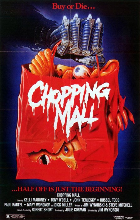
This feels like one of those posters that was designed by someone who hadn’t seen any of the film footage and had to simply work with a description: In this case, “Killer robots attack people in a mall.” Knowing just how boned he was, this poor artist presumably said to himself “Okay, what can I do to suggest the idea of killer robots in a mall, when I have no idea what the robot designs look like?” And so he made a guess—a guess that turned out completely and utterly wrong. The robotic hand in the poster is like some kind of weird, techno-gauntlet—it looks like the robotic hand Ash builds for himself in Army of Darkness, and it implies the film’s robots are human-like, in that they, you know, HAVE HANDS and all that. Unfortunately, the actual robots in the film aren’t humanoid in the least, sporting treads and no arms/hands at all. It’s a big, probably inadvertently misleading swing and miss.
3. A Bronx Tale, 1993
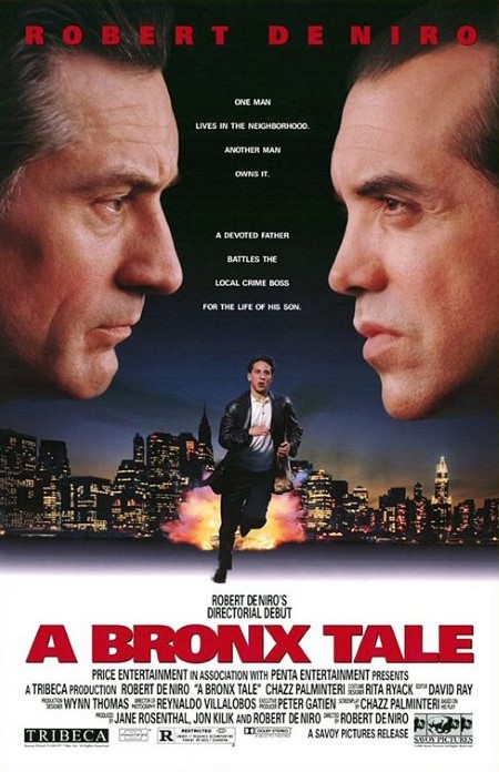
It’s hard to get more misleading than this straight-up lie of a poster, which takes a crime drama and attempts to give it some sizzle by inserting the insinuation of a story and scenes that aren’t even there. “A devoted father battles the local crime boss for the life of his son.” Okay, so it’s De Niro vs. Gangsters, let’s do it! Except no, it’s really not that at all. De Niro is a supporting character, and the evil-looking mobster in question is more of an anti-hero than villain, developing a close relationship with De Niro’s son and trying to push him away from a life of crime. But pshhh … drama don’t put butts in the seats! Better make it look like an action movie with the kid running away from an explosion (which never happens, naturally)!
2. Reign of Fire, 2002
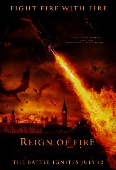
It’s generally a bad idea to depict in your poster a movie that people would rather see than the movie you’ve actually produced. In the case of the dragon flick Reign of Fire, the poster is pretty damn awesome—dragons torching London! The military mobilizes to fight the dragon menace in attack helicopters! It’s man vs. dragons in an apocalyptic showdown! Except the actual film takes place about a decade after any of the events depicted on the poster. Humanity is in hiding, fighting a guerilla war and scraping to get by. No attack helicopters. Total false advertising. It would be like a poster for The Road that depicted the initial disaster rather than the trudging, dirtiness and cannibalism that follows.
1. Godzilla vs. Megalon, 1973
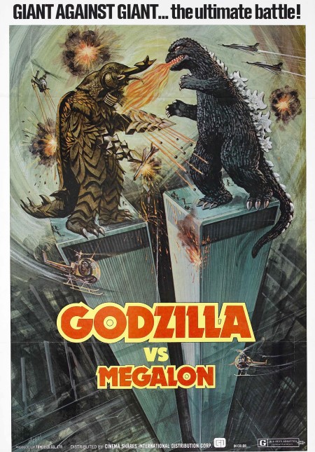
This is my favorite poster of all, for the sheer audacity of it. For its 1976 American release, someone decided to design a new poster for Godzilla vs. Megalon, and it puts even the amazing Godzilla vs. The Thing to shame by depicting the two monsters battling at the top of the World Trade Centers. Where does one even begin? With the fact that the sizes are all wrong, considering that both kaiju are way too big to stand on top of the buildings? (one of the few times a monster has been made smaller for a poster) Or with the obvious—that the film takes place in Japan, like all the other Japanese films in the Godzilla series? The World Trade Centers never appear—the monsters are literally 6,700 miles away from them. You can’t help but sort of admire the sheer chutzpah of the guy who said “Eh, screw ’em, the audience won’t know the difference.”