
Type on Screen: Use Movie Poster Design to Pick A Flick on Netflix Instant

Unless you want to spend your time on Netflix Instant like this, you have to judge a movie by its cover.
There are hundreds of movies to scroll through in your queue, and it’s time-consuming to sift through descriptions. To solve this problem, we looked for movie poster type and imagery trends in 10 popular movie subgenres over the past 10 years. Instead of spending the runtime of a movie trying to choose something to watch, you’ll be able to tell if it’s a movie you’re in the mood for at a glance!
1. Psychological Thriller
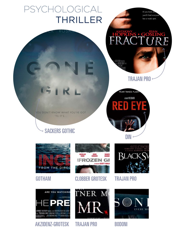
These movies are all about the smoke and mirrors, so it’s not surprising that the majority of the film covers we looked at incorporated smoke or fog into their design. Type usually takes a backseat to imagery. It’s relegated to the lower or upper center, is white, and is usually a san-serif like DIN Next or Akzidenz-Grotesk Std. The characters shown in these posters have part of their faces obscured or have their backs turned looking over their shoulder. All of these design elements combine to create a cold, suspenseful, and cerebral mood.
2. Slasher
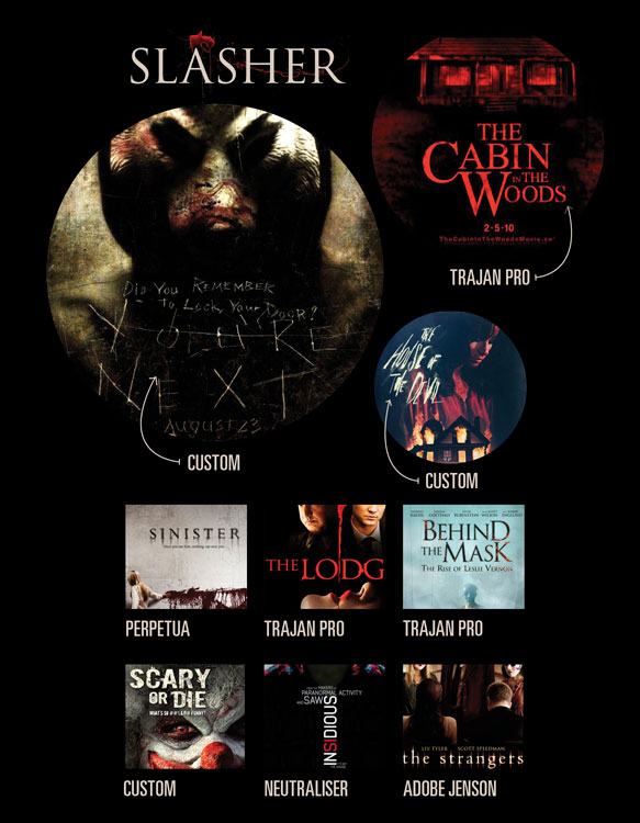
There’s a lot of red in movie posters of the slasher variety. Notable exceptions to the practical rule that blood be incorporated as a design element are the film posters for Insidious and The Strangers. They achieve their macabre mood through imagery of a low-lit boy with empty eyes and three characters in masks staring at you, respectively. Typographically, it’s pretty much either Trajan Pro or distressed, distorted fonts like Doodlebug and Smash. Often, someone in the poster is holding a weapon, or the type has been edited to look sharp and metallic. Throw some blood spatter over all of this and you have a killer recipe for a slasher poster.
3. Superhero
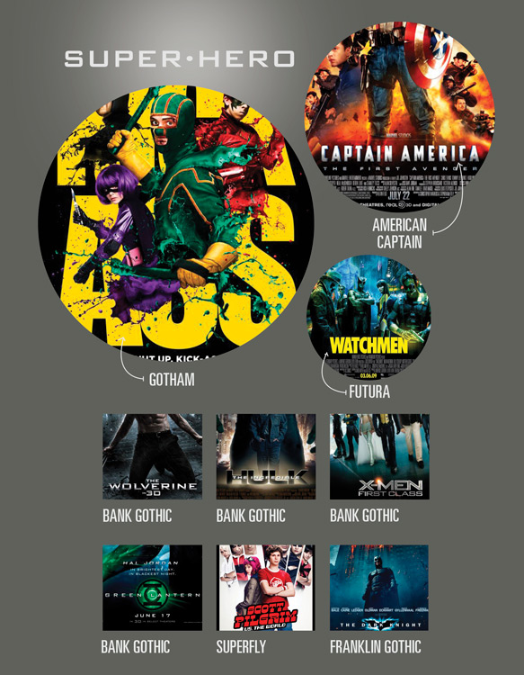
Superhero posters feature the hero or the hero’s symbol front and center. Pretty much every single member of the supporting cast with dialogue will be pictured in the background, arranged in accordance to the popularity of the actor. Preferably, something will be on fire or glowing. Typography includes a whole lot of Bank Gothic or 3-D versions of sign-painter typefaces like Avengeance and American Captain.
4. Slapstick
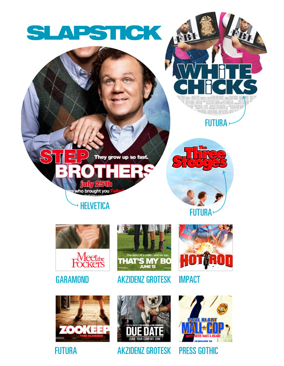
The typography in comedy posters adheres to a set formula: big, bold, and san-serif. Favorites include Futura,Helvetica, and Akzidenz-Grotesk. The posters for the Fockers franchise deviate from the typographic norm by using Garamond as the primary font. Usually, a posed portrait of the main characters doing something ridiculous serves as the main image.
5. Period Drama

Period drama posters will be designed to fit the aesthetic of the times. For example, the characters will be dressed in period appropriate clothes, and the color scheme is often desaturated or yellowed to look vintage. Typography will either be a san-serif typeface like Futura or reminiscent of type designed in whatever time period the movie is set. For example, the title font for American Hustle is ITC Bauhaus, a retro font designed in the 1970s.
6. Sports Drama

Sports movie posters are pretty straight-forward in subject matter. Characters pictured in the poster will be wearing a uniform or playing the sport the movie features. The posters often have a neutral color scheme with a bright accent color, particularly orange and red. Typography is either a san-serif like Gotham or a squarish sans like ITC Machine.
7. Animated Family

Bright colors and friendly animated characters with physiological characteristics that reflect their personality (e.g. big eyes for the innocents, squinty features for the bad guys) abound in animated family movie posters. The highly customized typography becomes a logo for the movie that’s used in big merchandising campaigns and advertising.
8. War
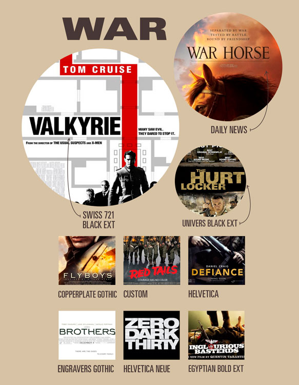
War posters have a sandy color scheme of browns and tans. San-serif, extended and bold typography shouts, for example, “Defiance!” or “Inglorious Basterds!” Imagery includes dynamic scenes like explosions and chopper rescues or banded stills of the cast members looking badass.
9. Indie Romance
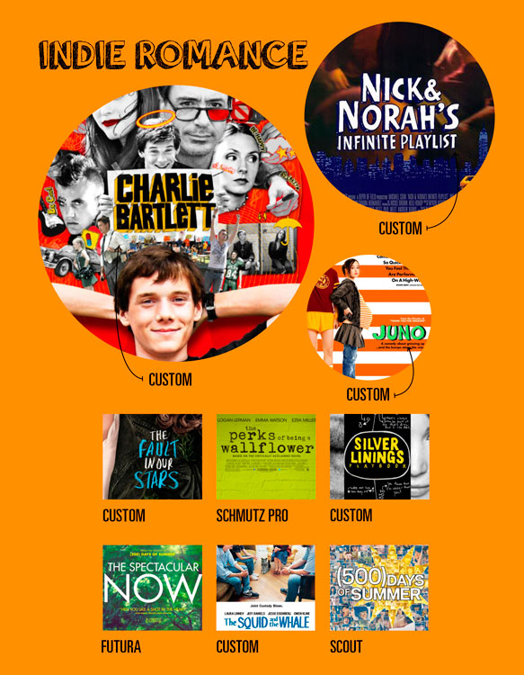
Hand-drawn type equals Indie is practically the industry standard. It’s interesting to note that handwritten typography is meant to make the movie seem unique and alternative, even though every other indie poster is doing a variation on the same theme. There will often be quirky illustrations to accompany the hand-written type.
10. Deadly Disasters

Disaster movie posters capitalize on destruction: the nasty bite of a sharknado, collapsing national landmarks, and lots of casual casualties. The poster will feature the most disastrous as the primary image. Typography is often a condensed san-serif or Trajan. As you’ve no doubt noticed, Trajan Pro is the Movie Poster Font. Trajan is used across all genres and because of this it indicates nothing about the movie’s subject and looks like a default choice. The poster for Pompeii is a good example of an effective use of Trajan. The typeface is based on rubbings taken from an inscription on the column of Trajan, so it makes sense in the context of a movie set during the Roman empire.
Further Reading: Type designer Yves Peters writes a fantastic monthly column ScreenFonts where he discusses effective typography in movie posters. Also check out his 2013 lecture on Trajan Pro and Gotham’s proliferation in movie poster design.