
State of the Art with Moon Knight‘s Declan Shalvey

Comic art is more than just pretty pictures. Though its job is to keep our eyes glued to the page with dynamic figures and double-page spreads of dazzling action, the art’s most elemental function is to tell a cohesive story. You may find yourself marveling over what you read in a particular comic rather than what you saw. And while comics are a visual medium, art can be silently overshadowed by the volume of words that dominate our focus as we read. Comic book reviewers, too, tend to place more focus on writing and plots, as pointed out by Declan Shalvey, artist on the upcoming reboot of Marvel’s Moon Knight with incendiary writer Warren Ellis.
Shalvey’s critical of the way comics are reviewed and written about: “In so many reviews they’ll look at the story and see the story as something that’s purely written, when without the art, there is no story; it’s just a script.” He acknowledges that there’s an artistic vocabulary that non-artistic readers and reviewers, as writers themselves, tend to lack. “If you’re watching a film, you’re not going to know the frame rate or the aperture. There’s the language you’re not going to understand unless you’re versed in that. I can always appreciate that,” Declan said during a phone conversation from his home in Dublin.
From his early work on the blood-spattered pages of 28 Days Later to the loping action of his runs on Deadpool and Venom, Declan has always put his artistic focus squarely on storytelling. “The most challenging, and rewarding, part of drawing a comic is taking those words on a page and making them images,” he said. “It’s really frustrating sometimes, and you’re banging your head against a wall to make it work. Those are the bits that keep artists awake at night but also make them want to get up in the morning and figure it out.”
That tradition continues on his latest project, in which he teams with Warren Ellis and frequent collaborating colorist Jordie Bellaire to resurrect Marvel’s moon-powered mad man. The lunacy in antihero Marc Spector may be a wonderland for Ellis to craft his psycho-noir plot lines (the more deranged, the better, I always say), but it’s the character’s grit and belly-of-the-beast existence that Declan embraces. Declan was especially drawn to Moon Knight for his identity as one of Marvel’s “street-level characters.” For instance, he’s made no secret that he would love to draw Daredevil or Batman.
So in the interest of making us better comic readers (ed: and reviewers), Declan took a break from toiling away on the monthly Moon Knight to school us on some basic elements of visual storytelling that readers may be neglecting.
Movement and Focus
The artist’s most essential job, Declan says, is to control the reader’s eye, and if he’s done it well, you won’t even know it’s happening. “I remember when I was a kid, sometimes you’d see an arrow from panel one to panel two,” he laughed. “There’s an artist who doesn’t know what he’s doing.”
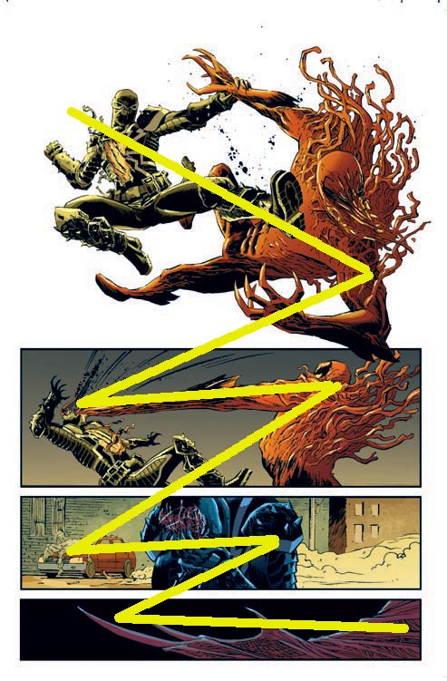
In the case of illustrating comics, the artist is more or less bound by our instinct to read left to right (though this varies by culture; Manga is read right to left). “You’re basically doing a zigzag though the page,” he explained. “If somebody is flying or punching in a very forward direction, you would try to lead them back from right to left, depending on what you’ve drawn before hand.” He mapped that path for us on this page from Deadpool, diagramming where he intended our eyes to gravitate as we read.

Most striking is the subtlety. The left-to-right directive is obvious in Captain America’s shield, swooshing across the first horizontal panel. “I am very much trying to lead your eye left to right, but in an action way. I could have done it completely differently,” he explained. “If I switched that the other way around, it wouldn’t have made much sense, because you’d see him get hit first, and then you’d have seen where the shield came from.” The sense of motion in this panel, leading us to the point of impact, is plain enough, but Cap’s downward-slanting arm pointing us backward into the panel below is more subtle.
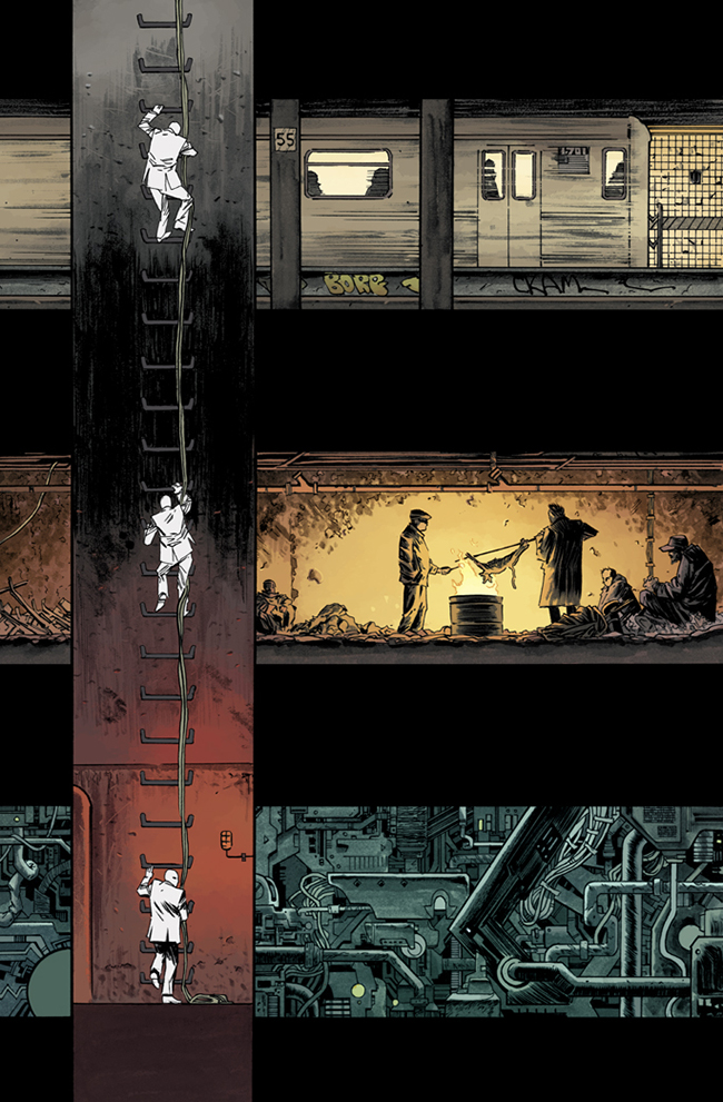
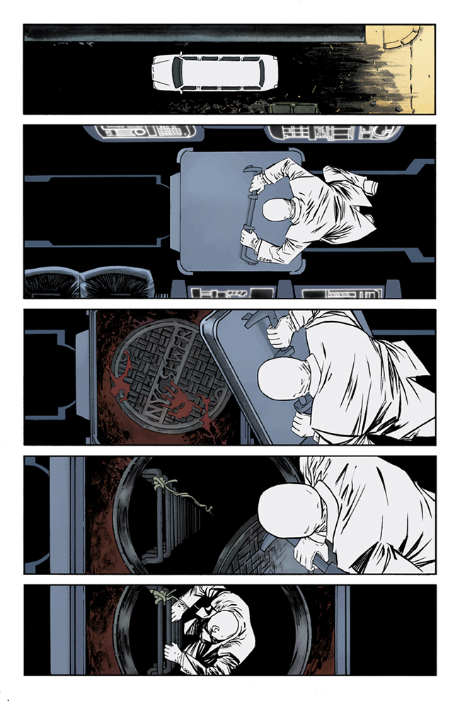
Casting your eye toward the choices an artist makes to capture that movement adds another level to the story. Had I not been looking for it in a page from Moon Knight #1, I would most likely have overlooked the sense of motion before I even knew I felt it. In the issue, the pale vigilante descends into New York’s underbelly, crossing layers of underground life the lower he goes — a subway tunnel, followed by hobos huddled around a bonfire, and deeper still, the industrial techno-guts that power the city. “It takes you down and also takes you across,” Declan said. “I have to point out that was Warren, he wanted that.” But while there’s an almost whimsical air to it, as if he climbed lower we’d see dinosaur bones before he arrived in China, you can see how panel size and placement contribute not only to downward motion but also to a sense of depth. “I could have drawn each one of those panels a lot bigger, had more detail in there. But the way I saw it, it’s more important that you get the feeling that you’re going underground.”
Beyond moving your eye around the page, how the artist wrangles your focus also informs how you read the comic. One way Declan achieves this is by balancing detail with simplicity. “You see a proper shot of Wolverine, I make sure I draw the hell out of Wolverine,” he said. “But if he’s far in the background, why should I be drawing hair on his knuckles?” Those details are also an anchor keeping the reader in the scene; neglect them too much, and you risk losing his or her eye. For a particularly foggy scene in Moon Knight, Declan knew he had to lay down the details early since they would be hidden by the mist. “I didn’t want someone to think that I was being lazy, so for the first page I drew the crap out of the establishing scene, I drew every brick, every person, in as much detail as I possibly could,” he said. But as he also points out, if two characters are talking for three pages, then there’s no need to draw every brick behind them in every panel.
He subscribes to a school of thought that favors utility over detail for detail’s sake. Employing these types of subliminal directives, he commands the reader to look here, not there. “If Deadpool is the one talking, that’s who I’m going to be focusing on because that’s what you’re supposed to be focusing on.” Declan said. “It’s not that you should always use simplicity, but knowing where to simplify, I think, is a very valuable skill.”
Click to the next page to read about mood, tone and paneling.
Mood and Tone
Referring to Moon Knight’s sparsely-worded early pages, Declan said, “It’s not a case of needing to put something in for narration’s sake, it’s trying to show a certain mood or tone. And hopefully by the third page you know the kind of book you’re reading. You’re not going to expect Captain America to burst out of a manhole.”
His goal, he says, is to give Moon Knight a unique look and feel. He lauds books like Hawkeye and Wonder Woman, which he feels deserve more credit for their ability to forge a unique identity. “When you open up a page of Hawkeye, you know it’s Hawkeye. An awful lot of superhero books, it could be a page of Aquaman or a page of Avengers, sometimes look completely interchangeable.”
Part of doing that for Moon Knight means leaning into a style to which Declan is already partial. “There’s a certain tone that I like, using black for shadow; black spotting, I quite like that black base,” he said. “I use black and I use composition, its a mixture of that, and pacing, that I go for.” Gothic is a term that springs to mind — ominous landscapes, inky skies and abyssal shadows — and though he’s drawing urban night-scapes rather than ruined abbeys, that pensive mood remains. Having said that, some of Declan’s favorite things to draw are close-ups on tense, severe faces.

The other part of defining Moon Knight was determining what that visual identity might be. Again leaning into a style already present, Declan opted to make Moon Knight absolutely white. No shading, no gray-wash, just the blackest possible shadows over the whitest possible costume. “No matter what page you’re on, when you see him, your eye is drawn to him because he’s basically a vacuum,” he said. There is little to no texture on the character himself. “I’m using a lot of gray-wash in the book, but I didn’t use it on him. I didn’t want him to look ghostly.”

Much like balancing simplicity with details, the lack of texture on Moon Knight is offset by his highly textured surroundings. Color factors heavily into that, and colorist Jordie Bellaire — who happens to be Declan’s girlfriend and already colors massively stylized books like The Manhattan Projects and Pretty Deadly — fulfills that role with a commanding verve and instinct toward story. “I’ve been able to kind of talk with her about color a lot, and by talk I mean argue,” he joked. “I think Jordie is doing a lot and people are going to notice. She’s basically enhancing everything I’ve done.”
Paneling and Composition
Intertwined within all of these elements lies paneling, or how each frozen shot is organized against others. The arrangement of panels will often inform our senses of direction, timing and atmosphere. A series of small panels will lend a high-speed tension, just as a sprawling splash page can signal drama and scope. “The amount of panels, and the arrangement of panels, can hugely affect a story,” Declan said. “Does it change the pacing? Why are all these panels horizontal? Why is this a 6-panel page? Those are very much creative decisions that become part of the storytelling. It’s completely invisible of course; I don’t expect anyone to go ‘Oh my God, there’s six panels on this page!’”
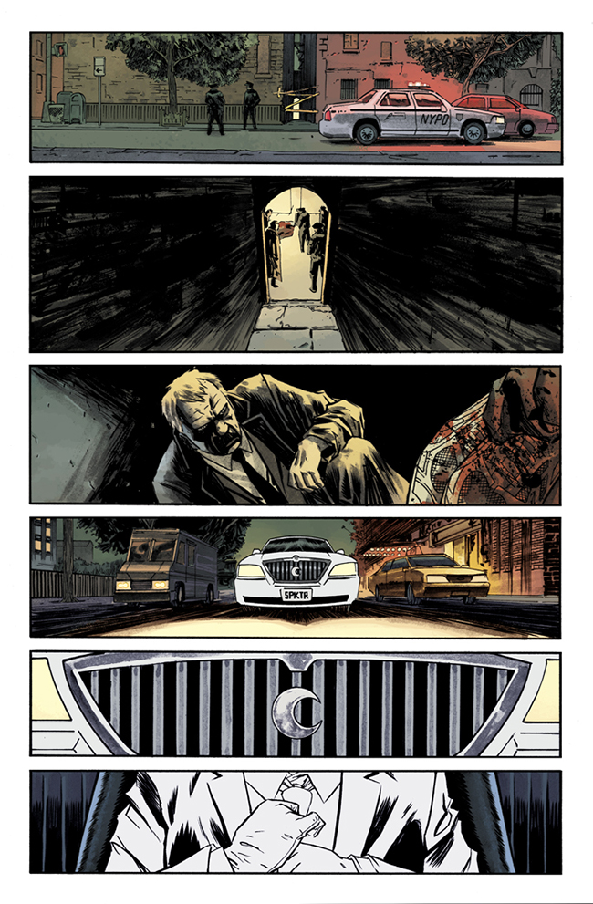
Horizontal panels seem to be common in Moon Knight, and Declan acknowledges his penchant for them. “When I had discussions with Warren, I explained that something I personally like are horizontal panels and I like symmetry. It more directly forces the reader to go from left to right.” Like the page with a series of wide panels depicting the arrival of Moon Knight’s car, closing in on the crescent moon front grill, then closing even further to the car’s interior and a faceless white-suited man. “I could have made that a really badass looking shot of the limo, and if I gave that panel more space it would have made the other panels smaller,” he explained. “In no part of that story was I trying to tell you to look at this sweet car. I wanted you to see the sweet car, but just as important is the shot of someone adjusting their tie.”
The layouts are as important as the art within them. “When I was on Thunderbolts, I tried doing more dynamic layouts, then when I was on a book called Northlanders I would be deliberately restrained,” he said. “With Moon Knight, I’m trying to do both and make a very atmospheric and deliberately-paced story.” In Declan’s case, the planning and layout decisions often take longer to figure out than the actual drawing. The issue of Moon Knight he was working on during the interview comprised a vast tonal shift from the other issues in the series, requiring added imagination. “I spend more time thinking about how I’m going to draw it. I’m working on issue #4 at the moment, and it’s the most insane thing I’ve ever fucking read,” he laughed. “Each story has been more and more weird than the last, and the one I’m doing right now is the weirdest.”
When Warren Ellis made his pronouncement that this incarnation of Moon Knight, would be a “weird crime-noir type of story,” and the comic-reading world cheered, Declan jokingly said he thought “Bollocks!” because of the elevated expectations. But the artist enjoys the challenge. “I think the anticipation of doing something wrong and messing it up is what makes an artist try harder,” he said. “Every single thing Warren has said about this book has made me happier. At the very least, he’s doing something interesting.”
Given Moon Knight’s less-than-successful history and Marvel’s best efforts to lift the odd-ball character from obscurity, it remains to be seen how readers will react to the new series. On the other hand, a famously unknown character looking for a little time in the spotlight could do hell of a lot worse than Ellis and Declan. “I like that Warren is doing something different,” Declan said. “If people don’t like it, fair enough, but I’d much rather do something that’s interesting and fails than do something safe and boring.”