
The Best Comic Colorists of 2017 (So Far)
Main Art by Russell Dauterman, Matt Wilson, Jerome Opeña, Matt Hollingsworth, Nick Derington & Tamra Bonvillain
We’re not going to go so far as to say colorists are the unsung heroes of comics (that’s probably still letterers and production folk), but colorists absolutely do not get due credit for the visual contributions they make to our favorite funnybooks. The diversity and range of comic coloring in the digital era has elevated the art form to new neon heights. Chances are that many of the line artists we celebrate wouldn’t reach half of their intended audiences in black and white, yet it’s often a struggle to parse out colorist credits when publishers release new preview pages and teasers—and it’s only in recent years that crediting colorists on covers has become industry standard. The five colorists below range from chameleons who adapt to each and every assignment to digital painters whose palette is as recognizable as any line artist’s work. Throughout the first half of the year, they’ve produced eye-catching work that establishes them as some of the most trusted names in the game. In addition to our hagiography of modern legends like Dave Stewart and Laura Allred, these are the pigment-slingers we couldn’t keep our eyes off. We look forward to finding out who might join their ranks as 2017 moves ever forward.
Injection Interior Art by Declan Shalvey & Jordie Bellaire
Jordie Bellaire
Notable Titles: Injection, The Autumnlands, Moon Knight, They’re Not Like Us
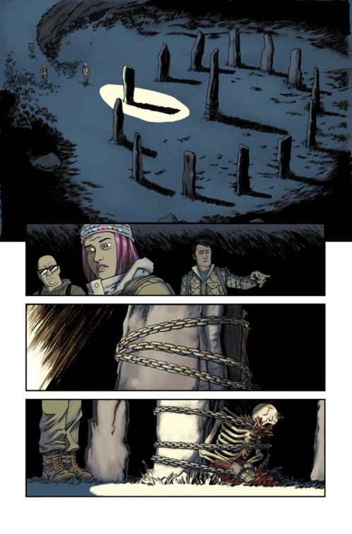
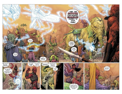
The first half of 2017 has been yet another period for versatile and prolific color artist Jordie Bellaire, whose inventiveness is on par with any creator in comics. Along with strong work on The Autumnlands and They’re Not Like Us, Bellaire’s most striking recent collaboration is Injection, the sci-fi thriller written by Warren Ellis and illustrated by Declan Shalvey. Bellaire’s colors, whether leaning toward the realistic or exploding into abstraction, always sell the mood of the comic, creating pages you want to linger on. Recent issues feature a dead body found chained to a Stonehenge-type monument, and Bellaire paints relevant flashbacks in a striking palette of colors that would suit the Batman of Zur-En-Arrh. The colors highlight the shift in time and the weirdness of events: Bellaire and the Injection are both changing the colors of the world.
Bellaire leaves these clean colors behind on the concluding Moon Knight run, which might be the best in the character’s history. She opts for highly textured, granular shades that enhance a strange, spooky series where pyramids rise in New York City and a cab might also be a spaceship defending the moon from werewolves. Again, Bellaire makes the surreal feel real and comics feel like the best art form in the world. Mark Peters
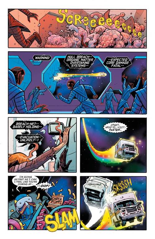
Doom Patrol Interior Art by Nick Derington & Tamra Bonvillain
Tamra Bonvillain
Notable Titles: Doom Patrol, Wayward, Moon Girl and Devil Dinosaur, Angel Catbird
There’s an old theory that red, yellow and blue signal heroism in comics, while green, purple and orange bring to mind baddies. Colorist Tamra Bonvillain seems to delight in trashing that adage, embracing an off-kilter color wheel that finds vibrant new uses for sickly greens and eggplant purples. In the throwback edu-tainment series Angel Catbird, Bonvillain dresses line artist Johnnie Christmas in authentic nostalgic hues; between the gutters of Young Animal flagship Doom Patrol, Bonvillain and co-conspirators Nick Derington and Gerard Way are clearly charting the future of comics page by page. Bonvillain’s unmistakable style is changing the game, and thanks to her work on new-reader-friendly titles like Wayward and Moon Girl, will surely help influence the next generation of powerhouse colorists. Steve Foxe
Kill or Be Killed Interior Art by Sean Phillips & Elizabeth Breitweiser
Elizabeth Breitweiser
Notable Titles: Outcast, Kill or Be Killed, Velvet, The Fade Out
Elizabeth Breitweiser’s palette lies at the stylized crossroads between Italian ‘80s horror maestro Dario Argento, pop-art messiah Andy Warhol and every punk flyer produced before 1992. Her contributions slather on a grimy, evocative film that’s at once decadent and undeniably cool. In Outcast, she contrasts the mundane with the demonic by injecting blasts of invasive red, blue, purple and yellow against the subdued browns and grays of modern Appalachia. From the sepia-tone glitz of The Fade Out to the obsidian-and-crimson descent of Kill or Be Killed, Breitweiser is a master of mood devoid of digital gloss. Not only do all of her pencillers benefit from her heightened fills and gradients, but her choices tell the story as well as any words, poses or facial expresses. These images channel a spectrum of filth and alarm, of mortality spoiling and souls corrupting—it’s the decadent Venn diagram where beauty, horror and disgust overlap, and it’s completely inimitable. Sean Edgar
Seven to Eternity Interior Art by Jerome Opeña & Matt Hollingsworth
Matt Hollingsworth
Notable Titles: Seven to Eternity, Infamous Iron Man, Jessica Jones
Veteran colorist Matt Hollingsworth—whose Twitter feed is 50% comics, 50% his award-winning beer-brewing—has spent much of 2017 making photo-realistic line-artists pop. Infamous Iron Man’s Alex Maleev and Jessica Jones’ Michael Gaydos both rely heavily on photo-referencing for their striking visual acting, and their work would seem flat and static in the hands of a lesser color artist. Hollingsworth weaves swaths of vibrant energy alongside more somber grays and steely blues to help sell the core concept of the Marvel Universe: the strange intruding on the mundane, right in the streets of NYC. Hollingsworth makes heavy use of neon energy swirls in his other major title right now: Seven to Eternity, where he brings to life the many-hued fantasy world of Jerome Opeña and Rick Remender’s devising. Seemingly every denizen of the magic-powered dictatorship sports a different skin tone or aura, and Hollingsworth floods the pages without ever sacrificing clarity. Steve Foxe
Black Cloud Interior Art by Greg Hinkle & Matt Wilson
Matt Wilson
Notable Titles: Black Cloud, Black Widow, Mighty Thor, Paper Girls, The Wicked + The Divine
It’s often a struggle to get publishers to recognize the hard work colorists do, let alone journalists and readers, but some stylists stand out from the pack. Matt Wilson’s name comes up again and again as his audience starts to recognize just how much of an impact colorists have on how their books read. Wilson has worked on a variety of series so far in 2017, and what’s impressive is that they are very different books. While many of his titles feature bursts of poppy neon, one of the skills that makes Wilson so good at what he does is his ability to shift approaches depending on the needs of the book. Black Widow is, by design and necessity, darker and more monochromatic than many of his other recent titles, and Black Cloud oscillates between sepia-tone and technicolor reveals to rival The Wizard of Oz. When it comes to monsters or large casts of characters, a colorist like Wilson who can make sense of busy panels and hectic motion is invaluable. You can’t always tell a Matt Wilson book at first glance, but his use of that trademark neon and the way he contrasts bright palettes with swaths of shadow and negative space is what often gives him away. That ability to give individual books what they need and still maintain a consistent, recognizable (if fairly subtle) style all his own is what sets Wilson apart, and makes him one of the best in the business. Caitlin Rosberg