The Font Wars
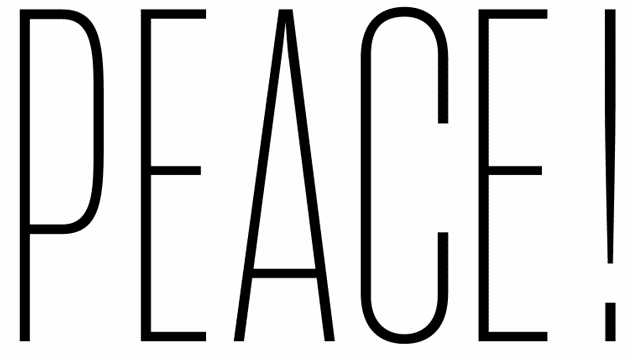
Graphic courtesy of Erik van Blokland / Example of how Variable Fonts, a developing font technology, can work.
In the early 1980s, my job in the graphics department at a newspaper meant spending a large part of my day typing words and control codes into a computer terminal to set type I’d use for headlines on special new sections, or captions for new graphics. The type would come out of a large typesetting machine on a strip of paper, or “galley.”
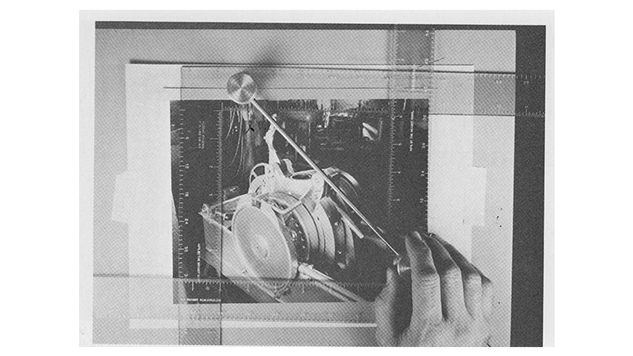
I’d wax the back of it, trim it into pieces and paste it in position on a thin sheet of cardboard that would then be photographed to make a printing plate. My coworkers and I spent a lot of time specifying type and calculating its size to ensure everything fit within the page area we were responsible for. It was nothing like graphic designers’ process today based on desktop computers. Nothing about modern word processing, design, or the Internet would be as we know it if not for three technologies that started it all.
The Dawn of Desktop Printing
In 1984, Apple released the first Macintosh computer, and Steve Jobs decided to ship the machine with a set of expressive fonts that used characters of different widths. (Previously,
most computer systems were limited to using monospaced fonts, as on a typewriter, requiring, for example, j and m to be the same width.)  The Macintosh was the first mainstream computer to offer this and partially reflected the calligraphy classes Jobs audited at Reed College after he dropped out.
Also in 1984, Adobe, then itself another young upstart, introduced the second innovation, PostScript, a “page description language” or interpreter between computers and printers. In 1985 Apple shipped the LaserWriter printer, which came with a PostScript interpreter built in. With PostScript devices like the LaserWriter, users could now convert text on their screen into desired printed copy. The final link was the first professional-quality page layout program, PageMaker from Aldus in 1985, which ran on the new Mac computers. With its layout and design software, practically anyone could produce their own brochures, signs, and newsletters that looked “like the real thing.”
At the time, I was a graphic artist for the San Francisco Newspaper Agency, laying out pages for the science section and investigative series, and designing maps and information graphics. Desktop publishing tools certainly transformed page layout for thousands of graphic artists, like me, who were used to cumbersome practices before then.
Around this time, spurred by a long-time passion for designing typefaces, I began knocking on the door at Adobe, after reading a 12-page Macworld article on the LaserWriter and desktop publishing. The article mentioned Adobe had hired a calligrapher, Sumner Stone, to lead its type team. I was surprised a tech company would value calligraphy, so I wanted to check it out. In design school, I was interested in type design. Back then it was a tiny field. Fewer than 100 people worked in the trade worldwide, and the type companies were focused on selling typesetting equipment rather than fonts.
Thanks to desktop publishing, the demand and use of fonts quickly became more than a niche field. I joined Adobe in 1986, and little did I know then, a war was brewing that would color my career for the next decade.
The Intense 1990s Wars of Two Font Standards
Before the tech titans – Apple, Microsoft, Google, and Adobe, among others – learned to coexist and work together, the early days of the personal computer were a time of fierce struggle between proprietary technologies. At the time, all of the “page description languages” that enabled computers to send pages to a printer were proprietary technologies. As consumers and businesses latched on to desktop publishing, there was stiff competition for who could would set the standard. Eventually Adobe’s PostScript won that battle.
But that victory led to a new struggle. Two competing font standards triggered fierce rivalries
that became known as the “Font Wars” of the 1990s. Adobe’s success meant computer
companies were paying royalties to use PostScript and the associated Type 1 font format.
Looking to free themselves from dependency on Adobe, Apple and Microsoft formed an alliance to create an alternative.
This move democratized the world of digital type design.
Before that alliance could produce a new language and introduce their new font format, Adobe published its Type 1 font specifications in 1990. This move democratized the world of digital type design, letting almost anyone make and sell their own digital fonts without needing a license or massive computer systems. As part of that effort, Adobe developed a new product called Adobe Type Manager that displayed Type 1 fonts on screen and enabled printing to non-PostScript printers, which benefited anyone who used fonts on a computer. You could see the font you were working with onscreen in real time, and didn’t have to print it out just to proof your document. It was the first true “what you see is what you get,” or WYSIWYG, implementation.
Of course Apple and Microsoft rallied back with their own alternative, TrueType. Their WYSIWYG font technology offered comparable capabilities. But despite TrueType being an
integral part of both Mac OS 7 and Windows 3.1, members of the design community never fully embraced TrueType, perceiving it as an inferior technology.
In 1997, the so-called “font wars” ceased as Adobe and Microsoft came together to negotiate a treaty. The two realized they and their communities had more to gain from collegiality than competition. This began the OpenType initiative. OpenType allowed fonts to use either TrueType or Type 1 formats, and let a single font file work on both Mac and Windows, making documents much easier to interchange.
The Modern Web and Ubiquity of Fonts
Around 1999, a new frontier emerged: the Internet, with one-third of households online by mid-1999. However, the dot com boom websites looked nothing like the Web today, largely because of font licensing. Early Internet sites relied on the fonts that were on a user’s computer. Since the set available on a Mac was not the same as the set available on Windows, websites looked different depending on where they were viewed. Web sites worked around this by limiting pages to a small group of fonts found in both environments, known as web-safe fonts.
There were already thousands of other fonts, but there was no simple way to license them and control how and where they were used. Before, fonts were purchased from a font design shop, or foundry, and sent to the user (typically on a floppy disk) for making printed documents. Suddenly, where and how fonts appeared was more complicated.
Only a few years ago did Web browser makers and font developers agree on a font format to distinguish Web fonts from desktop fonts so that fonts on the Web couldn’t easily be copied for use on the desktop. Further, companies such as Typekit devised new ways to license and distribute fonts, easing the complications of font usage in both environments. These efforts protected the licensing for font developers and let designers integrate almost any font into Web pages, allowing sites to fine-tune their appearance. For the viewer, this translated into today’s much more interesting and varied styling of websites.
Emoji and the Next Chapter in Font History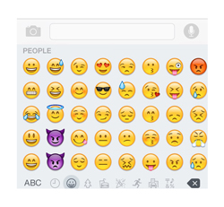
Even with the countless thousands of fonts today, they are still limited to finite selections: attributes such as boldness, a small number of widths, and a single color. Fonts in the future will emphasize greater control and customization that a website or the user can adjust.
I believe emoji give us a glimpse of the future of fonts. By default, they possess several colors. On some systems, many not only have solid colors but also gradations. If you examine the original Japanese emoji, many also have animations. In addition, instead of allowing a user to just change the entire color of a character from black to red or green, future fonts will supply glyphs with many layers to let a user fine-tune and control the colors with precision. This all points to a more expressive way to communicate.

Recently, Adobe, Apple, Google, and Microsoft revealed new Variable Fonts within
OpenType This advance will enable designers and consumers to define the weight or width of a font within a range that the font developer creates. This proves particularly interesting for
websites, since designers can use one font for all device displays and adjust the results for each screen. Eventually, they may be able to tune the font in response to how close the screen is to the user’s face.
Finally, the business and technology for getting fonts to users – whether designers or just
someone using an app on a mobile phone – are evolving quickly. I expect we’ll see many more people using many more fonts in the near future. It’s an exciting future indeed.
David Lemon is the former senior manager of type development at Adobe. During his three decades at Adobe, he furthered font and typeface innovation around the world.
About the main image:
The “Peace” graphic is an Example of how Variable Fonts, a developing font technology, can work. Source: Erik van Blokland