
Kurt Vile is all about that old-time, lo-fi, DIY, rock and roll
Cover Me: The Philly rocker talks to us about the stories behind all of his album covers, including how he was given a previously unused William Eggleston photo for his new record, Philadelphia’s been good to me.
Photo of Kurt Vile by Eleanor Petry

Cover Me is a column highlighting the stories behind great album covers, as told to Grant Sharples by the artists and bands who made them.
“That old-time, lo-fi, DIY, rock and roll… nights!” So goes the refrain of “Chance to Bleed,” a highlight of Kurt Vile’s latest record, Philadelphia’s been good to me (out May 29 on Verve). That recurring line extends into my recent conversation with Vile himself, who’s quick to point out his lo-fi, DIY origins as a proud Philly indie rocker. His first trio of albums in the late 2000s sound particularly homespun; Vile’s voice and guitar sound distant and far away like trees lightly cloaked in early-morning fog. Even when he broke through to larger audiences in 2011, the rustic qualities of his music remained intact: his unmistakable drawl, the languid guitars, the nonchalant ambiance.
That methodology also extends to his album covers. As the two of us explore the stories behind all of his album art, Vile repeatedly mentions the DIY ethos that animates all his work, from the music videos to the cover art to the songs themselves. Philadelphia’s been good to me feels like a culmination of that mindset. It’s a tribute to the city he has called home for his whole life and how he gradually rose to prominence without losing the most integral part of himself.
In my newest Cover Me feature, Vile and I dive into the stories behind each of his album covers. Subjects discussed: William Eggleston’s previously unseen photography; a friendship with David Berman; fatherhood; the classic Kurt Vile Philly mural; Bob Dylan’s Street-Legal; and Halloween.
******
Constant Hitmaker (2008)

Paste Magazine: I read that you were inspired by Bob Dylan’s Street-Legal. What was it about that cover that inspired you?
Kurt Vile: Yeah, what I liked about Bob Dylan’s Street-Legal is that it just has him in front of his rehearsal space, like an urban wall just looking down the street with monitors on the floor and everything. But I was obsessed with that album anyway, like my really close friends turned me on when I was younger, but then I was back into Bob Dylan again and reading all the books and deep in it. Aside from the backstory, I just liked how it was Bob in his element, like in an industrial spot. When I had to have an album cover, I would be walking home from Philadelphia Brewing Company. This is late 2007, and the sunsets were really good that time of day. I would go from Kensington to Fishtown.
Back then, Fishtown had a lot of abandoned warehouses and some coffee shops. It was starting to get built up. Now it kind of looks like little Williamsburg or something. But back then, there were plenty of beautiful bombed-out buildings, and there was this one wall in particular across from it, just a little down off of Frankfurt, across from this coffee shop that used to be called the Rocket Cat. And the wall looked like a [Robert] Rauschenberg painting or something. It was just ruins or whatever, but the wall looked like a painting in itself. So I was like, “I just want to pose in front of this with my amp and my guitar.” My old friend Sarah McKay, who I grew up with, took that photo.
******
God Is Saying This to You… (2009)

That’s actually my dad’s train. And my dad drove trains for a long time. First, he drove for Conrail. I think he worked for Amtrak. I don’t think he drove Amtrak trains, but he drove SEPTA trains for his whole life. I only had the scan [of the original photo], and then we blew it up to record size so it’s all pixelated. But one day I hope I find that [original], because I’ll do some kind of anniversary release where it’s like, full-frequency graphics or whatever. But anyway, it looks like found-object vibes, which was cool. The story is: It’s actually my dad in front of his train. And it’s just a cool photo. I love that era of lo-fi DIY, which is what I come from. It’s like a film photo, sort of obscure, but beautiful and abstract and makes you think. And it’s also, I guess, blue-collar-looking, all those things, which is where I come from.
How do you feel this photo of your dad speaks to the music of the album itself?
I mean, that’s the beauty, right? It just invokes some kind of feeling. But it’s also my dad, and I think it fits with the lo-fi vibes. Merce Lemon, her last album cover, is somewhere between lo-fi and classic Nineties Drag City. It’s definitely influenced by how a random photo can evoke some kind of warm, homespun, psychedelic feeling.
******
Childish Prodigy (2009)
This photo does a similar thing, where it’s just evoking how the music itself feels.
The story behind that is that my brother Sam gave [the photo] to me. My brother Sam, who had his prom at the Art Museum of Philadelphia, sent it to me, and he gave it to me years before I made [the album]. He said, “I wanted to give it to you because it looked like something you would use for an album cover.” Sure enough, once I started working on that artwork with my friend Boyd Shropshire, I had, as I always do, a collection of potentials, like all cool-looking photos, and we kept looking at that one. As we were working on the art, it became clear that it was the one, and it’s got the lo-fi vibes. Again, I came out of the lo-fi DIY scene, and there’s a couple of home recordings on there, but then the rest are recorded by Jeff Ziegler. But it’s still cool. I like that album because it’s probably my most punk record I have, but it’s got the psychedelic and really cool guitars, like noisy and jangly and pretty guitars combined.
So it’s interesting because it’s becoming a family story in front of our eyes. To this day, me and my brother Sam, we collaborate like that. I do with all my brothers, really, but my brother makes cool videos. Now we’ve done a few video collabs together recently. We did that Christmas video. He was really involved in that. He’s also the kid that’s in my “Mount Airy Hill” video. And a lot of times, you mix us up. Sometimes we look similar.
******
Smoke Ring For My Halo (2011)
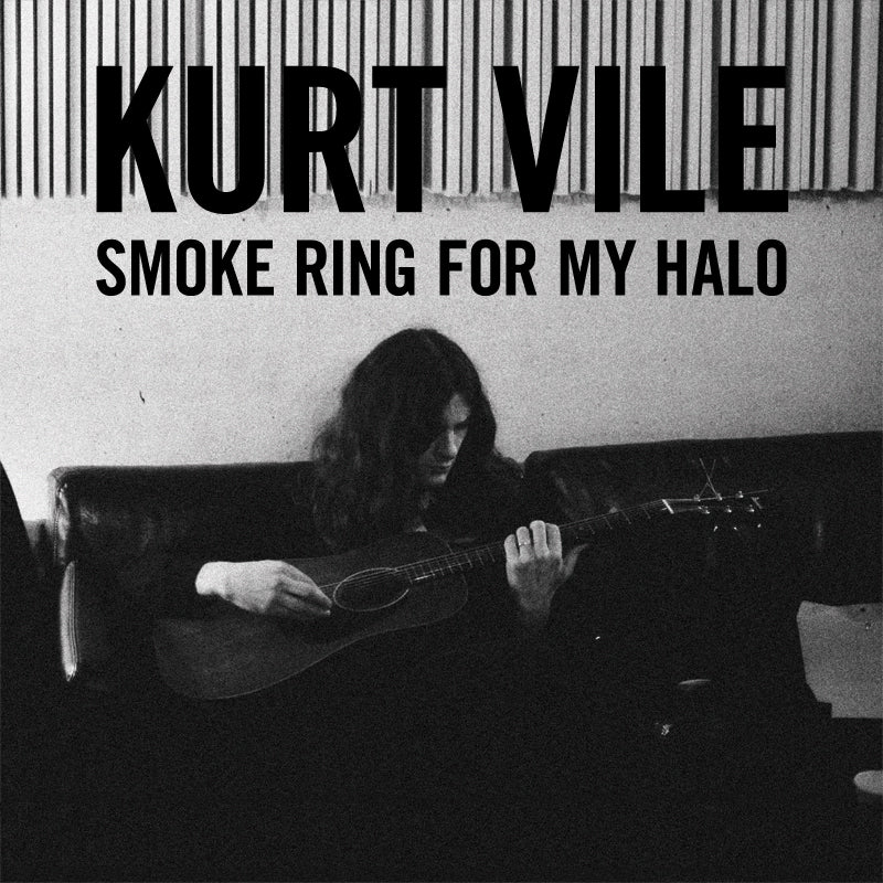
Something I’ve noticed, too, is that you always pick a photograph as the medium for the cover. And this photograph in particular is really striking with the black and white. Why did you choose a black-and-white photo for this one?
Once I signed to Matador, my manager—Rennie Jaffe—his old friend Shawn Brackbill took my first professional photos. And then we invited him to the sessions for Smoke Ring For My Halo. I’m holding the guitar that I played “Baby’s Arms” on, which is my old friend’s Ibanez acoustic. It’s interesting because, for both the album and the art, there was an absolute shift. There were the growing pains of shifting from making a more professionally produced songwriter record from the lo-fi thing, and the art took a really long time, specifically the text, because I was used to making homemade text and cut-out text, or, in a lot of cases, just leaving the text off. It’s hard with fonts.
But anyway, in the hour we got that big “Kurt Vile Smoke Ring For My Halo” across. And even then, I wasn’t sure [about it], but now I think it’s iconic. The label loved it. It’s funny because on most records, I’m a little further back, and then I get a little closer. On some of the records, I get a little closer. But it’s appropriate because I’m holding the “Baby’s Arms” guitar, which is also an old friend’s, and in the Magic Shop, where the sessions started in New York. You know, there’s a shift from Philadelphia to New York City, and I’d say it’s my first and really only sort of conventional songwriter record, and also aside from the last one, that’s one record. All the following full-lengths are two records long.
You’re saying this felt like a breakthrough moment for you, too. So I feel like this should be the first cover where you’re up front and present.
To their credit, [Matador] really pushed that, you know, like I say, there were some growing pains with that, but looking back, you know, it was just the fifteenth anniversary a couple of weeks ago, basically. So it’s cool to look back for sure. We did the right thing.
Why do you like to choose photographs for your covers?
It’s interesting because, obviously, I loved Pavement and so much cool collage in the Nineties. I make collages a lot. I almost went to art school. I was an art major by senior year, and I was into it in eleventh grade. But I was an artist my whole life, and I was influenced by collage and Rauschenberg and Pavement’s art and things like that. But in a lot of ways, I’m also sort of a last-minute guy. At the end of the day, it’s just easy to have a photograph, you know? But it’s also cool because a photograph can say so much. A photograph is worth… whatever the term is. It’s a simple way to start. Once you get a computer and fonts, I want to cut things up and make it look worn in at the end of the day. It takes a minute, or it takes work to get that right, and you sort of run out of time. So thank God for the simple photograph.
******
Wakin on a Pretty Daze (2013)
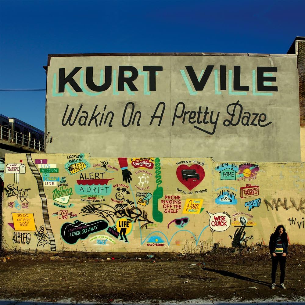
Did you get any input on what would be on the mural?
No, I’ll tell you exactly how it happened. The Philly graffiti artist that went on to New York, I didn’t know who he was, but he happened to write me and asked me to have some of my music in a movie he was going to make with street actors, which I don’t think he ever made, and I forwarded it to my manager, Rennie. Big credit to Rennie on this cover, it wouldn’t exist without [him]. When I forwarded him the message, he said, “Holy shit, this guy is a legend,” and we had a lot of mutual friends. Steve Powers, and I know him well now, but I didn’t know him, and Rennie’s like, “This guy’s a legend.” And he said we should have him because he’s known for that style of graffiti, and said we should have him do an album cover, and the wall will be the album cover.
It’s funny because he did a similar thing with Steve Powers recently. He was running an idea and said, “We’re going to have that Kurt Vile and Pavement weekend. So you should make a poster—quote-unquote—for the show with Pavement.” So he just did the same thing in wet concrete and then dried it. But anyway, yeah, so we got Steve to do it. It was incredible. Two layers of wall, like the bottom wall, and then up top.
Up top is the album title; on the bottom is all the sort of—I think he called them “icons”—that reenact visual versions of lyrics within the album. And he just listened to the album and would draw. “There’s a place in my heart for all of my friends.” There’s a heart, and “friends” is written in there. There’s so many of them. And yeah, I remember we got Shawn Brackbill to take photos of me on the front, but we realized we didn’t get one head-on. The back is Shawn Brackbill. But then we got Steve Powers’ old friend Adam Wallacavage, who’s a Philly guy who shoots for Thrasher. He just shot a photo of me head-on in front of the mural. And that’s the photo you got straight on. It was cool at the end of that, because Adam Wallacavage is a great artist. And the mural still exists to this day.
Have you gotten to visit it recently?
Well, it’s right in the heart of Fishtown. So I see it all the time. It’s right in the hub.
I read that you did the graffiti for the “Violators” text on the back cover. Had you ever graffitied before?
When I was younger, I had friends and we tagged a little, like with markers. And the guy you see is the version of a guy I draw. I was big into the art, and I still can pick it back up. They’re sort of psychedelic, basic drawings, but I could get detailed if I want to add more. But I still to this day collect all kinds of objects and materials for collage and stuff. I do think I’m going to get heavy back into it soon. My daughters are great artists. I think once I slow down a little more from music, I’m going to sit back and do that kind of thing, make more collages and art again. We draw together all the time. I would love to chill with my daughters and just do art. I’m starting to feel that way right now. I just need a career now, and it’s so fun turning in an album. And then you get the artwork done, and it’s a little dramatic. It takes a lot out of you. And then you’re like, “Oh, I’m done.” But you’re only really just beginning. You’ve got to talk about it and figure out the songs for the road, and by then you’re really tired, but once I get moving, I’m great. So yeah, sometimes, I’m like, “Man, I want to cash in on my golden years a little early and take it easy.” [There’s a] good chance I will in a couple years from now, or at least take a year off or something.
******
b’lieve i’m goin down… (2015)
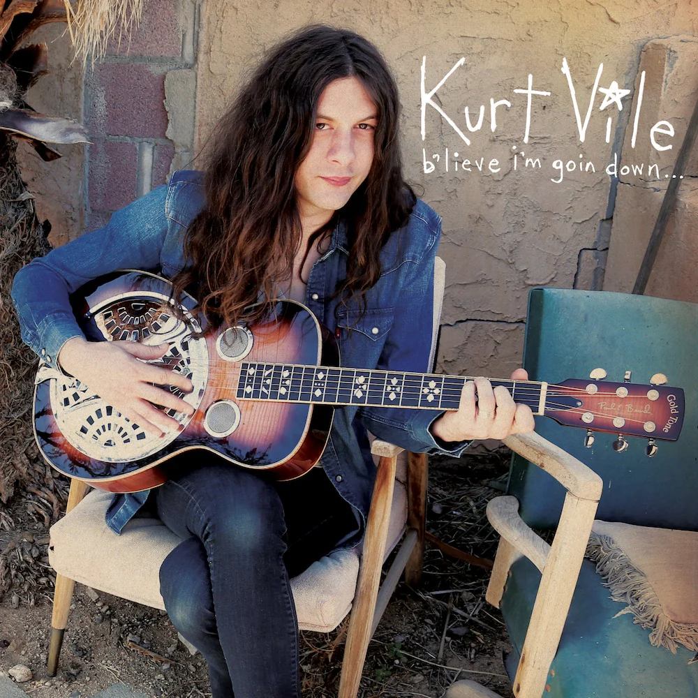
This reminds me of what you said with Matador encouraging you to take up more space on the cover itself for Smoke Ring For My Halo. On this one, you’re right up in front of the camera. Was that their idea, as well?
Well, I don’t know exactly, but we did note that I get a little closer all the time, and that was me. I mean, it’s got my only sort of big hit song on it, “Pretty Pimpin,” so that definitely was a breakthrough for me. I noticed a huge difference when that came out. So yeah, it’s me up front, and it’s me and Joshua Tree. It was definitely my most California record I’ve done. I mean, I’ve been in California for most records since Wakin on a Pretty Daze. But that was me really embracing California, and I started at Joshua Tree. So that’s where I am. The photo is by Henry Diltz, the legendary LA photographer who’s done CSN&Y. [Art director and designer] Gary Burden was a fan of mine, and he got in touch through Conor Oberst, and I really wanted to collaborate with him on a cover. So he gave me that LA, California treatment.
What’s the guitar you’re holding in this picture?
It’s a Gold Tone Resonator guitar. Some people call it a dobro, but technically, a dobro usually has really high strings. So it’s just for slide. I could be wrong, but it’s called a Resonator guitar by Gold Tone. It’s the guitar I wrote “Goldtone” on on the previous album. On this album, it’s got the song “All in a Daze Work” that I captured on there. I think I wanted to shout them out. I was playing that guitar at the time, and it’s got its chromium qualities and such, combined with wood. I was also just playing that guitar a lot, but it really makes the photo shine a little more out in the desert there.
******
Bottle It In (2018)

Speaking of you holding guitars, we’ve got Bottle It In, and this is a Kay Trutone Vanguard, right? Can you tell me a little bit more about how you got this guitar?
Yeah, that’s actually Rob Schnapf’s guitar, and that photo was taken right around the corner from his studio in Eagle Rock in California. Rob Schnapf, the first thing he ever recorded [for me] was “Pretty Pimpin.” On Bottle It In, I was working with multiple producers more than ever on that record, but some of my favorite songs, like the title track, were recorded by Rob Schnapf, and “One Trick Ponies,” that’s Rob Schnapf. “Cold Was the Wind” is Rob Schnapf. There’s some really good songs that never came out that will eventually that Rob Schnapf did. There are others I’m forgetting, but to this day, I still work with Rob. He’s like a brother. He’s like part of my brother, part my dad, and he did the first single on the new album called “Chance to Bleed.” That’s the last thing he did with us. And he came to me in Philly a lot on the last record, but back then, I would always go to him in Eagle Rock, and it’s such a great studio. It’s not too big, but everything works, and that’s what I’ll do. He literally put that guitar in my hand.
Mimi Raver took that photo, and she worked at the studio. She’s a great photographer, so it’s all in-house vibes. It was almost like an afterthought. I was like, “Oh, maybe you could take a photo for the album.” I think I said that, but then I was lazy, and she’s like, “Should we go around the corner?” We literally just went around the corner for like, three to five seconds, and you never think you’re going to get it. I never do. My brain’s always flying. I’m self-conscious once I’m doing the photos. Then I got one of my favorite artists. He did the previous album, too, but he worked for Matador. His name is Mike Zimmerman. He did the layout on b’lieve i’m goin down…. But this one, we got more involved, and I was influenced by The Johnny Cash Collection, and it had, like, a rainbow square. There’s elements of that.
******
(watch my moves) (2022)
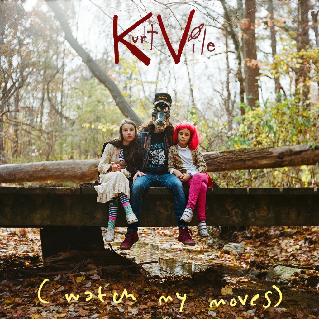
Who are the three figures here?
Well, (watch my moves) is a product of the pandemic and being forced to stay still. The two characters with no masks are my daughters, and I’m the one wearing the mask. I got really close with my kids. I’ve always been close with my kids, but once the pandemic hit, you realize how much you’re missing by not being around all the time and on the road. I used to always say, “Well, I tour and I leave, and that’s hard, but when I come home, I’m totally home, as opposed to leaving 9-to-5 every day for a 9-to-5 kind of job.” Then once you’re actually home all the time, and they were pretty young, then, you know, they were seven and nine, now turning eight and ten. It’s crazy how time flies. They were so little then, and I was around all the time, and so I made that. It was the first record I made in my own studio, OKV Central, and Rob Schnapf came out with me, and then we’d trade. Rob would come to me, and then I would go to him in LA.
I called Rob Schnapf a lot over that pandemic and asked him what kind of things I should buy to build my studio. By the time the album was all done, I was thinking about the art. It was Halloween, and the kids were really on me: What am I going to be for Halloween? And we found that alligator mask. When we went walking out for trick-or-treating, I looked at the woods by my house and how cool they looked when the sun was setting, and how it’s so nice to take photos with my kids because I’m happy to be home with them, and they love Halloween so much. It was also the opposite of the previous [two] albums where I am the cover. I did that so many times. Let’s do something weird where it’s me, but I’m wearing a mask. I also just thought it blended nice with the woods. But again, the people that were hanging with me, my friends who did the “Like Exploding Stones” video and their photographer friend, they walked through the woods with me, and they told me to sit on that bridge, which is a bridge we always go to on the trail. And they just captured it again. You’re taking pictures all day and filming or whatever with the kids, capturing the moment, but you never know, really. A photograph is tricky, but they got just the right moment with us sitting on the bridge.
You mentioned that you’re usually self-conscious when you’re taking photos, but when you’re taking photos with your kids and just hanging out with them, did you feel that wall go down a little bit?
Yeah, totally. I just wanted to involve them. That’s a record I made at home, or a lot of it at home, and I was home a lot, and I was living with my kids with me. It was more natural than going off on my own. So just to involve them was fun.
******
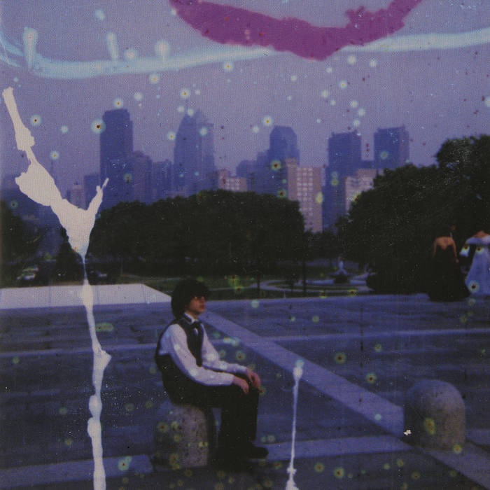
Philadelphia’s been good to me (2026)
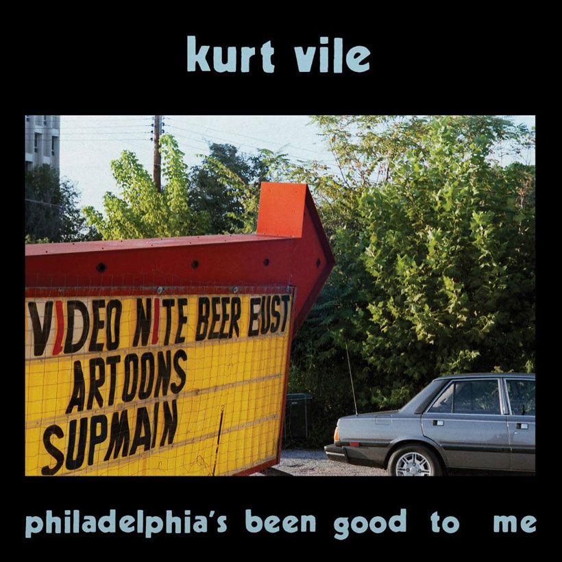
This is a previously unused William Eggleston photo that was given to you explicitly for the cover. What’s the story there?
The first time I was knowingly shown William Eggleston’s photos was by David Berman. I visited him with my family in 2016. I’d been going to Nashville a lot then. He was a hero to so many of us, but we had been emailing because I heard he was a fan of my song “Society Is My Friend” from Smoke Ring for My Halo. But anyway, when we finally got to visit him, when I got through Nashville with my family, I was like, on, like, a country music quest, but I was also reaching out to people like Doug Easley, who was in Memphis a little on this new album, so that it all connects. David Berman showed me a book of his photos and some of the more psychedelic ones at the time, like the more obscure ones where they’re hazy and stuff. But then, when David passed, I went to his funeral, and Winston, William Eggleston’s son, came up to me and he said, “I’m a fan” or whatever. And I was like, “Wow.” And he was really nice. And I was like, “David turned me on to your dad’s photos.”
David had books and books of [William’s photos], and I was looking through them at his house. When me and Winston became friends, he sent me books, and over the pandemic, he was one of my pen pals, where I had time to actually write to people. He sent me this photo over the pandemic, and I was kind of clueless, like it was a big ask, but sure enough, he said, “OK, I could send you one, maybe from the Eighties, something that’s not well known.” And he sent me this one, and it turns out it’s never been seen before. My actual print is faded. You can see on the back of the record that it’s not the right colors, but it’s a cool, faded thing. And it reminded me of God Is Saying This to You…. I’ve had it now for six years, or whatever. I did some recording in Memphis for this record, and I would always connect with Winston, so it made sense, even though the album’s called Philadelphia’s been good to me.
I did ask Winston, like, “Did your dad take any photos in Philly?” He said, “I don’t think so.” And then he sent me another book of [photos of] Pittsburgh, quite close to Philly. At that point, I was like, “This print feels like me.” It reminds me of God Is Saying This to You…. It reminds me of that same kind of vibe where it has become me. So when I look at it, it feels like me, but it could also be anywhere. It could be in Philly. It’s just a sign. So then what they did was they told me those aren’t the right colors. But on the back, it’s still the faded original print-to-scan. But that’s sort of the magic. The mystery of it is that the album is Philly’s been good to me, yes, and it was recorded in Philly and in Memphis, Tennessee, where Eggleston is from. I would visit multiple times. I would go to Winston’s house and talk and hang out with William Eggleston. We’re like family. We visit all the time. But that’s all intertwined: the Memphis story and the Philadelphia story in this record.
Grant Sharples is a writer, journalist, and critic. His work has also appeared in Interview, Uproxx, Pitchfork, Stereogum, The Ringer, Los Angeles Review of Books, and other publications. He lives in Kansas City.