
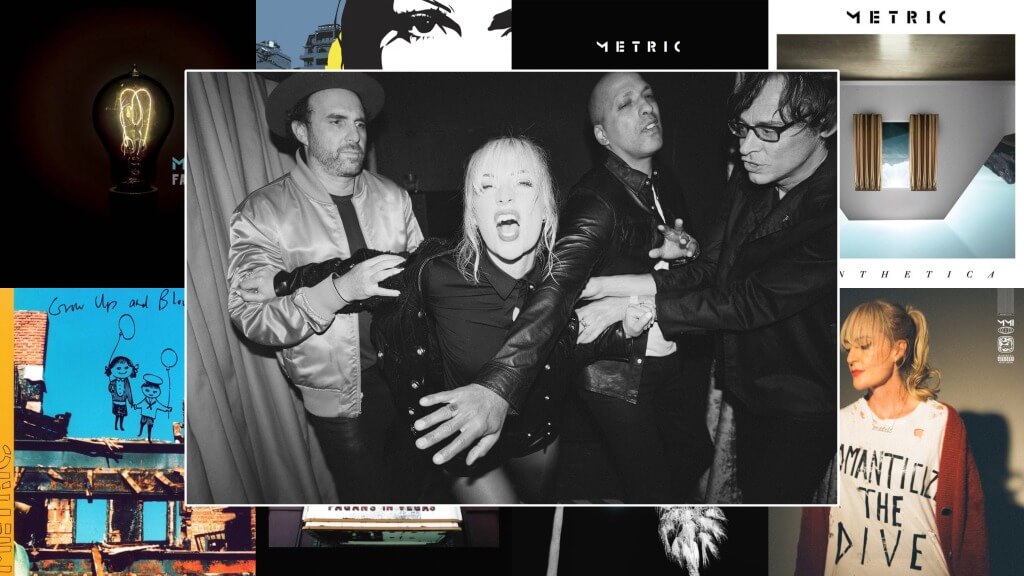
Metric take us back to their roots
Cover Me: Emily Haines reminisces on the stories behind her band’s album covers, including the frantic process for Fantasies, the unnoticed references in Formentera, and the callback to their origins on Romanticize the Dive.
Photo of Metric courtesy of press
Cover Me is a column highlighting the stories behind great album covers, as told to Grant Sharples by the artists and bands who made them.
On their 10th album, Metric goes back to the beginning. Well over two decades into their career, the Toronto indie rockers originally got their start in New York, where frontwoman Emily Haines and guitarist Jimmy Shaw shared a Williamsburg loft with fellow blog-rock ascendants TV On The Radio and Yeah Yeah Yeahs. For Romanticize the Dive, they returned to Electric Lady Studios to recapture the spirit of their origins.
The album cover of Romanticize the Dive, fittingly, is the first to feature Haines since their 2003 debut, Old World Underground, Where Are You Now?. It’s a poetic callback, but the album itself unites the scrappy indie rock of their genesis with the twinkly synth-pop of their modern output. It all culminates in a celebration of their wide-ranging, storied career. Metric are a perfect candidate for this column.
In this edition of Cover Me, I joined Haines on Zoom to go over the stories behind each Metric album cover. Subjects discussed: graphic novels; Terry Gilliam’s Brazil; duct tape; partial nudity; the original name and cover for 2009’s Fantasies; Led Zeppelin; and wasting label money.
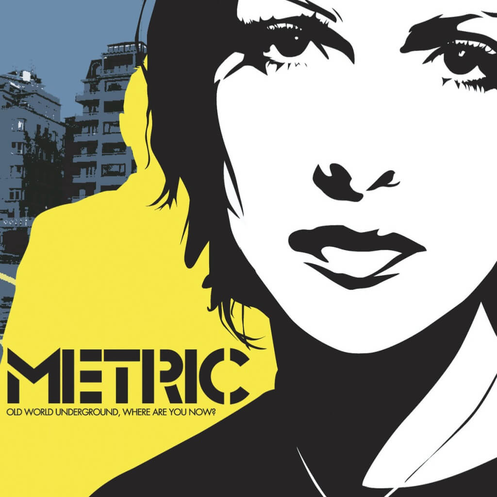
Old World Underground, Where Are You Now? (2003)
Paste Magazine: What do you remember about the cover for this one and choosing it?
Emily Haines: Yeah, so that’s an artist named Josh Hassin. We were so lucky. The band met in New York, right in 2001, and then we came to L.A. via Toronto, and we were really fortunate. [We were] playing to ten people at the Silverlake Lounge, but we met all these great people, and among those people was Michael Andrews, who has done a lot of soundtrack work for Donnie Darko and other things. And he ended up producing that first album and introduced us to a bunch of people, one of whom was this artist named Josh Hassin, who’s a San Diego guy, and he is really good, as you can see from that cover, at doing graphic-novel-style drawings.
With the album title being Old World Underground, Where Are You Now?, it’s sort of a dystopian storybook feeling. He drew all that, and then the back cover and a lot of the other accents were a combination of silhouettes and some wartime imagery because the Second Gulf War was in play around that time. So one of the details I love on the cover is, if you look closely—and it’s not all of them, but the first pressing has it—there’s a little hint of pink in this one spot [of my short black hair]. It’s such a cool artist move. That was Josh Hassin.
Live It Out (2005)
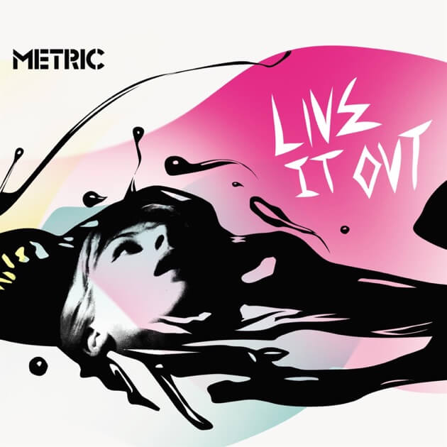
I think Live It Out also kind of looks like the cover of a graphic novel. Was this also Josh?
It was Josh Hassin, and he definitely continued with that [style]. But I think he really responded to the difference in our sound. Our debut album was very much thanks to Mike Andrews anchoring us in the world of Blondie, the Cars, and some new-wave references and really establishing the analog synthesis and a sound that, now, doesn’t seem so out there. [laughs] But at the time, people were like, “What’s happening? How can this be this scrappy-ass rock, but also, why is she playing a keyboard? Like, how is this possible?” And now, obviously, everyone’s fine [with that], but that first album was definitely more refined, even though it has scrappy tracks on it, like “Dead Disco,” but Live It Out was very much a searing rock album, and I think that the artwork really represents that.
We wanted to make an album that would protect us from the people who were throwing beer bottles at our heads. So that’s what that album was: “We need some tougher songs so that we can protect ourselves.” It’s as though it’s my face in that drawing, and it isn’t. I think [Hassin] used a photograph for Old World and drew that out of a photograph, but for Live It Out, I think he just made this inky reality. And then another thing that he did that was really cool on the back cover is he made animations for every song. There are little drawings that go with each song.
With the face on the cover, was he trying to make it look like you, or like it could be you, or is this just a completely original character?
I’m not sure. I don’t know that we ever talked about it, but I know it wasn’t me, but it sort of, as I said, kind of implies that it could be me, but it could be you. Visual artists have their own kind of code of how they communicate. So I think that was cool.
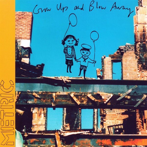
Grow Up and Blow Away (2007)
So this is originally the debut, right?
Yeah. So Jimmy [Shaw] and I met in Toronto, and then we went to New York, and then we went to England, and then we came back and met Josh [Winstead] and Joules [Scott-Key]. And in that time period we went through the rigmarole of record labels, and almost getting signed, and then getting signed, and then things getting shelved. It was a very classic throwdown, so the album got shelved, and we were fine with that because we were like, “Great, let’s just start over with Josh and Joules and write a whole new record instead of chasing the songs that are owned by this guy.” So then the label in Canada that we started working with, which is this label called Last Gang, bought the rights, and then they were like, “We want to put this out right now,” which we didn’t. We weren’t happy about that. We thought that was a weird chronology. To me, that album could have come out 20 years later. It’s like, bedroom-poppy, and I love that. I love the songs that are there.
But I didn’t really understand the logic of that coming out then as sort of like, “Look at our new record,” like we were building the momentum of this band. I thought it was kind of arbitrary, but people really liked it, but the artwork is drawings that I did. It’s all Jimmy’s and my handwriting, which I guess is kind of nice. And then the image of the broken-down construction, that was a photo that I took of neighborhoods at the time, like Williamsburg, these neighborhoods that, now, we’re totally priced out of. [laughs] Yeah, we self-gentrified ourselves so that we can’t live anywhere. But they were really industrial, not for human habitation. I loved photography, and I would always be taking shots of things like broken-down buildings.
And [the drawing], I think of them sort of as friends, the girl and the boy holding hands, or like, brother and sister or something. But that’s actually an image from this wallpaper in an abandoned house that I photographed. That was the wallpaper in one. Then I traced the illustration and thought that was a really good image to go with that broken-down world. I’m always quite… What’s the word? It’s a combination of things. I’m flattered, but a little bit alarmed when I see all the tattoos that people have gotten of Metric lyrics and imagery and stuff. I’m just sort of like, “Ah, I hope that I’m serving you well! I met a woman in Paris who has, on her inner thigh, those two kids holding those umbrellas. I’m like… “Oh?” But it looks awesome. It’s just a choice. Maybe I struggle to find the mixture of emotions. In German, there’s probably one word for it, but I don’t have one in English. It’s a long, rambling sentence. [laughs]
Was that originally the album cover when it was going to be the debut?
Oh yeah, that’s funny. Actually, there were a lot of, to me, very cringey press photos. There were a lot of photos of just Jimmy and me looking really hungry and super skinny and very dramatic. I’m not totally sure, but I know that that’s what we came up with when we were informed, like, “Congratulations, we bought back the rights to this record, but to make the money back, we’re putting it out.” And we were like, “Shit, okay, let’s make the artwork.”
Fantasies (2009)
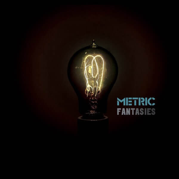
This is the first cover that doesn’t feature a person, which I think is an interesting choice. What was the decision behind this light bulb?
Well, this is one of the most Metric things ever. So we did a whole elaborate photoshoot. I want to say it was Milk Studios in New York, or something, and there were stylists and people for eight hours… one of those things. And the people that were doing it were really excited, and they were going to do all the photos and the layout, too. They had a whole vision, and they photographed all four of us, but as though we were wearing nothing. And then the album was actually not going to be called Fantasies. It was going to be called Distance. The layout was going to be… When you would open [the CD case], it would be like squares going out, kind of in a cross, and it was going to be a picture of each of us, but naked from here [gestures from upper chest] up. The prototype got made. I remember looking at it being like, “What the fuck?” We’re like… “Distance, what Josh’s nipples…?”
There’s no distance at all?
Yeah, exactly. Or there might be after! [laughs] We were talking about this the other day, trying to recall the sequence of events. It has been happening a lot where I attribute things to other people that I actually came up with. I don’t know how it worked, but there was something of a pivot and a crazy deadline. We were on tour, and everything was so intense. And like, “We can’t call it [Distance], and that photo shoot is a fucking bust.” We were going through all the images. The only image that we liked from it is… They were really lovely people, by the way. This is no shade on them, but they had made a filament bulb that said Metric in a tube. It looks like a tube from an amplifier.
There also happened to be a photo of that light bulb, and we felt like the filament kind of looked like an M. We’re looking at endless photos of us, then at some point, someone was just like… I feel like this was me, but I’m not sure. It was like, “How about just a fucking light bulb?” But then we still didn’t have a title, and the song “Sick Muse” was actually called “Fantasies.” There’s the lyric in there, “all the blondes of fantasies,” and we were like, “What if it was this?” I feel like I was on a tour bus, because it was down to the wire, and I remember my friend that I was out with the other night. She was like, “Yeah, I was in the back lounge on your tour bus, and you opened the door and you were like, ‘I figured it out. The album’s called Fantasies.’” And they just kept playing Grand Theft Auto, or whatever. [laughs] So that was the revelation. I was like, right now, I just have to come up with another title for that other song because I thought it would give the song too much weight. If that was the title track…
It’d be like the thesis statement.
Exactly. “Sick Muse” is a great title. I feel like I had that somewhere… Oh, yeah, that’s in the lyrics. It’s like, “Watch out, Cupid stuck me with a sickness / Pull your little arrows out.” I don’t think I ever say the words “sick muse,” though.
I always thought the lyric was “sick muse” until now.
“Stuck me with a sick muse.” That would make so much more sense, Why wouldn’t I just say… Well, because I didn’t know the song was going to be called “Sick Muse,” as we’d already recorded it. That’s why.
Maybe you were hearing “sick muse” instead of “sickness” as you were coming up with the new title for the song?
I think I had that as a title before for the song. I feel like that’s in my notes somewhere, but I’m now curious to go back to my notebooks. But that is how that came together. And then I just remember being in a hotel room. We went from having this whole graphics team and this big photo shoot and all the stuff that was going to be the album art to scrapping everything. I think we were happy because of how it fades in, like the light is sort of implied. I don’t know how we pulled that off, but I think Josh did that, and then everyone on our team was, like, freaking out because it’s like, “You just blew $10,000 or something,” and we were, like, no different title, different image, different things. [laughs]
Synthetica (2012)
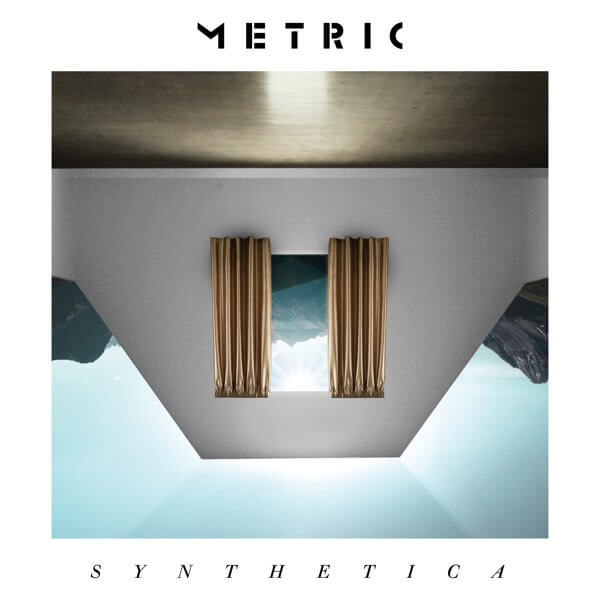
That’s the first album we started working with Justin Broadbent on. We’ve worked with him ever since, and the first thing we did with him was the video for “Sick Muse,” paradoxically. But we were just like, “This guy is a genius.” It’s one of our favorite videos. It was so fun. He just captured the spirit of who we are. It’s not an awkward, proper, official music video vibe, but it looks great. And we just loved him. And he took a ton of photos for Fantasies as a photographer, a lot of our press photos. And we’re like, “This guy’s amazing.” So for Synthetica, he actually won a Juno Award for that album art. It was so cool; he did everything backwards inside. And we had little glasses where you can read the backwards text. We were very inspired by [Stanley] Kubrick on that one. And this feeling of being taken into this synthetic environment. So, yeah, I love how that one turned out.
So you’re trying to reflect this synthetic world, like creating a portal, almost?
Exactly, yeah, and this artificiality. Is it real, or is it a hallucination?
Pagans in Vegas (2015)
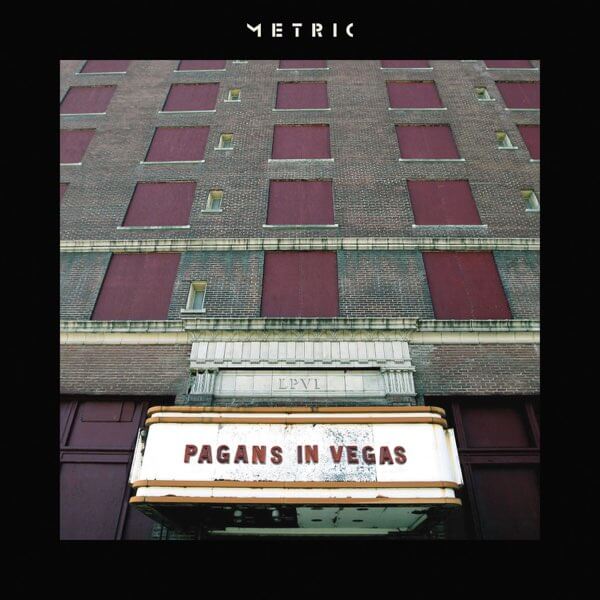
I actually did that artwork. There’s a layout guy that we use that we really like named Antoine Moonen, who did all the layout with me. But I actually harkened back to the Josh Hassin thing, where each song had its own little symbol in the sleeve, if you got the vinyl. I really liked the sort of… Wait, it’s not Houses of the Holy. What’s the Zeppelin record?
Physical Graffiti?
Physical Graffiti! Yeah, I really love that idea of the windows into something. I imagined doing a take on that. There’s also a Grateful Dead album that has a similar idea, almost like an advent calendar where there’s people inside. [laughs] But it ended up being all this photography I was doing. I just kept finding these boarded-up buildings and stuff. And then I really liked that image. I didn’t take that photo, but I love that image.
So the photo, did it actually have a marquee that said “Pagans in Vegas?” Or was that Photoshop magic?
Yeah, magic. [laughs]
Art of Doubt (2018)
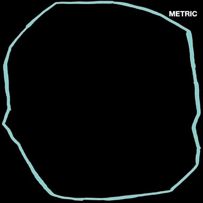
Justin Broadbent again, right? Compared to the one he did before, Synthetica, where there’s so much going on here. This one’s literally just a black void with a teal trace. What was the thought process for doing something so minimal?
That’s him being an artist. With the title being Art of Doubt, like this process that you go through when you do something, you’re always questioning yourself, and when have you reached the point where you’re like, “Okay, that’s done?” Like, what’s the last stroke? Where does the doubt work for you, and where does the doubt get in your way? Where’s the pure, confident move and the purity and the brilliance that we all seek? He was like, “I see it being something like this.” And I was like, “Well, why isn’t it just actually that?” And he’s like, “Wait, like, actually?” We had a whole philosophical conversation about it, and then he’s like, “Oh, my God, I love this.” That the Metric [logo] is purposely… [gestures toward the corner of her screen] this is his intention, claustrophobically stuck over in the corner. To me, it’s a bit of an ink blot test of what you see when you see it. But what I got from it was, like, the doubt is just completely dominating the entire frame, like what I see being inside that teal circle is all my doubt. And then, like, the tiny little room on the side that’s carved out is the attic. It’s what I get to inhabit, but the rest of my existence and my consciousness is in doubt.
Everything that this teal outline contains, it’s massive. There’s plenty of room for the Metric logo in there. But it’s pushed into this corner.
That encompasses everything that we’re trying to do and say, and I think that is brilliant. It also looks so good. A lot of what I struggle with, with the artists I work with, is adapting to the thumbnail of it all. It’s like you’re trying to do something beautiful and impactful, and then it’s almost cruel. It’s like, “Here’s what you get to work with, and you’re generic, and you’re exactly the same as everybody else.” I thought that that was kind of a cool statement, too. It looked really cool to me because the sides go away and then you just have this floating, teal question mark.
Formentera (2022)
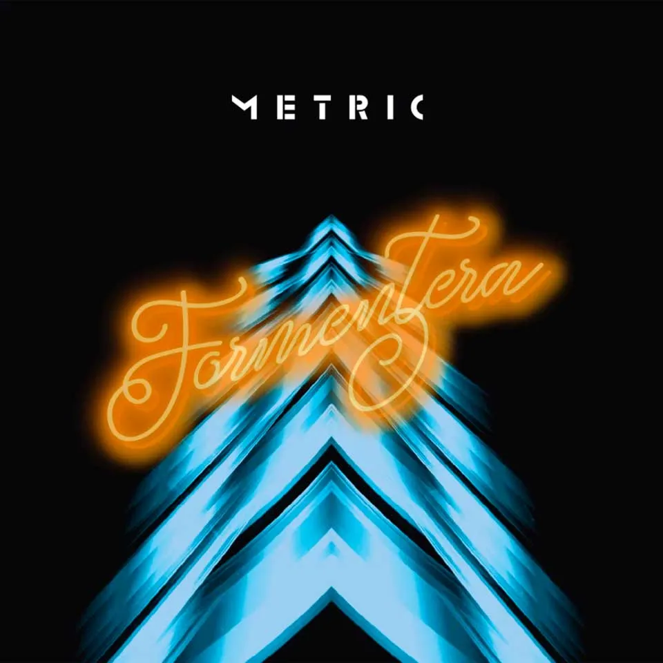
I did this with Justin Broadbent, as well, both of those [Formentera] albums. But, this is such a funny thing to me. If you were to look at my inspo board around all of this, which is just a bunch of photographs, it’s all inspired by Terry Gilliam’s Brazil, if you’re familiar with that film.
I’ve never seen it!
Oh, I’m so excited. Can you watch it? I don’t know you that well, but I think you’re gonna like it. It’s so timely. It’s so timeless. The natural world has been destroyed, and everything is automated. And there are these signs that are like, “Escape to paradise!” And everything is internalized, like this imaginary world, but the reality is really bleak. And I was like, “This is perfect for our pandemic double album.” In the film, and you’ll get the song stuck in your head, but the song “Brazil,” it’s like, of course, [Brazil is] a real place, but in the way that it’s constructed in the film, it’s just like, “Go to Brazil,” like it’s an ethereal feeling. It’s a state of mind where you could escape. And he has these fantasies where he’s the person he wants to be, and he’s heroic in this other place that is like Brazil, but they don’t ever say it literally.
So my version of that was Formentera, which is an actual place, an island in the Mediterranean Sea. That was a perfect stand-in, at least. Our experience of the pandemic was an extremely locked down, extremely sad, claustrophobic winter of no escape. It was very intense. In Canada, I had people die. We had elderly people we’re caring for. Lots of people had a different pandemic experience, but it was really bad and very serious for us. Millions of dollars in lost revenue, canceled shows, the question of whether we would ever actually come back, which I know it now seems obvious that we would. We were trying to create this escape for people who couldn’t be like David Geffen and just go live on a yacht for three years or whatever. That was the whole Formentera concept.
Formentera II (2023)
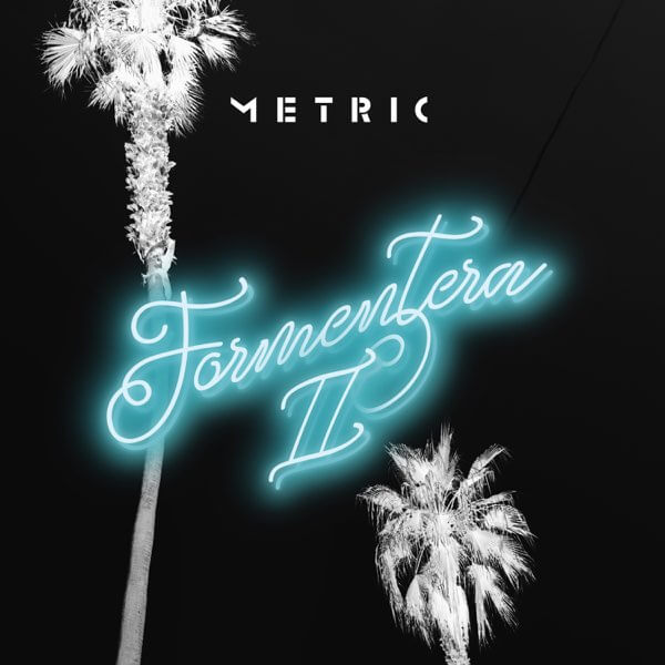
The second one, we just thought we’d lean into the palm tree. I love how both of them look. When you imagine being trapped somewhere, you dream of an escape. We wanted the word to be almost like Hotel California, you know?
Like a tourist postcard?
Exactly, a postcard, and we actually did a whole campaign. We worked with this artist, and it’s definitely in our socials; it’s documented, but I’m blanking on her name. She does all these really cool kinds of sci fi, almost collage art, but where she juxtaposes things, and we used one of her images, which was a bunch of people sunbathing, but they’re on Mars. And we use that as, like, “Escape to Formentera,” like this sort of, “What is this place?” And so when you watch Brazil, the whole thing will be revealed. But I was afraid. I thought I was gonna get flack from people being like, ”You can’t be so bluntly inspired by that.”
And I’ve actually met Terry Gilliam, and I was nervous if I’d gone too far. There was not a single person who even caught it, or, like you, most people hadn’t even seen the film. So I was like, “Oh, okay. Well, this is taking on a whole new meaning because now I’m so excited, and everyone should see this film.” It totally tanked when it came out because the marketing people were like, “Brazil? Is this a movie about the beautiful jungles, or the incredible music, or bossa nova? What’s happening?” But he said the best thing to me about that movie, which was that if he’d known what was impossible, he never would have been able to make that movie, which has stayed with me. There’s a lot to that. He didn’t think that it wasn’t possible what he was doing, and then he did it, and he said he’s never been able to really get back to that since.
So with Formentera 1 and 2, how did you want to distinguish each of them, cover-wise?
I feel like the first one really established this concept. The first one opens with “Doomscroller,” which is perhaps the composition I’m most proud of in my life. And we definitely were like, “Can we call out some shit?” Which also, you know, the song “Suckers” is on Formentera II, which is also pretty punchy lyrically. But the first was like, “You’re in it,” and the second album was like, you’re out. It starts with “Just the Ones” and “Detour Up” and, you know, being like, “Oh, my life took a turn. But maybe it was for the best. I don’t know what’s happening, but I’m rolling with it” kind of thing.
Romanticize the Dive (2026)
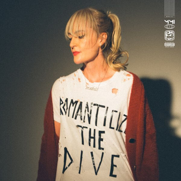
Something that stood out to me is that this is the first album cover to feature you since the debut. Was that a deliberate choice? I know some of this album is about capturing those origins and your early days.
I worked with Justin Broadbent again. It was his idea. So I was like, “Okay, let me see what I can pull off.” And it was like most things that we do where we’re just following some inner guidance that I can’t totally articulate the source of, but I was like, “Okay, I always do the tape on the drum kit. Like, that’s who I am; that’s my identity.” Actually, I wrote a piece in our app. There’s a section called Rogue and Random, which is where I do all my writing and dispatches about random shit. And one of them was like, “I’m the person who writes ‘XO Metric’ on the kick drum with tape.’” A friend of mine was like, “That’s such a statement of identity. That’s who you are.” And I’m like, “You know what? I think that’s the closest thing I have to, like, who I am. I’m the person who’s still writing with duct tape. That’s just who I am.”
So I found myself with my Sinéad O’Connor T-shirt, I turned it inside out, and put “ROMANTICIZE THE DIVE” in tape because I didn’t have a stylist or anything for the shoot. And I was like,”I don’t know what I’m doing, but I feel like it’s this.” And then I asked my friend Lana and was like, “I need a Kurt Cobain cardigan. I need a fuzzy cardigan.” And she knew exactly what I meant and sent me a photo of the one that I’m wearing, which is her cardigan. I have a friend that did my makeup. And then it was like, “Justin, just book a studio, and I have no idea what we’re doing. Let’s just walk around and see what happens.” We got a lot of shots that were engaging the camera and being very like… very on it, very present, very like… eye contact. The reason we went with what we went with is I just felt like there’s something in it that’s got a bit of a Mona Lisa vibe. You can sense the dissonance and see me feeling something. I feel like in that photo, we were trying to really get that grainy texture, which I finally just got the vinyl, and we achieved it. I’m so happy. But it looks filmic, like a frame from a film.
I love the connection of the duct tape, connecting something you’ve always done with the kick drum and now doing it on a T-shirt. Also, that’s a lot of letters to duct-tape on one shirt. I’m impressed that you pulled it off!
Thank you! [laughs] I have a whole technique. I rip it like it’s the gaffer tape that they always have on stage. I’m just used to interacting with it. Joules tapes his fingers up with it. It’s a staple in our lives at this point. Actually, the amazing people that I work with who do all our footage and stuff for socials, I came back one day to the studio, and they’re working away, and she’s like, “By the way, I made a font out of your tape letters,” so we have a font for everything that she based on the way that I write in tape. So that was pretty cool.
How do you think this photo connects to the songs on this record?
I think it totally captures and is connected to the sound and the themes, as you pointed out. If you look, I’m looking sweaty. I was jumping around and dancing around in the photoshoot. It’s not this polished, perfect thing. My bangs are like [tousles her bangs] you know? That image that’s like a shirt with holes in it and the sweater, it’s a representation of that sort of defiance I feel like you can see in me and the ownership of that. It’s cool to be, you know, the people of the world. We are everybody other than the four billionaires. We are the people, and whatever your dive is, if it’s a dive bar or a descent in your life, that’s happening, you have the ability to narrate what it means to you and what you value. And in our case, it’s friendship, fucking music, the fans we have around the world. No, we’re not playing domes and stadiums. We’re playing to 5,000 people, and it’s amazing. In Toronto, it’s 20,000. But that’s what it is. Trying to get an image that captures that pride, I feel like all of that is in my expression, in my posture, and what I’m wearing. It’s not like I’m in a bounding gown, right? I’m in a ripped inside-out Sinéad O’Connor T-shirt.
Grant Sharples is a writer, journalist and critic. His work has also appeared in Interview, Uproxx, Pitchfork, Stereogum, The Ringer, Los Angeles Review of Books, and other publications. He lives in Kansas City.