The Best Videogame Art Direction of 2016
When discussing the “best” games of the year, our discussion often hinges on assessing games as a full, finished product, the sum of all its parts. But some games have core aspects of their design that stand out so strongly from the rest, they deserve their own category of praise. This year there were some truly beautiful titles that debuted on a variety of platforms, visual treasures that should be enjoyed not just for the gameplay they offer, but the atmosphere as well. Here are our ten favorites.
10. I Am Setsuna
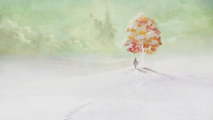
The artistic style of I Am Setsuna is in keeping with the game’s continuing themes of sadness. Leaves of scarlet and amber peek through soft caps of snow, wistfully illustrating the life lurking beneath the land’s perma-winter with the delicate but nebulous stroke of a fine watercolor painting. As a JRPG it does the genre justice by reinforcing its reputation as one of the most visually beautiful in the medium.
9. Abzu
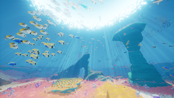
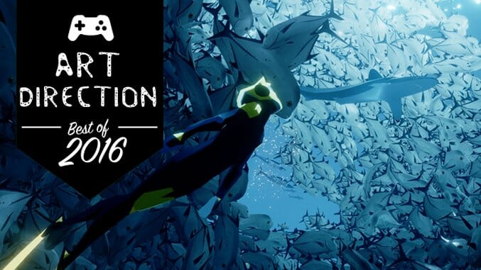
As the first project from studio Giant Squid, Abzu is the offspring of art director Matt Nava, who previously worked on Flower and Journey. Like its predecessors, Abzu is simultaneously vibrant and calming, bright yet unobtrusive, soothing even as it is stimulating. Developed around Nava’s love for scuba diving, it also masterfully mimics the atmosphere of a tropical fish tank, glowing with rich aquatic blues and playful shards of penetrating light filtering through an open ocean of vividly rendered fish and sea creatures.
8. Moon Hunters
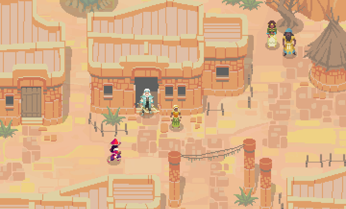
This isometric, procedurally generated co-op title evokes memories of the landscapes of The Legend of Zelda and the Diablo series, its many environments illustrated in a nostalgic pixel art style that draws on the art of video games past while still forming an aesthetic of its own. Featuring the watercolor paintings of Xin Ran Liu and the pixel artwork of G.P. Lackey, the visuals also use an avatar pop-up style seen in dating sims, allowing for dramatic portraits that show the finer details of each character’s design and painted scenes that add to the rich mysticism of the game.
7. Burly Men At Sea
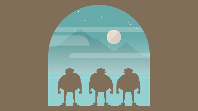
The clean minimalism of Burly Men At Sea is perhaps its greatest strength. The game’s appeasing use of blank space combined with its interactive elements and use of text-based narrative add to a picture-book whimsy that is instantly charming.
6. Kentucky Route Zero Act IV
Perhaps the most curious thing about the art of Kentucky Route Zero is how masterfully it mimics the experience of playing the game. It feels like drifting through a place you once visited but no longer remember, sitting somewhere between nightmare and deja vu. Like a dream, the art sits close to reality but is littered tiny surreal flourishes; the high, jaunty waists of its characters, their soft but discernible features. The geometry of its simple cut-outs mirrors the unassuming ways of its rural setting, yet affords enough nuance to leave a quietly unsettling impression.
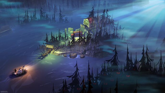
5. The Flame In The Flood
There’s something very fun about the pioneer spirit of The Flame in the Flood, its art style reminiscent of a quirky, retold fairytale. Perhaps one of the best details is the foliage, layers of leaves, branches, and grass deftly painted in crisp layers to give the forests depth. It truly shines, however, after nightfall, when amber campfires glow against the rich purples and blues that give way to twilight. The game’s look, the work of Chad LaClair, was directly inspired by and evolved from the personal art style of Bioshock’s Scott Sinclair, undoubtedly adding to the evening cycle’s cryptic feel.
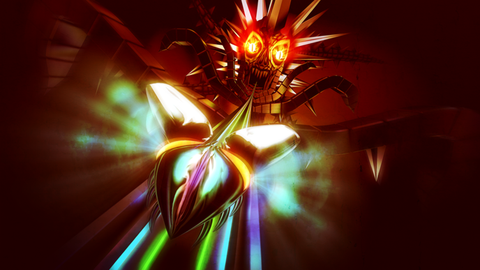
4. Thumper
The “highway” format of rhythm games is all but a standard in the genre, but this year Thumper brought it to new visual heights. Players drift on a slick track lined with intense, electrified beams of color, violently hurtling through dizzying polygons and psychedelic explosions as they dip and bend through the rail’s many curves. The end result is not unlike Amplitude, if Amplitude were a Daft Punk video.
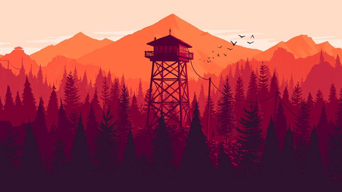
3. Firewatch
The rich sunset hues of Firewatch so perfectly capture the warmth of the Wyoming wilderness, it’s no wonder the art for this game was literally stolen for a local Ford campaign out in… Maryland. But beyond the game’s satisfying depiction of western America, its use of aesthetic elements integral to our national forestry system add a folksy and nostalgic touch.
2. Superhot
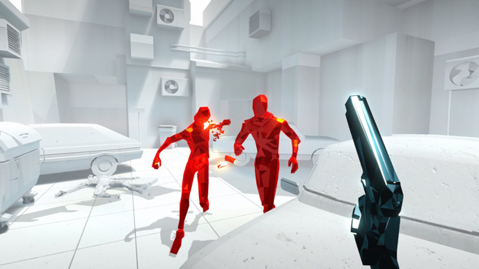
The slick stylized minimalism of FPS Superhot has the inspired edge of a Tarantino film, the whites and light grays of its environments punctuated by bright red polygonal mannequins that fully command the player’s attention. An innovative game demands a bold look, and Superhot achieved it with a limited use of color and an enemy design that is sophisticated even as it is unpretentious.
1. No Man’s Sky
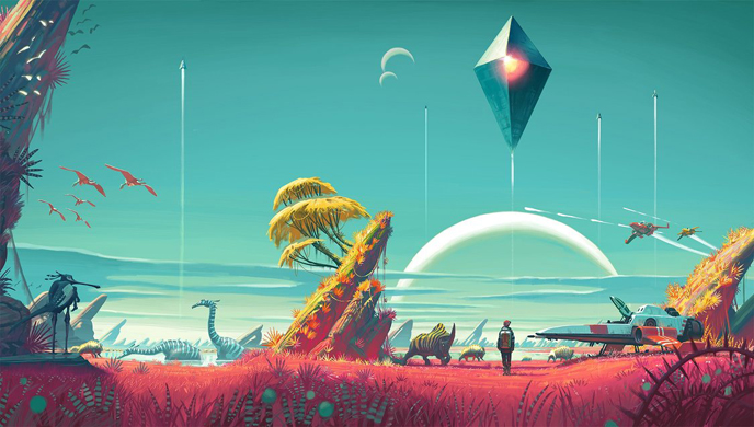
No Man’s Sky was one of our favorite games of the year, and the art direction and overall aesthetic are big reasons why. The game’s surreal tweaks on a bold palette, its scarlet grasses stretching out beneath a turquoise sky, give the many biomes of No Man’s Sky a bizarre, otherworldly feel.
Holly Green is a reporter, editor, and semiprofessional photographer living in Seattle, WA. She is also the author of Fry Scores: An Unofficial Guide To Video Game Grub. You can find her work at Gamasutra, Polygon, Unwinnable, and other videogame news publications.
