
Design on Display: What Soars and What Flops in New Movie Poster Releases

If movie posters were people, they’d be car salesmen. Fine-tuned to be as persuasive and alluring as possible, the best posters can sell you on a movie instantly.
What changes certain movie posters from meh to memorable? In this entry in the monthly series Design on Display, we critique posters released in December 2014 from a design standpoint: what works, what doesn’t, and why.
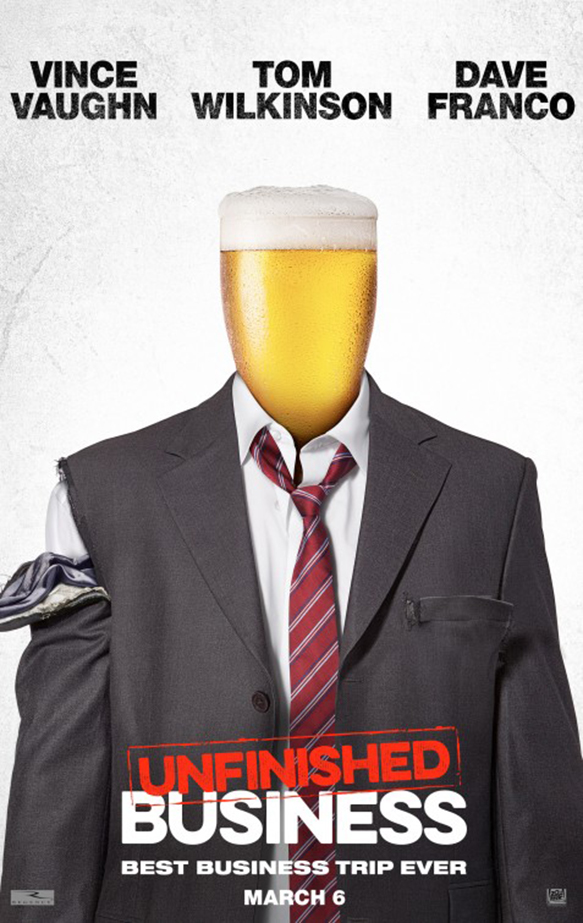
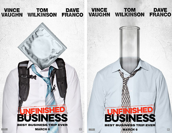
1. Unfinished Business
Year: 2015
Director: Ken Scott
Poster Design: Arsonal
First up, is a character poster series for drunken bro-comedy Unfinished Business. They replace goofy portrait shots of the big stars with icons of the main character’s personality traits, like a condom for sex-crazed and a bong for high-flying. The concept is interesting, but you can immediately tell that they are Photoshopped images. This is not necessarily a bad thing, but in this case the series muddles in a grey area where it’s unclear whether the intention was photorealism or campiness. The beer glass poster works best by sporting the least cheesy photo-editing, and that brew looks mighty tasty. Comedy movies often use bold, extended and san-serif typefaces because they’re loud and in your face, which based on the trailer for Unfinished Business is pretty on target. We think it would have been a nice touch if they had continued the stamping effect of the main title for the actor’s names.
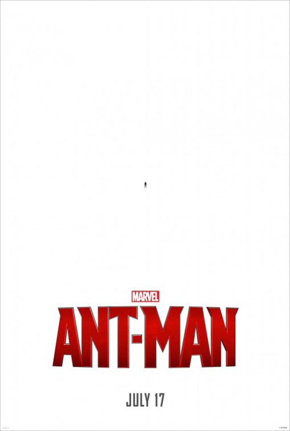
2. Ant-Man
Year: 2015
Director: Peyton Reed
Poster Design: BLT Communications
It’s a fleck of dust, it’s an ink smudge, it’s Ant-Man! The Ant-Man poster makes a solid case for simplicity. The vast amount of white space emphasizes the teensy size of the movie’s hero. It’s different than most jam-packed super hero posters that have 18 things on fire, explosions, and the chiseled faces of every famous person who has a word of dialog. The movie title is most likely set in a modified version of the typeface A Story So Far. Compared to a widely used font like Futura or Helvetica, the title of the Ant-Man poster can easily serve as a logo for the movie franchise because of its distinctive look.
![]()
3. Pixels
Year: 2015
Director: Chris Columbus
Poster Design: BLT Communications
Partially aided by nostalgia, the posters for Pixels are pretty awesome. In Pixels, gaming gurus are hired by the military to save the world from attackers that look like video game characters. The poster series is fun and over-the-top with Godzilla-scale versions of Pacman and Donkey King descending on famous landmarks. A modified and pixelated version of Bank Gothic is a cool nod to the subject of the movie title.
![]()
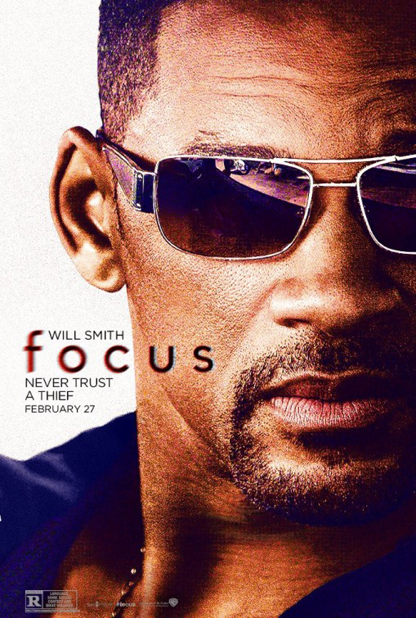
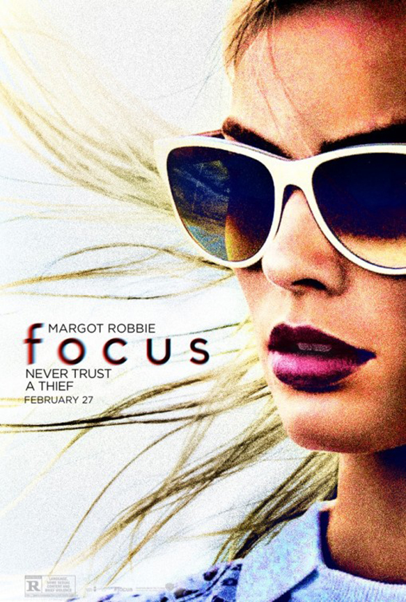
4. Focus
Year: 2015
Director: Glenn Ficarra, John Requa
Poster Design: BOND
BOND released some beautiful posters for Will Smith’s latest action vehicle Focus. Purple and yellow are frenemies, and their strong color contrast makes the two posters for Focus pop. It also separates the posters from the usual movie complementary colors blue and orange. The left-center placement of the movie title highlights Will and Margot Robbie’s sexy profiles instead of just sticking it at the top or bottom of the poster. The Gotham typeface is prevalent at the movies lately. It’s in danger of going the route of Trajan Pro if it continues to crop up in every genre. It’s used for an action movie here, as well as psychological thriller Inception, sports movie Rush, and comedy movie Kick-Ass. The sunglasses trope might be overdone, in particular for Will Smith posters (e.g. posters for Hancock, Bad Boys I, II, & III and MIB I, II, & III), but damn they look cool.
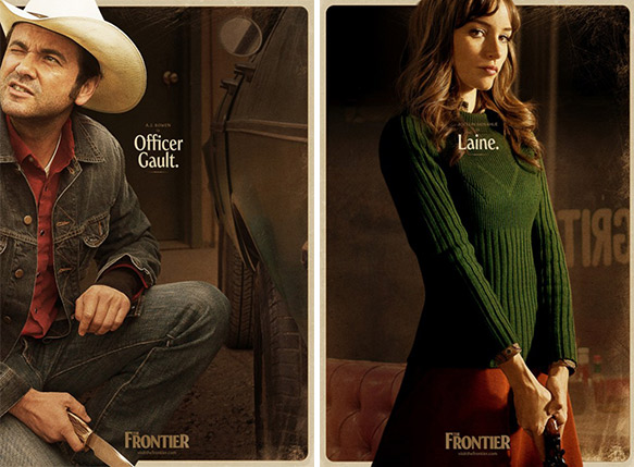
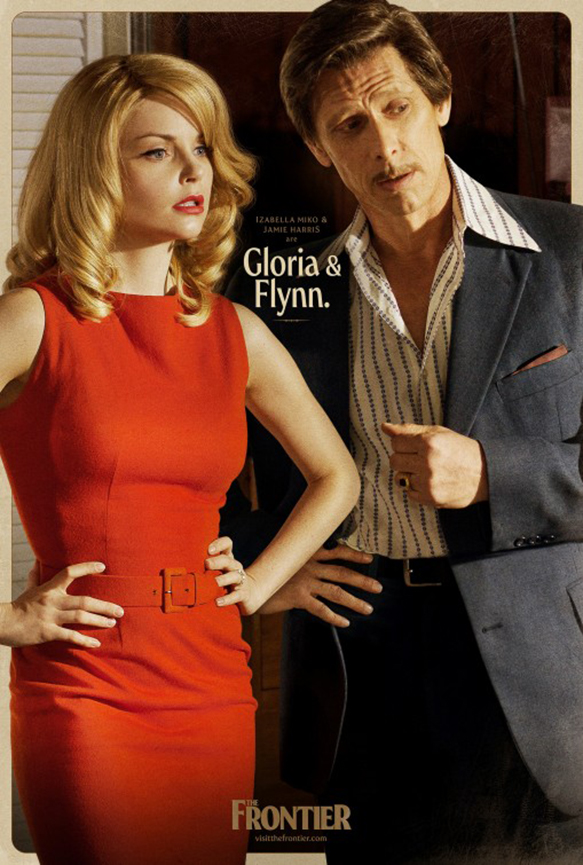 5. The Frontier
Year: 2015
Director: Oren Shai
Poster Design: Robbergirl Productions
We love the sultry mood of the character poster series for The Frontier. The Frontier is an indie crime thriller set in the 1970s, so the vintage detective paperback look is right on target. Each character’s posture and clothing gives us a hint to their personalities and the roles they’ll likely play. Squinty Officer Gault looks the schmuck, Laine the femme fatale, and Gloria and Flynn look like sly con artists. Heroine Pro is the whimsical typeface used throughout the poster series. It is a modern interpretation of Windsor, an old style display typeface that’s best known for its use in almost all Woody Allen movie posters.
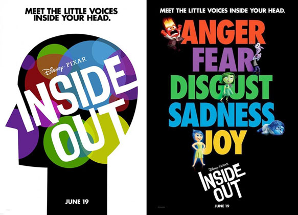
6. Inside Out
Year: 2015
Director: Pete Docter, Ronaldo Del Carmen
Poster Design: BLT CommunicationsThe French version (left image) of the poster for Disney’s Inside Out is the best of a batch of great movie posters. The paper-like versions of the characters are warm and visually consistent with the solid colored background. Using a silhouette of a smiling girl like in the French poster is a more kid-friendly choice than the android silhouette in the English posters released in October. The typography poster is upbeat and has a great visual line. Your eye moves from the top left of Anger in a zig-zag dance following the characters down the page to the title “Inside Out.”
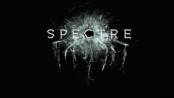
7. Spectre
Year: 2015
Director: Sam Mendes
To round out this entry with a bang, check out the poster for the 24th James Bond movie Spectre. As straightforward as a gunshot, a bullet hole punches through the ominous black background. Shattered glass forms the shape of the eerie octopus icon of global terrorist organization Special Executive for Counter-intelligence, Terrorism, Revenge and Extortion (S.P.E.C.T.R.E.) from the Bond universe. The fragmented type design also plays off of the glass cracks, and creates a sense of dynamism and shifting parts. What horrors lie in the future for secret agent 007…
As you can see, the best movie posters use design to make us stand up and take notice. Next up, stoke the fires of movie poster design debate! If we’ve missed out on a poster, let us know your thoughts in the comments below.