
Airbnb’s Controversial Logo Looks Exactly Like One From An ’80s Design Book
Photos courtesy of user "FM_STARMER" via reddit
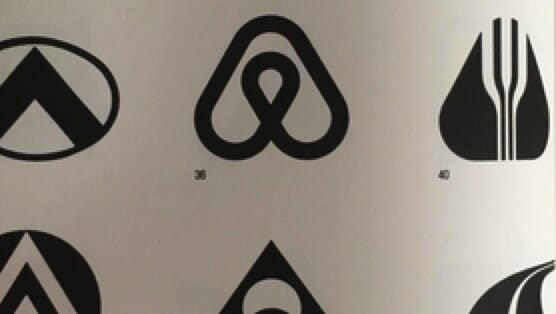
You might remember last year when Airbnb released their new logo, which they named the bélo. The bélo signifies belonging and was met with mixed reactions.
Unfortunately for the design agency responsible for the current Airbnb logo, a Reddit user found a design in a late-‘80s design book that is pretty much identical to the bélo. This isn’t saying that London’s DesignStudio stole the logo. In fact, they probably didn’t know it existed. According to the Reddit user FR_STARMER, the logo in the book was designed in 1975 for a Japanese drive-in called Azuma, nearly 30 years prior to Airbnb’s beloved bélo.
This isn’t the first time Airbnb’s new logo has been compared to another. Last year, it was a technology company.
In 2014, the getaway-rental website released a statement with Automation Anywhere concerning their logos, which were nearly identical. They said it was a coincidence, but if you go to Automation Anywhere’s website today, you’ll see they have a new logo. One can only guess why that is.