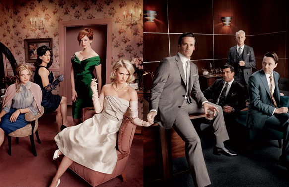
Mad Men is a show that gives precedence to costume, interior, and overall art design unlike any other. It, for seven seasons, has mostly taken place indoors with very few scenes taking place outside. The offices, apartments, desks, chairs, paintings, and the fashion is always in focus in every frame and shot — hence the heavy reliance on design. It’s an interestingly particular, and exquisite aspect of Mad Men, that can easily go unnoticed by most viewers, but it’s a feature that glues the show together as much as its characters. Since its debut in 2007, the show is credited for bringing 1960’s fashion, culture, and design to the forefront of modern design.
The revival in men’s suits, in particular those with shorter jackets and higher waistbands, fedoras, slicked-back hair, bourbon and whiskey drinks, and even tortoise sunglasses can all be attributed to the show’s immense popularity. “Mad Men’s set design, fine art, the incorporation of day-to-day utilitarian objects and costumes of Mad Men are so historically accurate, perfectly placed and well researched that the show instantly brings us back to a nostalgic time that so many viewers remember and want to revisit,” writes Lisa Gizara, a photographer and painter whose work has appeared on Mad Men, as well as Modern Family, Castle, Variety, LA Weekly and others.
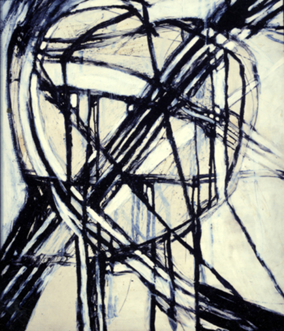
Mad Men’s set decorator Claudette Didul was searching for eccentric works of art to complement Roger Sterling’s (John Slattery) mid-century cool office. Didul happened upon a panoply of Gizara’s eclectic work at Art Pic, an art gallery in North Hollywood, and was captivated by her monochrome-like painting Madonna I alongside King of Hearts and Queen of Hearts. The former painting is of mixed-media with paint, oil stick, and graphite, and contains curvaceous lines that Didul deemed perfect to sit on the wall right behind Sterling’s desk.
”[Production Designer] Dan Bishop and I wanted to keep the black and white theme going in Roger’s office,” Didul told Gizara, when she asked her why her work was chosen. “One of the paintings looked like it had a backwards ‘R’ in it (Madonna I — which is by Roger’s desk). They had the perfect abstract feel of the period. Many offices were using abstract art at the time and both pieces (The King and Queen of Hearts) seemed very fitting.”
The crew’s search to include paintings that can most complement a single set highlights their fastidious attitude towards Mad Men’s design. The time and effort spent on aesthetic is almost equal to the writing here, and there have been a deluge of benefits as a result in these past seven years. Everything has to fit. Every single shirt, painting, desk, skirt, hairstyle and tie has to have character, and needs to invoke a nostalgic ’60s vibe in the viewer.
“My paintings needed to set a tone and reflect a time during the 1960s Mad Men era,” writes Gizara. “Since my favorite paintings are by the American expressionists first developed in New York in the 1940s-’60s: Joan Mitchell, Helen Frankenthaler, Willem de Kooning, Franz Kline and Jackson Pollock. I am honored to have my paintings included as representational of that time. I still refer to these artists for inspiration when I paint today.”
The ’60s was arguably the last period of “glamour” in the United States, where daytime fashion was equally as important as dressing up for a fancy dinner. Perhaps this is one of the biggest reasons why Mad Men has left, and is still leaving, such an impact on culture. It shone a bright light on an era that was difficult to be forgotten for too long. Gizara even goes so far as to say that the White House during the ’60s also brought a swift, and colorful change to its appearance as well.
“The young President John Kennedy and first lady Jacqueline’s presence in the White House added — for the first time — an elegance and refinement to the White House,” she writes. “Jackie was educated in art history and brought her taste and education into what was a stodgy and dated White House. She researched, renovated and restored the White House while adding her own style and we all watched a new era come into being.”
Gizara was born in 1960, and has distinct memories of what people wore during that decade. Her mother always wore Chanel suits with a “frost coiffed hairstyle,” while her father attended similar martini lunch meetings as Don Draper does throughout Mad Men’s seven seasons. The ’60s pinpoint accuracy from the show is prodigious. But as it is slowly coming to a close with its final season, people will wonder: What will be the next fashion and design trend, and what will be the next show to captain this change?
According to Gizara it just might be the 1970s, with Mad Men’s final season kick-starting the decade’s dominance. “Mad Men is now set in the 1970’s Peter Max era complete with Day-Glo colors, bell bottom pants, paisley patterns and long hair (and bad mustaches),” she writes. “Predictably there is a resurgence now, especially in Venice, California, of this hippie style. With the onset of ’70’s hippie fashion, casual, comfortable clothes with fringe and flowers, jeans and peasant skirts become the norm.”
Fashion and design trends come and go, clinging on to the next “thing” every few years or so, and showrunner Matthew Weiner would be proud to know that his show will forever be a significant part of that. Whether or not Don Draper, Peggy Olson or Roger Sterling live on in TV audience’s hearts years from now, Mad Men will always be a prime template — an example of how a show’s design can be just as important as its characters.