

One of the scariest moments in Concluse is also one of the most boring. At a certain point in the Cordova Hospital, the player has to use an elevator to reach a portion of the roof. As the platform begins its laborious ascent, you peer across a black divide to a distant landscape of decaying buildings and a sinister row of—wait, are those monsters? Demons? Ghosts? Oh whew, just some white trees. Despite trekking through that section at least 10 times to finish all the puzzles, it got me every time.
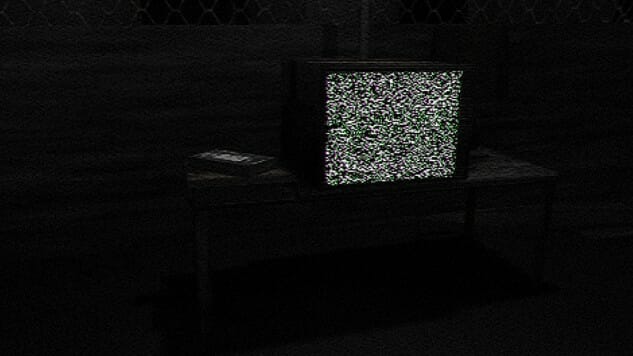
Concluse, in which a man named Michael searches for his lost wife Carolyn in the remains of a hellish New England town, has all the hallmarks of the ‘90s horror games that inspired it: a spooky hospital, a weak flashlight, and way too many damn door keys. The savepoints are infrequent, their icons a garish eyesore, and a degraded, grainy visual style suggest a “found footage” origin, a gimmick reinforced by the game’s initial premise as a “lost” PlayStation title found in an old fan’s attic. If you miss the first few Silent Hill and Resident Evil games, you’ll immediately appreciate Concluse’s vintage—but still immensely effective—sensibilities.
What is it, exactly, that makes retrograde graphics so effective in horror? A cursory glance suggests the crudeness of the graphics is a factor: not only do the jaunty, angular polygons seem distorted by comparison to modern videogame visuals, they leave some room for interpretation. The genre has long used the imagination of the audience against them; as I wrote about Faith, it’s sometimes best to provide as few details as possible and let the audience do the rest, letting them inevitably fill in the gaps with the things they find scariest. In Concluse, you know what you’re looking at is terrifying, even if (or rather, especially because) you’re just not quite sure what you’re looking at.