
The 100 Best Movie Posters of the Past 100 Years

Movie posters help sell tickets, but they’re also an art unto themselves, whether they hint at the plot, highlight the stars or just offer an abstract representation of a key moment in the film. We looked at the best poster for each year of the past century. That meant leaving off of some classics, but offering look through movie-poster history.
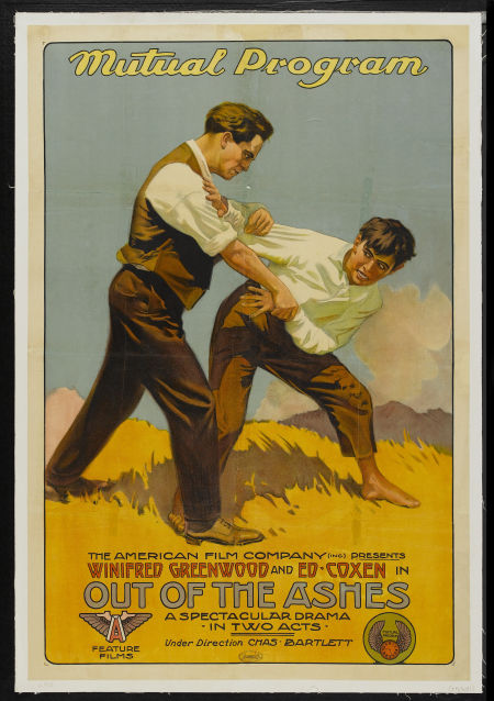
1911: Out of the Ashes
This early example of a silent-film poster paints the climax to give audiences something to look forward to.
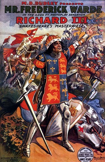
1912: Richard III
There’s Richard III crying out in front of the carnage; a vivid depiction of Shakespeare’s play.
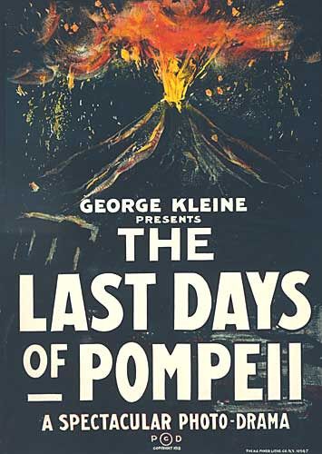
1913: The Last Days of Pompeii
The history of Pompeii was well known thanks to the rediscovery of the city 200 years before this film came out. All the poster needed was Vesuvius looming in the background to entice moviegoers.
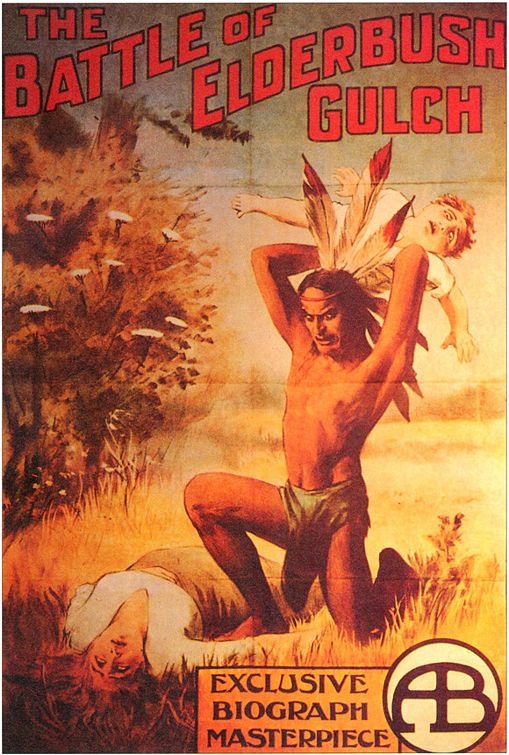
1914: The Battle of Elderbush Gulch
This dramatic Western is one of the first posters to depict such horrific events to the masses.
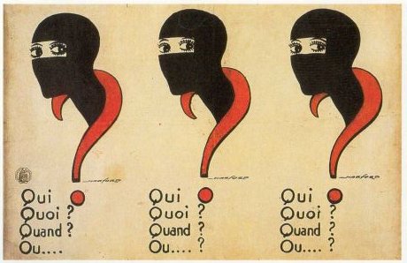
1915: Les Vampires
Actually a 10-part French film series, the poster asks “who? what? when? where?” to show the confusion about what exactly was terrorizing the characters.
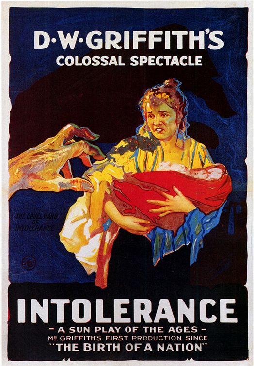
1916: Intolerance
An intruding hand reaches for a terrified woman clutching her baby with a subtitle that reads “the cruel hand of intolerance” hinting at the four plots all based on intolerance.
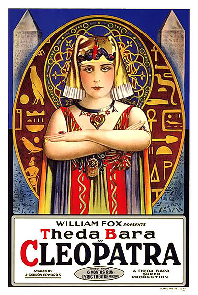
1917: Cleopatra
The story of Cleopatra has been told so many times on film, but this was the first and the basis of so many posters to follow.
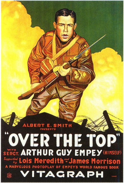
1918: Over the Top
The film was all about Sgt. Arthur Guy Empey and the poster focused on selling his name. It’s as simple as the sergeant going over the top.
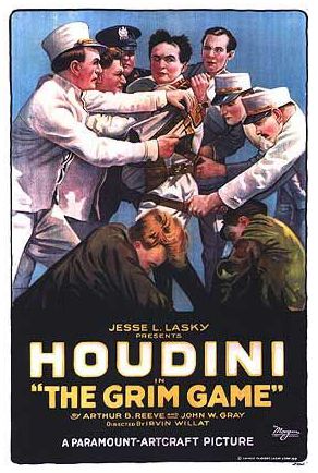
1919: The Grim Game
Here’s Houdini doing what he does best: escaping. It sells the plot of the movie and sells the image of the escape artist as well.
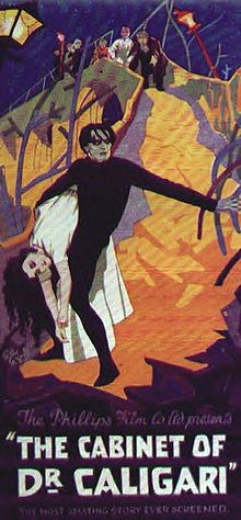
1920: The Cabinet of Dr. Caligari
Caligari is the ideal German expressionist film, and here’s the only poster that could suit the film’s needs.
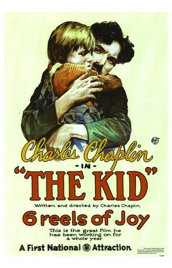
1921: The Kid
Chaplain spent a full year (a ridiculous amount of time by 1921’s standards) to craft one of the greatest comedies of all time; it looks like Chaplin knew what he was doing by having the poster proclaim it has six reels of joy.
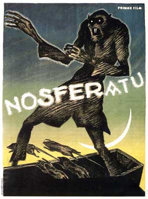
1922: Nosferatu
It was terrifying then and it still is. Even though recent posters use a still from the film, this painting does better justice for the expressionist film.
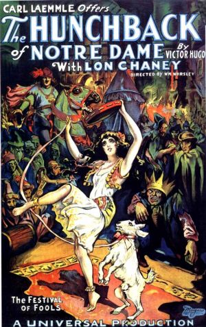
1923: The Hunchback of Notre Dame
There’s the Hunchback, and there’s Esmeralda. Unlike the Disney remake in the 1990s, this shows Quasimodo as the grotesque figure he’s supposed to be.
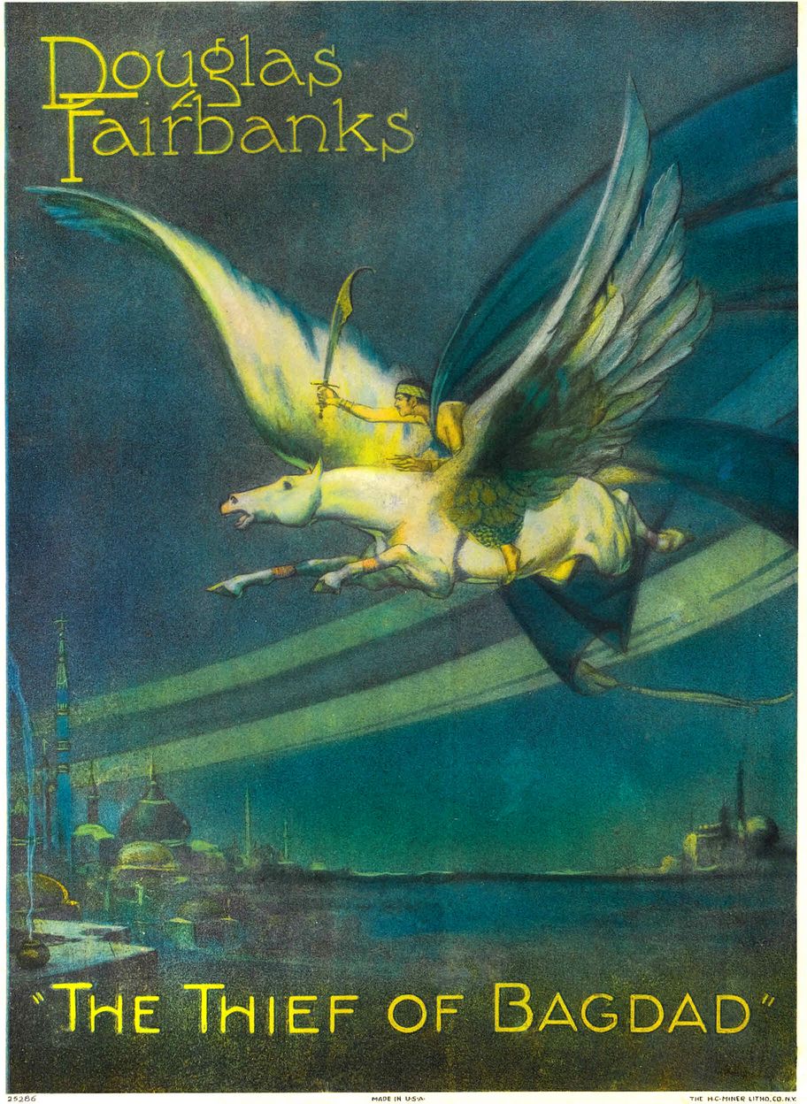
1924: The Thief of Bagdad
The film had exceptionally strong special effects, and the poster helps get viewers into the mindset by showing a flying horse over a majestic landscape.
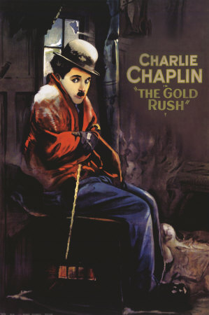
1925: The Gold Rush
There were two great posters for this film. The other shows Chaplin’s character sitting on a mound of snow. Both do a great job of depicting a down-on-his luck character.
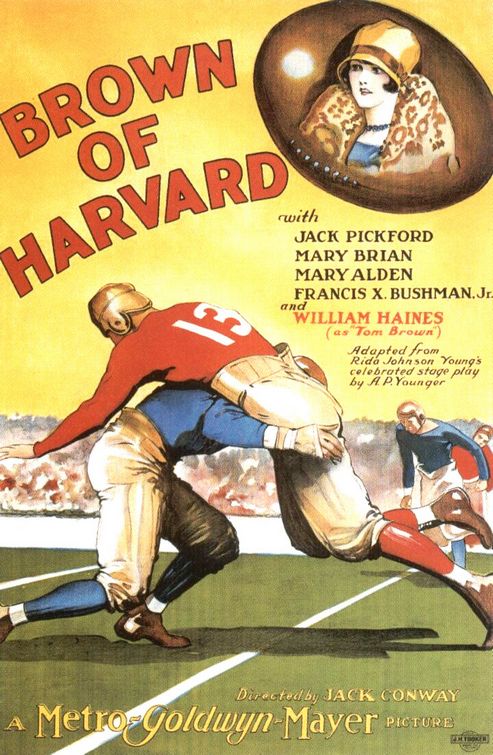
1926: Brown of Harvard
MGM cashed in big on the love for football that just hit the country. Here we have two burly players crashing, with everything on the line.
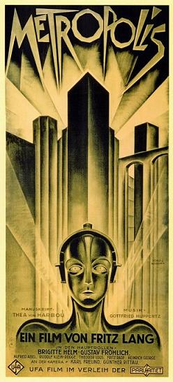
1927: Metropolis
One of the best film posters of all time is still recognizable 85 years later.
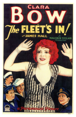
1928: The Fleet’s In
So far we’ve seen female leads, but The Fleet’s In puts the actress front and center with nowhere else to look. Plus, look at the red hair!
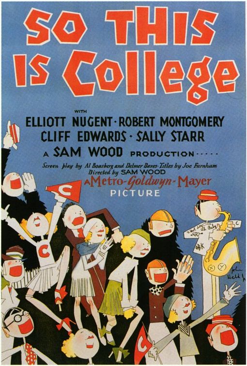
1929: So This is College
“College is supposed to be fun,” this poster screams. The cartoon is a clever way of expressing how, well, cartoonish college can be.
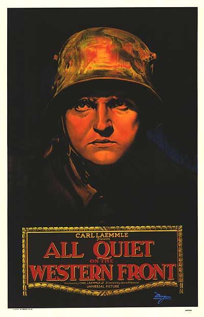
1930: All Quiet on the Western Front
For a film about war, the poster is rather quiet. It’s just a soldier silently looking out of the black abyss that rages on.
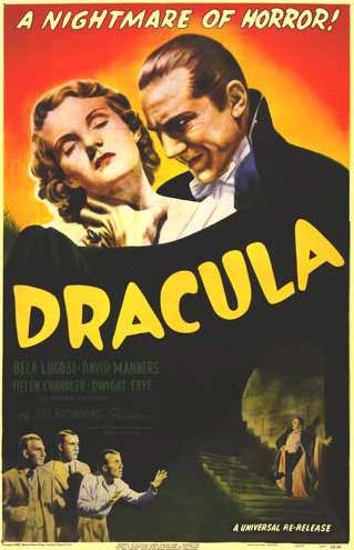
1931: Dracula
The film claims to be “the nightmare of horror” and the poster delivers the tease. Everyone wants to see the horrific vampire, and here he is ready to suck the blood out of an attractive female.
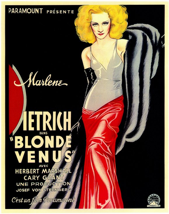
1932: Blonde Venus
So far female actresses have been rather tame, but not here. This poster shows a seductive lady looking right into the eyes of any man that pass by.
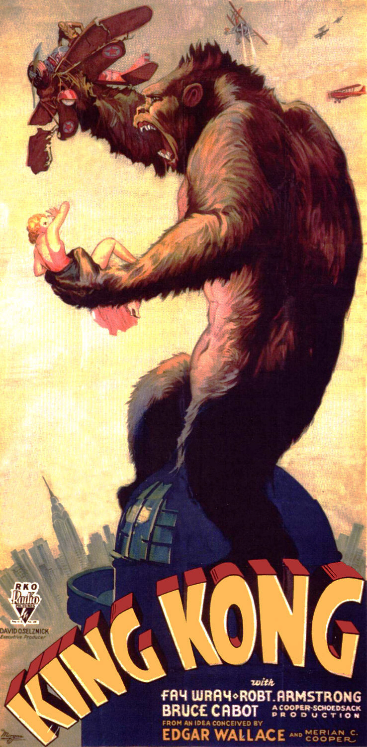
1933: King Kong
There are so many great posters of Kong on top of a building snapping a plane. It’s one of the most iconic moments in film history, and this specific poster shows the magnitude of the beast that was killed by Beauty.
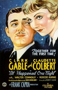
1934: It Happened One Night
There’s the now-iconic poster of the two leads embracing on the moon, but this is the original that promoted the first film to win every major Oscar.
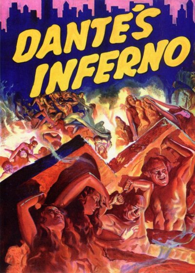
1935: Dante’s Inferno
Hell’s demons are pushing through and ascending onto the city. It’s an adaptation of one of the most famous scenes in the film and done with a very disturbing painting.
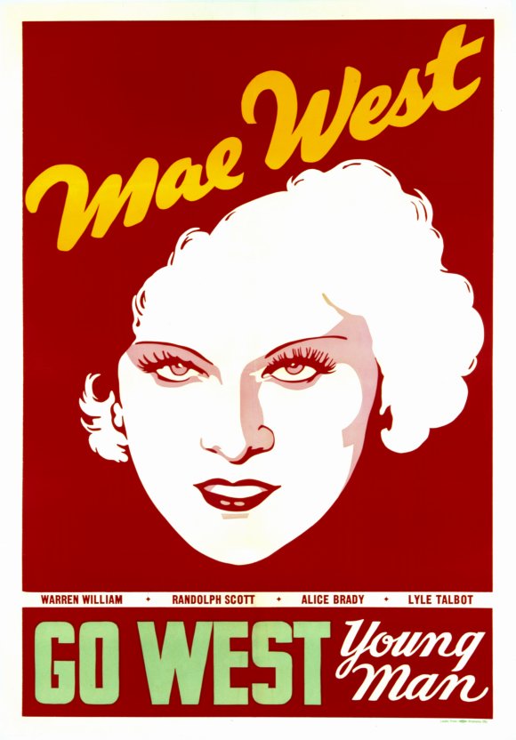
1936: Go West Young Man
Unlike a lot of films, this one implemented a very artistic representation of the star. It tells us nothing about the film and entices viewers to go into the movie with no preconceived notion.
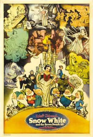
1937: Snow White and the Seven Dwarfs
Here’s the film that launched Disney. It uses the same artistic delight that the film unleashed onto the world.
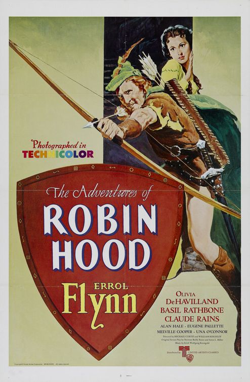
1938: The Adventures of Robin Hood
Errol Flynn set the bar for all subsequent Robin Hoods. Here he is in all his glory, ready to take out a villain with his bow and arrow.
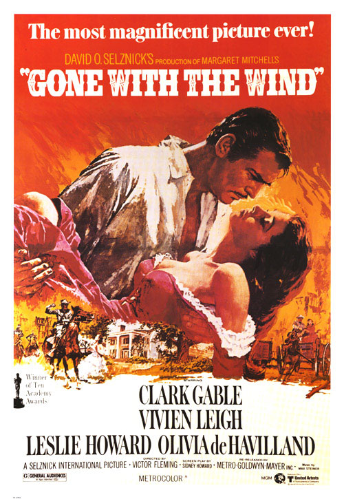
1939: Gone With the Wind
It’s the most magnificent picture ever; at least according to the poster for perhaps one of the most iconic films of all time.
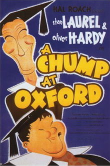
1940: A Chump at Oxford
This animated poster implements caricatures of Laurel and Hardy to help show the film’s slapstick nature. It’s almost as funny as the movie itself.
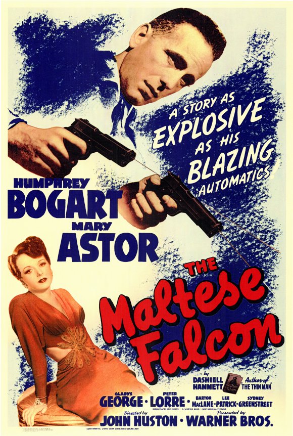
1941: The Maltese Falcon
Good-looking people: check. Guns: check. Maltese falcon: che…wait a minute. The film is famous for using the title artifact as a MacGuffin and the poster uses the same technique, leaving viewers to question how important the falcon is.
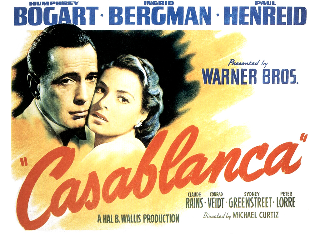
1942: Casablanca
All that the greatest love story ever told needs is the two lovers embracing. What’s so poignant is the look of worry they have on their faces, which hints at the fate of their affair.
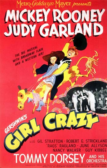
1943: Girl Crazy
By the looks of this poster, the girl is crazy.
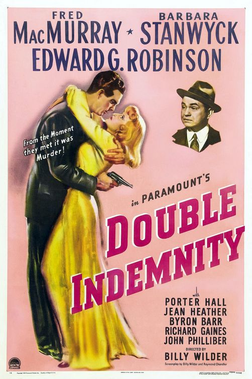
1944: Double Indemnity
The best part about this poster is the tagline and the worried onlooker in the corner. It tells you everything that you need to know without telling you anything at all.
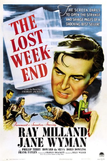
1945: The Lost Weekend
Here’s the floating head at its best. The film’s plot isn’t revealed in the slightest, but at least we all know who the star is.
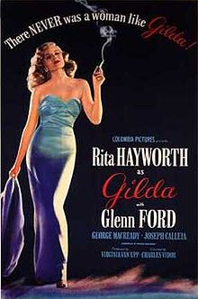
1946: Gilda
Rita Hayworth is all this poster needed.
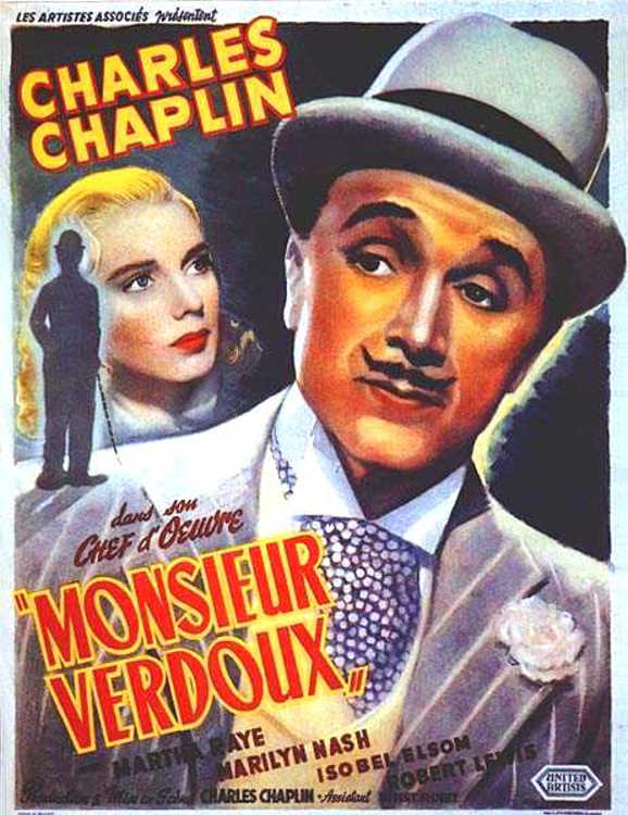
1947: Monsieur Verdoux
By the late 1940s all Chaplain needed to sell a film was his face, his mustache and a bowler derby.
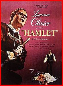
1948: Hamlet
Of course there’s Hamlet himself, but in the corner is one of the most dramatic scenes in the story.
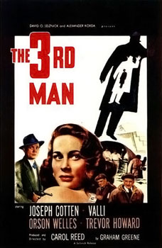
1949: The Third Man
The detail of the three silhouettes is genius. The poster is starting to use abstract ideas that represent the film instead of focusing on the stars or depicting a scene from the film.
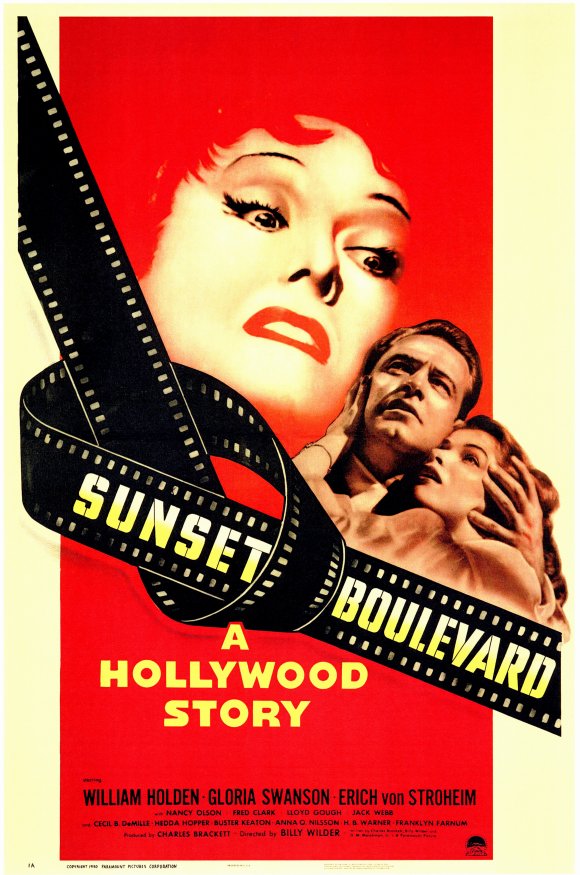
1950: Sunset Boulevard
This is a true Hollywood story. The knot in the film reel symbolized the main theme of the film and Gloria Swanson’s face is captivating.
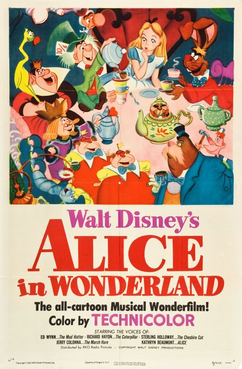
1951: Alice in Wonderland
Here’s a great introduction to all of the zany characters that the film contains in one shot. Not all of these characters interact with each other, but the artist did a great job of putting them all around a table for tea time.
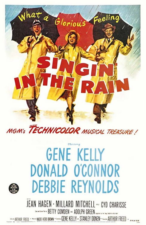
1952: Singin’ in the Rain
They’re singing and they’re in the rain. How much more literal can this poster be? Even the tagline is a great representation of what the film is all about.
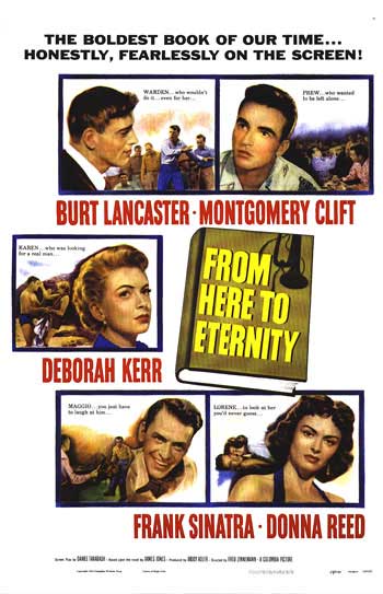
1953: From Here to Eternity
What’s the best way to get five big-name stars on one poster? Boxes (like The Brady Bunch did much later).
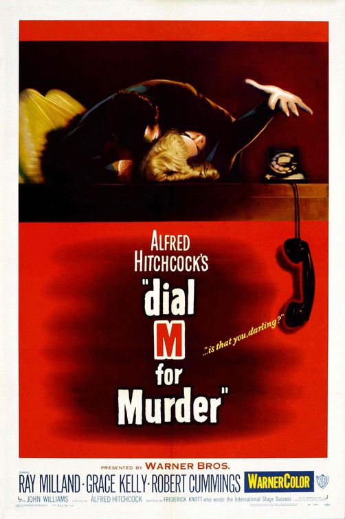
1954: Dial M For Murder
Hitchcock’s movie uses a graphic representation of a woman reaching for a phone in a struggle. It’s a very thrilling image for one of the best thrillers on film.
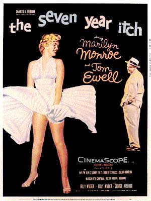
1955: The Seven Year Itch
This poster made Marilyn Monroe synonymous with her flowing white dress. The image has been recreated and parodied so many times, but never matched.
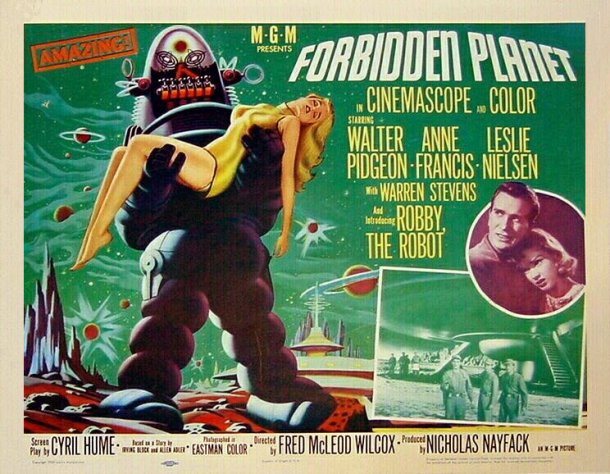
1956: Forbidden Planet
This is the first film to be entirely set on a different planet. The now-classic robot carries what seems a lifeless body.
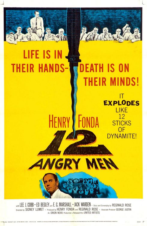
1957: 12 Angry Men
At the top are the 12 angry men of the title, but front and center is the knife that plays such a central part in the plot of this murder trial. The great use of foreshadowing is enough to forgive the cheesy tagline.
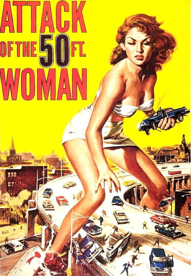
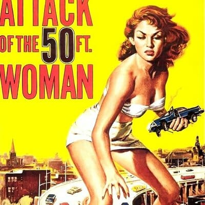
1958: Attack of the 50 Foot Woman
The iconic 50 foot woman beat out Vertigo to be on this list. While that’s no easy task, the sheer number of references to this poster outweighs anything else that was released this year.
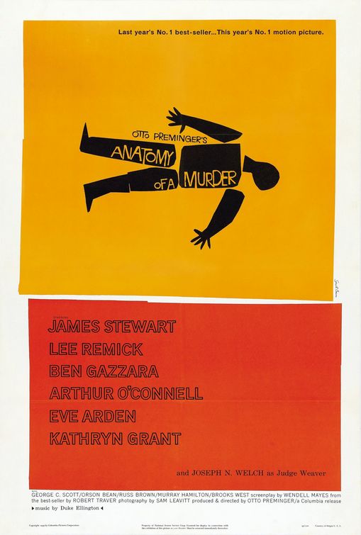
1959: Anatomy of a Murder
What a wonderful image to help give the sense of an actual autopsy being performed. And to do it with only four colors was brilliant.
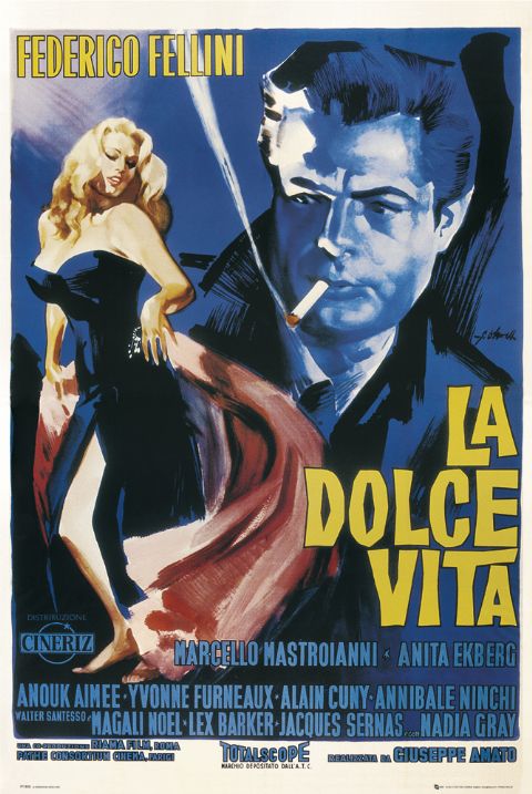
1960: La Dolce Vita
The title’s translation means “the sweet/good life” and the poster depicts what the 1960 good life was: having an attractive woman and smoking while maintaining a sense of mystery in the shadows.
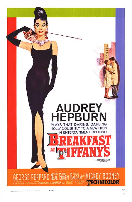
1961: Breakfast at Tiffany’s
Every woman wanted to be her, and every man wanted to be with Audrey Hepburn. Everything about this is iconic: the long cigarette, the jewels, the cat and her long black dress.
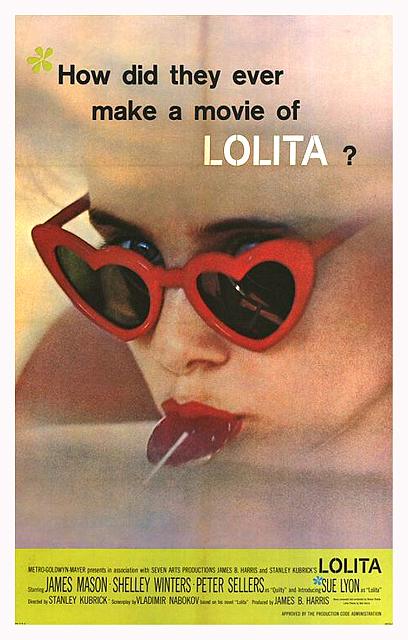
1962: Lolita
Those heart-shaped glasses. That lollipop. Need we say more?
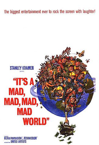
1963: It’s a Mad, Mad, Mad, Mad World
Everyone wants a little bit of the good life, right? Here we have the entire world struggling and fighting with one another for a suitcase full of bills.
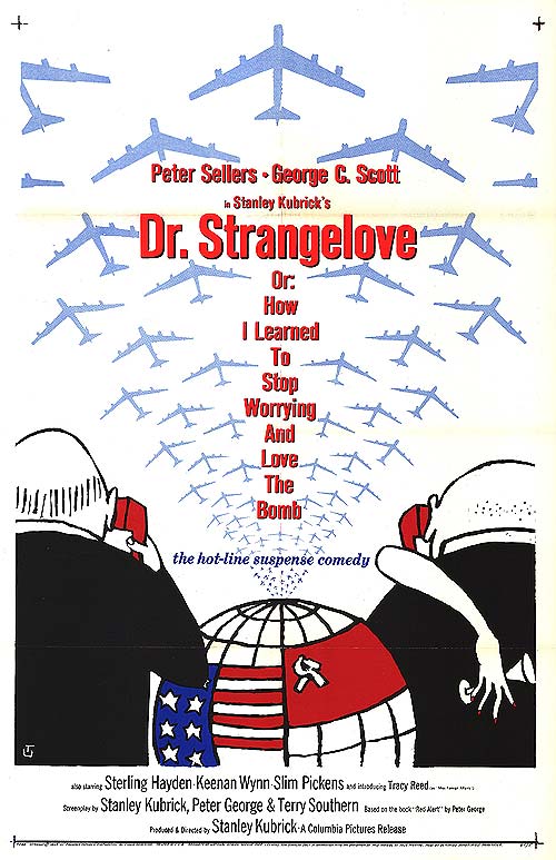
1964: Dr. Stanglove
America is on one side; Russia on the other. Maybe they should learn to stop worrying and love the atomic bomb.
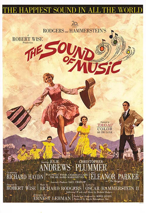
1965: The Sound of Music
Let’s all go prance around in the hillside and sing happy songs. That’s the message this musical’s poster wants to deliver and does to great success.
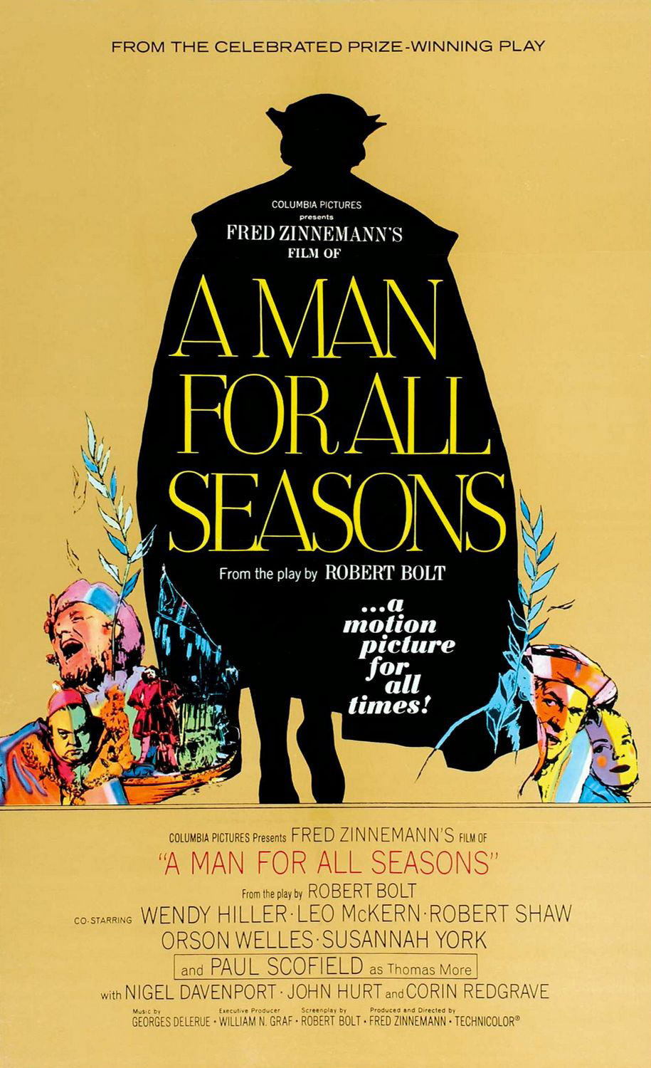
1966: A Man for All Seasons
Instead of highlighting a single man, the poster silhouettes the character and leaves it all up to the viewer’s imagination.
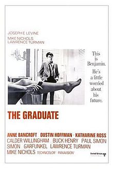
1967: The Graduate
“Mrs. Robinson, you’re trying to seduce me.” One of the greatest quotes ever gets immortalized in the poster for the film.
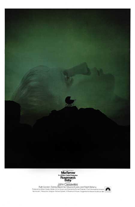
1968: Rosemary’s Baby
The baby’s carriage is perfectly placed inside of Rosemary’s head. The symbolism is genius; as is the movie.
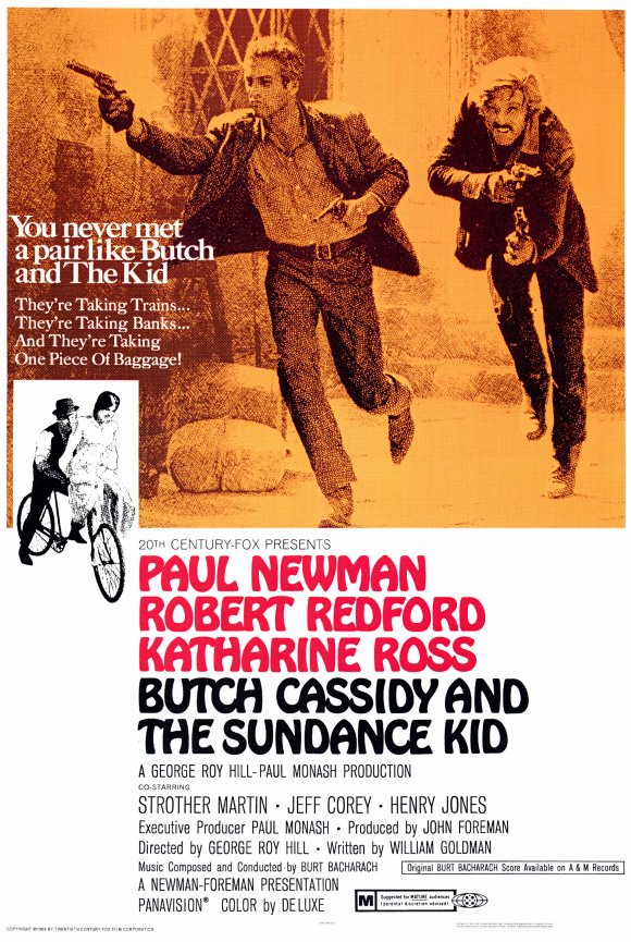
1969: Butch Cassidy and the Sundance Kid
The poster introduces a pair like no other. It’s an iconic image of Butch and the Kid running and shooting their way to infamy.
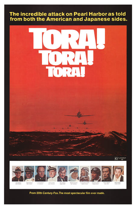
1970: Tora! Tora! Tora!
From the symbolism of the red sky to the increasingly larger title (code for ‘Tiger!’) the poster illustrates the precise feel of Japan’s attack on Pearl Harbor.
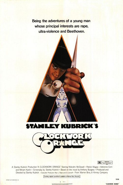
1971: A Clockwork Orange
You may not have recognized every single poster so far, but this classic image of a menacing Alex kicks off a string of the best of the best.
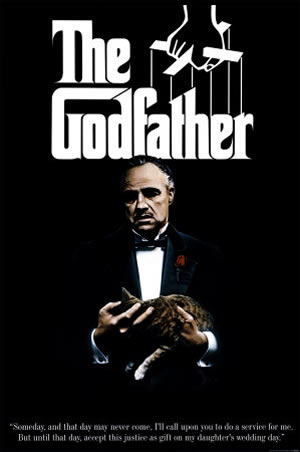
1972: The Godfather
The typeface, the puppet strings and the Godfather himself is all that was needed to make this an unforgettable movie poster.
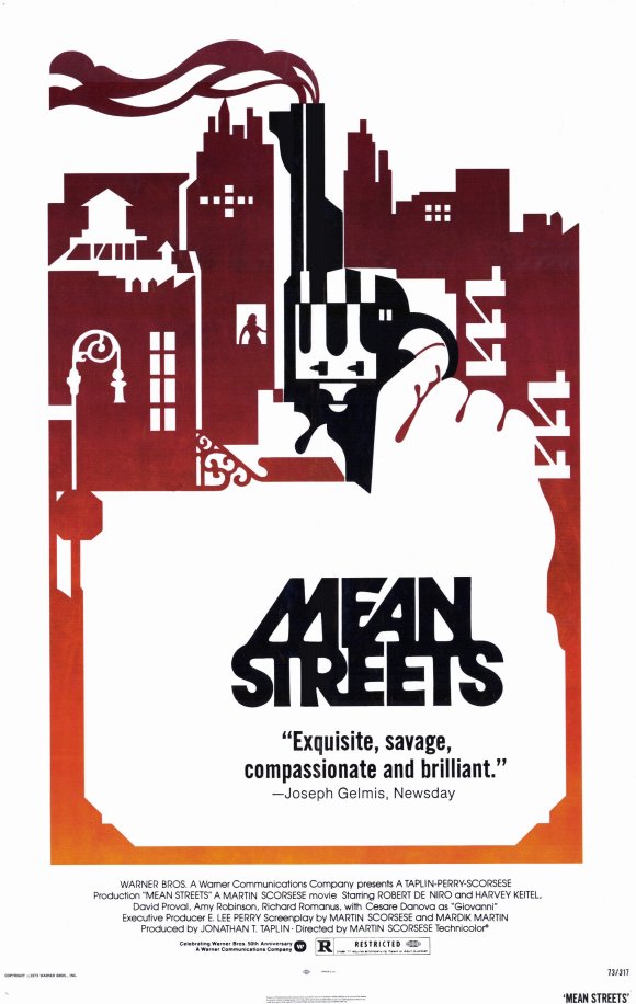
1973: Mean Streets
The smoking gun in the skyline is a wonderful graphic detail that has inspired many other designs. There’s also another poster where a gun is made to look like a map of Manhattan.
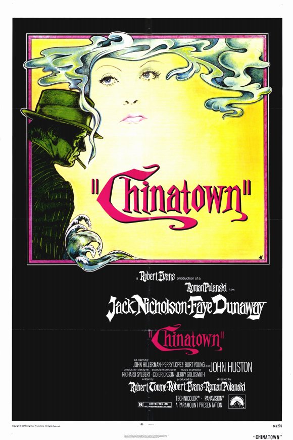
1974: Chinatown
The mysterious man’s smoke forming the woman’s hair is such a simple element, but made this an instant classic upon release.
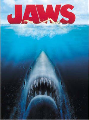
1975: Jaws
Almost as iconic as the film score. Duh-dah. Duh-dah.
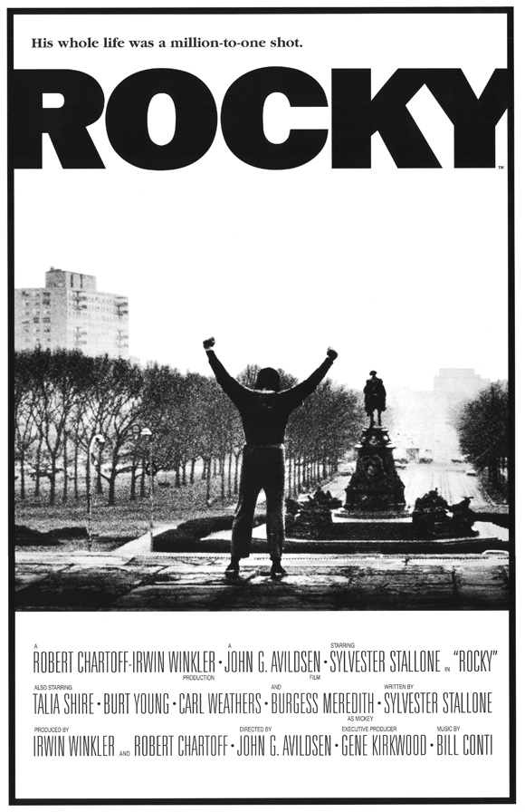
1976: Rocky
We’ve all emulated the iconic stair sequence before and cheered upon successfully reaching to top.
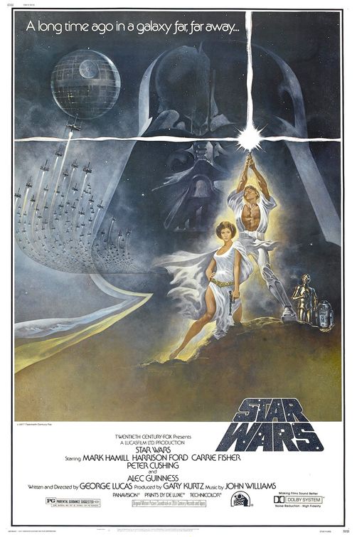
1977: Star Wars
A long time ago in a galaxy far, far away was a world where Darth Vader loomed over his children who were destined to bring him down. Only we didn’t know it yet. Maybe that’s why Leia is a little too close to Luke.
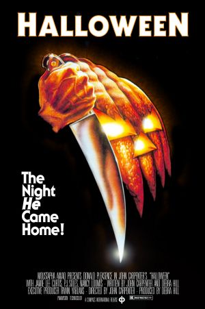
1978: Halloween
Well, there’s a knife and a pumpkin; it must be about a murder on Halloween, right? Some may consider it too simple, but it’s a clever and rather terrifying image.
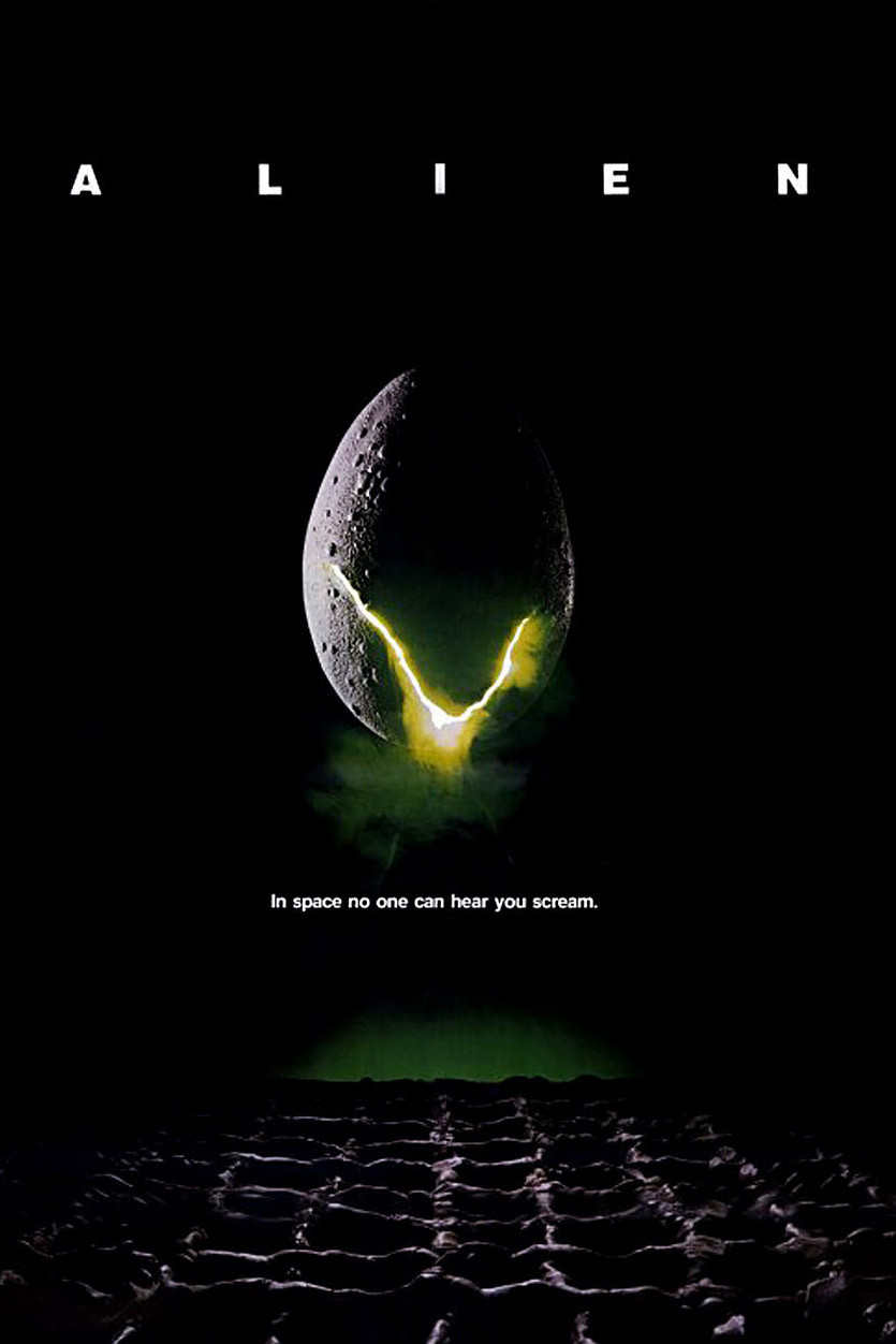
1979: Alien
The image of the alien’s egg hatching is great, but what makes this unforgettable is one of the best taglines of all time: “In space no one can hear you scream.”
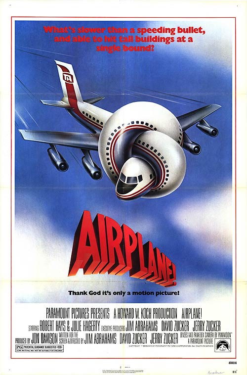
1980: Airplane!
Everything about the film, including the poster, is laugh-out-loud funny. Only a twisted airplane could do justice to how absurd this comedy.
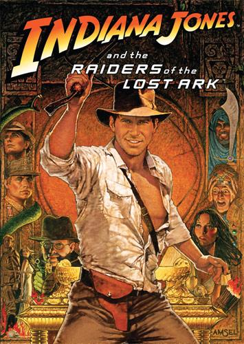
1981: Raiders of the Lost Ark
The original poster featured a similar image, but was a closer shot of Jones. This one was released and stole the show. Just look at that fedora and whip: remarkable.
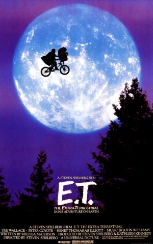
1982: E.T.
Other posters included the iconic ‘finger touching’ scene, but this version was mesmerizing beyond belief.
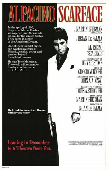
1983: Scarface
This is such an iconic image and has been on so many shirts that it’s easy to forget it started as a simple poster for a gangster remake.
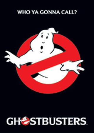
1984: Ghostbusters
Sometimes all you need is a logo, a perfect catchphrase and nothing else.
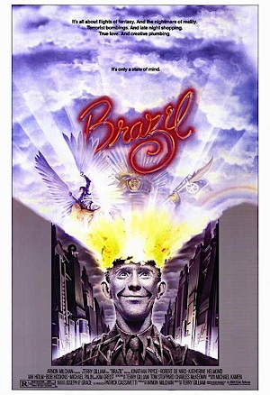
1985: Brazil
We’re pretty sure this is what Terry Gilliam’s brain looks like.
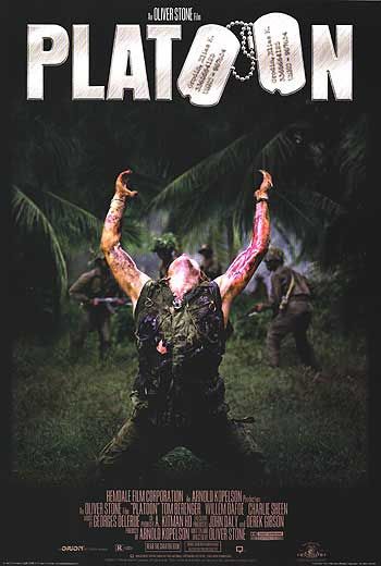
1986: Platoon
The original poster was a much simpler one with an upside down army helmet, but Oliver Stone cashed in on one of the most memorable war film moments and made that still the poster fairly quickly.
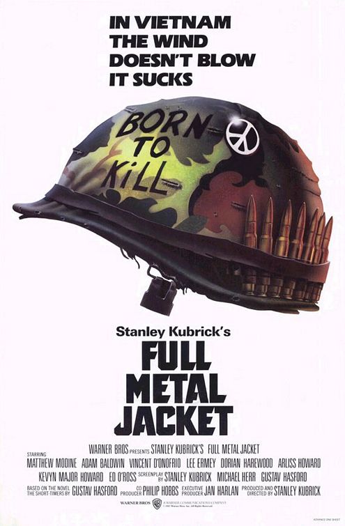
1987: Full Metal Jacket
War films were the kings of the late 1980s. Here the film used central prop and a catchy tagline to edge out the also-beautiful Empire of the Sun poster.
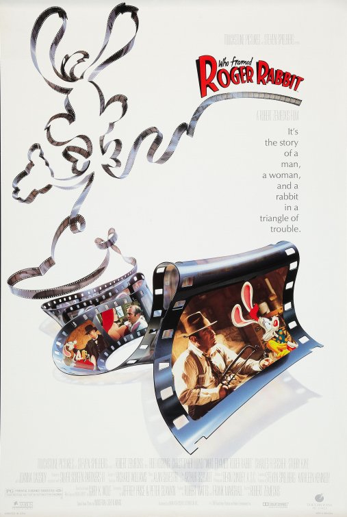
1988: Who Framed Roger Rabbit?
Having the film outline the title character was a simple choice, and to do it in a film reel was a clever way to showcase a central part of the film.
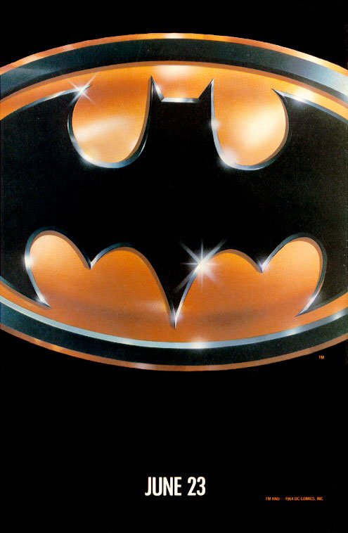
1989: Batman
Like the actual poster, no words are needed to explain this one.
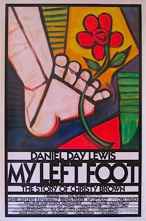
1989: My Left Foot
Other versions just had Daniel Day-Lewis, but no one remembers those.
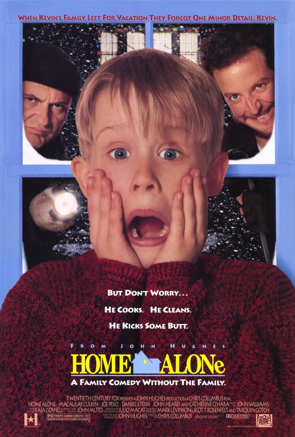
1990: Home Alone
He was the richest child star ever at the time. All he had to do was trick bad guys and scream. We sure missed our calling.
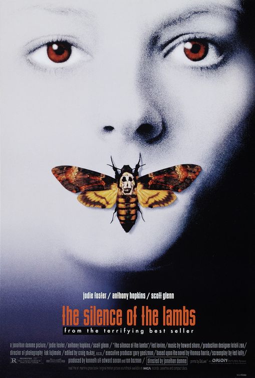
1991: The Silence of the Lambs
The butterfly represents a key plot point, but it’s the naked women forming a skull that transforms this from a solid poster to a mind-blowing one.
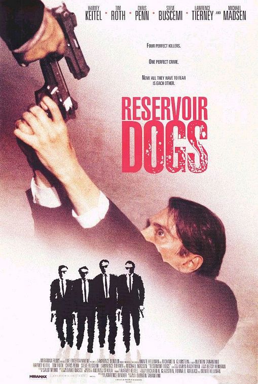
1992: Reservoir Dogs
The first poster was a simple design of the Dogs walking together, but this one depicts one of the most intense scenes in Tarantino’s film history.
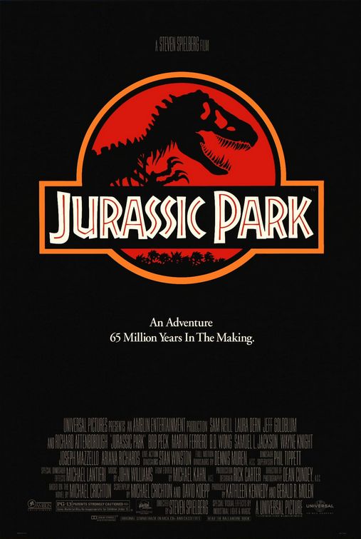
1993: Jurassic Park
Again, a dominant logo can transcend the film and becomes its own entity.
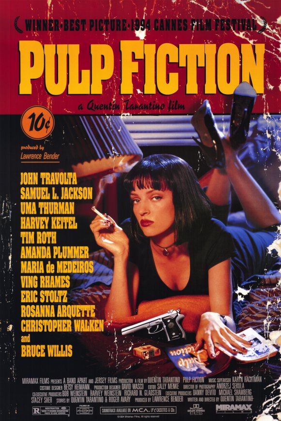
1994: Pulp Fiction
The poster plays on the film’s title and takes the form of a book. A great, and often missed, detail is that Mia Wallace is reading a book called Pulp Fiction.
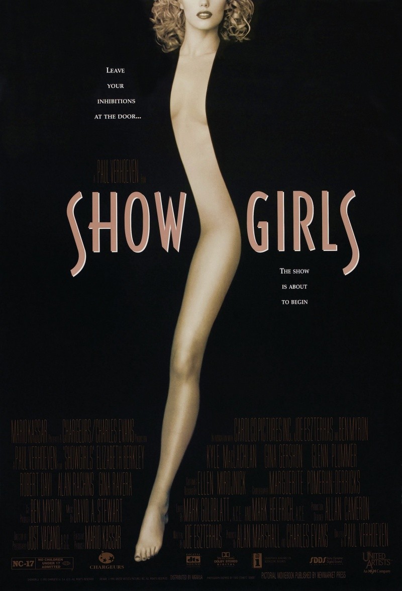
1995: Show Girls
A terrible movie with a great poster. The sleekness is undeniable and enough to beat out modern classics like Toy Story and Apollo 13.
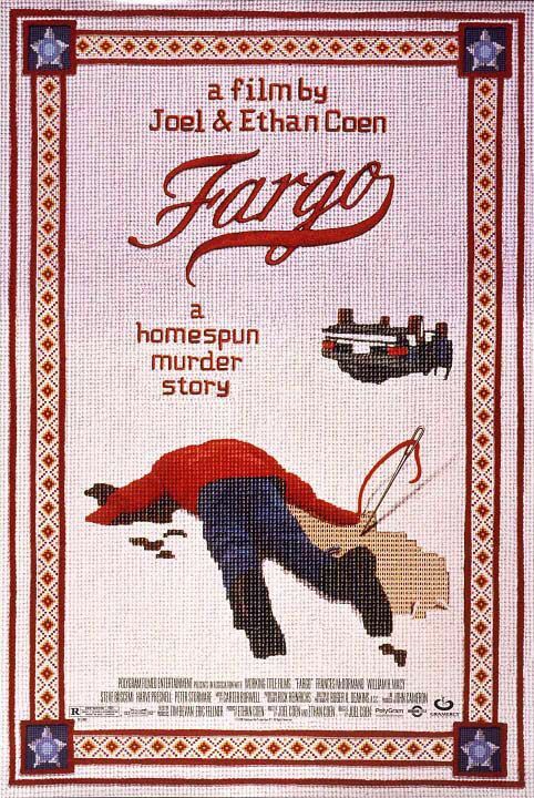
1996: Fargo
Using a needlework pattern for a murder film was a smart way to beat out Drew Barrymore on the poster of Scream and Woody Harrelson’s The People vs. Larry Flint.
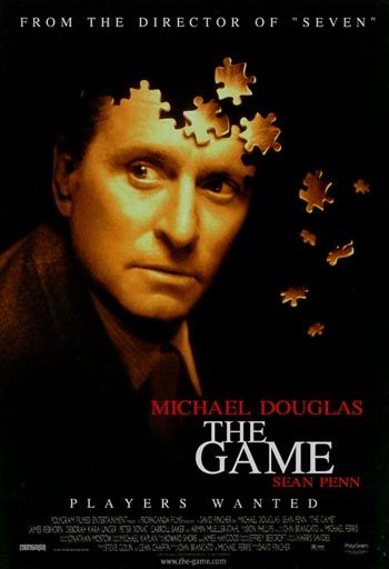
1997: The Game
Life is a gam,e and the game is a puzzle. While the photo may seem flawless, it breaks away and makes viewers guess what exactly the game is.
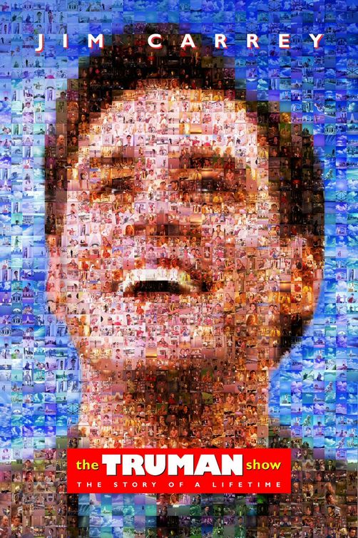
1998: The Truman Show
A great way to mirror the film’s plot by showing his photo is a composition of every ‘scene’ in his life. Plus, this was before those annoying puzzles so it gets points for originality.
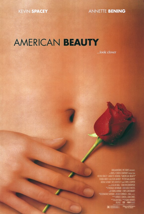
1999: American Beauty
There was a lot to choose from in 1999, but this close up is one of the most memorable scenes. It shows something sensual without revealing the true nature of the film.
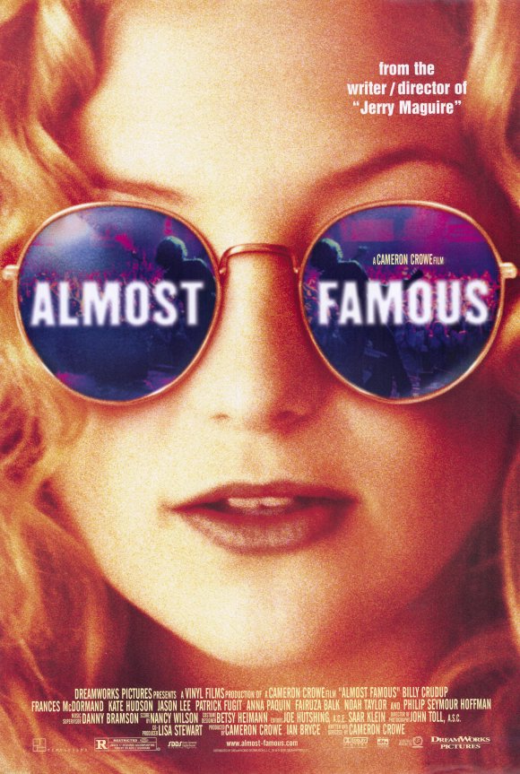
2000: Almost Famous
Those glasses marked an unforgettable character in a film about rock ‘n’ roll journalism and surprisingly details precisely what the movie is about.
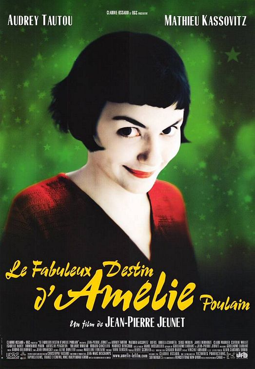
2001: Amélie
A great year for movie posters with several contenders, bu the title character of Amélie is too piercing to deny.
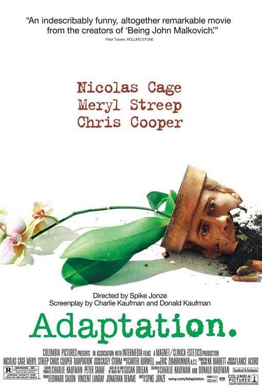
2002: Adaptation.
The poster is precisely what the film is about. We see an author struggling to adapt a book about flowers; and in a sense, he’s broken.
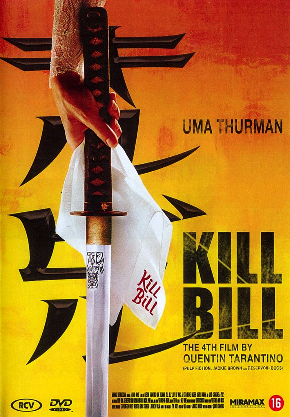
2003: Kill Bill: Vol. One
The entire marketing campaign focused on the yellow jumpsuit worn by the Bride and the Japanese setting of the climactic battle. This teaser does a great job at presenting the initial reaction of the movie.
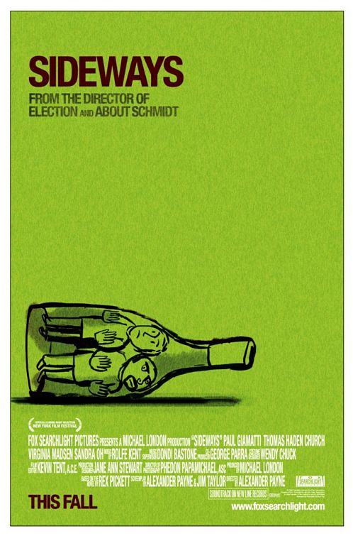
2004: Sideways
They think they’re just going to taste some wine, but their entire life ends up off-kilter.
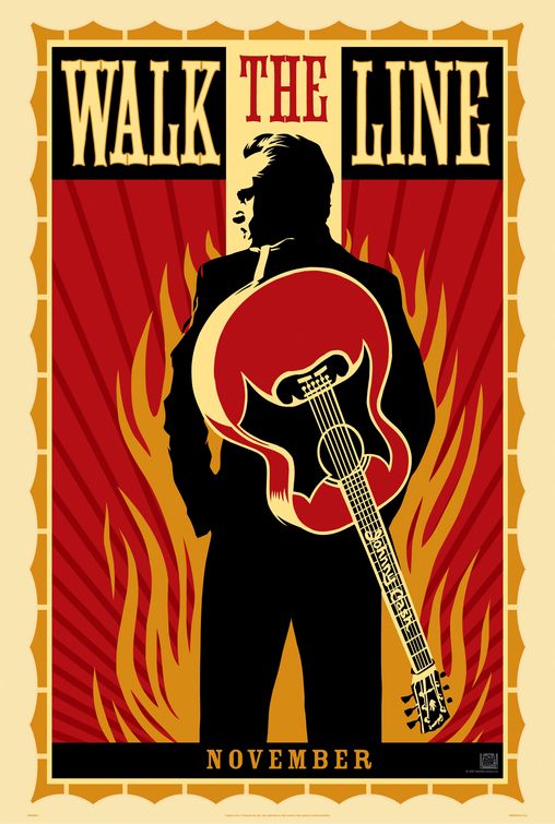
2005: Walk the Line
It’s a great graphic showcasing the Man in Black himself standing in front of a ring of fire.
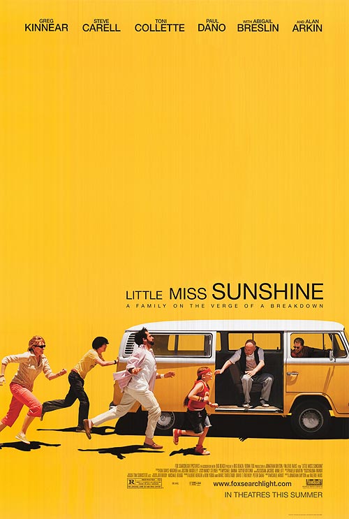
2006: Little Miss Sunshine
Everything about this movie is adorable. The poster leans on a cute scene and manages to get every character in it without the use of photo editing.
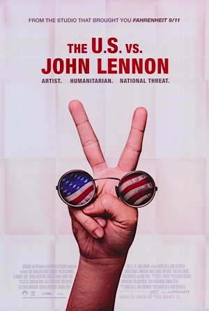
2007: The U.S. vs. John Lennon
You don’t need the title character when you’ve got his iconic specs and a peace sign.
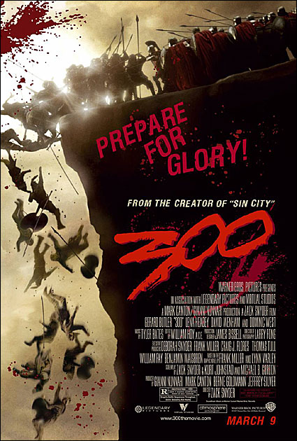
2007: 300
The over-stylization of the film makes for great art. There’s the “tonight we dine in hell” and the other “prepare for glory” posters, but this specific scene was taken right from the comics and pleased everyone.
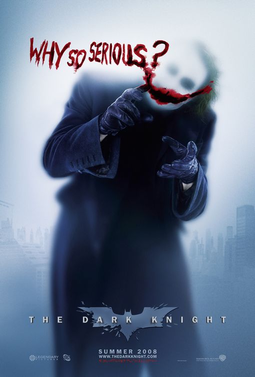
2008: The Dark Knight
The entire marketing campaign focused on the Joker without revealing too much about the character.
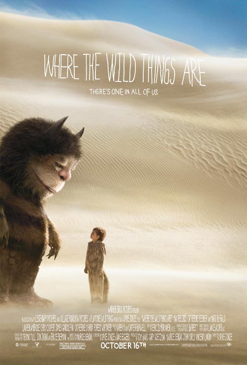
2009: Where the Wild Things Are
The sandy imagery shows us that sometimes when we think that we’re all alone, we’re not. It also reminds us that there’s a wild thing in all of us.
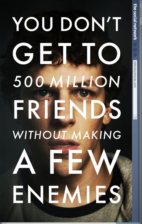
2010: The Social Network
Who would have thought a movie about Facebook would inspire so many movies to plaster catchphrases all over every single poster? It’s a great poster on its own, but it’s also a significant one.
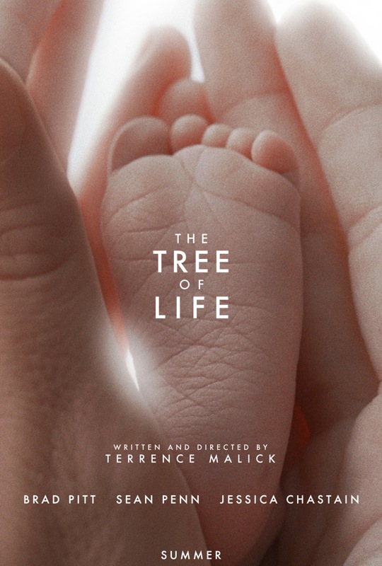
2011: The Tree of Life
No one was quite sure what the film was about, but this poignant image hinted at the bigger picture and left us all with a warm spot in our hearts.
GET PASTE RIGHT IN YOUR INBOX
The best music, movies, TV, books, comedy and more.