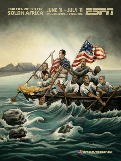
One of my favorite parts about the 2010 World Cup—fifth favorite, actually, after Donovan’s goal, infuriating the English with a draw, Suarez’s heroic handball, and the awesome Uruguay-Germany third place match—was the series of promotional posters ESPN made for each of the 32 teams. They were done by South African artists, apparently in the style of Ghanaian ‘80s movies (I wouldn’t know), and they were awesome. They had a sense of humor, they were colorful, they honored each country’s history and symbology, and they generally got me pumped for the matches. Take a look at the Team USA mural as an example:
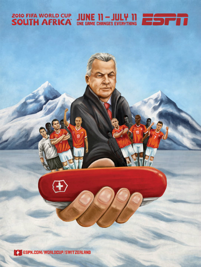
Is it goofy? Absolutely! Is it still pretty awesome? Yup! For me, “Landon Donovan Crossing the Potomac” is a terrific emblem for the national team. And Team USA’s poster wasn’t even close to the best. Check out the Swiss Army Knife theme for Team Switzerland:
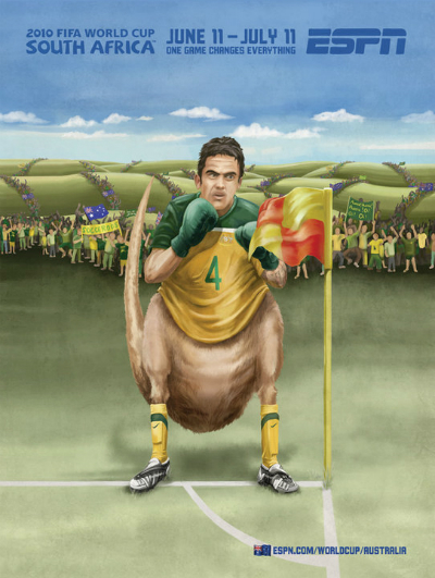
Or the boxing kangaroo for the Aussies:
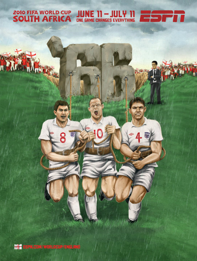
Or Team England bearing the weight of 1966, the county’s only World Cup win:
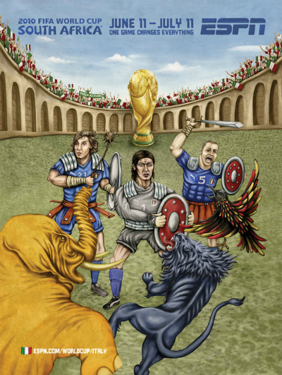
Or Team Italy fighting off mythical beasts in the Coliseum:
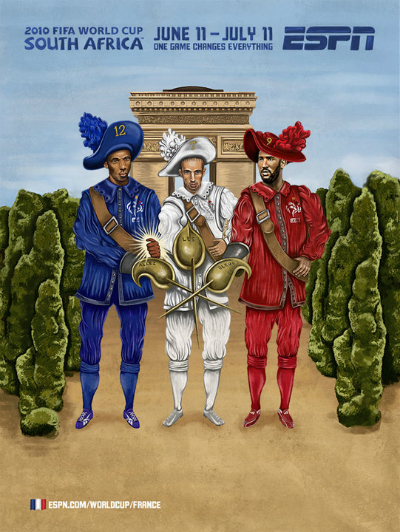
Or (last one, I swear), the French three musketeers. Don’t miss Thierry Henry’s glowing hand, a reference to the infamous handball that allowed France to qualify over Ireland:
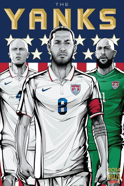
You can see the whole rundown here, and I highly recommend it. Now, let’s turn our attention to 2014. Yesterday, we gave you the good news that ESPN was reprising the poster concept and had hired Brazilian graphic designer Cristiano Siqueira to design the murals for all 32 teams. You can see the gallery here, and check out the Team USA example:
First, let me express my joy that this is happening again, and my hope that it will be a permanent World Cup tradition. And with my positive sentiments out of the way, here’s the bad news: I don’t love them. They look more like the tifos you’d see at an actual soccer match, and that’s cool, but something about the intense graphic novel vibe, creating icons of the players, leaves me a bit cold. Where’s the geographical and historical flavor? Where’s the wink, or the personality? These just seem like uber-serious posters you might see for a bad modern superhero. It’s like V For Vendetta translated to the World Cup.
This could be as simple as the fact that I like sports to retain their inherent playfulness. It’s no accident that this is my favorite World Cup commercial of all time:
The “Write the Future” ads from 2010 were cool in their own right, but give me the Brazilians goofing around in an airport every time (happily, the playful spirit is back in this year’s excellent “Winner Stays” ad).
Now, not everyone agrees with me about the posters, and that’s fine. I fell into a massive debate with Spike Friedman, fellow Paste Soccer writer and frequent g-chat companion, on this very topic, and this morning I asked him to summarize his preference for the 2014 posters. Spike’s take:
“None of it is “good art,” so to me the question is which one gets me more pumped up. It’s an aesthetic instinct—the new ones feature stars prominently, and they have a Soviet-bloc recruiting ad feel to them. The previous iterations were clever, but they realized the bodies in intentionally subversive ways that make them unappealing for me, which may have been the point. But I don’t need to think that hard about my soccer propaganda.”