Picking ten notable comics artists in 2014 is like picking ten favorite Beatles songs; approaches may vary, but the excellence is overwhelmingly consistent. We mentioned last year that the the concept of the house style — publisher guidelines to ensure a similar aesthetic between different titles — was slowly dying; if that was a burgeoning realization then, it’s a known fact now. How else can the exaggerated cartoon revelry of Skottie Young exist in the same universe as the cinematic realism of Declan Shalvey? Image has also continued to foster some of the most imaginative examples of world building in genre storytelling, while independent imprints have introduced talented multi-media artists who dare to stretch the trade past traditional pen and ink. So yeah, 2014 has been a pretty great year. Let us know your favorites in the comments.
![]()
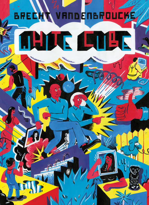
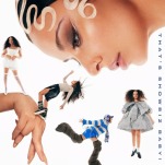
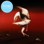
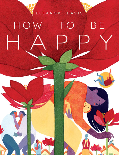
10. Brecht Vandenbroucke
White Cube
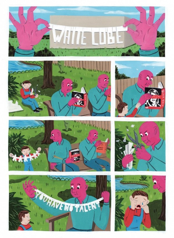
White Cube is far from the most subtle comic released this year, but there’s no denying that Belgian Brecht Vandenbroucke has a powerful style. His array of wild, dynamic colors should hurt one’s eyes; instead, they compose a fantastic dance, giving his visuals life beyond their immediate context. Profane, unruly and surprisingly lovely, Vandenbroucke’s art smacks you right in the face rather than waiting for your attention to turn its way. Hillary Brown
![]()
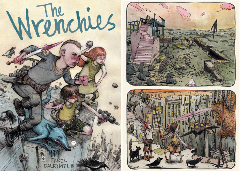
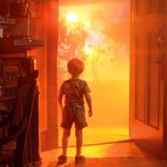
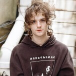
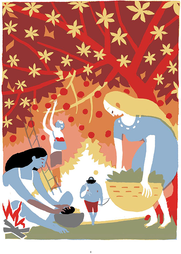
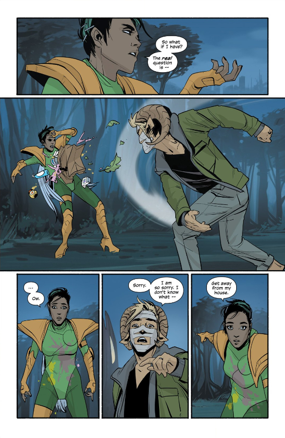
9. Farel Dalrymple
The Wrenchies, It Will All Hurt, Prophet
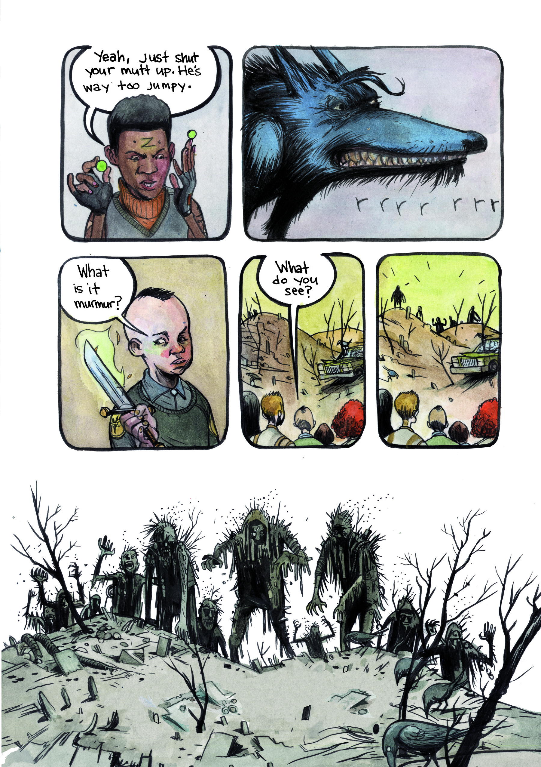
In The Wrenchies, Farel Dalrymple’s art is given its fullest showcase to date. He’s already proven deft at magic-realist cities (Pop Gun War, Little Nemo: Dream Another Dream) and surreal science fiction landscapes (Prophet). In this tome depicting a post-apocalyptic war between juvenile gangs and grotesque fairy tale demons, he includes both, along with devastated fantastical countrysides, horrific monsters, and heroic warriors young and old. Tobias Carroll
![]()
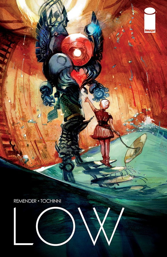
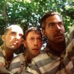
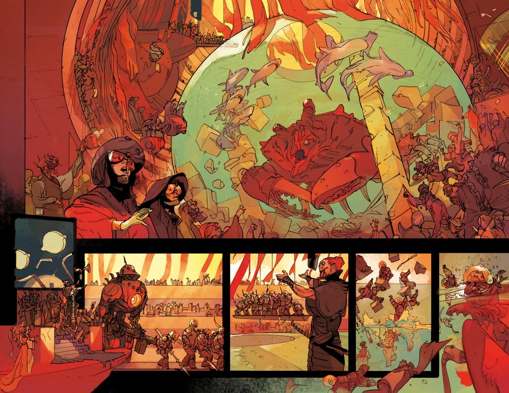
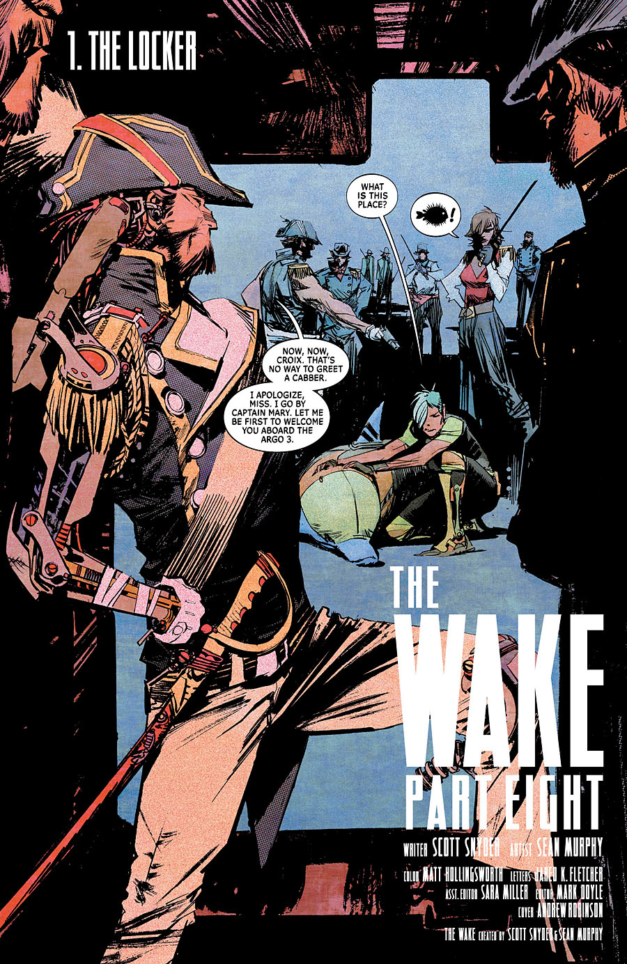
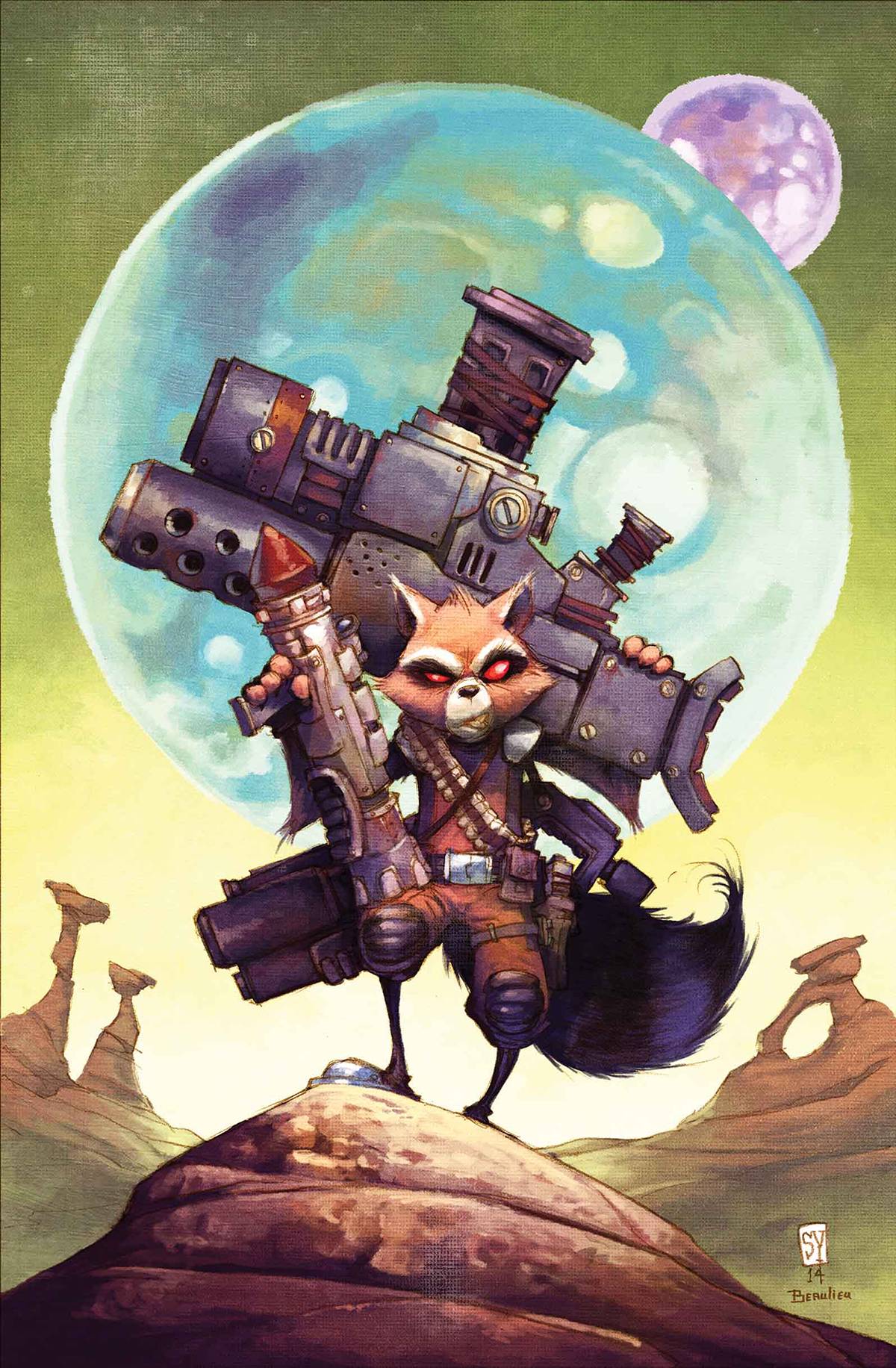
8. Greg Tocchini
Low


-

-
-
-
-
-
-
-
-
-
-
-
-
-
-
-
-
-
-
-
-
-
-
-
-
-
-
-
-
-
-
-
-
-
-
-
-
-
-
-