
State of the Art: Jock Explains the Personal Horror Behind Wytches

No flying broom sticks, no bubbling cauldrons. With Wytches, Scott Snyder and Jock conjured a unique, thoroughly creepy spin on a genre full of cliches. Neither Salem nor Slytherin, Wytches is not your typical tale of hocus pocus. These are skeletal beasts lurking in hollows beneath the forest, accepting human sacrifices, and the people we’ve historically thought of as witches were merely their acolytes.
Jock’s pages, heavily inked and occasionally confusing, evoke a bump-in-the-night sense of the looming Other that provides Wytches’ lasting chill. Add Matt Hollingsworth’s colors—including a splatter effect counterintuitively cast in bright pinks and oranges that crescendos to absolute chaos as the horror peaks—and it’s no wonder the series has already been optioned for a movie.
But, to hear Jock tell it, Wytches is far more than a dance of psychological terror. “It’s probably the most personal thing we’ve done,” Jock says. It’s a family yarn that pivots on parenting, the vulnerability of youth and human frailty. Though told within a horror framework, it’s the story of a flawed father striving to be better, confronting fears—real and supernatural—that are frightening in their relatability.
“I always feel like, as an artist, if you’re doing you’re job well, the reader shouldn’t know how it’s done,” he says. “It’s like good special effects in movies.” In spite of that sentiment, Jock took us behind the scene of a horror book that’s both warm and chilling, emotional and macabre.
![]()
Paste: Tell us a little about your process in Wytches.
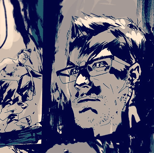
Jock: I have found that I’m drawing it a little bit differently to how I’ve handled other titles. I’m not the most shiny superhero artist. I’ve done some of that stuff, work for DC and Marvel, but I’m not necessarily one of those super-clean, sharp guys. With Wytches, it’s got even looser. I’m hoping it’s unnerving. Sometimes things aren’t 100 percent clear, they leave room for the reader to go ‘Hold on, whats going on there?’ The emotional core that I think is the heart of the book, is the relationship between the father Charlie and the daughter Sailor—hopefully the emotion will be even stronger. Hopefully those moments mean more because the reader is feeling a little bit unhinged.
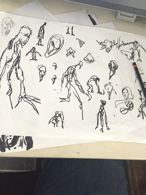
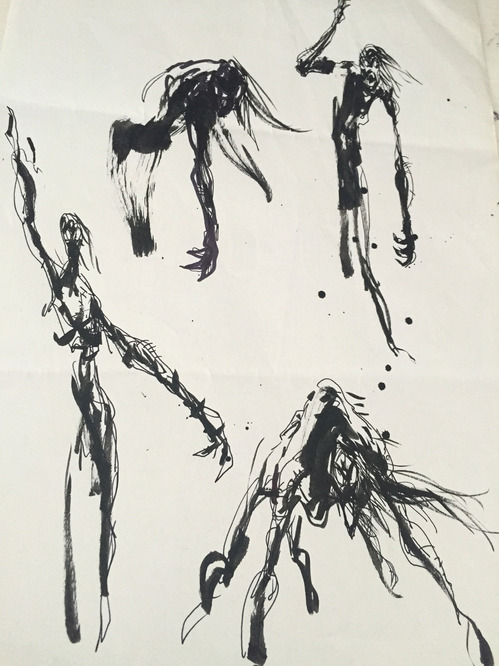
Gesture sketches by Jock
Paste: Your style does seem ideal for horror. Can you elaborate on why it’s so distinctive?
Jock: My style isn’t deliberate. I’ve thought about it a lot but I try not to analyze it. I find that if I approach the scripts with some honesty, and try to put that down in the inks, that’s when people tend to respond to the work. Sometimes when you do that, that’s when you’re most at risk, because people might look at it and think ‘What the hell is this?’ but it’s worked for me. But when it comes to actually drawing the pages, I just try and let go of all that and try to be in the moment.
Paste: Do you find your style changing much for various projects?
Jock: Early on I’d start a new project and sort of think ‘How should I approach this? How can I tweak the style for the book?’ I feel like as my career has gone on, you learn to trust your instinct and not try to push things too far in a certain direction, because often those directions are born out of how you think something should be rather than how you feel something should be. With something like Wytches, it’s the most emotive book that I’ve done, and that’s a lot down to Scott’s writing, but it’s also that the art is very free.
Paste: Did you have any influences going into Wytches?
Jock: I was very wary starting the book because I think horror is a very difficult thing to pull off in the best of times because it’s hard to do something that’s genuinely scary. With a comic—although comics lend themselves to building atmosphere, the reader can always look away, go make a cup of tea—and I was really worried that we wouldn’t pull it off. I didn’t really look at a lot of other stuff because I wanted this to have a unique look.
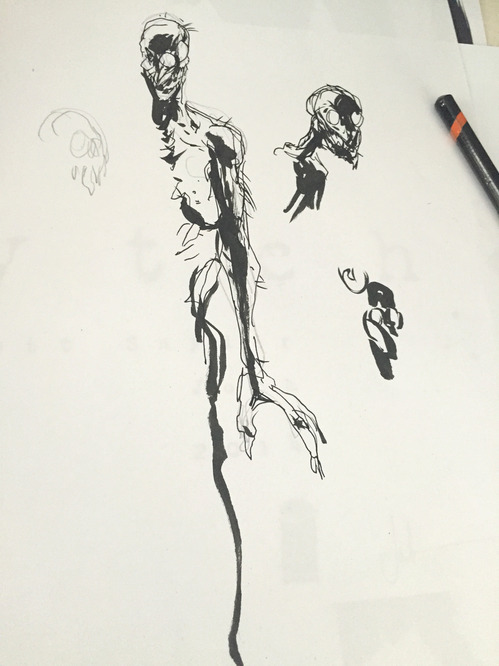
Character designs by Jock
Paste: These witches are so different from any witches that people would imagine. Was it liberating to not have to draw pointy hats?
Jock: A lot of the design, Scott had in his mind. It was his idea for them to be like nine-feet-tall and have eyes on the side of the head so they can peek around trees. But the fact that the lore of the witches that we’ve gone for isn’t really ignoring what’s gone before but hopefully adding to it, and you realize that all the witches we thought we knew in times gone by were really just the worshippers of these bestial creatures that live underground. It is liberating.
Paste: How did the design process progress?
Jock: The monsters, for a while they were much more animalistic, for a while they were pretty much all teeth, or looked like aliens. We could do anything. The thing that took the most time to get right was the look of the wytches themselves. The second arc we’re going to do takes place in a completely different place, and a different type of environment. So basically Sailor is in a desert because there’s no trees, so there’s not going to be any Wytches. But she might be proved wrong there. I’m looking forward to how these things have evolved underground, and for different places they’ll have different attributes.
Paste: So wytches that evolved to live in the desert will look different than ones that live in the forest?
Jock: I think it’s cool to think if these things do live in different places, the environments are going to be different, the rocks are going to be different that they have to burrow through, so their arms are going to be different because they’ve had to burrow through different types of materials. From doing a bit of concept work on movies as well, that’s the type of stuff you have to think about. It helps with the world building.
Paste: When approaching something like this rather than say Batman, how are you thinking differently?
Jock: Probably my favorite part of drawing the script is laying out the pages. I love how you can move people’s eye around, you speed the eye up and slow it down. I do them very quickly, and they’re very instinctual. As I read the script, I try to lay out the page almost at reading speed, so I can get a sense of how a reader might read the page. Then you get an instinct for where the panel needs to be bigger or fatter, where to stutter the time. The art reflects that, the way its looser with the trees in the forest, it’s just a little bit more expressionistic. I’m hoping that unnerves the reader. So if anyone’s had a bad time reading this book then I apologize, but I also kind of think job’s done.
Paste: Which scenes do you think work that way?
Jock: I found that when I was drawing the burrow, when Charlie goes underground, panel borders started to melt away. The pages were a bit more montage-y. To me that was all about losing boundaries, literally. My thinking was, here’s Charlie in the burrow, lots of connecting tunnels, he literally doesn’t know what’s around the corner. I think if I did a very stilted six-panel grid that was sharp and clean, it just wouldn’t have the same feeling. In the above ground moments, with his wife Lucy, it was much cleaner, more open, lighter.
Paste: You mentioned the family aspect, and horror isn’t always known for it’s emotional core. Do you find that your art changes when you have that element?
Jock: That first scene between Charlie and Sailor when she’s getting in the school bus, Scott’s writing was so clever. I very quickly felt very strongly about these characters. I’m a big fan of using acting. Some people don’t like drawing people talking, I love drawing people talking. So I try to use body language. Then you have the whole spectrum, the horror of these freaky creatures, but you’ve got the human element as well.
Paste: There’s a lot of body language, like with Charlie’s underlying anger.
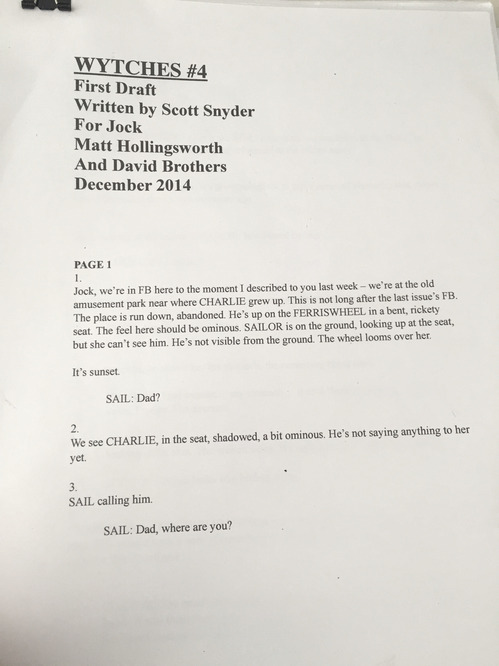
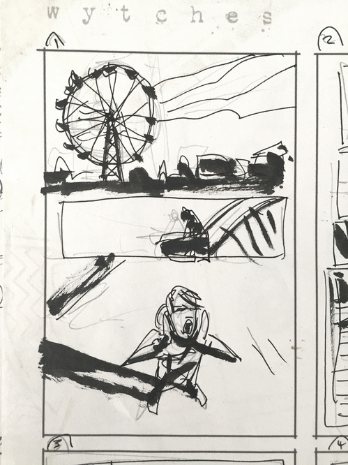
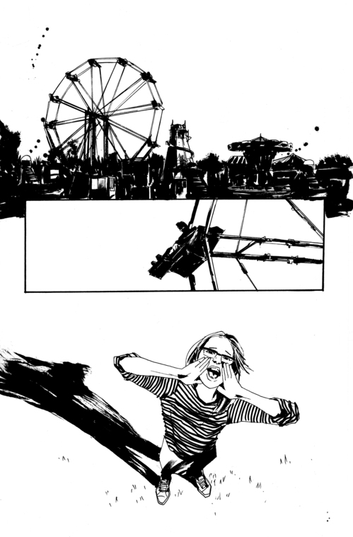
Jock: That’s my favorite part about this book actually. Charlie and that side of him is, I think, the book’s strength. Scott would write this stuff and he’d call me and say ‘Is it too much?’ and I’d say ‘No, this is the good stuff.’ There’s a moment in issue 3, maybe 4, where there’s a flashback and sailor is climbing a ferris wheel and Charlie’s up there—he’s a bit drunk—and he throws a bottle at her. Scott was like ‘I’m not sure about this, is it too much?’ My advice was ‘No, this is the underlying struggle, or fear, that all parents have.’ Life isn’t always a bed of roses, and Scott’s writing was so honest and laced with emotion. To me, that’s the good stuff.
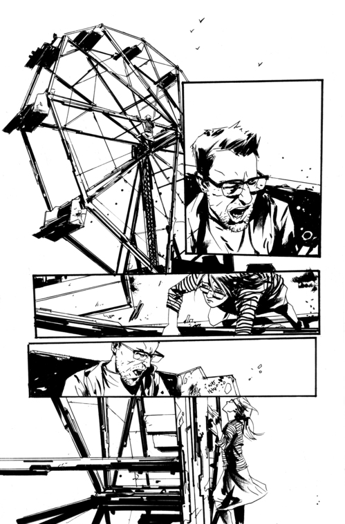
Paste: That scene was definitely jarring.
Jock: The fact that it’s a flashback, and you see how he is now, that he’s trying. It’s kind of his journey to be a better person. I think that’s amazing. Scott’s mentioned in the essays he’s written in the back how he’s drawn on his own experiences as a parent, and feeling those kind of fears. I think if you just approach the material honestly, that stuff is going to resonate with people.
Paste: Tell us more about how you tried to get that unsettling feeling.
Jock: When Charlie climbs into the tree, there’s a double-page spread where on the left he’s going down into the tree and on the right there’s a really clean page where he’s in the hospital with Sailor. That page on the left was one of those pages I was sort of concerned about, there’s not a lot there. The previous page is him climbing up the tree, putting the stink on him, and losing those panel borders, so it all becomes a little more fluid, then it just goes into this pit of darkness. The art is expressive, it’s not clean. It is considered, but it has a really loose quality to it, which I enjoy. To get a manic point across some of the inking was done very quickly.
Paste: You often flip the perspective throughout a scene, what effect do you get from that?
Jock: I love camera angles, putting the camera in interesting places. I think too much comic art can look a bit stilted and boring and dull. For example, when he’s moving through the burrow, that’ll help with the passage of time. You’re looking at him, then you’re looking at his back, then you’re back with him and you get the sense that something has moved. But also, I sort of deliberately put the camera away from the characters sometimes because there’s a sense that this is what the creatures might be seeing—not literally, but it give a sense that there’s always something slightly out of panel.
Paste: Similarly, you also tend to juxtapose still scenes with action, or peaceful with horrible. Is that the same idea?
Jock: When you do that you’re displaying a range, two very different moments that have an effect. Going back to the core of this story which is the family relationship, if you can show a range then that stuff is going to work a lot better. I feel like if you’re handling material like this, it’s kind of your job to have some of that in there, to try to show still, warm moments and juxtapose them against these horrendous, dark moments.
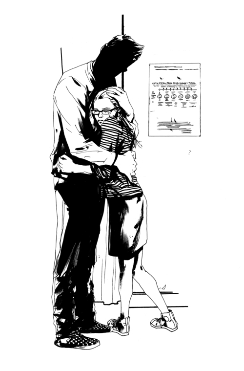
Paste: Like that spread in issue 5, where on the left it’s Charlie hugging Sailor in the hospital, and on the right they’re hugging in the burrow.
Jock: That’s exactly the page I’ve got up. Sailor’s body language when hugging her dad there, she’s slightly timid, kind of vulnerable, but she’s also trying to hold on to this thing that will give her hope and strength. That’s the hardest stuff to get across. Then the difference between that kind of clean page and what’s on the other page. Interestingly, they’re doing the same thing, hugging. They’re having a moment, he’s found her, they’ve been apart and found a way to be together but it’s in a very different place. That’s the horror.
Paste: There’s a lot of visual noise, with the splatter work. What was the intention there?
Jock: Matt’s one of the best colorists in the world so we were lucky to have him, but this is the sort of book where I pushed him a bit. I think because of the nature of the book I wanted it to have a unique quality to it. I wanted the color to have moments that popped, some jarring quality to them—hopefully interesting and beautiful and all those things colors should be, but also have a quality that’s slightly jarring. Splatters themselves are expressive by nature, but there was something really tasteful about them, the colors of the spatter would almost be the opposite of the color underneath it. And it played on some of the themes of the book.
Paste: Yeah, it’s sort of odd, here’s this dark horror book with all these pastel accents.
Jock: There’s something almost poppy about them, like in music how a synthesizer can sound inorganic. Even though the spatters are entirely organic. Outside of his house sometimes, when it’s raining, he’ll do them to get that organic look. You sometimes get these bright pinks or oranges in this dark environment. I used to paint before doing black and white pages, so I’m a big fan of textures and the way that the natural media can behave in a slightly erratic and unexpected way.
Paste: It’s also interesting that they don’t just come into play for the horror moments, but also the deeply normal moments.
He tempers the amount of splatter on the kind of scene. I think once you commit to a certain style you keep it up, so those hospital scenes, the splatter is still there. It’s far more subtle but it creates a different look. Then in horror moments, the spatters become a lot more extreme and pronounced. It’s almost like the Jaws theme, there’s an element of the storytelling that starts happening and you just go ‘Oh, shit.’