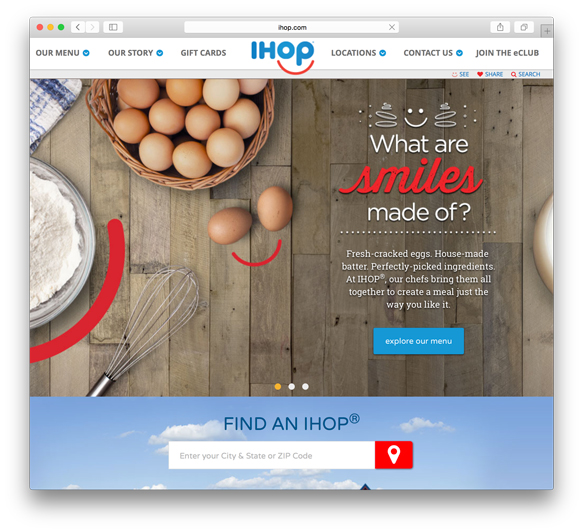
David Llewellyn: This logo update is long overdue, reminding me of rebrands already done years ago (and more intricately) by companies such as Agent for AMC Theatres. That being said, I like it. Studio Tilt has freed IHOP’s logo from it’s dated blue box, with the blue color now holding court in the slightly tweaked, geometric typography. This gives their identity a fresher look with more flexibility for digital use and supporting materials.
Belinda Love Lee:As a non-American I’ve heard so much about IHOP and their delicious pancakes, but having never seen their logo/ branding I’m coming to it with fresh eyes! I definitely like the new logo much more than the old. The old logo is incredibly dated. I like the new simplicity they’ve gone with, it looks more friendly and inviting which is suitable for a family orientated restaurant.
Jason Yang: The new IHOP rebrand is bright, fresh, and evokes a feeling of joy – something the previous logo was in desperate need of. It is nice to see the type unconstrained by the box it has lived in for over half a century. The simple approach stays true to the familiarity of the brand, while bringing it into the 21st century. As David mentioned, the brand strategy creates flexibility that will allow IHOP to evolve over time across various mediums.
What are your opinions on the color and type (in that they aren’t that far from the original style)?
David: I’m fine with keeping the red and blue colors, doing away with the white. Going with the familiar blue is part of their physical identity. Who doesn’t know IHOP by their famous blue peaked roofs. Love it hate it, you can’t miss ‘em.
Belinda: I agree with David on this one, I think it’s actually smart for re-brands to keep to a similar colors just for the sake of familiarity. And since their roof tops are blue, it keeps it all the more cohesive.
Jason: It only makes sense to maintain the blue and red color palette with such an established brand as IHOP. The inclusion of the same heavy, rounded typography (albeit slightly altered) is important for consistency in my mind. The only thing that I’m not particularly fond of is the weight relationship between the typeface and the new red smile. Regardless, it works.
Belinda: I too am not particular fond of the weight relationship between the typeface and smile. Perhaps the red smile at a little bit of a thicker weight would have balance the two better.
Davd: Jason and Belinda, I actually don’t mind the weight difference between the red smile and the IHOP type. Without the box, that would be one heavy logo if the smile was thickened to match. The red smile already stands out as is. Any thicker and it would dominate the entire image, pushing it past the line of cheesy (which this logo already flirts with). The smile floats, with the focus balanced back to the IHOP logotype, keeping it light.
Jason: David—You bring up a very good point with thickening the logo. I agree it would take too much attention away the type itself if the weights were equal, but I think a little more weight would help balance it out.
Do you think the smiley face works? Or is it trying to attach itself too much to the emoji trend?
David: Supposedly, IHOP had a chip on it’s shoulder about the inverted curve (encasing the word, ‘Restaurant’) being mistaken as a frown. So they flipped the script — literally. IHOP went after the ‘low hanging fruit’ with a quick fix of adding the smile but it’s questionable whether chasing the emoji trend will make this identity sustainable. Considering IHOP’s recent successes in targeting their social media language to a younger audience, this new family friendly logo might be just the trick. Time will tell.
Belinda: I actually don’t think of the smiley emoji when looking solely at the new logo. Of course, when you place it side by side with the smiley emoji there’s a resemblance, but place it beside any smiley clip art or cartoon and the swooping motion will automatically resemble each other. The smiley face has been around long before emojis existed, so I don’t think it necessary doesn’t ties them down to our generation of emoji’s, which is good as it keeps their logo a little more timeless.
Jason: Although not ground breaking by any means (immediately reminded of the PeoplePC logo), I welcome the addition of the smile to the logo. Not only does it visually enhance the brand, but more importantly it reinforces IHOP’s philosophy, unlike the previous logo. I’m on the same page with Belinda – I saw it as a simple smile, but of course the happy emoji becomes apparent when in context. Why wouldn’t IHOP want to capitalize on that fact as they focus on marketing to a new demographic?
David: Jason, I agree and I think many people will have other logos come to mind when first seeing this. Back to an inverted curve, I immediately thought of the Citygroup logo, which rebranded with the red curve back in 1998 when Citicorp merged with Travelers Group (What can I say? I’m old-school). But IHOP has it’s own history and tradition that keeps it’s identity firmly anchored.
Belinda, I don’t know how you could miss the blaring emoji reference. The “O” and the “P” are now staring at me with that smile like a new IHOP mascot.
Anything else?
David: Now if IHOP would only freshen up those dated interiors to match their new family friendly logo, we might be looking at a leaner, meaner brand identity. Now where’s my Rooty Tooty, Fresh ‘N Fruity®?
Belinda: One thought I will mention is that initially when I first saw the new logo, it reminded me of Skype’s. It’s similar in font style and color.
Jason: Kudos to Studio Tilt for a successful IHOP rebrand. So….David is having the Rooty Tooty, Fresh ‘N Fruity®, I’ll take the Funny Face Pancake®… Belinda, what about you?
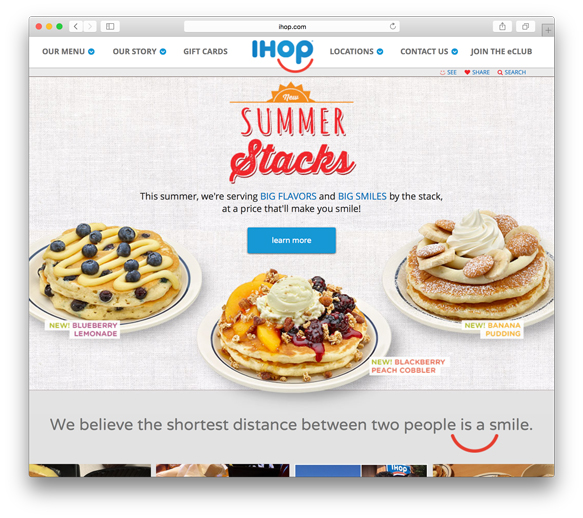
Belinda: Since I’ve never been to IHOP, I had to Google the menu! Everything sounds so delicious, I try the Blueberry Lemonade Pancakes!
David: Belinda, you’re in for a treat! This is one “shameless pleasure” breakfast that most of us haven’t had since our college days. Diets are out the window!
Jason: Belinda – I was impressed by how the rebrand was carried through to the website too. It will be interesting to see how long it takes for the physical locations to make the transition to the new look.