Perhaps not the quickest, but certainly the most surefire way to drum up some publicity is a shiny, new logo and rebranding. The Twittersphere could be awash with praise for the new design treatment—or flooded with hate manifestos 140 characters at a time. Remember the Airbnb redesign of 2014 Yep. Here are the rebrands that had the design world buzzing in 2015.
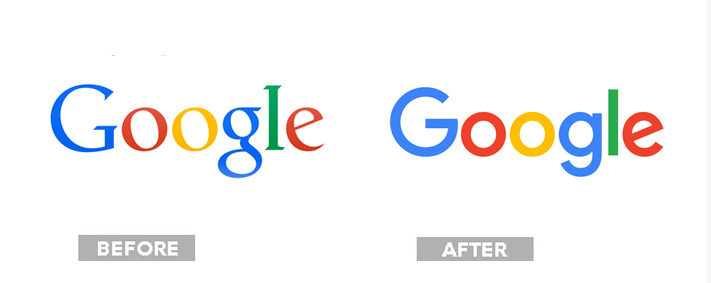
1. Google
You were surely living in a cave without WiFi if you didn’t hear about this one. The tech giant kicked the serifs to the curb and opted for this cleaner look. Critics went a little nuts over this, with some calling out the second “g” as out of place.
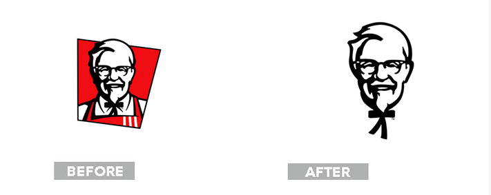
2. KFC
Say “KFC” and this year’s commercials with creepy Darrell Hammond and Norm MacDonald will probably come to mind. But that wasn’t the only change the chicken brand faced in 2015. The trusty fast-food chain also got back to its roots with a throwback logo and packaging for a cleaner feel. The same can’t be said for your body after taking part in a family pack, though.
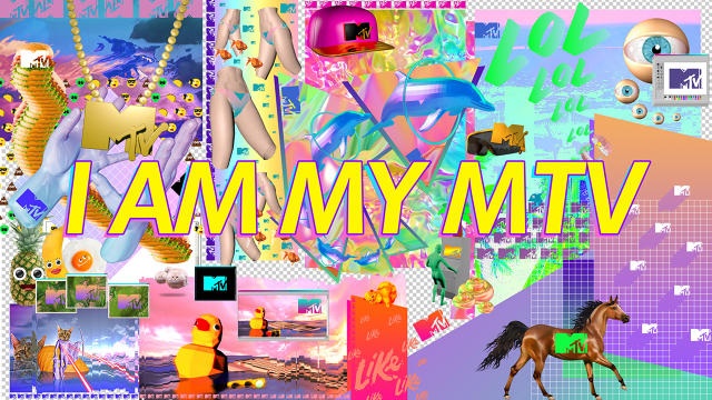
3. MTV
The brand has stood at the forefront of pop culture frequently during its time by embracing the current and what’s currently “cool with the kids.” In 2015 that meant switching the iconic “I want my MTV” to “I am my MTV” in a move to reflect a culture of self promotion and reality TV. The accompanying visuals are somewhat fuzzy, extremely chaotic, and an obvious grab at Tumblr-like sensibilities. No, this isn’t a fever dream. It’s the new MTV.
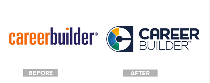
The masses spoke with a resounding hatred for the CareerBuilder redux. The logo of yore would size nicely and easily across devices, but this new look is something like if your dad decided to take up a graphic design course at a local community center on the weekends. Sorry, dads.
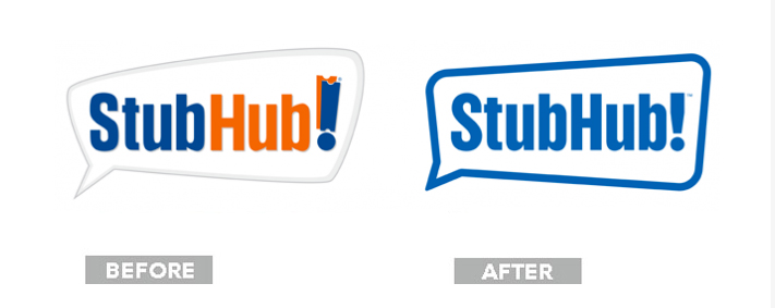
5. StubHub
The ticket commerce site’s former logo made us think of a sports steam with the complementary blue-and-orange colorway. We get it; the exclamation point is made of tickets! The decade-old logo got the boot in favor of this sleeker version that takes the focus off tickets in a move to give customers the complete event experience, including where to park your car and grab dinner before the show. Plus, the design allows for easy scaling across devices.
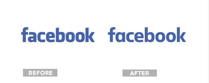
6. Facebook
Blink and you may have missed this subtle change the social behemoth made back in late June. The Klavika-font logo has been a mainstay for the site since 2005. So when it came time for a redesign, picking a font out of a lineup wouldn’t do for Zuckerberg’s brainchild. The custom font designed in-house is the company’s stab at making a modern, more approachable look for the brand. We can’t say the same about your Aunt Kathy’s political views she’s sharing on Facebook.
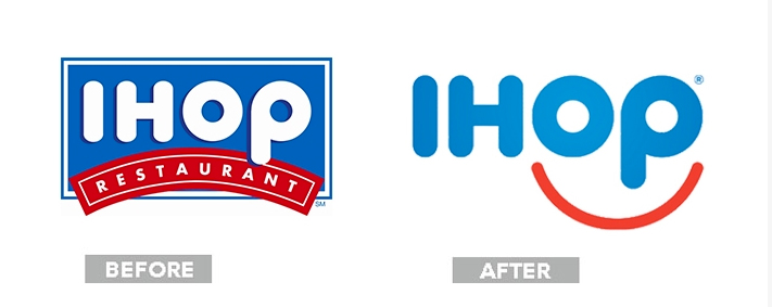
7. IHOP
The only place to meet your hometown friends over the holidays got an emoticon-ish refresher after 20 years. We get it, IHOP. Pancakes make you smile. The redo is obviously geared toward millennials. So is it working? For the record, this millennial liked the pancakes before and after the redesign.
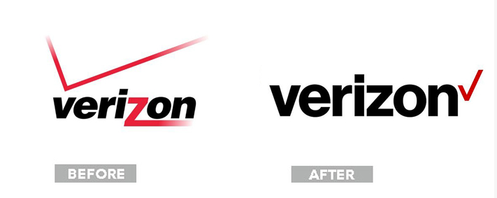
8. Verizon
The new look for Verizon is nearly the polar opposite of MTV’s. The old logo wasn’t exactly breaking ground in a design sense with 15-year-old look, complete with a gradient that wouldn’t do in a time when an inability to scale across devices can break a brand. The new, flat version is modern and plain, but keeps the check as an accent.
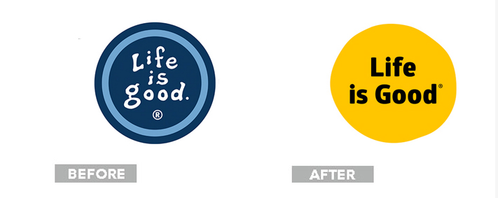
9. Life is Good
This brand is all about chillaxing, from its iconic stick figure luxuriating in an Adirondack chair on a JEEP decal to sunning itself in a hammock between two palm trees on the back of a T-shirt. The design aesthetic has always been a little messy, but fit in extremely well with is branding. So it’s a bit of a bummer to see this plain logo that bails on the charm of the original.
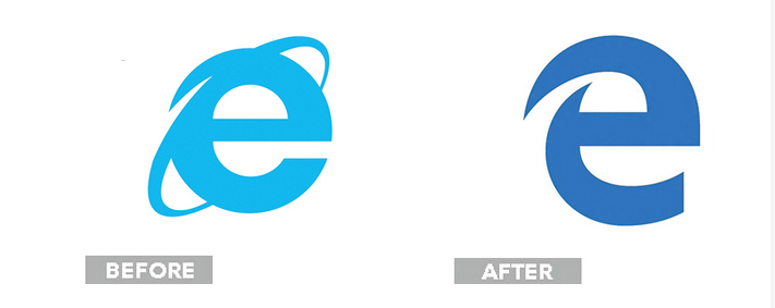
10. Microsoft Explorer turned Microsoft Edge
Is it technically rebranding if it’s killing off one thing and replacing it with another? For the sake of this list, we’ll say yes. Internet Explorer is the choice browser for people who don’t make a living off of the Internet, which is the reason why this redesign is actually brilliant. The “after” is awkward and a little ugly, but looks familiar for those just looking to get on a browser that will take them to the Internet. The design itself won’t win any praise, but the rebrand will.