We all remember those magical concert experiences that moved us so much we just had to buy a shirt. But there’s also something to be said for T-shirts that commemorate historic shows or tours that we didn’t get to attend. A treasure trove of rock memorabilia, Wolfgang’s features several lines of vintage shirts for music lovers of all ages. Naturally, many of the T-shirt designs draw from the amazing stock of poster designs commissioned by legendary Bay Area rock promoter Bill Graham, but the shirts pay tribute to the legacies of the respective artists as much as they do to the memory of the shows themselves. Not to mention that when you order from Wolfgang’s, you’re getting a “deliciously soft” shirt that the company advertises as “literally one of the softest you will ever put on your body.” Here are 10 favorite rock T-shirt designs to choose from.
Blue Cheer / Vanilla FudgeFillmore Auditorium, September 21 + 23, 1967 Just as Blue Cheer has become synonymous with the psychedelic/acid rock era (“blue cheer” was a slang term for a type of LSD, after all), so has the visual style of this T-shirt. You’ll actually have to lean-in a bit to make out the band name, but the iconic poster image by artist Bonnie MacLean is really the selling point here, as is MacLean’s signature lettering style. MacLean, who passed away in 2020, ascended to her role as one of the in-house poster artists for Bill Graham in 1967, after Graham, inspired by the way she drew letters on a chalkboard, decided to surprise her with an easel and art supplies for Christmas. Between 1967 and 1971, she designed a total of 32 posters for the company, many of which are still celebrated among the most enduring images from the period. Also on the bill for those two nights in ‘67 were Vanilla Fudge and The Sunshine Company. If you look closely enough, you’ll see a line at the bottom that reads “Note: Fillmore closed Fri. Sep 22 for Donovan at the Cow Palace.” Available in a women’s scoop-neck cut and a standard men’s fit.
Chicago / James Cotton Blues BandFillmore West/Winterland, March 26-29, 1970 Two months after the release of their sophomore album, Chicago touched down in San Francisco in March of 1970 for a four-night stand split between the Fillmore West and the Winterland Ballroom, two of the city’s most famous venues. All four nights also featured the James Cotton Blues Band and the groups Family and Fritz, with a light show by Brotherhood Of Light. Taken from a poster by artist David Singer, the style of Singer’s design suggests that Chicago during this period was a far cry from the band that achieved commercial success with a string of soft rock hits several years later. A hard-driving fusion ensemble with shades of progressive rock, Chicago’s sound fit the aesthetic of the period perfectly, as the psychedelic era transitioned into the ’70s. Here, it’s refreshing to see the band name printed in something other than the cursive font we associate with the band’s official logo, which allows us to imagine the more expansive music Chicago was making at this time. (Since it’s inevitable that this shirt will generate comments about the band’s later output, it might as well be sold as a conversation-starter. Fun tip: you can always share the trivia bit that the second album, though widely known as Chicago 2, is officially self-titled because the band had just shortened its name from Chicago Transit Authority to Chicago.) Available in standard men’s and women’s fits.
Santana / Dr. JohnFillmore West, September 10, 1970 Artist David Orr fused the primal with the sublime in his poster for this show, which also featured Dr. John, The Nighttripper, Luther Allison and lights by Heavy Water. Orr, who was fresh out of high school when the psychedelic scene blossomed in San Francisco, was hired at the age of 20 by Bill Graham’s art director Pat Hanks. This Santana image was his first assignment for the company, which Orr considered a good omen as Santana was one of his favorite groups. Of course, the elegance, raw power and spiritual magnetism of the tiger at the heart of the image all speak to what Santana sounded like at the time. Available in men’s standard fit and women’s scoop neck.
The WhoCow Palace, November 20, 1973 The Who famously hated hippie culture, and yet they will forever be linked to the psychedelic era via their barnburning performance at Woodstock, as well as numerous other bills they appeared on throughout the late ’60s and early ’70s. In 1973, the legendary rock band opened its U.S. tour in support of Quadrophenia at San Francisco’s Cow Palace. The date is memorable for the fact that drummer Keith Moon passed out on his drums twice about an hour into the set. But the show didn’t actually end there. Guitarist Pete Townshend took matters into his own hands, asking the crowd if there were any drummers present who could finish the night behind the kit. A 19-year-old Iowa native volunteered and played the last three songs with the band. Artist David Singer’s black-and-white poster image of a castle in space casts a mystical aura around a group that was known more for knocking audiences out with volume and fury—not to mention that it translates beautifully to a t-shirt. Available in traditional women’s and men’s fits as well as a men’s baseball jersey design.
Prince and The New Power GenerationFew pop-culture symbols are as recognizable as the unpronounceable logo Prince adopted for himself in the early ’90s following a contract dispute with Warner Bros. Unsurprisingly, the symbol looks fantastic on a shirt (especially a shirt made of purple-colored fabric). This design is taken from Bill Graham Presents art director Arlene Owseichik’s poster for a 1993 show at the Bill Graham Arena, though the shirt doesn’t include any of the info about the show. (It doesn’t need it.) Owseichik’s visually sumptuous touch has graced posters for appearances by Devo, the Pretenders, the Cramps, the Red Hot Chili Peppers, the Cure and the Grateful Dead, to name just a handful of the many Owseichik masterpieces available on Wolfgang’s. Here, though, Owseichik opted for a relatively straightforward design that looks like it had been made for a T-shirt all along. Available in women’s and men’s standard fits.
Metallica / Soundgarden / Faith No More / QueensrÿcheOakland Coliseum, October 12, 1991 The image of a giant metal serpent rising out of the waters around the Golden Gate Bridge perfectly sums up what Metallica represented in late 1991, when the band headlined a homecoming show (billed as Day On The Green) with Queensrÿche, Faith No More and Soundgaren—all representatives of a new vanguard in heavy rock. At the time this show took place, Metallica were in the process of rocketing from their status as the highest-profile band in metal (an amazing achievement in its own right) to a commercial behemoth and one of the most successful music acts on the planet. The T-shirt, available in a baseball jersey design, speaks to the seismic shifts occurring in popular music at the time, with each band on the bill representing a different facet of that shift. It also reminds us that the Bay Area gave us not one, but two crucial chapters in music history as the incubator of both ’60s psychedelia and ’80s thrash.
Led ZeppelinChances are, this shirt wouldn’t even have to say “Led Zeppelin” on it for people to recognize what the blimp on the shirt represents. That said, the vaguely art-deco lettering pairs quite nicely with the image of a once-futuristic looking aircraft hovering over what appear to be the ruins of a long-gone civilization on another planet. The image conveys the majesty, grandeur and scale of Zeppelin so well, in fact, that there really isn’t much else to say about it. The band has achieved such monolithic status in the pantheon of rock that it’s fairly likely its music will be known by future generations accustomed to real-life scenes not unlike what you see on this shirt. Available in women’s scoop-neck, men’s standard fit and baseball jersey cut.
Grateful Dead / Miles DavisFillmore West, April 9-12, 1970 The very thought of the Grateful Dead and the Miles Davis Quintet on the same bill inspires the mind to imagine infinite galaxies of sound, which is exactly what artist David Singer evoked in his nautilus-in-space poster for the four nights the two legendary acts shared the Fillmore West stage in April of 1970. At that point in time, the cross-pollination between jazz and rock had reached a kind of hyperdrive, with entire new genre ecosystems emerging as if after a big-bang event. In a sense, the audacious exploration of Davis’ electric period shared a common spirit with the Dead, even if Davis was a step or two further down the road that the increasingly mind-bending Dead would pursue soon after. Fresh off the release of the paradigm-shattering fusion landmark Bitches Brew (and just a year after the equally groundbreaking In A Silent Way), Davis linked up with the Grateful Dead train while the band was still in its Americana phase, months before their classic one-two punch of Workingman’s Dead and American Beauty. Nevertheless, this was a double-bill for the ages, well worthy of being immortalized on a T-shirt. Available in men’s standard fit and women’s scoop-neck.
Grateful DeadThere are, of course, many famous images associated with The Grateful Dead, but perhaps none of them looks more at-home on a T-shirt than this spare design of a skeleton standing atop the Winterland marquee. Designed by psychedelic design pioneer Stanley “Mouse” Miller, the image not only captures only the essence of the Dead, but the joy of live music in general. Available in women’s standard fit, men’s standard fit and men’s long sleeve.
Pink FloydOakland Coliseum, May 9 + 10, 1977 The epitome of eye-catching design, this image of a flying pig, seagulls and the towers of the Golden Gate Bridge partially obscured by clouds (get it?) is another one of those rock shirts that wouldn’t even need the band’s name on it for people to know exactly what it refers to. A reproduction of the poster for Pink Floyd’s two-night stand at the Oakland Coliseum in May of 1977 (when the band’s U.S. draw started to swell behind the release of Animals), designer Randy Tuten was aiming for a subtle play on 1950s air-travel ads. Today, we can look at the image as a kind of retro relic—a ’70s artist doing something of a throwback to a ’50s aesthetic. That said, there’s something timeless about the image and, other than the lettering style, it could easily be mistaken for a contemporary design. It makes an even more striking impression when printed on either bubblegum pink or baby blue fabric. Available in women’s and men’s standard fit, as well as pink and blue infant onesies.


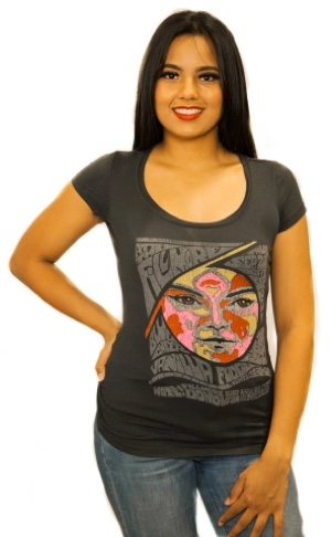 Fillmore Auditorium, September 21 + 23, 1967
 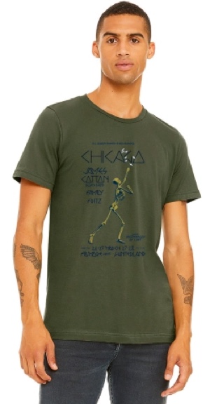 Fillmore West/Winterland, March 26-29, 1970
 Fillmore West, September 10, 1970
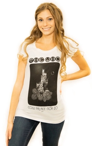 Cow Palace, November 20, 1973
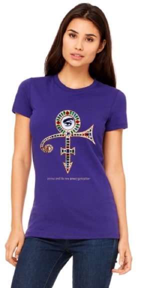 Few pop-culture symbols are as recognizable as the unpronounceable logo Prince adopted for himself in the early ’90s following a contract dispute with Warner Bros. Unsurprisingly, the symbol looks fantastic on a shirt (especially a shirt made of purple-colored fabric). This design is taken from Bill Graham Presents art director
 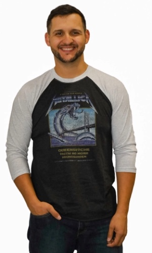 Oakland Coliseum, October 12, 1991
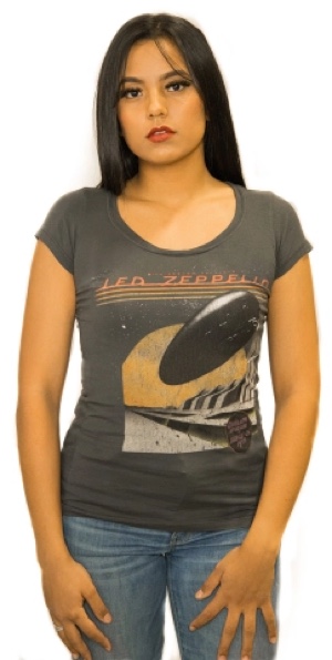 Chances are, this shirt wouldn’t even have to say “Led Zeppelin” on it for people to recognize what the blimp on the shirt represents. That said, the vaguely art-deco lettering pairs quite nicely with the image of a once-futuristic looking aircraft hovering over what appear to be the ruins of a long-gone civilization on another planet. The image conveys the majesty, grandeur and scale of Zeppelin so well, in fact, that there really isn’t much else to say about it. The band has achieved such monolithic status in the pantheon of rock that it’s fairly likely its music will be known by future generations accustomed to real-life scenes not unlike what you see on this shirt. Available in
 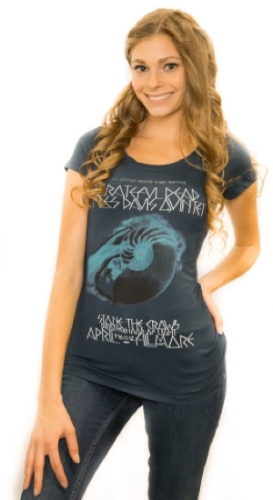 Fillmore West, April 9-12, 1970
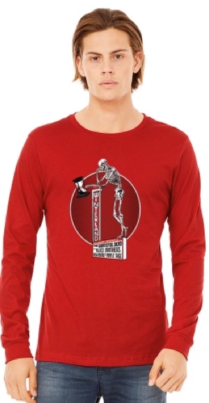 There are, of course, many famous images associated with The Grateful Dead, but perhaps none of them looks more at-home on a T-shirt than this spare design of a skeleton standing atop the Winterland marquee. Designed by psychedelic design pioneer
 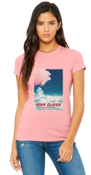 Oakland Coliseum, May 9 + 10, 1977