A few years ago, Microsoft made a significant change to the way Windows was going to work as an operating system. We’d no longer get the individual releases of Windows 9 or Windows 2020, which would need to be purchased and installed.
Instead, under the leadership of CEO Satya Nadella, Windows 10 was developed to be a platform, rather than an individual product. That means incremental tweaks and updates to the OS in the vein of what Apple has done with macOS (previously known as OS X).
Thanks to a leak from Twitter user Tom Hounsell, as well as some earlier leaks from MS Power User, we’re getting a look at what the first overhaul of Windows 10 could look like. Internally, this update is being called “Project Neon.” After the return to a simpler, more traditional design in Windows 10, the operating system is moving toward emphasizing new effects, animations, and design language.
Though it probably won’t be available to the public until the fall of 2017, here’s what we’ve learned about Project Neon based on the leaked screenshots:
1. Transparency
Photo leaked from MS Power User.
Remember Windows Vista? Yeah, Windows has definitely done transparency before.
However, what Microsoft is doing here is a bit more subtle. It looks similar to what Apple did back in iOS 7 and macOS Yosemite, giving the layers and windows of the OS a bit more depth. It uses that same “frosted” blur effect to give depth without it being distracting. According to the leaks, this new effect is being called “Acrylic” internally. As long as it’s not called Aero 2.0!
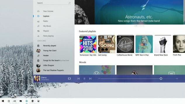
2. The Groove redesign
Photo leaked from MS Power User.
It’s hard to get away from the Apple comparisons in these leaks, but the most blatant is the redesign of Groove, Microsoft’s music player. In the screenshot, we get a look at the direction Microsoft is headed with the design of Groove, which looks like a mix between Spotify and iTunes. From the way the Featured Playlists look to even the font choice, it all looks pretty familiar to what Apple does with its design. Overall though, it’s a really nice update that modernizes the app, while still having of its own individual flair to stand alone.
Groove is also a portal into using the Groove Music Pass, which is a subscription music streaming service like Spotify. In other words, it’s very similar to the iTunes/Apple Music dichotomy that Apple has going in terms of function as well.
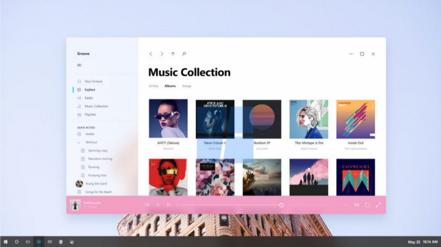
3. Say goodbye to borders and title bars
The biggest change in how this new iteration of Windows 10 is designed is how the actual windows look. The apps now seem to go edge to edge—yes, including the title bars. Essentially, the title bars (which feature the minimize, maximize, and close buttons) have been integrated into the app itself in the top right corner. It looks quite clean and modern in the Groove app, though we’ll have to wait to see how it plays out in other apps.
It’s not clear if this will be a feature built into each app, but there’s also a back button located in the top left corner for help with navigation. I’m most interested to see how Microsoft will use this design for applications with more complexity like an internet browser or Microsoft Word.
4. The Task Bar
The familiar Task Bar, which made its comeback in Windows 10, also looks like it’s getting a bit of a visual update. As shown in one of the leaks, it’s now completely white, with a hint of translucency mixed in. It’s a pretty stark contrast to the original version of Windows 10, which uses a black Task Bar as default.
Speaking of contrast, it looks as though icons will now be shown in black when they aren’t selected. All of this will no doubt probably be customizable in in the settings, but the lighter theme could be the new default that Microsoft is shooting for.
5. Next Generation Applications
We’re expecting to see a full unveiling of the update at Microsoft’s BUILD event, which takes place on May 10 this Spring. It’s a developer-focused event, so expect to see how these new design elements will be implemented across the system, as well as with third party applications.
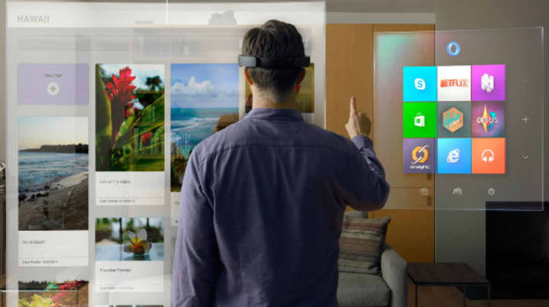
The update is also expected to be a redesign that works fluidly on all sorts of new devices such as future smartphones, the HoloLens, and Xbox One. According to WindowsCentral, Project Neon isn’t just a pretty update for desktop users— it’s a UI that works with the HoloLens to actually be mapped onto the real world using things like textures, 3D modeling, and lighting.
Here’s to hoping that Microsoft finally nails a platform-crossing design language that fully unifies the brand.