What’s in a belt? Well, if we’re talking about the magical, kayfabe-laden world of pro wrestling, then the answer is “pretty much everything.”
Championship title belts are the single most iconic image that is held in the collective pop culture consciousness when the phrase “pro wrestling” is uttered. They’re symbols of their companies/federations, and intensely associated with the champions themselves. It’s impossible to not think of Hulk Hogan when someone mentions the “winged eagle” WWF Title used in the ‘80s and ‘90s, or Ric Flair when the NWA’s “Big Gold Belt” is invoked. The belts are visual metaphors for the entire industry, and they drive many of the storylines.
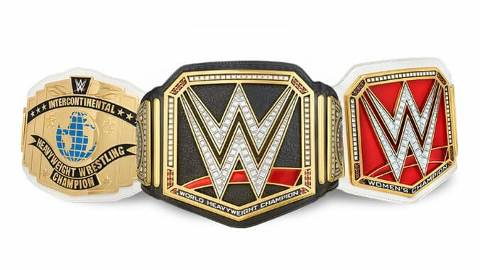
In the WWE, this is an interesting, novel time period for fans who love title belts. After years of condensing and eliminating titles from the company in an effort to streamline their business, the WWE has reversed direction. By separating the company’s roster onto two separate live shows, Monday night Raw and Tuesday night SmackDown, the WWE created a need for new titles—a “world title,” a midcard title, tag titles and a women’s title on BOTH shows. And with the addition of a new cruiserweight division as well, the WWE has added more new titles in the last couple of months than in pretty much any time in its history.
Therefore, this is now a perfect time to take a look at those titles—the literal belts, themselves, and rank their designs. Please note: We’re only talking here about which belts are the most visually appealing, not which of them are “best” or most relevant. We’re EXCLUSIVELY talking about design rather than application.
Here they are, from best to worst—because worst is usually more contentious than “best.”
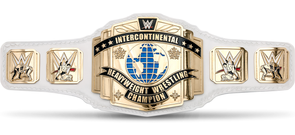
The current version of the illustrious, history-laden Intercontinental Championship was first introduced by then heel champ Cody Rhodes in 2011, and it immediately became my favorite of the modern belts. The white leather strap, a throwback to one of the belt’s older designs, is such an eye-catching and unique look that it immediately makes a statement. The overall design, with its touches of blue on the globe and gold on the plate, is simultaneously classic-looking and very clean and functional, while the sideplates are a nice tribute to wrestling history.
It’s simply a dignified, classy looking belt. There’s a reason why wrestling fans so often say that the IC belt “would look great” around the waist of various wrestlers, and it’s because the belt is so good-looking that it looks great on almost anyone. It has a touch of elegance that none of the other current WWE belts can match, and it doesn’t look like any of the other belts.
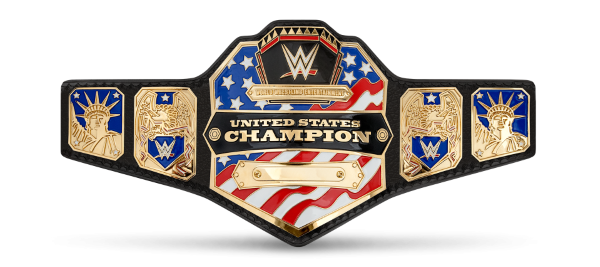
2. WWE United States Championship
I often feel like the United States Championship is the least-appreciated of WWE’s belt designs, and that’s a shame. Of all the belts, it most easily and immediately conveys exactly what it’s supposed to say—“this guy is the champion of the United States,” rather than the “world champion.” The star-spangled look fits it perfectly, and makes it easy for any face holding the belt to rock a patriotism gimmick, or any heel holding it to run down the U.S.A. to easily get boos. I even like the text, which cleanly gets the point across at a glance with its large, central positioning. Like the IC belt, one of its strongest aspects is that it’s truly unique for the company, with an entirely different shape and visual motif than any of the other belts. It’s impossible to mistake it for anything else, and that’s something all the belts would ideally have. Unfortunately, that’s not the case.
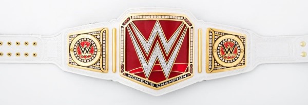
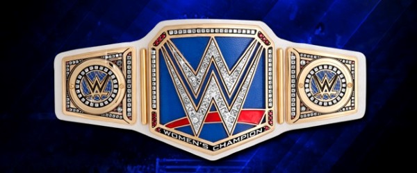
3. Raw Women’s Championship
Introduced as the “WWE Women’s Championship” in April of this year after the company FINALLY decided to stop referring to the female performers as “divas,” it’s now the Raw Women’s Championship thanks to the creation of a simultaneous women’s title on SmackDown. It’s also the highest-ranked representative on the list to feature what is about to become a running motif—the same basic design that is repeated four times for the Raw and SmackDown world and women’s championships.
To which I say: Look, I get what they were going for. I can see how you’d want some form of visual consistency across your top titles for both women and men, but they’ve all ended up looking too similar to each other. If they were all designed simultaneously, I doubt this is the route that the WWE would have taken, by the way. Rather, they sort of wrote themselves into a corner when they created the Raw Women’s Championship, because the whole idea was to create something that conveyed a sense of equality to the men’s belt. This was a good idea, but it becomes watered down when two more belts with twists on the same design are then introduced six months later.
Of the belts in this mold, however, the Raw Women’s championship has the cleanest look. It benefits from the white strap in the same way that the IC belt does, which looks great in contrast with the red face. The gemstones are a little ostentatious, but they actually stick out a bit less than on other versions of the belt. And I love that nothing on the belt specifically proclaims that “this is for women,” unlike the hideous butterfly title that the WWE was using until spring of this year. The current belt is certainly a massive improvement over THAT disaster.
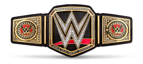
4. WWE World Championship
The name and lineage of this belt is incredibly complex, as it spans all the way back to 1963 under dozens of designs, tweaks and name changes, but suffice to say, the current name is simply the “WWE World Championship.” This version of the belt was introduced in 2014 after the company’s two top titles had been unified, and it was thus the first to bear the same basic design that it now shares with three others. It at least does maintain a little bit of individuality by being the only black-strapped title in the company, which I personally like, as it projects a certain sense of toughness.
However, this design at its core does have a few flaws. It makes its “world heavyweight champion” text so small that most people would never even notice it, and instead turns the entire front plate into an advertisement for the company’s logo, rather than something that conveys a sense of prestige. Wrestling fans have often complained that this was done primarily for promotional purposes, so that the logo would be visible on wrestlers carrying it on red carpets and award shows, or on belts given to celebrities and athletes to display in public. Still, the end result is still a serviceable belt.
5. SmackDown Women’s Championship
There’s not a lot to say about this newish belt for the SmackDown Women’s Champion, which has only been around since August. It’s simply a palette-swap of the Raw Women’s Championship, although the blue does have a nice look of its own that fits the SmackDown branding. It does also look a little bit unintentionally patriotic and American flag-like, but this isn’t much of a concern. Its biggest issue is that it simply suffers from design fatigue. WWE undoubtedly would have had a harder time introducing a new belt shape/basic design for this title and the Raw Universal Championship (more on that soon), but it really would have helped them stand on their own more ably. This one can’t help but fade into the background somewhat as a result.
6. WWE Cruiserweight Championship
The WWE’s newest belt has been around for less than a month, so it hasn’t had much of a chance to get showcased just yet. It’s an interesting design departure—I certainly appreciate that they didn’t make yet another with the same mold as the world titles, which would have been ridiculous. The execution, on the other hand is so-so.
The purple is obviously the belt’s most immediately notable aspect, which is a carryover of the purple branding from the WWE’s Cruiserweight Classic, where the first champion was crowned. Purple is the official color of the division, but it seems almost more naturally suited as a companion to the blue of SmackDown than the red of Raw, where it exclusively appears. One thing I do like is the shape of the main plate, an unusual heptagon that feels sort of similar to something you might see on Lucha Underground. All in all, the color and look feel like it’s supposed to be a “fun,” more lighthearted belt, which also may fit in a division where the champion comes out to what sounds like a Mega Man remix. This design isn’t the most traditional or classic wrestling title belt, but it may very well grow on me in time.
7. SmackDown Tag Team Championship
The SmackDown tag team titles are simply a palette swap of the earlier Raw Tag Team Championship, but in this case the palette swap is actually somewhat better than the original. The tag belts in general have been heavily criticized in the years since the round design was first trotted out in 2010, which fans have likened to the sort of flattened penny you’d get out of a vending machine at the zoo. But if a penny sucks, then I suppose a dime is slightly better? If anything, it’s the blue leather strap that makes this one pop, and although silver is less common for wrestling belt plates than gold, it still does convey some sense of “this thing is valuable.” The gladiators, I never had any particular problem with, but it would be nice if the “tag team champions” text was offset in some way (such as with color) to make it more legible.
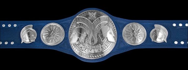
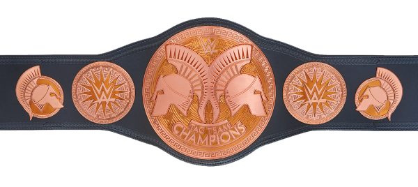
8. Raw Tag Team Championship
Ah yes, the aforementioned pennies. Suffice to say, there’s a reason why nobody makes their wrestling belts look like they’re clad in copper. Because nothing exudes the idea of value like pennies, right? The coin that costs more to manufacture than it’s actually worth as currency? Those pennies?
These belts are almost universally disliked among wrestling geeks, and I really can’t argue against that point. I’m not sure what the design behind the gladiators helmets is supposed to be—a maze, or something? Did they go with one Greek/Roman bit of iconography and decide to evoke Theseus and the minotaur as well? I have no idea. But of all the belts in the company, this is the one that should most be in line for a redesign. Enough time has passed since their introduction where it would be reasonable to bring out an entirely new belt, and you could simultaneously leave the SmackDown version untouched.
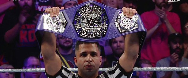
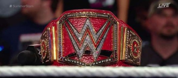
9. WWE Universal Championship
The most recent WWE world title, exclusive to Raw, has had a lot of shit thrown at it … and honestly, it deserves most of that shit. From the moment it was unveiled on Raw, the crowd in attendance turned against it in what was frankly an impressively united way, considering it was something they’d just seen for the first time.
To me, the biggest issue is with the pattern/texture of the main plate. Although some of the other world title/women’s title belts also have some of that ripple effect, it doesn’t look even close to as prominent and obnoxious as it does on the (stupidly named) Universal Championship. That, combined with the monochromatic red, makes the title look rather like the face of Todd McFarlane’s Spawn, or as so many wrestling fans joked, as if it was made from wrestler Shinsuke Nakamura’s red leather jacket. I think that visually, some of the overload of a single color also stems from the globes in the sideplates, which are a nice red counterbalance in the Raw Women’s title or the WWE World Championship, but are too close to the color of the (also red) strap here. It just looks subtly wrong, in addition to being too similar to the Raw Women’s Championship in color and design already. For the top-tier title of WWE’s flagship show, the company needed something that looked unique from the rest of the lineup. What they got was the worst example of four versions of the same design.
Jim Vorel is one of Paste’s several resident wrestling geeks. You can follow him on Twitter.

