

Graphic design trends are fickle friends. As soon as you’ve mastered a technique or style, it becomes unfashionable and your portfolio cliché. But never fear! We’ve compiled a list of five trends that are sure to be big hits this year. So get ahead of the curve and take note of what’s to come in 2015.
Thick Brush Lettering
Handwriting is a lost art. As typography becomes more sophisticated, there’s a push back from clean lines toward flawed, varied hand type. Splotches and imperfections make hand written letters stand out, and give a projects a friendlier vibe.
Calligraphy had a big moment in 2014. Modern-style calligraphy, featuring very thin and very thick lines and large spacing between letters, has been popping up all over wedding invitations and motivational posters on Etsy. But for a less feminine, more solid look, 2015 is all about thick brush stroke type.
Digital typefaces that imitate brush strokes are available to download — but nothing quite beats doing it by hand.
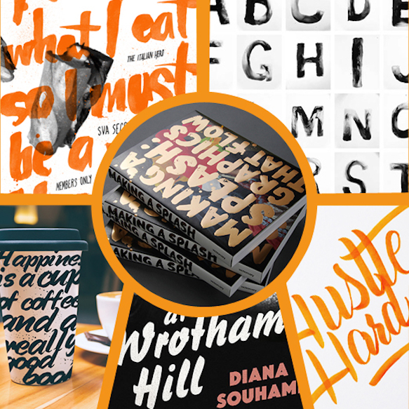
Clockwise from top left:
SVA Secret Sandwich Society Poster Series by Zach Harter
Helvetica Inked by Larissa Scholtis
Hustle Hard & Stay Humble by Laura Dillema
Murder at Wrotham Hill book design proposal by Clare Skeats
Typography by Sudakshina joshi
Center:
Making a Splash by victionary hk
Subtle Gradients
Nothing suggests the early days of web design like harsh, unnecessary gradients. But they’re making a comeback — in a new way. When Apple iOS 7 updated their app icons in 2013, they used subtle gradients, and much of the design world followed suit. The new look is smoother and less flashy, even when using bright colors. Smart illustrators use subtle gradients effectively to suggest a change in light, or to give an object depth. It’s one way to make a minimal, flat design stand out. The trend picked up steam in 2014, and only seems to be growing for 2015.
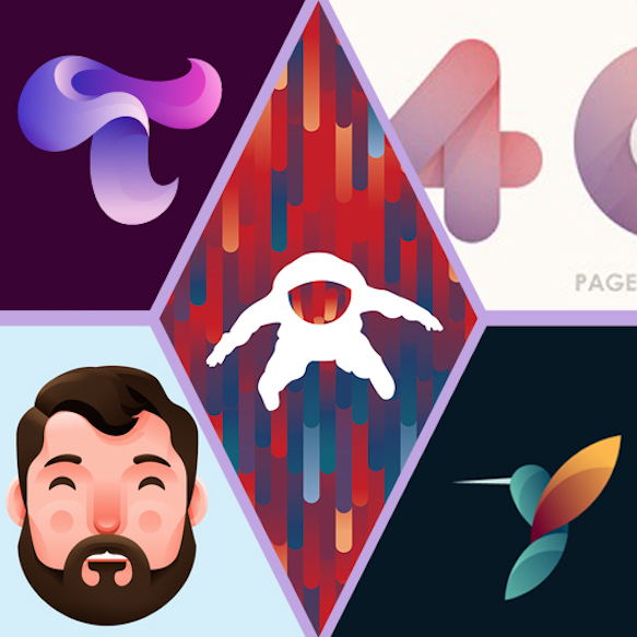
Clockwise from top left:
T by Ivan Bobrov
404 logo concept by Yoga Perdana
Animal Logos Vol 1 by Tom Anders Watkins
Bearded Dude by Nick Slater
Center:
Take risks. Conquer your fears. by Tom Anders Watkins
Liquid and Smoke
The best way to break free of straight lines is to add a puff of smoke. This effect is often made by dripping ink in water, photographing it, and adding special effects in Photoshop. It adds depth, color and a little abstraction to an otherwise ordinary image, elevating it to the next level.
But don’t get stuck using pastels and neutral colors — this effect looks its most radiant in neon colors over a pale background. Add it to a typeface or photograph for maximum effect.
Clockwise from top left:
Colors Experience by Studios Meca
Psyche by Florian Mueller
Chemical Cloud typo by José Bernabé
Heavy Metals by Alberto Seveso
Ayaka – Beautiful EP by Alberto Seveso
Objects Intersecting with Type
This is a difficult effect to achieve, but if done right, it pays off. The most popular objects to layer with lettering are flowers, landscapes and people. It’s not a particularly readable style, so stick to simple words and phrases, and use a plain font color so your message doesn’t get lost in the crowd.
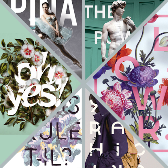
Clockwise from top left:
The Motion Theater by Caroline Grohs
The Power of Marble by Nikita Nikiforov
Illustration «Flower» by Aleksandr Gusakov
Typographic Mindset by Mark Niemeijer
Communer de Paris by Kim Roselier
Cards by Antonio Rodrigues Jr
Airbrush
Texture can make or break a good piece of design, and a new way to do that is by old-school airbrushing. No, not the kind of airbrushing that smooths out pores and wrinkles, but the old-fashioned, Art Deco kind that is reminiscent of a stencil. It’s a little geometric, a little texturized, and coming back big time in illustration. Whether it’s done by hand or a clever Photoshop effect, this 20th century look is a neat detail for 2015.
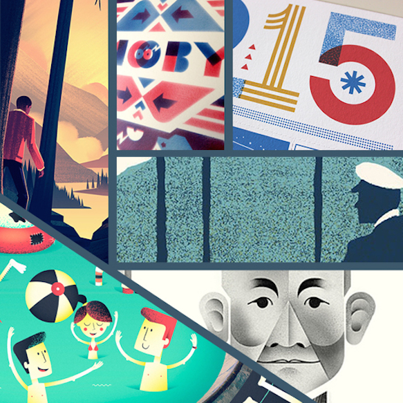
Clockwise from top left:
The Vanishing Man by Brian Miller
Moby Poster by Junichi Tsuneoka
2015 Brave Wall Calendar by Brad Woodard
Feest In Den Hof by Stijn Felix
Kishi Bashi by Andrew Colin Beck
Bucuresti Optimixed by Paula Rusu