
The 5 Worst Things About the Galaxy S8
Photo by Drew Angerer / Getty Images
As it has been thoroughly documented, 2016 was not a great year for Samsung. However, Samsung hopes you’ll forget about its past and embrace it’s new smartphone. I’ve liked a lot of what I’ve seen about the Galaxy S8 thus far. There are plenty of reasons why the Galaxy S8 should be your next smartphone: that dazzling display, a great design, and top-of-the-line performance.
More than anything, the Galaxy S8 is a comeback party for Samsung and a way of getting back into the good graces of smartphone consumers. It hits store shelves just next week and will soon be in the hands of the public.
However, not everything about the Galaxy S8 is perfect. Here are the five worst things about the Galaxy S8 that you should probably be aware of:
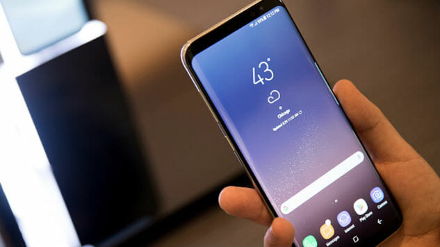
1. Holding and using the phone takes time to get used to
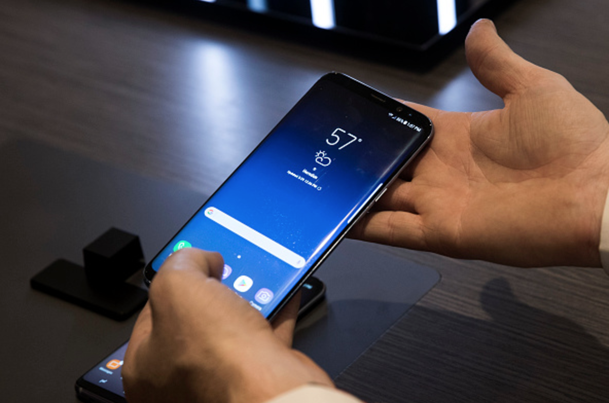
Photo by Drew Angerer / Getty Images
The big story with the Galaxy S8 is the “Infinity Display”—a screen with nearly no bezels. The tradeoff for getting that amazing display is that holding it in your hand isn’t quite as comfortable as a phone that has an actual edge.
There’s definitely a learning curve for getting used to holding and using the phone without accidental screen touches. It’s something we’ll all probably need to get used to as bezels become a thing of the past, but there’s no arguing that the device feels daintier and touchier than your average smartphone.
2. The fingerprint button is in a weird position
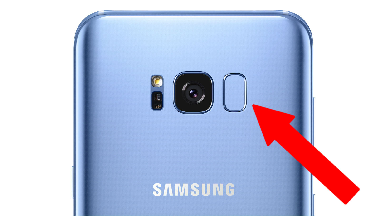
One of the other problems with having that immersive display is that the fingerprint scanner have been moved to the back of the device. While plenty of other manufacturers (such as LG) have moved the home button and fingerprint scanner to the back, none have severely misplaced it quite like this.
If you’re going to move something to the back of the phone, it better be done in a way that it can be both reached and deciphered without too much trouble. Placing the fingerprint scanner to right next to the camera is only asking for smudges all over your camera. Not only that, most people will have to do a bit of a hand stretch to reach your finger to it.
3. The camera hasn’t been updated
Photo by Phil Walter / Getty Images
While the Galaxy S7 was no slouch in terms of its camera, competition in the the smartphone race never lets up. That’s why I was a bit disappointed to hear that the Galaxy S8 has the same sensor and camera as the previous iteration. The one new feature Samsung has here is the upgraded front-facing camera, which is now a 1.4?M, 8.0-megapixel camera.
It would have been nice to see Samsung at least implement a dual-camera, like those found in the iPhone 7 Plus and the LG G6. Don’t expect much of a camera upgrade with this device.
4. Those gross app icons
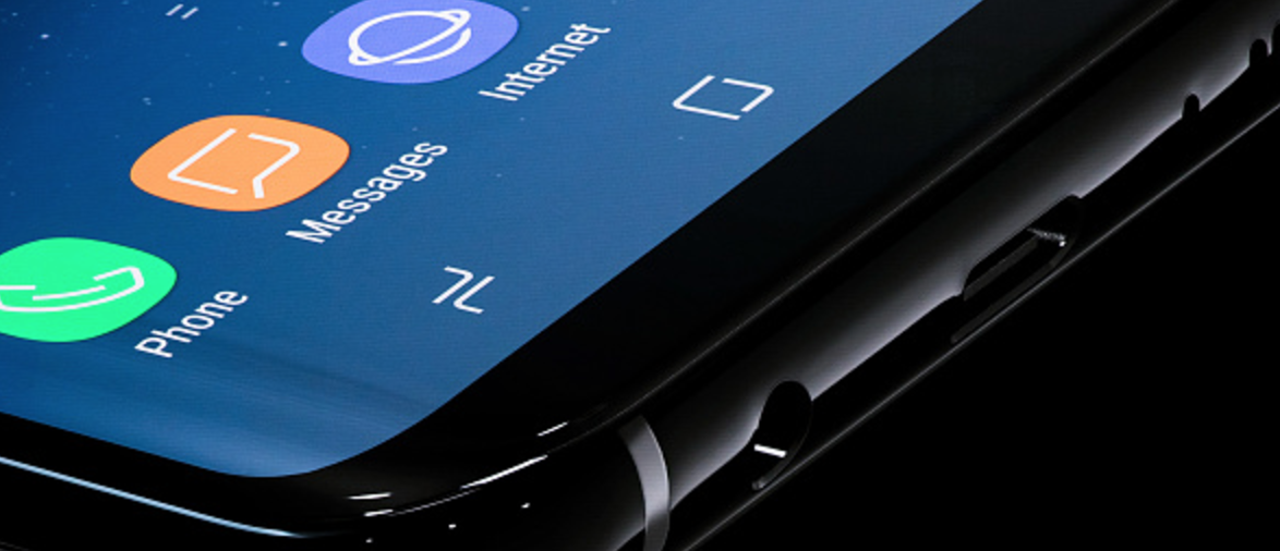
Photo by Drew Angerer / Getty Images
Okay so Samsung has never been known for its software design. It’s come a long way from its cringy fonts and animations of the Galaxy S4 and S5 days, but it still feels like it’s a step behind the modern design language of Apple, Microsoft and Google.
The worst of it is the replacement of the soft controls at the bottom of Android. Samsung removed the refined triangle, circle, square controls of modern Android, and puts in its own ugly icons. It all feels completely unnecessary when you consider that the software is built on the beautiful design language of Android.
5. Software Duplication
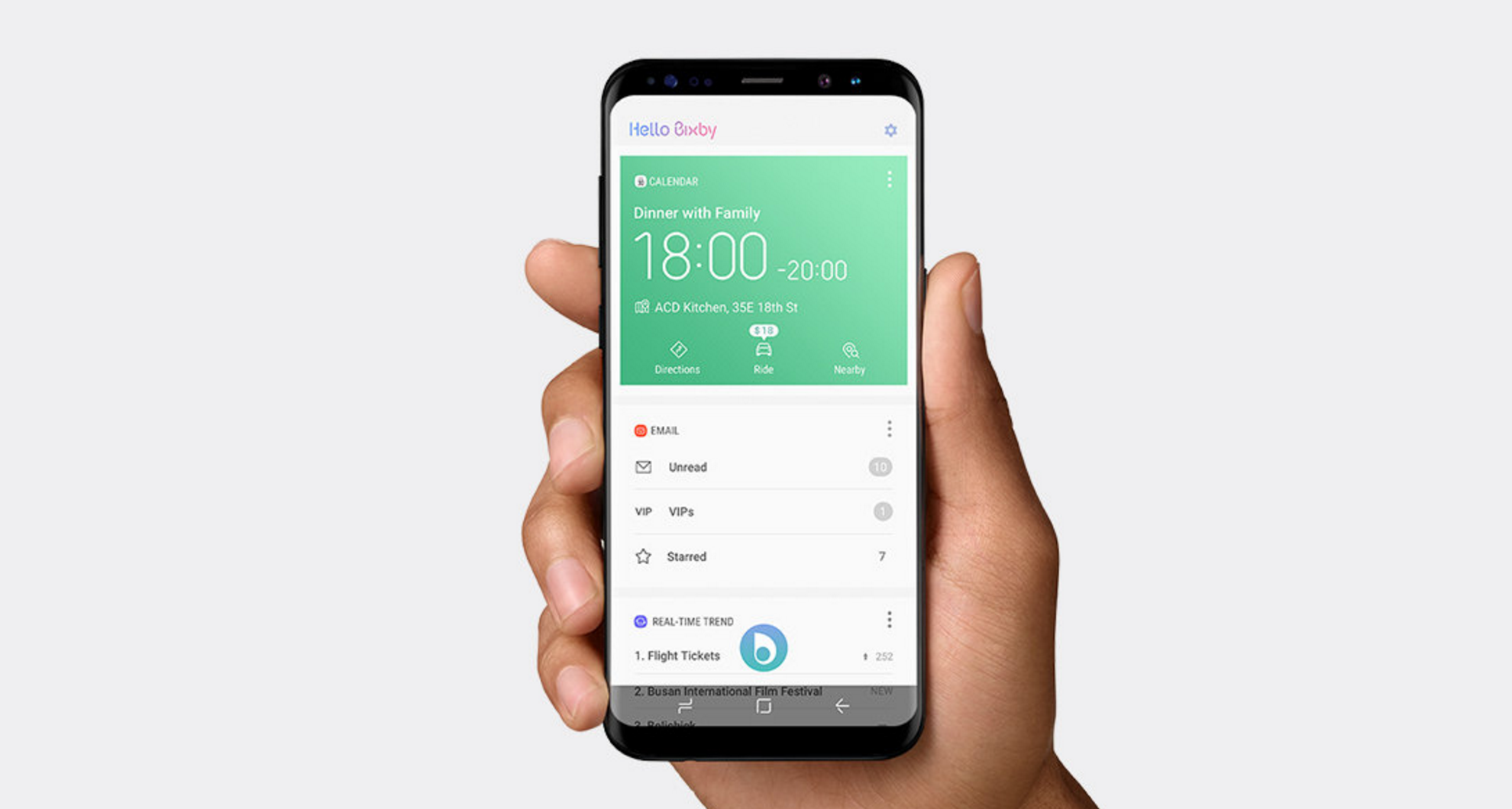
Photo by Drew Angerer / Getty Images
Samsung’s philosophy of mobile software is confusing at best and downright irritating at worst. For every feature Google has implemented into Android, Samsung has doubled—in usually a less-satisfactory way. That means for every Google app that comes in the device, you’ve also got a Samsung version. Throw in the carrier apps that may come pre-installed, and you’ve got a confusing mess of applications that bog down the experience of using the device.
The best example is a new smart assistant called Bixby. Every company’s got a personal assistant these days, but Bixby doesn’t really offer much to differentiate itself from Google Assistant, the other artificial intelligence that just happens to be built right into the infrastructure of the operating system. Long press the home button and you’ll still get the Google Assistant pulling up. Confused yet? The result is the kind of clunkiness that has people running home to the unified approach of iOS.