State of the Art: Inside David Mack’s Mixed-Media Approach to Jessica Jones & Fight Club 2

If you’ve ever seen a David Mack cover, you likely remember it.
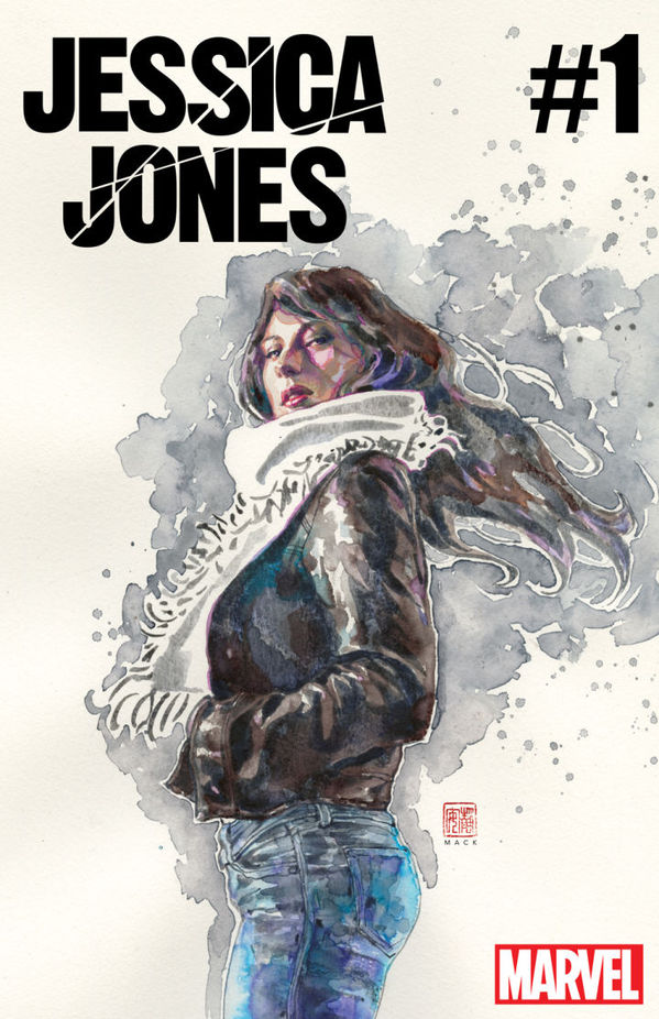
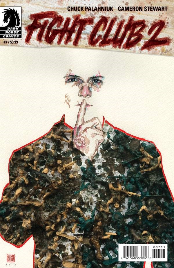
His striking, multimedia paintings have drawn plenty of eyeballs to Fight Club 2, Mack’s creator-owned series Kabuki and Jessica Jones, whose first issue debuted last week. Mack is a unique force in comics, bringing an adventurous, trans-disciplinarian approach that separates him from his peers, much as Alex Ross’ realism distinguishes his work.
When creating covers, Mack considers the context: he wants to “grab people’s attention and differentiate that book from all the other books on the shelf. How does it look in the comic store? How does it look in the bookstore? What’s going to grab their attention to look at it first?” he explained to Paste at Wizard World Chicago. His philosophy is partly motivated by the fact that “in reality, people aren’t seeing only that image—they’re seeing that image on a shelf of many other books.” White space is one way to “make them zero in on [his] cover… A lot of [his] images will have a lot of white on the borders, because it immediately sets them off from whatever’s next to it.” This approach can be seen in the gorgeous first cover for the new Jessica Jones from writer Brian Michael Bendis and interior artist Michael Gaydos.
While catching the reader’s eye, Mack makes sure his covers “…crystalize one of the interesting themes from the story itself.” If that theme is layered—literally and psychologically—all the better. Mack says he particularly enjoys movies, books, comics and other art forms that can be enjoyed for different reasons at different life stages, and that’s an experience he bakes into his covers and interior work. For Mack, the layers should peel away slowly over time for readers. “Someone will think something when they first see it,” he said, “and after they read the book they’ll come back and see another layer.”
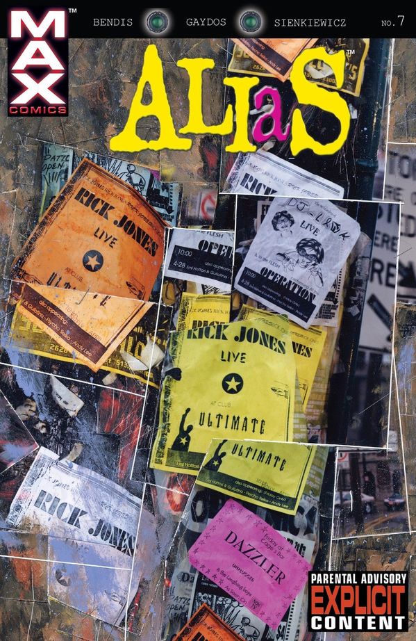
The artist often achieves this layered effect through the use of found objects, which are a trademark of his work. Mack is always prepared to reinvent a regular object, thanks to the prodigious contents of his basement and garage, where he stores material that might be considered trash by most people. For Mack, it’s a palette that can be tapped as needed.
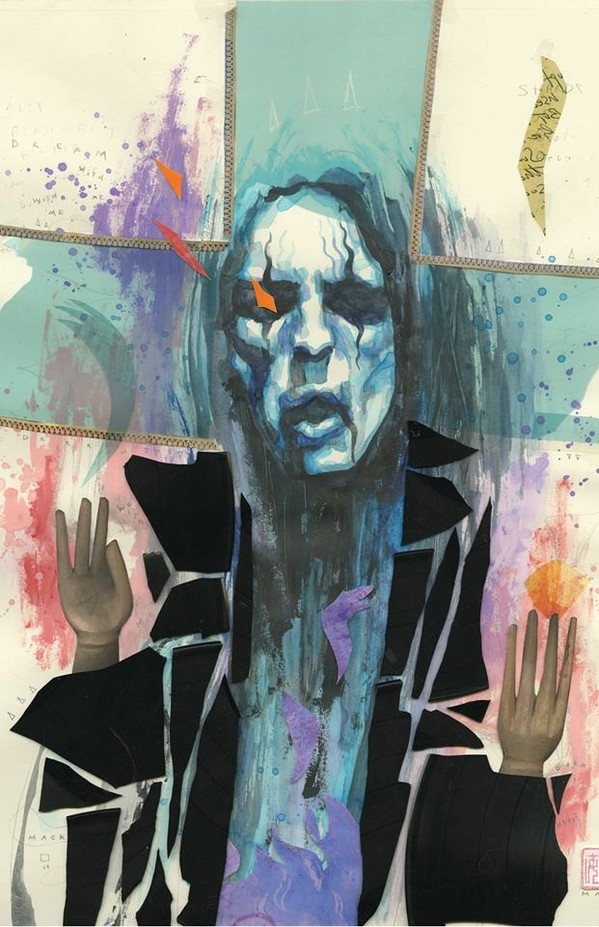
When putting together the above Alice Cooper cover, Mack used an appropriate medium. “I took all these old records, and I broke them into little pieces. I collaged the actual bits around the character.” In this case, Mack said the record bits were “a symbol and theme of the story itself.”
-

-

-

-

-

-

-

-

-

-

-

-

-

-

-

-

-

-

-

-

-

-

-

-

-

-

-

-

-

-

-

-

-

-

-

-

-

-

-

-

