Glenmorangie’s Classic Scotch Whisky Labels Just Got a Major Redesign
Photos via Glenmorangie Drink News whiskey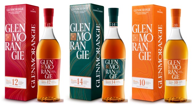
First things first, to state the obvious: I am not a graphic designer, and my taste in art and color has never been characterized as expansive or particularly insightful. I’m merely a spirits geek who loves whiskey, and doesn’t mind poring over a beautiful whiskey/whisky label while I’m at it. With that said, I’m not out here making purchasing decisions based on labels, artwork or branding … but I do notice when a company updates a classic label, because it typically speaks to their desire to refresh a brand and hints at how that company views the current whiskey market.
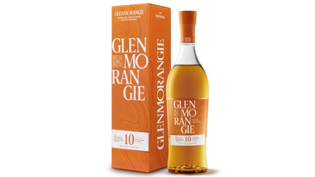
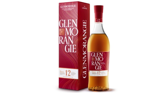
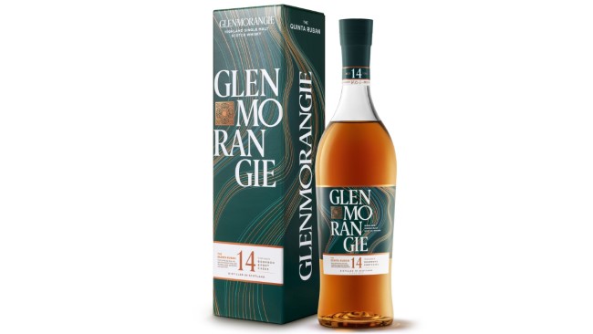
And with that said, today’s newly announced Glenmorangie rebrand feels like a pretty big one, affecting three entries in the iconic scotch whisky distillery’s core range: The 10-year Original, 12-year Lasanta and 14-year Quinta Ruban. The liquid inside is unchanged, but the labels are pretty strikingly different, eschewing the delicate details of the current labels for brighter, bolder colors and massive text. As the company puts it:
The bold colors of the carton were selected to catch the consumers’ attention and reflect the taste of the three different whiskeys. The orange packaging of the Original reflects the orange and peach notes of the liquid, while the red packaging of the La Santa draws on the whisky’s sunset-like taste and the deep green of the Quinta Ruban denotes the velvety depths of the liquid. Louise Dennett, Glenmorangie Global Head of Brand, said: “Our whisky is truly delicious and our reimagined packaging brings its flavors to the fore. We see this as an opportunity to welcome new drinkers with a playful elegance which reflects our creativity in whisky making; and to ensure our single malt stands out by using bold colors and enhanced branding.”
That’s the positive spin on the change, sure. You can’t argue with the fact that these labels will probably “stand out” more on the shelf, and that seems to be the whole point—that a consumer browsing through the scotch aisle will have a hard time missing these when his eyes pass over them. But at the same time, I imagine that some detractors will also see these labels as something of a “dumbing down” of the more previously elegant Glenmorangie brand, particularly in the case of The Original, which had a pretty iconic label already. The “primary color”-type approach, one could argue, feels like the move of a company that is worried about being overlooked in the modern market, rather than a beloved brand that is confident about its station within the industry. Again, I’m no designer, but I can’t help but get that impression. I’m curious how other consumers will feel about it.
Thankfully, the whisky itself—including my beloved Quinta Ruban, an always underrated dram—should be just the same as it always was. Regardless, you can get a closer look at the newly redesigned labels for each bottle below.