
Apple’s Dynamic Island Might Be The Silliest And Coolest iPhone Feature In Years
Image via Apple
It’s become an annual tradition for Apple to refresh its iPhone lineup, with it typically getting spec bumps one year and more substantial refreshes the next. This year;? We got a bit of both.
Where the iPhone 14 is basically a slightly goosed-up version of the iPhone 13, Apple got a bit more creative with the higher-end iPhone 14 Pro and iPhone 14 Pro Max—giving users a sneak peek at what will likely be the future of how notifications and widgets will function for the next few years in iOS. Or at least a sneak peek at what Apple is thinking about how those things will function.
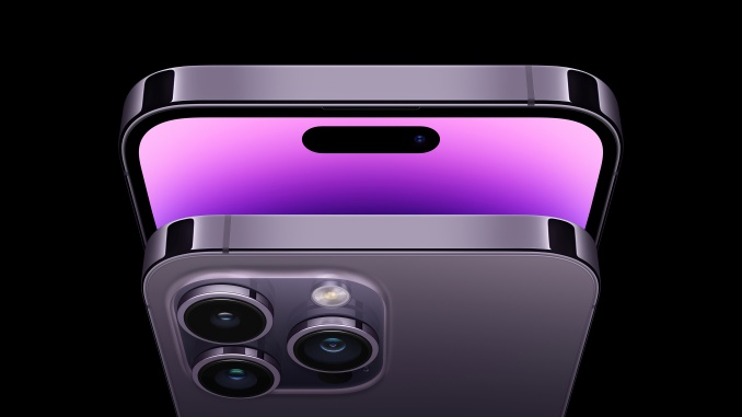
The notch at the top of the iPhone’s display has become a signature piece of the design at this point, due largely to the fact that Apple can make pretty much anything stylish if it tries hard enough. But where the iPhone 14 just keeps the same ol’ notch, the Pro and Pro Max trade it in for what can best be described as a pill-shaped space sitting slightly below the top of the screen, which looks to be a bit bigger than the old notch. For practical purposes, it houses the camera and scanner tech for Face ID, but instead of just leaving it there like the notch of old, Apple has built that space straight into the UI experience.
Apple describes the space; as being “hardware and software and something in between,” and marketing babble aside, it’s pretty accurate. The pill-shaped area—which Apple is calling the Dynamic Island—is now the home to notifications, widgets and any other unknown features and use cases Apple seems to be cooking up. When you’re playing music or podcasts, the functionality and play bar will “bubble” up for access, or when you’re making a FaceTime call the functionality will expand. The same for accessing real time data, such as sports scores and weather forecasts, or when making a phone call, booking a ride share or getting beat by beat notifications for directions.
Instead of bouncing up a notification window overlaying on top of the screen (or just forcing open the applicable app itself), the Dynamic Island expands its existing black space to relay that information and make it interactive. Basically, it gives the illusion of that widget spot always being there via the island, and it just expands and retracts whenever you need to access it, or whenever you’re interacting with an app that connects with it for functionality. Sure, it makes for a weird little floating black spot when you’re watching a video in full screen, but so was the notch—we got used to that. It stands to reason we’ll get used to this soon enough, too.
Thankfully, it does look very cool, which is a plus.
But beyond the slick animations, this opens up a whole lot more possibilities when we glance at the crystal ball for the iPhone 15 and beyond. Apple made some massive changes; to the lock screen in iOS 16, finally adding some customization options, widgets and a whole lot more of the things Android users have been enjoying for years. But along with the Dynamic Island, the iPhone 14 Pro and Pro Max also adds another killer feature Apple’s line has lacked up to this point: an always-on display.
All those customization features and real-time widget data takes on even more importance when you combine it with an always-on lock screen. Now, the iPhone can deliver personalized data (i.e. glanceable sports scores, weather, headlines, notifications and more) without having to wake it up. Melding those new functions with the Dynamic Island could make it even smoother to use your iPhone without actually having to open apps and use it, if that makes sense. A user interface is at its best when it can get you what you want simply and with as few clicks as possible. Popping it into a dynamic space and letting me tell it what to put there so I don’t even have to click and scroll through apps in the first place? That’s the real killer app.
Creating a floating widget tool that’s always there and finding a way to funnel all that functionality into one place is a brilliant move for Apple. Once more app developers get time to optimize for the Dynamic Island, it should streamline all those interactions into one place where you no longer have to bounce between apps just to complete simple tasks and interactions, while also not having the widget itself take over the entire phone to get you there.
The Dynamic Island might look like a silly gimmick from the jump, and for a while it’ll probably be just that as Apple figures out the best use cases and gets more data on how people use it, but it represents what could be one of the company’s biggest UI tweaks in years.
Trent Moore is a recovering print journalist, and freelance editor and writer with bylines at lots of places. He likes to find the sweet spot where pop culture crosses over with everything else. Follow him at @trentlmoore on Twitter.