

Writer/Artist: Nick Drnaso
Publisher: Drawn & Quarterly
Release Date: January 26, 2016
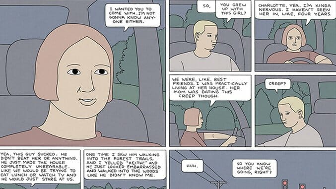
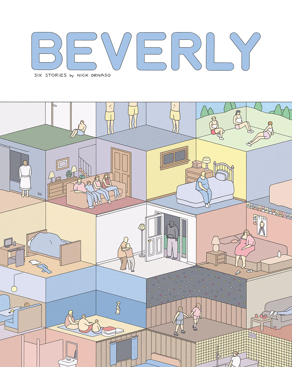
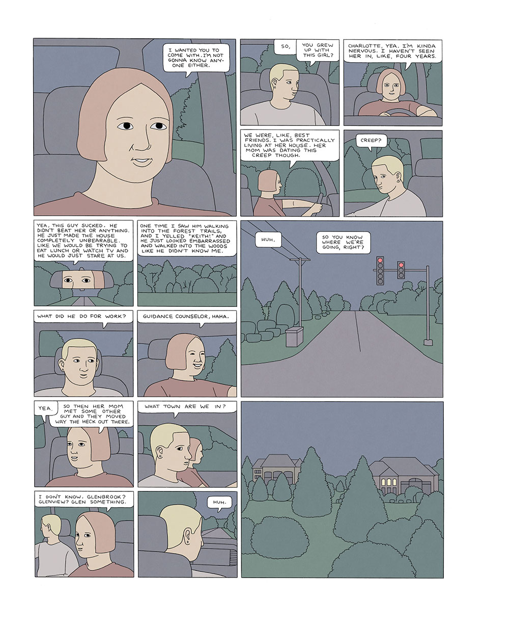
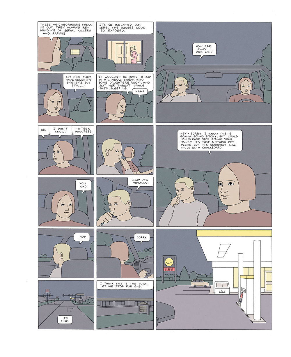
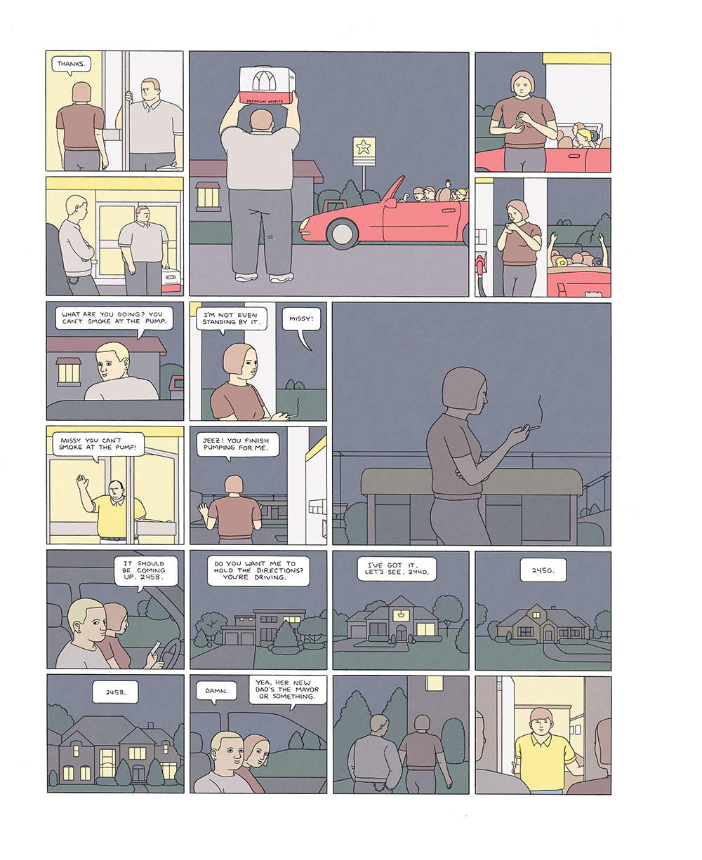
As you look at the cover of Nick Drnaso’s Beverly, you’ll probably hear Malvina Reynolds’ song “Little Boxes” playing in your head. Used as the intro music to Showtime’s Weeds, the track’s lyrics address the same kind of exhausted suburban environment Drnaso tackles in his graphic novel: “There’s a green one and a pink one/And a blue one and a yellow one/And they’re all made out of ticky tacky/And they all look just the same.” Set some time ago (the ‘90s? AOL Messenger and video games are plot points, but no one seems to have a cell phone) in a midwestern suburb, the book is constructed as a short-story cycle of interlocking narratives. Beverly’s people are sad, soft and kind of lumpy. They spend a lot of time sitting, sinking into their equally sad, soft, kind of lumpy furniture, kind of like the human characters in Wall-E.
So what kind of suburban ennui are we entering? The world of Chris Ware, full of quiet despair and what-ifs? The world of Alexander Payne, characterized by a loving familiarity as well as a willingness to poke some fun at the mundane? Unfortunately, this is the world of director Todd Solondz, equal parts horror of everyday life and horror of violent imagination. Any possibility for these characters to experience happiness falters as they fail to see outside of themselves, unable to connect with family and friends (let alone strangers). Tragedy looms around the corner. The only chance at an Ozzie and Harriet-type existence is on television, which is designed purely to sell unneeded things through commercials that make you feel bad about yourself.
Even if all of this is true (it might be), the daily experience of living is rarely so unleavened by joy, and reading page after page of it makes one want to go turn on a Busby Berkeley musical to compensate. Drnaso is clearly skilled at constructing his story. He doesn’t stumble at what he sets out to do. His muted color palette goes right along with his edgeless characters, and he lays out his pages in clear—but not repetitive—grids that make the order and geography of events obvious. But to reduce the human experience to a mere series of boxes differing only slightly in color is, fundamentally, sad.
Beverly Interior Art by Nick Drnaso
Beverly Interior Art by Nick Drnaso
Beverly Interior Art by Nick Drnaso