

As the tech editor at Paste, I get to use a lot of smartphones each year. However, in 2014, the phone that was my daily driver more than any other was the 2nd generation Moto X. It was released in the fall of 2014 and was the second in this new line of Motorola phones that was started under the command of its new owner, Lenovo. Compared to the company’s previous devices, the Moto X was determined to be an affordable, near-stock Android alternative to the Samsungs and LGs of the world—and it really was.
Motorola was one of first companies to pioneer the cheap, flagship unlocked smartphone and they really did do it right. The Moto X was fast, well-designed, and had some nice features too (and none of the crap you didn’t want). In my mind, it was an example of what a great third-party Android device should be. Helpful, not intrusive.
And now, Motorola has released a new version of the Moto X called the Moto X Pure Edition (or the Moto X Style internationally). Has Motorola misstepped with its third Motorola or does it continue the high standard quality set by its previous flagship smartphones?
Hardware
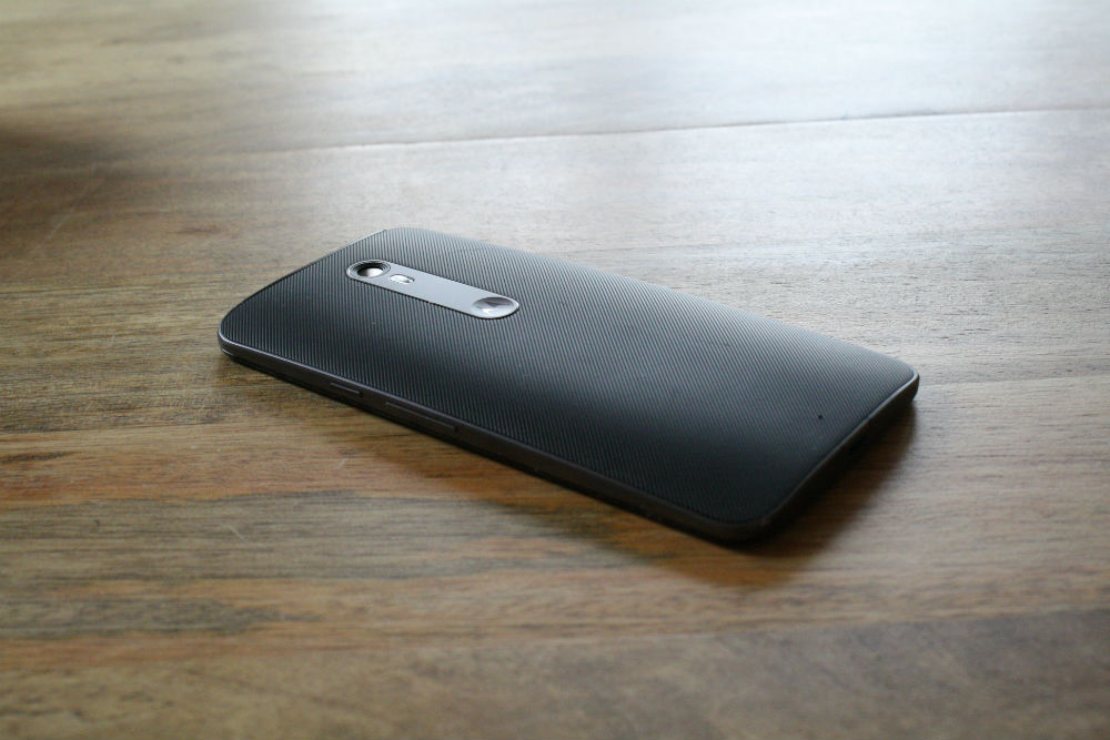
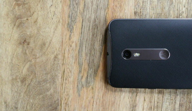
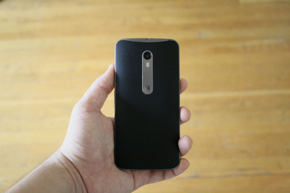
The Moto X Pure Edition looks very similar to previous Moto X models. The three design features that make it stand out from the other black slabs out there are the heavily curved back, the Motorola dimple, and the two bars across the front that hide the speaker and microphone. It’s also still got the same metal frame and a host of options for color and material for the back. The only real difference between this year’s Moto X and last year’s is the small metal tab on the back that connects and the dimple. Honestly, I prefer the look of the 2014 Moto X, but this small difference is easy to overlook.
I think the bigger issue with the design of the Moto X Pure Edition comes to the options given in the famous MotoMaker. MotoMaker is Motorola’s customization tool in the company’s online store where you can choose things like what kind of material you want the back of your phone to be or various color combinations of backs, fronts, and accent colors.
Unfortunately, most of the options here are a bit ugly and just don’t fit together well—so much so that I ended up just choosing black and the standard silver finish. The white with silver finish looked decent too, but the bright colors and combinations that Motorola chose just aren’t very flattering. As for materials, I just got the standard rubber back, though the leather would have definitely been my first choice. The MotoMaker is still great though—and for just an extra $25 you can do the leather or wood backs for a really premium feel.
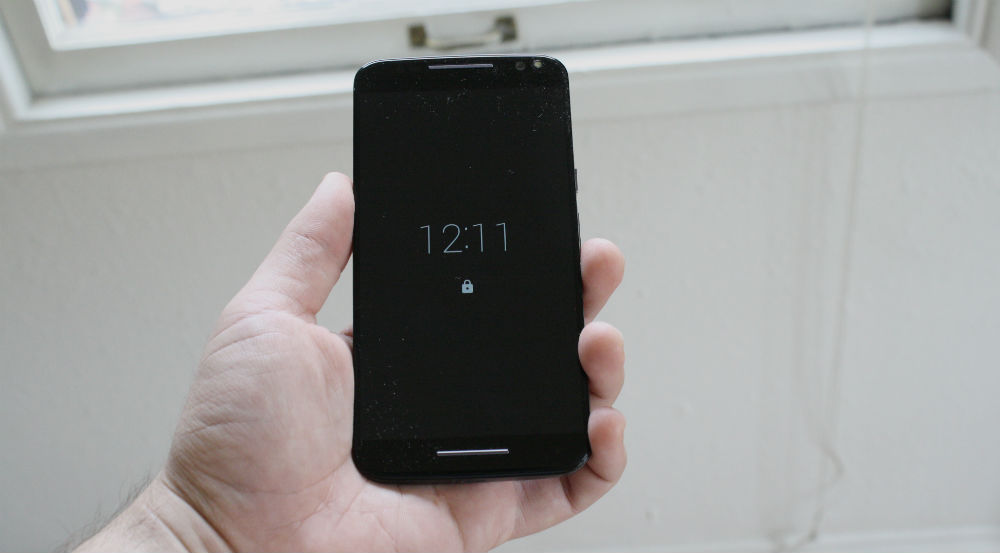
That all might sound like I don’t like the design of the Moto X Pure, which certainly isn’t true. Some things that I love about the phone’s design include the minimalist look of the front of the phone, as well as the really small side bezels. Speaking of bezels, the display on the Moto X Pure is beautiful. It’s a 2560×1440 5.7-inch IPS display, equaling out to around 515 pixels per inch, which is pretty competitive pixel density with other high end displays at this size on the market such as the Nexus 6P (518 ppi) or the Galaxy Note 5 (518 ppi). However, because of how small the bezels are on all sides, it really doesn’t feel as big as it sounds. It’s important to remember that even with a larger display, the Moto X Pure Edition is still smaller than a phone like the iPhone 6s Plus.
One thing that must be talked about is the camera. The weakest element of previous versions of the Moto X had always been the camera, which lagged behind phones like Galaxy devices, LG devices, and iPhones. Now the Moto X Pure has an upgraded 21-megapixel camera—and that has upped what this phone can do. However, in my time with it the consistency felt a little off. It suffers from a lot of the problems that plagued previous Moto X phones, despite the fact that you have a big sensor here. Fortunately, the camera focuses and captures fast, which makes it a camera for quickly pulling it out and snapping a photo.
Another important thing to note about the Moto X Pure Edition is the battery life. Overall, my experience with the battery life here is that it’s merely average. Coming fresh off using the OnePlus Two, which had amazing battery life, I have to admit the Moto X Pure was a little disappointing. It has a decent-sized 3000 mAh battery, but can’t quite compete with devices like the OnePlus 2, Droid Turbo, or even iPhone 6s Plus. However, the truth is that except on day when my usage is especially heavy, my Moto X Pure has pretty consistently made it through my entire day. For me, if a phone can do that I’m happy. If that’s not enough, you do have TurboPower charging which makes charging up your battery super fast.
The last thing I’ll mention about the hardware on this device is the performance, which has been impressive. It runs the Qualcomm Snapdragon 808, which is the same SoC that is in the LG G4 and Nexus 5X. It’s not the latest chip, which would be the 810—however, the Moto X Pure never feels sluggish or underpowered. That has as much to do with the software as it does with the hardware though, so let’s get into that.
Software
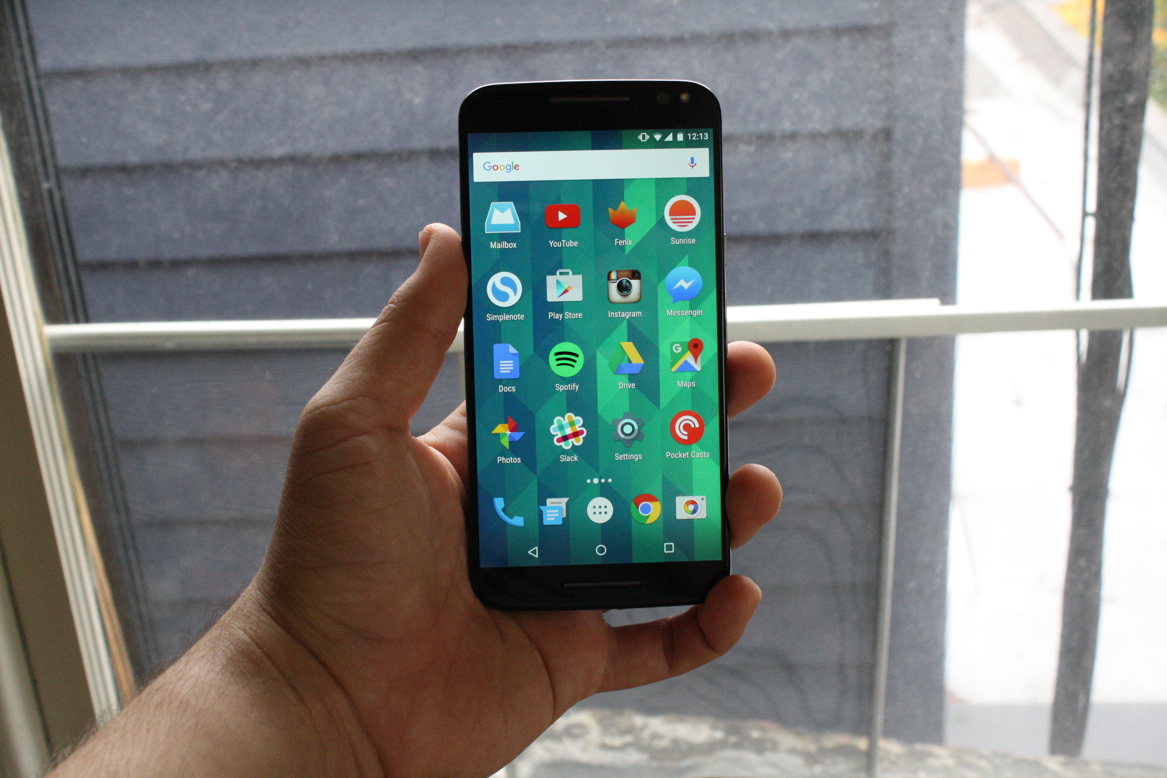
The software on the Moto X Pure is as near stock Android as you’ll find outside of Nexus devices, which is a really, really good thing. The Moto X Pure Edition comes with Android 5.1.1, which isn’t Marshmallow, but the newest version they could have put on this smartphone in time for launch. Fortunately, Android 5.1 is easily the best version of Android yet (outside of Marshmallow of course). It’s clean, light, modern, and actually helpful. Click here for some of the highlights of what comes in Android 5.0.
Even better though, the handful of features that we’ve come to expect from Moto X smartphones are back on the Moto X Pure Edition. One of my favorites is Moto Display, which is a really nice lock screen that gives you a glance of notifications with just a wave of the hand over the display. It’s really great for when you’ve got your hands are dirty and need to check the time or only have one hand free. I would have liked to see some enhanced functionality with this feature this time around, but it’s still really handy.
Others like Moto Assist are helpful, though I find myself pulling up Google Voice more often to perform tasks or do searches. The good thing is that nothing Motorola has added ever gets in the way of the clean Android experience—and that’s exactly what I want from the software experience on an Android phone.
The last thing that needs to be mentioned is updates. The question on everyone’s mind is “When we are going to get a Marshmallow update?” Last year, the rollout began earlier on the Moto X than on other devices, but it was still quite slow. We’ll have to wait and see if the Moto X Pure Edition gets the Android Marshmallow update quicker than last time, but we at least know that this phone should get it some time in the next four or five months, which is more than we can say for some other 2015 Android phones.
Verdict
The Moto X Pure Edition is a great phone, especially when you consider the price. At $400, it’s significantly cheaper than devices like the Galaxy S6, Galaxy Note, LG G4, and iPhone 6s, though every bit as much of a premium device. If you are considering purchasing one of those phones, I would take a good look at the new Moto X before doing so.
The Moto X Pure Edition isn’t perfect though. Both the battery life and the camera are passable, but could definitely be better. Furthermore, when you compare the Moto X against phones in a similar category such as the Nexus 6P or the OnePlus 2, it stands out a little less.
Motorola may have been one of the major trailblazers in pumping out inexpensive, unlocked flagship smartphones, it’s no longer the only company in the flagship killer game. We’ll save a deep dive into the comparisons between these devices for a different piece, but as a means of reference the Moto X Pure Edition ($399) is a hundred bucks cheaper than the Nexus 6P and 70 bucks more than the OnePlus 2. At this point though, the OnePlus 2 is more difficult to get ahold of (and the 16GB version is already sold out). If you like the aesthetic of the Moto X, you may also want to check out Motorola’s other 2015 smartphones: the Droid MAXX 2 and the Droid Turbo 2.
Ultimately, I can’t tell you for sure if the Moto X Pure Edition is the right phone for you, but it should certainly be in the running.