
Color Theory: The Bright, Cavernous Technicolor of P.T. Anderson’s Punch-Drunk Love

Color Theory is a Paste column that examines and critiques the literal and symbolic use of every hue under the sun, within the works of some of cinema’s greatest auteur filmmakers. You can see every entry in the series here.
At the age of 29, writer-producer-director Paul Thomas Anderson had already made a very serious name for himself. With the hot-and-cold criminality of Hard Eight, the self-destructing makeshift porn family implosion of Boogie Nights, the myriad devastations and offenses of Magnolia, and the increasing length and scope of each project, Anderson had established himself as a drama-heavy, art-first filmmaker in a new New American sense, one being concurrently shaped by the indie American movement of the ’90s that saw the emergence of Soderbergh, Tarantino, and a new generation of Coppola.
“With Punch-Drunk Love the goal was to try to make a movie that I would want to watch. I’m very proud of Magnolia, but I really don’t want to watch it. But I would like to watch this on a Saturday night,” Anderson explained on the film’s press tour back in 2002. The first few features introduced an Anderson that fashioned sprawling, idiosyncratic cinema from a dichotomy of empathy and apathy, love and loss, with a gravitational focus on the loss. For his fourth, he took a new direction: short, sweet, and swooning, with the focus shifted to love. “Like the Astaire-Rogers movies. I just love watching those. Everybody loves to watch those. They’re like chicken soup, you know? That kind of feeling, that kind of length, 90 minutes with music, handsome-looking couple. I know that it’s not exactly like that, but (I wanted) that flavor, like a bouncing-ball kind of flavor.”
Twenty-three years later, on the heels of One Battle After Another – his outrageous tenth feature (11, if you count Junun), which he describes as an “action comedy with a side of postpartum depression” – we dive into Punch-Drunk Love with a focus on how Anderson uses color to create unforgettable moods, tones, images, and feelings that suck us into the equally outrageous, anxiety-ridden love story overflowing with pudding, sisters, mattresses, and freakouts.
“We kinda had a little obsession for different technicolor musicals. And if you’ve watched many of them, there always seems to be a standard blue suit. There’s a great blue suit in Bandwagon, and I can remember seeing that and saying ‘I want that color blue.'” — Anderson, NYFF 2002
“I bought one. I thought it would be nice to get dressed for work, and I’m not exactly sure why.” -Barry Egan
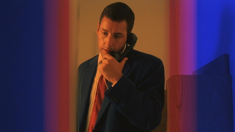
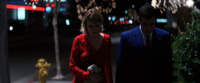
In the opening frame of PTA’s madcap romcom, a boyish slate blue runs across a concrete warehouse wall in an elbow of color bending in around Barry, who carries the color in a livelier shade – one more fit for a human than a wall – on his suit for the rest of the movie. Right out of the gate, Anderson’s color-centric approach is like a horizontal spotlight cutting through the frame, leading to and hugging our lead.
After a lengthy phone call about coupon fine print, Barry stands up and crosses the cave’s threshold of pitch black darkness to rip open the garage door at the break of day, the soft, silent light beckoning him toward a bizarre series of events that will turn his life upside down before it makes him whole.
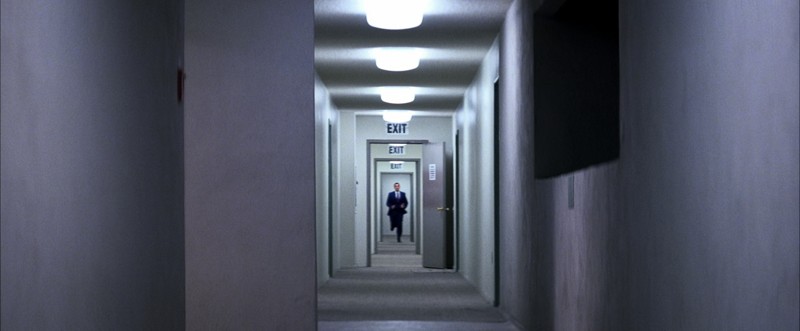
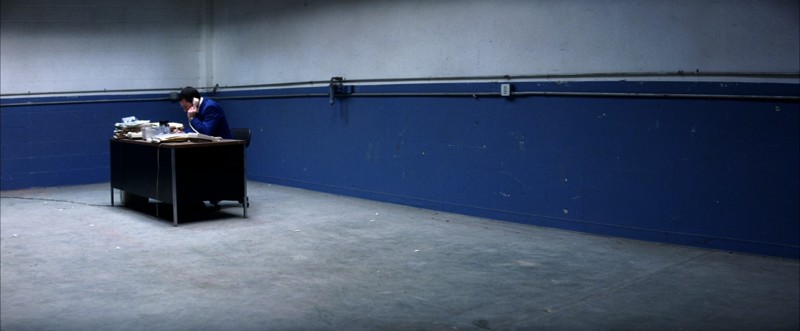
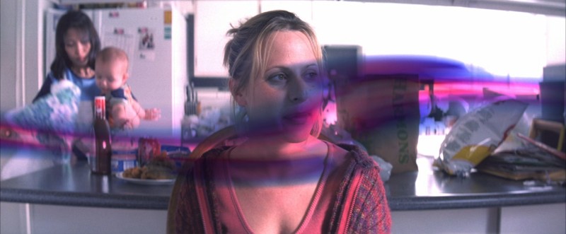
With the garage door shut, the warehouse is a fluorescently-lit cave. Not unlike Barry’s apartment – where he has long phone calls of a different manner – with its blank white walls, meager mixed brown furnishings, and lonely, desperate, might-as-well-be-a-warehouse vibe. The cavernous warehouse white matches the condo in Hawaii, the office in his warehouse, and the bathroom at the restaurant, among other places. Most importantly, it parallels Lena’s barren apartment, lost in the off-white, dry-walled abyss of the cookie cutter complex that, in 2025, eerily resembles a residential version of the Severance hallways, where love goes to die.
But, in Punch-Drunk Love, closed, sterile environments don’t point to ominous threats or corporate overlords. They point to a horrible hollow feeling at the core of our characters, a desolate state of the soul, lovelessness, and, perhaps, the simplicity of Barry and Lena’s longing. Anderson shirks the veritable complexity of Boogie Nights with clarity much like he shirks the elaborate grief of Magnolia with humor. This is simple. All they want is each other. All anyone wants is someone else. In tasteful pricks of color, the navy exit signs match Barry’s shadowed blue in the distance, and the lone fire alarm on the foreground wall plays like the Lena-colored emergency he’s sprinting toward.
“You just need the brightest colors you can in a love story like this, I guess.” -Anderson, NYFF 2002
On top of his approach to story and style, Anderson also changed his approach to lighting for the production of Punch-Drunk, scheduling shoots around the hunt for natural light, much like Malick, to capture “beautiful” and “theatrical” effects in frame. “It’s kind of a nice thing when you do that, when you’re at the mercy of the biggest light in the world. It’s bigger and more powerful than you, so you have to go to it. It’s a lot of fun chasing the sun,” says Anderson.
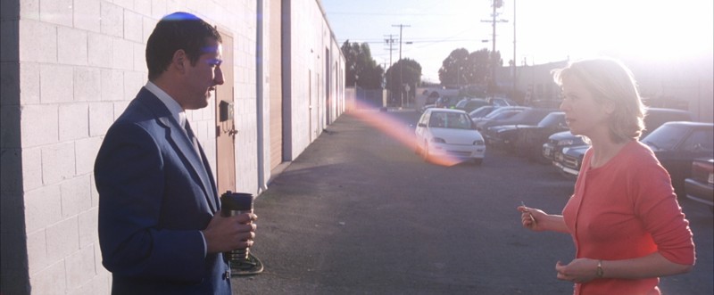
We see the beautiful brilliance of that big light around Lena like an angelic forcefield when the two meet, a moment we’ll later learn was concocted by the angel in disguise. (To the omniscient rewatcher, the bleary-brightness is also reminiscent of the heavenly Hawaii experience to come.) On Barry’s side, the trademark anamorphic blue streaks that define Robert Elswit’s cinematography show themselves for the first time, stretching across his face like azure tiger stripes and sitting atop his head like a yamaka of lapis light.
In between them, the sun creates a flare in the lens that appears as a rainbow of the same cobalt blue and ruby red of their outfits. The film’s core thematic colors, ruby red and cobalt blue, decorate the overwhelming majority of frames, be it obvious (e.g. the leads’ costumes) or subtle (e.g. painted onto an 18-wheeler).
Even in the dark of a moment like this – a walk of shame mere seconds after being kicked out of a restaurant for kicking the restaurant bathroom’s ass – their colors pop and they’re surrounded by each other’s light, neon red and electric blue dotted and lined up across the frame like ghosts of potential trying to get their attention, to unite them. As Anderson’s ode to and reimagination of Altman’s underseen 1980 masterpiece, Popeye, it’s hard not to notice the Olive Oyl-ification of Lena’s red outfit on their date, or, when that comes to mind, the fact that Robin William’s Popeye wore blue and white with a hint of suggestive red for his crush, like Barry.
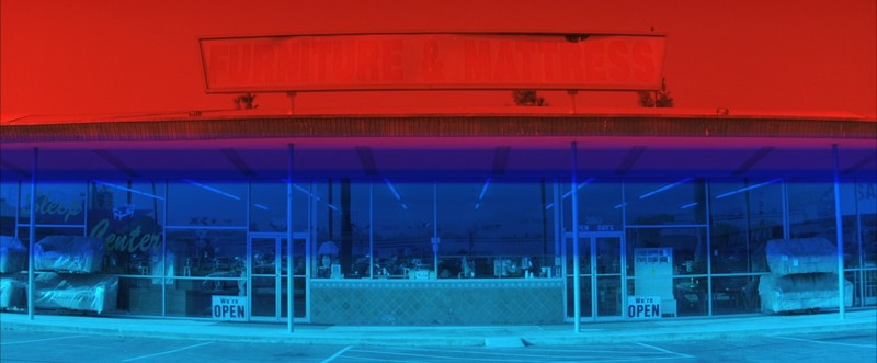
We don’t see enough of Lena’s life away from Barry to know if she follows the blues, but Barry is always following the reds in his life. When he decides to go to Hawaii on his own dime, coupon deal on pause, he runs out of the warehouse just as an all-red 18-wheeler peels by for him to follow in its wake. Towards the end of the walk of shame represented above, the tone shifts, love is in the air, and a white 18-wheeler stalks them with its large cobalt blue stripes, ruby red lettering, and a flood light on top to brighten the mood. (The 18-wheeler is used again as a cinematic device when Barry cartoon shuffles the harmonium back to his office.)
At the airport, Barry marches eagerly – leaps and bounds ahead of the mass of people behind him; occasionally skipping steps – toward the all ruby red-dressed flight attendants that let him on the plane. When he gets there, the traditional costumes in the Hawaiian parade are ruby red, as is the actual airplane that takes both of them back to the San Fernando Valley.
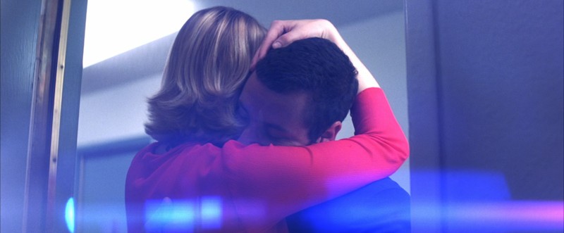
The fresh blue streaks of lens flare, which come courtesy of vintage anamorphic Panavision lenses that Anderson loves, grow more impressionistic as they spread their wings, taking over certain frames in moments of more pronounced emotion. Here, Barry buries his face in Lena’s loving embrace post-hospital-abandonment, and a radiant smalt blue flares like a fluttering of both forlorn longing and renewed hope inside him. And not without a trace of Lena’s ruby red in the bottom right hand corner. The gold of the doorframe and the varicolored gold of Lena’s blonde hair give a luster to the relief of the moment that makes everything burst with the fluorescence of the hall light above them.
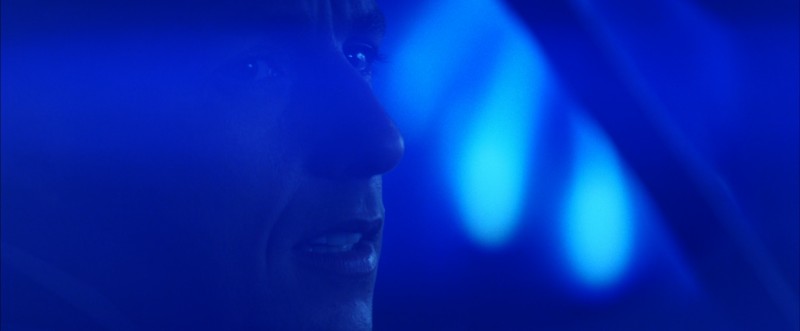
At its peak, the blue flare leaves the concept of subtlety behind entirely, but the swing for the fences works under Anderson’s measured hand, a strange harmony growing out of the beauty, symbolism, and evolution of color. On the way home from their first date, Barry’s hope and longing is so fervent that the color envelops the monochromatic frame in a blanket of electric shades of indigo, sapphire, and baby blue, leaving nothing visible but the frozen-dumb stare of infatuation anyone lucky enough in love has caught themselves in. Anderson takes the color from flare to setting, almost as if the two are inside the blue light that cuts through the picture. Barry’s head is often in the clouds, sometimes more literally than others.
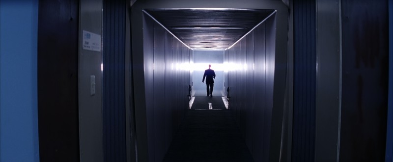
Here, the frame slows down and a hazy cloud of empyrean light swallows Barry’s Earthworm Jim head as he boards his first plane, Shelley Duvall’s “He Needs Me” swooning over the scene. The silvery blue hall leads up to the various shades of blue adorning the entryway, a sign of good fortune for the blue-bent Barry. Suddenly, the meaning behind the bleary-bright light that cascaded through the film’s many solitary caves clicks: Hawaii.
There’s a contagious hope in the ultramarines, zaffers, and Egyptian blues of Barry just like there’s a sexy vibrance in the ever-so-slightly-salmony ruby red of Lena. But the source of that bustling hope lurks most prominently in the shadow-piercing light that leaves so few scenes unbathed, precipitating an awakening, a paradisal Hawaiian brilliance so bright to cave dwellers such as Barry that it comes across onscreen as a celestial blown out blur more indicative of heaven over any place on Earth, purity over color. There’s light at the end of Barry’s tunneled cave after all.
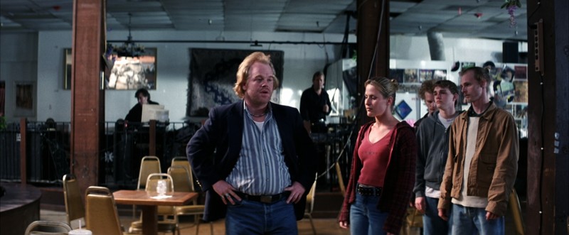
The dichotomy of Barry’s character is easiest to see in his manic change of behavior around his sisters. From a gentle voice over the phone to the life-threatening tone of someone roid raging; from hugging his sisters hello to shattering their windows goodbye. But we learn almost as much about Barry through the characterization of Dean.
As their fuck you phone-yelling match confirms – along with the belly-to-belly, mono-e-mono framing in the final confrontation – Dean and Barry are two sides of the same coin. It starts with the parallel of their costumes. Like Barry, Dean wears all blue, too – a mosaic collection of at least five shades (and that’s not counting the turquoise ring). Like Lena to Barry, Dean’s female counterpart (though in a much uglier relationship) dons darker and less saturated shades of red. He even has a little gaggle of employees with neutrally colored costumes like Barry.
Barry and Dean are yin-yang versions of an emotionally repressed man shoving his realities as far down as his emotions. We see that yin-yang as a sticker on the inside of the Hawaiian phone booth where Barry 180s from a violent Dean-esque intimidation of his sister to a delightful conversation with Lena over the course of a quick sunset.
Barry’s office is a near-empty warehouse that lets the light in, while Dean’s is an overstocked mattress store that shuts it out. Where the mattress man leads cruelly, through harmful trickery and the threat of violence, the plunger man leads insecurely, through harmlessly swindled coupon deals and pent-up bazooka-sized outbursts of anger and love that ultimately thwart his alter-ego aggressor. In their own way, they each kick and scream their way through the bizarro bossman lives they lead. But this isn’t Magnolia. There’s a protagonist and antagonist, pure motivation and impure motivation. In this case, plunger beats mattress.
The mustard of the chairs is one of the film’s lesser seen colors, but it shows up in Barry’s second of four ties, which follow a clear color theory progression from the PTA-patented Barry blue to mustard (when he calls the phone sex line and begins his conflict with Dean) to lilac (Lena’s secondary color, which he wears on their first date) and, finally, Lena’s ruby red. He’s always inching closer to Lena’s colors, who returns the favor by wearing blue when they leave Hawaii together.
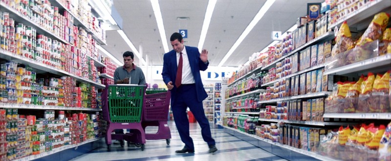
P.T. Anderson’s dream-colored grocery store is on par with Baumbauch’s gorgeous A&P in White Noise, with its meticulously designed set dressing and crystal clear picture, the fluorescent promise of capitalist coupon ventures beaming from every stocked aisle, an eternal rainbow of products at the edge of their shelf, practically leaping into the basket. As Barry’s jolly tap-dancing displays, here he’s in control, one step ahead of Healthy Choice. Here, his hope might as well be certain. The blue of his suit never looks more pristine than when he’s under the supermarket brights.
The aisle bumpers and the floor’s thick diagonal lines are the glossy waxed version of his cobalt blue, as are the words behind him and the aisle number above him. Lena is overwhelmingly represented by shades of red, but shades of green and purple – the colors of the shopping cart allowing Lance to collect the pudding that will get Barry to Lena – quickly become her auxiliary colors. The surf green door of her apartment matches the surf green curtains that surround her in the hospital after the accident. And the only colors we see her in pre-Hawaii are variations of ruby red and lilac.
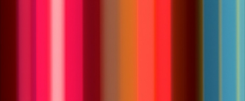
“All I had done was put red, white, blue and green flashes as placeholders for him. We talked for a while and he did 10 or 15 different pieces a day and it was just sort of a great thing. I ended up with a lot more than I thought I would get.” — Anderson, BAM 2003
No piece on the colors of Punch-Drunk Love would be complete without a mini gallery of the many motion paintings created for the film by the late artist Jeremy Blake. With so many to choose from, and every color within to analyze, the task seemed arbitrary at first. But, after a few more go arounds with the three Blake sequences, one main theme stands out. The curated, cartoon-colored, psychedelic art trips ultimately revolve around shades of red and blue dancing around and through each other, like Lena and Barry.
Whether the colors of the paintings were chosen in an effort to stir up their spirits or the paintings chosen were merely the ones that looked the best, Barry blues and Lena reds recur most often by a landslide. They dominate in single images full of color, like in the color bar shot above, where only two out of sixteen bars of color are verifiably neither blue nor red. As charms phantasmagorically chime, the vintage neon red and blue bars of color domino into various shades back and forth.
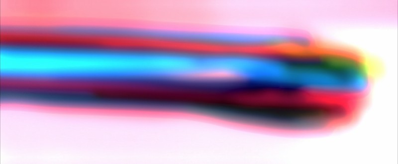
Blue and red also dominate across the myriad frames as they melt infinitely together, the vibrance of Barry and Lena’s colors holding onto the past frames and bleeding over the next frames much longer than their counterparts, as if they had more strength. Plus, they often bring the sequences back into the real world, as these two shots depict.
In an affecting variation, red and blue play more like pink and purple as the colors fade, morph, and bruise over the face of the abused phone sex sister in the shot above. In the shot below – the bleed out of the final hallucinogenic frame of the last color-blending Blake sequence – a sky of Lena-red blood hovers menacingly over Dean’s mattress store, while Barry’s blues pacifistically slice through the rest of the frame as thoroughly and true-heartedly as he’ll slice through Dean.
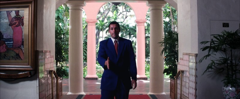
In the rush of an edit before the poster-making shot below, a series of images of Barry and Lena seeing and rushing toward each other on sight in the hotel lobby light and color the iconically silhouetted moment very differently – in supermarket-bright Hawaiian light, a thematic meeting between what must now be Barry’s two favorite places.
In the complementary color scheme (two prominent colors that sit across each other on the color wheel), the poster to the left, the plant pot on the bottom right, and the back two pillars employ sweeping and accent blush tones that surround Barry in his concomitant beet red nervousness, which presents itself as the handshake of an eager doofus. As he sticks his hand out and follows the Lena-red carpet at his feet, the verdant greens of the tropical terrain in the background pop between cream-colored walls and beams. They jump out from behind and sit in front of the stairs, and they’re even found in a couple earthier shades on the painting. But, of course, when they meet, all the lights go out.
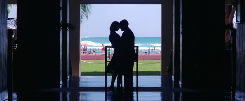
Much like Barry’s warehouse when the doors are lifted, the open-air setting of the Hawaiian hotel Barry meets Lena in is a perfect location for love to blossom, like the exit of a cave they can leave together. Unlike Barry’s warehouse, however, the hotel lobby – with its wildly contrasted spaces and oceanside backdrop – is an apt setting for accentuating the musical nature of the story, removing significance from the material elements, and drawing out the interior experience of the character through contrast and color, ditching the lonely white walls for a brief moment of surreal romantic bliss.
Cerulean sky reflects faintly off the dark, glassy floor and a candy apple red swimsuit walks by in the background, the colors of Lena and Barry still represented amidst their black co-silhouette. In the background, saturated hues of aqua, clay, and emerald square around the heart-shaped couple at the center and dominate the palette, giving the image its triadic color scheme (three colors spaced evenly apart on the color wheel). The celeste sky plays more like a flashy gray neutral in its lack of saturation, much like the glow on the hotel pillars.
Barry and Lena still have the third act to go through from here, but it’s from this moment on that their lives are changed for each other, and we see it in an extraordinary burst of interior technicolor. Barry’s blue dreams have finally come true, he has a love in his life that makes him stronger than you can imagine, and there’s nothing anyone can do to stop him. As Barry would say, and Dean would agree: “That’s that, Mattress Man.”
[ad]
Luke Hicks is a New York City filmmaker, film journalist, and musician by way of Austin, TX. He earned his Master’s studying film philosophy, theology, and ethics at Duke University and is the founder of the Brooklyn-based Art Mob Productions.