
Designing The French Dispatch: An Interview with Production Designer Adam Stockhausen
Photos Courtesy of Adam Stockhausen
Adam Stockhausen has placed a large and perhaps indelible stamp on the films of Wes Anderson. For many years, cleverness, quirkiness, personality, insight, humor and emotional nakedness were their cornerstones, and strong ones: Trademarks, components of a brand, points of auteurism in its purest sense. When Stockhausen came along, starting with Moonrise Kingdom, it was as if those elements found an adhesive medium that blended them into an entirely different product—still recognizable as an Anderson film but also radiating something just south of what Walter Benjamin would have called an “aura.” A presence that leapt beyond the facts of the story, shaping your experience of the film and haunting you afterwards; the consciousness of deliberation, the presence of a fervent visual mind with energy carefully applied.
So it is with The French Dispatch, Anderson’s latest, a story about the Paris bureau of a Midwestern newspaper that looks and feels a lot like The New Yorker. The very structure of the film—interrelated news stories, all with a touch of redactive how-would-THAT-ever-happen absurdity—lends itself to the kind of detailed and productively obsessive work that is Stockhausen’s m.o. Paste talked to Stockhausen about the impossibilities, hurdles and joys of designing The French Dispatch.
Paste: I’m curious about the importance of repetition in your work, what it grew out of, and what feeling you’re trying to create with it, specifically?
Adam Stockhausen: Well, it’s a very interesting question. And I hate to be disappointing but it’s kind of something that we don’t, or I don’t, think about so actively. I think it’s just second nature, as well as the fact that what Wes likes, I gravitate to automatically. Something starts to crop up when we’ll be scouting, and we’ll go to wherever we go. In Grand Budapest we’d be scouting and you would see these coal-burning heaters in the corners of all these rooms. And you just start to see it over and over and over, and then you start to say, “Well, that’s a good idea. That really is part of the feeling of this place, right?” And so then you start to use that over and over again, because that’s what you saw when you were scouting. In Moonrise Kingdom, raccoons kept finding their way in. On The French Dispatch, this kind of yellow color kept finding its way in. And so, it happens gradually.
Do you ever discuss the effect on the viewer of the repetition? In The French Dispatch the effect of seeing all these doors and identical elements gives a feeling of complexity or of a certain amount of unpredictability. What’s behind all these doors?
Stockhausen: Well, when you’re describing that, I’m thinking about the police station and how the confusing nature of the police station is part of what it is. We were putting doors everywhere to try to make the place as confusing as possible, because it is a maze that he walks through trying to find his way to the dinner. I mean, even when we made the big corridor where Jeffrey’s walking and trying to find the place, we were using mirror tricks, putting a mirror at the end of the corridor to try to make it look like it went on forever and definitely making it as confusing as possible, because that’s what he’s going through as a character.
I have a really technical question. It may seem like a naïve question, but it’s something that occurred to me while I was watching the film. A lot of it is in grayscale. Does that affect your choices as a production designer in terms of the props you use or the colors you use before the film is actually put in the process? And does that change the way that you view what you’re choosing to film or what you’re choosing to place in the production design?
Stockhausen: On this one, Wes was making those decisions about which parts were going to be in black-and-white and which parts were going to be in color as we were developing, as we were in prep and as we were getting close to filming, and he was on the fence about a couple of different areas in the film. So we went at it in a few different ways.
In “The Concrete Masterpiece,” for instance, we knew that we were going to see those spaces in color and in black-and-white. So that in a way that was the trickiest, because we had to evaluate: How will this read in a grayscale? But it also had to be pleasing visually in color. And so that involved a lot of having your iPhone on the black-and-white setting: Looking at it with our eyes, but also looking at it through this handy little filter we all carried around in our pockets. Some colors do different things, of course, in black-and-white and so it was tricky to get the right balance and the right effect to happen simultaneously in color and in black-and-white: The tones of the wood and the floor in the hobby room, the exact level of the distressing of the walls in the hobby room, the way the sunlight and shadow were working in the prison itself. We were looking at all of that simultaneously. Other sections, like the police station, we knew that was going to be in black-and-white. We occasionally even did sets entirely in black-and-white with paint. We didn’t actually use color because we wanted to reinforce what the ultimate look was going to be for the actors on the set.
I read that you had 130 different sets for this film. Based on the fact that things were changing so much, and there’s so much complexity in the storytelling, how did you keep track of all those sets?
Stockhausen: It was kind of nuts. The way we shot it helped, shooting the stories as stories. In a normal movie, scenes will be all jumbled up and you’ll be shooting the bits from the middle, bits from the end, and bits of the beginning. In this one, each of the stories was shot as a contained piece. We did those pieces sprinkled throughout interstitially. In between the stories we would do three of the Sazerac pieces or four of the Sazerac pieces, and then we would launch into another one of the main stories.
It was almost like making a super intense movie for two or three weeks just of one story. You would be completely filled with it and then you would move on to the next, and so it would stay very orderly in our heads. It became more and more difficult as we went along, because for the first story you have a ton of prep time, and then for the next not so much—it was a total scramble.
Regarding the sets themselves, how was the getting-to-know-you period with the actors, when you’d acquaint them with how to move around the sets and use all the props?
Stockhausen: Well, Wes works with a lot of the same actors over and over, so it becomes a theatrical troupe. There’s a shorthand with them, and it definitely makes that process that you’re describing more comfortable. But then also, we do as much as we possibly can in terms of rehearsal time, and Wes also visits the sets constantly to see how they’re developing and to line up the camera.
And so what we aim for is that by the time we actually show up to shoot, we know where the camera goes. We know where all the props come from. Wes has looked at all the props. Everything is sorted out. There would be no question. Then the actual shooting day can be all about the actors and the work with Wes and bringing the story out and not fiddling around with logistical things and prop stuff. That’s really the goal. When that process works well, it also provides a smoothness to the shooting.
What was the collaboration process like between the different departments, such as sound, photography and music?
Stockhausen: As we were filming, we didn’t know what Wes was doing with the composer. That’s a separate thing. It started while we were working but it came later. But as for the active departments in the principal photography shoot—like camera, lighting, costumes and production design—we worked just incredibly closely together. We would see each other every day. We were talking constantly. We were testing things. As I say, Wes comes and looks at all the sets over and over and over again. So we’re literally testing things out through the lens, making sure that it works. That helps tie everything together and it helps everyone get on the same page.
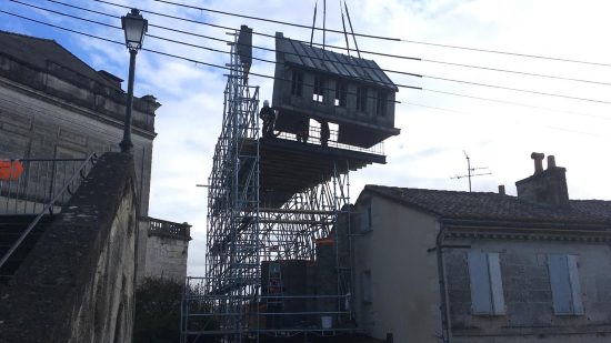
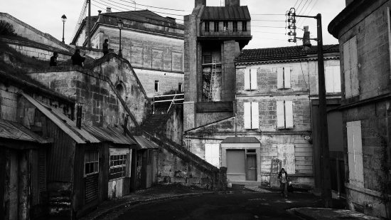
I know that you settled on a former felt factory as the home base for production. How did you choose that? What was right about the felt factory that was not quite right about everything else?
Stockhausen: It was an easy choice. It was so close to town. It was basically in town. It also provided these different areas that we could tell could be different stages, but there were also enough other spaces that we could use as workshops and storage. And they were far enough apart from each other that I could make noise in the carpentry shop, and it wouldn’t disturb Wes shooting in the next space over. It also had a hobby room, with an overhead window and a doorway structure on one end. We ended up modifying it quite a bit, but it was a really good base for our hobby room build. When we saw that, we thought, “Oh, well, that can be used as a major piece of the Rosenthaler story, and the other spaces make sense as build-and-shoot spaces.” We tend to work in these kinds of makeshift spaces rather than in traditional movie shooting stages and so we’re always looking for sites like that.
Wes Anderson said at one point that the film was all based on research. I’m wondering, what was your research like? When you were trying to come up with a palette for the film, what were you looking at?
Stockhausen: For me the process started with working with Wes on sketching the Sazerac story, which is the story that really defines the town and introduces the viewers to the town. All the other stories inhabit that town. And so I was really working top-down and doing loads and loads and loads of photographic research, mainly of street photography in Paris. Particularly the Charles Marville photographs of Paris, the documentary street views that were shot as the Haussmann changes to the city were underway and he was documenting neighborhoods before they were bulldozed. They’re beautiful photographs. And we would be going through and finding large and small details, sometimes saying, “Well, this whole photograph, this is what the flop quarter should feel like,” or “This little archway is a great one. Let’s put a pin in that and remember that for such-and-such scene.”
Also the films of Jacques Tati, like Mon Oncle. Or other films like The Red Balloon. Loads and loads of movies. And again, I would be circling details and saying, “Look at this, look at the cabbage in the gutter.” It’s not always giant details. Sometimes it’s really little details like cabbage in the gutter. You stick all this stuff up on the wall and then the pattern emerges.
How did you decide what worked for both of you?
Stockhausen: We emailed. We took frame grabs and sent them back and forth. It’s the same process for all of it. We had hundreds and hundreds and hundreds of images for the prison, French prisons from mid-19th century to early-20th century. It’s like, “Look at this. Look at the hinges on this door, they’re amazing. Look at this food slop.” Little bit by little bit, it builds up.
And if you want, for instance, to reproduce a hinge or a certain way a door looks, that’s a whole separate set of steps I’m assuming. I’m wondering if all those things started to work in tandem at a certain point, if your vision for the movie began to translate to the people you were working with in a way that made it more efficient?
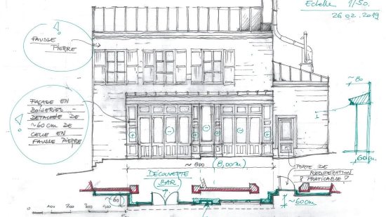
Stockhausen: You just described the entire process. It starts with conversations, and then my team comes on board, and then we start to find locations, and then you’re defining what you’re building versus what you’re finding. And then you’re getting the team up to speed with all the details you’ve been looking at. And then you start doing drawings of how you modify the location. You build the sets from scratch, and you start applying all those details across those drawings. And then meanwhile, the construction team begins, and you actually start building samples, and you’re looking at things, and then all of a sudden you’re shooting.
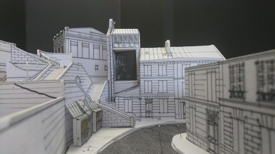
When you’re conceiving of all these things, do you use models? Do you use sketches? Do you use both? Do you work digitally?
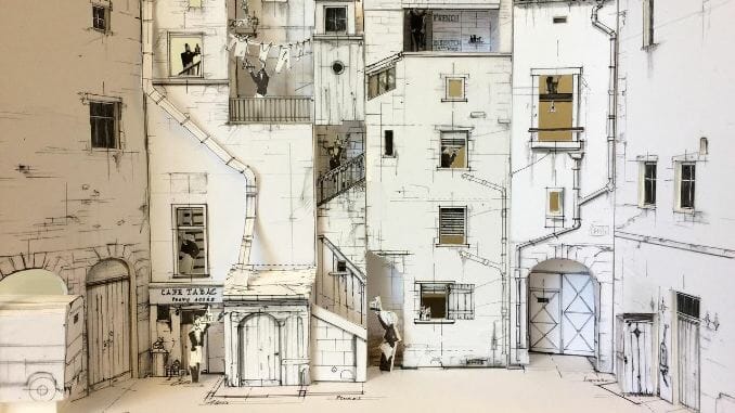
Stockhausen: All of the above. The process with Wes begins with an animatic, with a moving storyboard that he does, and then we break that apart. It’s like a big puzzle, and we’re trying to figure out: How does this actually translate into three-dimensional space? We use all sorts of techniques for that. I mean, sometimes it’s just pencil and paper. Carl Sprague is an illustrator I’ve worked with for a long time and who worked with Wes for a long time. He did the kidnapper’s lair, and he broke that apart just with a pencil and paper.
But then we took that and we built a very rough, very simple white card model so that we could discuss it and look at it. We very often do that. We built models of most of the sets on this film. Again, they’re very simple models but they help you visualize, to make that jump from the two-dimensional plans on the page up to what’s really going to be built. But we built the café, and we built the locksmith’s shop.
But then we also do digital houses. We had a full digital model of the prison interior. And we did digital modeling of the big dolly shot through the police precinct, the one that goes through the disguises room. That was all done with a digital model and digital lending to make sure that we were getting things exactly right, because it was a very precise shot.
Max Winter contains multitudes, sometimes comfortably. He has written reviews for The Boston Globe, The New York Times and elsewhere. He has published two books of poems. He co-edits a press called Solid Objects and is one of the Poetry Editors of Fence Magazine. And, from roughly 2012 to 2016, he edited Indiewire’s Press Play blog, devoted to the dissemination and cultivation of the video essay.