
Jay Z’s Tidal Claims To Respect Artists, But Rips Off Spotify’s Design

Jay Z’s recently re-launched streaming service, Tidal, is already knee-deep in controversy since its release on Monday (March 30). The service is backed by artists like Kanye West, Beyoncé, Drake, Daft Punk, and even Taylor Swift, who famously pulled her music from Spotify and wrote in the Wall Street Journal, “Music is art, and art is important and rare. Important, rare things are valuable. Valuable things should be paid for.”
It’s a fair criticism — according to an estimate by Billboard, Kendrick Lamar’s monumental To Pimp A Butterfly had a record-breaking 9.6 million listens on the first day and only netted him $44,160. Tidal’s pricing model in unclear, but the 16 artists currently affiliated with Tidal each have a 3 percent share in the company. Their press conference made it clear — this is a service designed to value artists’ interests.
There’s just one problem with this ethos — Tidal looks an awful lot like Spotify.
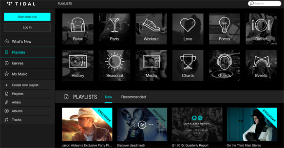
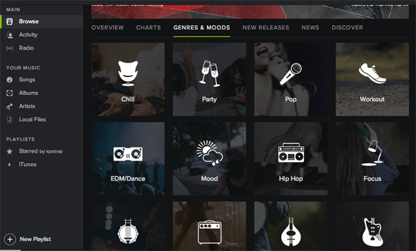
Tidal’s “Playlists” section is a point-by-point reproduction of Spotify’s “Genres & Moods”: square photos are overlayed with black and illustrated with white icon. As for the overall design of the service? All-black interface, sans-serif typeface, left-hand navigation, bottom play button — check, check, check and check.
It’s not like Spotify’s design is completely ground-breaking. Beats Music has a similar all-black look with white text, and many of these features are just what’s trending right now. But the blatant similarities between Spotify and Tidal call into question the true integrity of the new streaming service. Aren’t designers artists too, Jay Z? Shouldn’t we respect all forms of artistic pursuit, including user interface and branding?
Time will tell if music listeners will pay a premium for lossless audio and artist integrity. Or rather, musical artist integrity.
Have a news tip for Paste Design? Email us at [email protected].