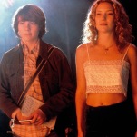
It’s been eight years since Joshua Cotter published Skyscrapers of the Midwest, a sad and touching examination of childhood that’s also his last long-form fictional narrative. This Tuesday brings the first of his seven planned volumes of Nod Away, a complex and beautiful sci-fi epic. The book alternates between a narrative of scientists working on a space station to tweak a biologically wired “Innernet” and back to nearly wordless scenes of a man traveling by himself through the desert, toward an unclear goal. Dreamy, packed with interesting ideas and suffused with the same quiet-but-felt emotions as his debut, Nod Away fills a void that makes Cotter’s previous absence all the more evident. The cartoonist exchanged a series of emails with Paste discussing his ambitious new work (many spoilers ahead).![]()
Paste: I’ve seen some of your thumbnails for page/panel layout, and the level of detail freaks me out. How much did you have ready going into this story? In other words: you seem like a planner. Talk to me about that.
Joshua Cotter: I started organizing notes and writing Nod Away after completing the collected Skyscrapers in 2008. I wrote for a couple years, got derailed for a couple more, and then once I got back on track in 2012, I wrote for another year or so before I started drawing anything. Initially it was just pulling together all of these disparate ideas I had while working on Skyscrapers and figuring out what direction I wanted to go in. Once a story started to form I did a lot of writing and rewriting, then dialogue writing and rewriting, and then thumbnails and a few character sketches. Before I actually started drawing volume one I’d say I planned for four years or so. At seven volumes, it’s going to be a large book, so I wanted to make sure I had all of the plot points and a satisfactory ending in place before I got started. So, yes. I’m a planner.
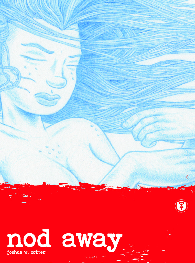
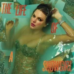
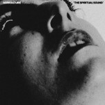
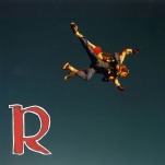
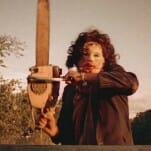
Nod Away Cover Art by Joshua Cotter
Paste: I know that you put up some of this book online serially, at Study Group Comics, but a big chunk of it is also new to the print format. Why split it? What parts are new? Did you draw everything sequentially and then parse out what went up online, or did you go back and add things? Did the comments affect anything about the story?
Cotter: When Zack Soto approached me about posting on Study Group, I wasn’t sure what to give them. I’m not much of an “online comics” person (nothing against online comics, I just don’t read much online personally). The final object means a lot more to me. I guess I decided on thinking of the Study Group posts as a “preview,” of sorts.
There are two stories in Nod Away, and since I was already working on the first story when I started talking with Zack, I decided to post those pages and see where things went from there. I ended up letting the first story run online until the last dozen pages or so, as not to ruin the ending for readers of the physical copy. I didn’t draw volume one sequentially; I wanted the different sections (the space station story, the desert story and the abstract sequences) to each have their own distinct feel so I worked on them at separate times. I try not to pay much attention to the comments section. I appreciate having an audience for my work, but if you pay too much attention to it, feedback (whether positive or negative) can become overwhelming and end up negatively affecting your output.
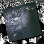
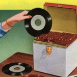
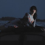
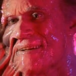
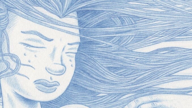
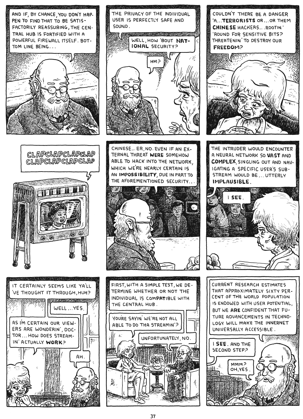
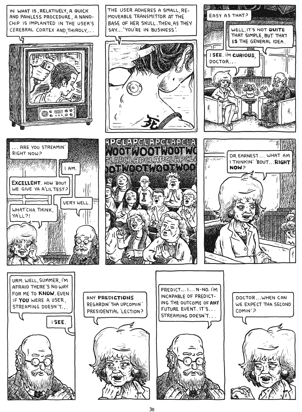
Nod Away Interior Art by Joshua Cotter
Paste: Can you talk to me a little about your drawing process and the media you use? Is it a super-dumb question to ask if you really use blue pencils [because of the cover design of the book]?
Cotter: I do use blue line. I don’t think that’s super-dumb at all. I use it because when it comes time to clean up my pages in Photoshop, I don’t have to spend an hour on each page digitally removing all of the graphite marks I couldn’t get rid of while erasing. With blue line I don’t have to erase at all. I just scan the pages in as full color and drop the blues out, if that’s something readers want to hear. Anyway, I draw on 9” x 12” Strathmore 400 series smooth surface bristol using blue lead in a .5mm Alvin Draft/Matic, and then ink with Tachikawa T-77s and T-99s nibs. I pencil each section in its entirety before I start inking in case I need to go back and add anything or make any changes.
After using blue line for a while I started to like how it looked aesthetically, and decided to use it for the cover illustrations. I feel it has an ethereal quality to it.
Paste: What about character design, which I see as a real strength of yours, especially with this book?
Cotter: Thanks for saying so. I put a lot more thought into character design in this one. Skyscrapers was just a bunch of geometric, round-headed cat people and I wanted to move past that. I tried to keep in mind that I wanted the characters to be recognizable in a silhouette test. Sometimes the characters came to mind fully formed (Melody, Dr. Serious). Sometimes, if I had difficulty coming up with a character’s look, I’d try to think of who from real life I’d like to “play” that character (in a movie or whatever) and loosely base their physical characteristics on that person (Iota, Black Angus).
Paste: So is that Mike Dawson making a cameo in the book?
Cotter: Yeah, that’s Mike. Also an attempt at Jim Rugg as the Unipol cop. I have to populate the world, so I figure I may as well use friends. Even if I’m not very good with likeness.
Paste: Are you a huge H.P. Lovecraft fan or what?
Cotter: No. I think Lovecraft had some good ideas, but I personally don’t care for his writing. His overuse of the adjective “hideous” drives me nuts, and he rarely helps the reader understand whatever he happens to be presenting as “hideous”… He builds up to it in the story and then steps back with a “it was far too hideous to describe, so I’ll move on.” I’m sure it was to leave it up to the imagination of his readers, but it doesn’t work for me. I also take issue with his racism. But I digress. People love Lovecraft. To each his own.
-

-
-
-
-
-
-
-
-
-
-
-
-
-
-
-
-
-
-
-
-
-
-
-
-
-
-
-
-
-
-
-
-
-
-
-
-
-
-
-