Vanesa R. Del Rey Styles a Noir Underworld in Hit 1957

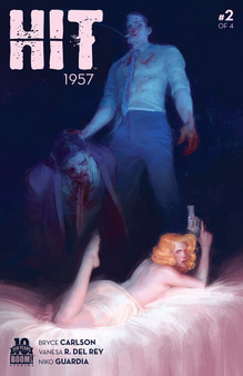
Artist Vanesa R. Del Rey and writer Bryce Carlson have returned to the crime-laden, blood-soaked streets of old Los Angeles in Hit 1957, the sequel to 2013’s noir breakout, Hit: 1955. The first series saw morality pushed to its bleeding margins as Detective Slater and his femme fatale love interest, Bonnie Brae, navigated the violence and murk of L.A.’s criminal underground. Two years later, Slater is still putting crooks on ice with his Rat Pack meets Judge Dredd squad of furiously righteous cops. All the while—surprise!—Bonnie lands in some hot water of her own.

Hit1957_002_A_Main.jpg

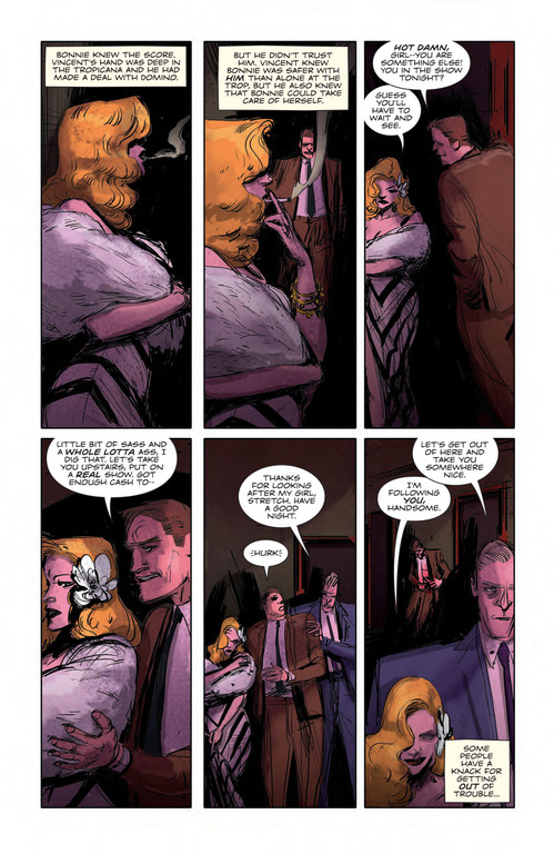
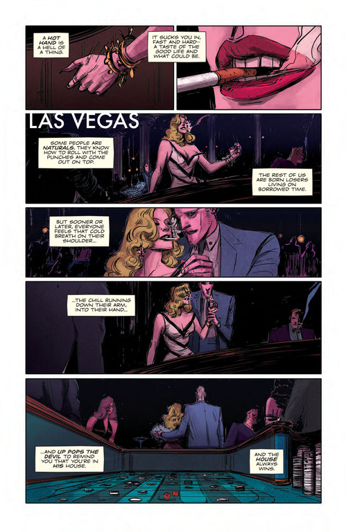
While Hit 1957’s characters are unflinching purveyors of brutality, the unquestionable truth remains that they look so damn good doing it. That praise, of course, belongs to Del Rey’s stylized pencils and inks, and Niko Guardia’s vividly dark color palette. Del Rey’s characters move seamlessly from slick to grotesque, sultry to savage, and back again. Visually, Hit 1957 may be at its best when when Del Rey focuses on Bonnie, who commands every panel she’s in whether she’s lounging or swinging a tire iron. The harder lines Del Rey uses this time around, as opposed to the grainy, scratchier ones from the first series, lend Bonnie a strength that suits her steely nature.

Del Rey took a break from splattering the ‘50s with blood and whiskey to answer a few questions over email about her process and how a cinematic book like Hit 1957 comes to be. Issue #2 of Hit 1957 comes out today from BOOM! Studios
1linebreakdiamond.png

Paste: My favorite thing about Hit is how you draw women, specifically Bonnie. Can you talk about designing her?
Vanesa R. Del Rey: She’s my favorite to draw. Her design is mostly made out of Lauren Bacall and Sophia Loren. They were who I could see in my head and the most present references. The rest is just anatomy lessons and observation.

Paste: Everything about her seems so effortless, by which I mean, she feels like an actual femme fatale rather than a caricature of one (like say Jessica Rabbit). What do you do differently here for that natural feeling?
Del Rey: Hmmm…I think the effortless part comes from observing movement in my drawings. I try to represent “reality” proportions, I’m not exaggerating any features purposefully. I think more about the character in the script and the way he/she would act in the environment. What kind of a person they are. Jessica was created to represent a different concept; she is closer to a caricature.
Hit1957_002_PRESS-3.jpg
Hit 1957 Art by Vanesa R. Del Rey, Courtesy BOOM! Studios

Paste: In terms of drawing women, can you elaborate on how you achieve such sultriness and sex appeal without those common distorted proportions and uncomfortable positions?
Del Rey: The idea is to get away from stereotypes but still make an identifiable, believable character. Sex appeal and sultriness can be expressed with more than appearance design. It can be posture, demeanor, gestures, the movements, all that becomes a character’s and personality. Observational drawing pretty much informs that. And the eye that is observing, of course. My perception of what surrounds me is something I bring into my work as well.

Paste: Speaking of which, what’s your take on things like Milo Manara’s Spider-Woman cover or the Hawkeye Initiative-type stuff?
Del Rey: I was unaware of H.I. actually. It’s hilarious! Milo Manara will do Milo Manara. All his work is exaggerated in that manner. He’s an erotica artist from a long time ago. It’s a matter of taste, I think. His work is for a specific eye.

Paste: Both Hit series really balance the violence alongside the “cool.” How do you go about striking that balance?
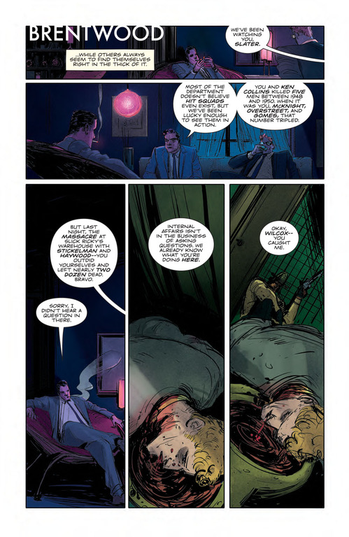
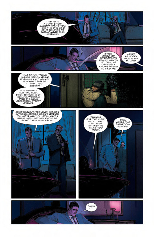
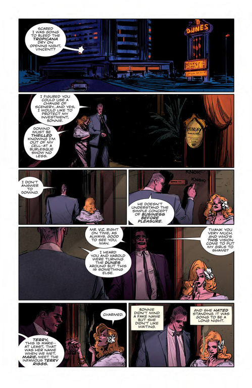
Del Rey: I don’t know if I can answer this one well. It’s difficult to explain. It’s about knowing what kind of mood, what kind of line to use and when. Some scenes are faster than others. I think I try to expose violent moments through faster lines, a little more resembling of a sketch or a storyboard sequence. In contrast to other scenes which are calmer, slower. Then I’ll use maybe softer lines, horizontal panels, more details for the eye to wander. These are some of the things I think about when I do layouts.
Hit1957_002_PRESS-4.jpg
Hit 1957 Art by Vanesa R. Del Rey, Courtesy BOOM! Studios

Paste: Is there anything you do in Hit that you feel is generally missing from comics at large, perhaps in terms of character or art design?
Del Rey: There are probably many things missing from comics that we haven’t seen yet in those terms. Hit might have been one of them and my work with it. I might have been missing from comics…

Paste: In general, what would you say are your artistic influences? How do those manifest in Hit?
Del Rey: My artistic influences…they are so varied! I have a love for art and the history of it, the Pre-Raphaelites, for 19th Century Realists, the Impressionists, early Disney animation and anime, story-boarding, films from now and before. I watch as many as I can. I’m influenced by all kinds of stories. Hit is mostly influenced by films I have watched. The Public Enemy, The Big Sleep, Touch of Evil, Cape Fear (Scorsese), The Godfather, and so many, many more.

Paste: One of the things that really stands out in Hit is how cinematic it looks. What’s your strategy there?
Del Rey: It comes from my influences, definitely. Films have been a big part of my formation as an artist. The way I visualize the scripts are guided by scenes in films I have watched. I think about what has been used for a specific scene and atmosphere and go from there to my own thing.

Hit1957_002_PRESS-5.jpg
Hit 1957 Art by Vanesa R. Del Rey, Courtesy BOOM! Studios

**Paste:* Did you have to study up on noir to familiarize yourself with the look? What movies—or comics or stories—did you use?
Del Rey: I looked a lot at Alex Toth/Jordi Bernet in Torpedo, Mad Men and forensics documentaries. The book really just developed while working on it. The characters and props were becoming familiar as I worked on each issue. I usually do character studies and some prop designs before I get into a story. Also gathering reference has become a big part of pre-production for my work.

Paste: It seems like with noir—and how its grit and tone are so well known—it can be easy to get heavy-handed. Did you find that? Were you concerned at all with overdoing it?
Del Rey: I don’t think I came across that issue with Hit. Concerns about overdoing it come looming once in a while, but that happens with everything I work on. I practice good self-control most of the time and try to meet my deadlines.

Paste: Your style lends itself perfectly to a noir story. From an artistic standpoint why is that?
Del Rey: Probably all the darkness. It’s not caricatured, it’s driven mostly by mood and personality.

Hit1957_002_PRESS-6.jpg
Hit 1957 Art by Vanesa R. Del Rey, Courtesy BOOM! Studios

Paste: You’re often able to use a distinct lack of detail to great effect. How do you decide when to do that and what makes the lack of detail still so powerful?
Del Rey: I think it’s a storytelling thing. I don’t like to put emphasis on something that isn’t very important for the story to flow. I arrange the page and draw the visuals to the necessary [degree], but still I try to set them up in an interesting visually appealing way. Through composition, line, lighting, gesture in the pose.

Paste: Have you changed anything style- or design-wise for Hit 1957? The look seems a little different.
Del Rey: The characters look more solid in the new series, I think I see that. I’m more familiar with them, I can draw them better. I have also tried new full bleed layouts for some of the sequences with assistance from a veteran cartoonist friend. The other thing that has changed is the medium. The Hit: 1957 pages were done in Photoshop versus Hit: 1955, which was done with brush on paper.

Paste: You often set the characters against something gory, like Slater and Bonnie side-by-side with some mangled flesh in the foreground. What drew you to that kind of visual?
Del Rey: The scene was actually scripted as such. It’s a pretty violent series. Both Bonnie and Slater are living in this gory world. That scene was a way of showing it.

Hit1957_002_PRESS-7.jpg
Hit 1957 Art by Vanesa R. Del Rey, Courtesy BOOM! Studios

Paste: How would you say Hit 1957 is going to be different than the first series?
Del Rey: Visually there will be more cinematic storytelling. But I’ll be stepping out of the boxes a bit. I’m experimenting with layouts a bit more in the new series.

Paste: Having done two noir stories set in the ‘50s now, are there any other time periods or genres you’d like to tackle after this?
Del Rey: Well, I did a short period piece for a Once Upon a Time anthology series, written by Corinna Bechko, in between Hit series. It was more fantasy medieval. It came out April 14th, titled Once Upon a Time: Out of the Past. A lot of fun too! I’d like to try my hand at many things. Nothing specific right now. Perhaps some magical realism, fantasy and science fiction.

Paste: Having seen some really cool sketches on your Instagram—Cheetara, Dark Phoenix, Iron Man—are you looking to do any superhero stuff in the future? Anyone in particular?
Del Rey: I’d love to work on all characters that have an interesting story to tell. I don’t really have favorites!

 
Join the discussion...