

Paste’s Best of 2012 series continues through Dec. 31 and is made possible by our friends at Tretorn.
Since launching a print edition in 2002, we at Paste been fascinated by the ever-evolving world of design, and the blogs listed here are one of the best ways to keep up. From illustration to typography to packaging to a mix of it all, these 10 blogs offered a beautiful glimpse of the strides being made among designers throughout the world. We present them here, grouped by subject matter, and we recommend allowing yourself some time to get lost in each one.
DESIGN & ILLUSTRATION
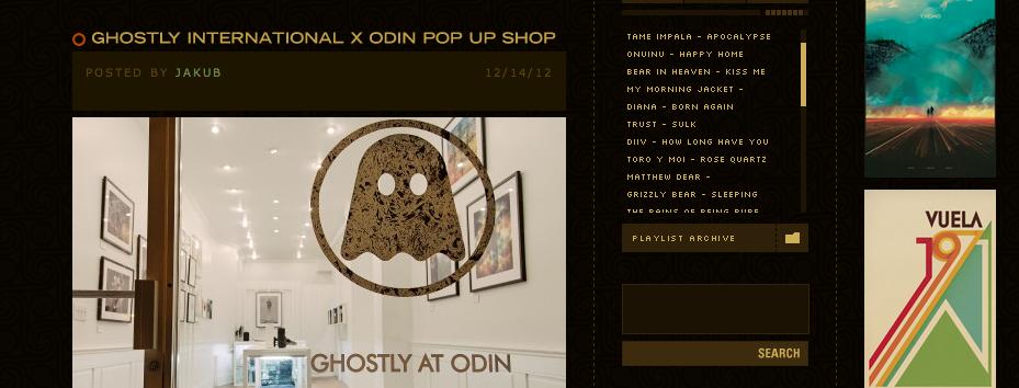
Originally created as a personal portfolio site ISO50 combines both the design and music realms. The blog’s creator, Scott Hansen, is both a designer and a musician in the band Tycho. The blog has a lot of personal touches, including archived playlists and curated material that often involves the intersection of music and design.
Favorite recent post: Daytum Data Tracking
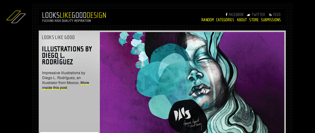
Jonas Kamber, a Graphic Designer from Switzerland, founded Looks Like Good Design, an interestingly interactive blog that allows users to “vote this shit,” “like this shit” and “share this shit,” as well as a call for discussion about the work that is posted. There’s also a sections called the “Toilet Wall” (like scribbles on a dingy bathroom stall) that lets people post their own inspiration.
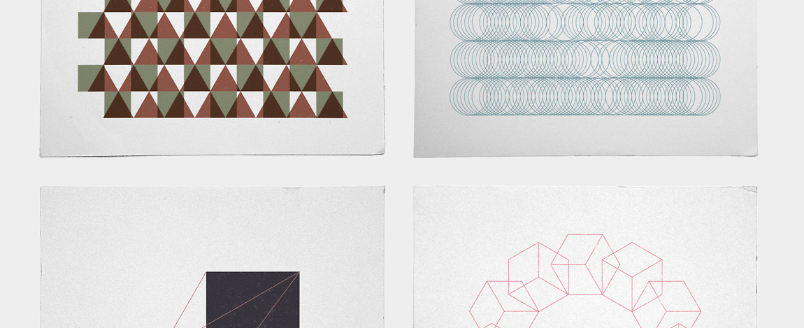
Tilman Zitzmann is graphic designer in Germany who took a year off to care for his two small children. To keep his designer’s mind fresh, he decided to undergo a daily project in which he creates a different geometric pattern every day. He says he gets “a serious flow “ when he draws these “simple patterns,” and that “doing this graphics project besides my dad duties will keep me on my designer’s toes.” The results are beautiful explorations in shape and color.
Favorite recent post: “For here we have no lasting city, but we seek the city that is to come.”
TYPOGRAPHY

Sponsored by Hoefler & Frere-Jones, this curated gallery of type-related content filters images by color, key word or just randomly. It also gives designers who are a bit (ahem) more particular the option to choose the grid in which the rectangular images are displayed (I prefer the 4×4 grid).
Favorite recent post: Letterpress sign
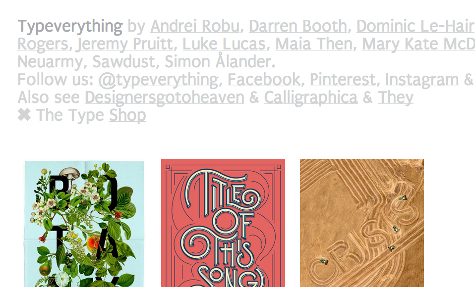
Typeverything is a well-culled selection of beautiful typography in “all shapes and sizes, colors and styles.”
Favorite recent post: R.I.P. Arte Festival by Marco Goran Romano.
PACKAGING DESIGN
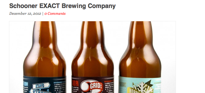
Lovely Package is a packaging blog that curates the very best of packaging design. From wine and beer bottles to pasta boxes and headphone cases, the ways in which designers can innovatively package products is always exciting to see.
Favorite Recent Post: Shepherd’s Purse Artisan Cheeses
A LITTLE BIT OF EVERYTHING
The Fox is Black
Established in 2007
Other Projects
Desktop wallpaper Project
Re-covered Books
Spacesuit of the week
The content that the team of The Fox is Black delivers is always exciting and engaging. The unifying threads among the wide range of subjects covered are personal descriptions of quality design, as well as great music, art and photography.
Favorite Recent Post: Saul Bass poster sketches for Stanley Kubrick’s The Shining
Design Work Life
Established in 2008

A division of Seamless Creative, Design Work Life showcases lots of beautiful images of great design without a lot of exposition. Consistent with posting the best in great typography, branding and packaging, the finds are unique and inspired.
Favorite recent post: Santa Rebranded
Swissmiss
Established in 2005
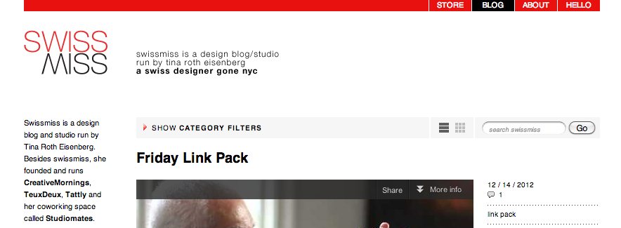
From architecture to gadgets to children’s toys, Tina Roth Eisenberg’s Swiss roots are deeply embedded in the content of her blog. Sleek and minimalistic design is the primary focus, but sometimes she sneaks in some other fun and cheeky things. Eisenberg is also the founder of Tattly, enormously fun and well-designed temporary tattoos, and an organizer of a monthly breakfast series called Creative Mornings.
Quipsologies
Established in 2005
A division of Under Consideration, this blog is based off of user-submitted “quips,” or short videos or images used to describe themselves or someone else. The result is a tantalizing mix of images and videos that are unique and fresh, oftentimes hilarious and sometimes sobering.
Favorite recent post: Presidents with Boobs on their faces (Presidents with breasts literally painted on their faces).