

Time to reposition yourself. An intern ran afoul of the Twittersphere, and it’s now a viral opinion that your brand is dodgy and outdated. Also, you want updated business cards so white that Patrick Bateman will concede defeat.
A thoughtful, well-executed rebrand is a great way to change the public perception of a company and differentiate from the competition, all without spending the money to change your actual product. Exhibit A: in a stumbling rebrand campaign 5 years in the making, people now think Miller Lite tastes better in its throw-back packaging. Although not all are the “best” – some definitely missed the mark – we’ve rounded up the 10 most notable rebrands in 2014.
1. Olive Garden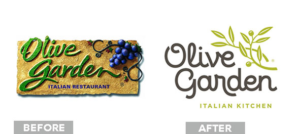
A quick poll of the office, and the responses include, “It looks like a nondenominational church logo” and “Church newsletter, though this one of course does not have Papyrus.” The simplified olive branch, lime green, and monolinear script combine for a logo that’s pretty generic, although easily read and scalable. Ditching the stucco texture was for the best, but the loss of the leafy dark green and handwritten script makes the notion that Olive Garden is authentic Italian dining ring even more false. But, let’s not forget what’s important: endless breadsticks.
2. DeviantArt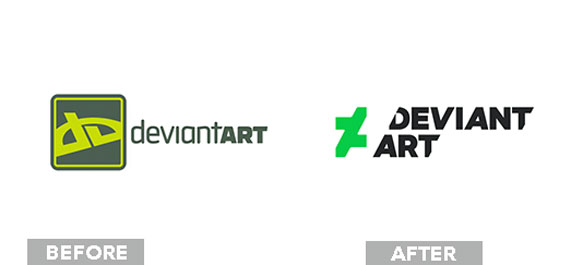
At first, we were skeptical of DeviantArt’s slashed logotype. It dredged up traumatic memories of finally finishing a design and then promptly destroying it with an Xacto knife mishap, hopefully without getting blood on the project. However, a lot of thought and planning went into this rebrand, and we do think it’s leaps and bounds better than the old logo. The sciencey feel is on brand, and we love the slashed type large and dropped out of artwork.
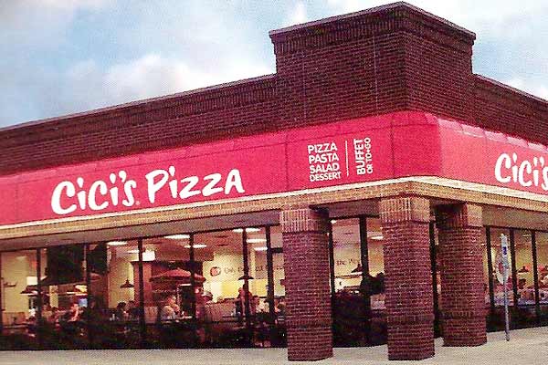
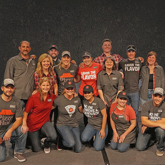
3. Pizza Hut
With the introduction of the “Flavor of Now” campaign, Pizza Hut also rolled out a new logo. The white brush script dropped out of a tomato sauce red looks very similar to a Cici’s Pizza buffet awning. The logo works best when the roof is together with the logotype; separate them, and the roof looks more like a gardening hat. Sign us up for these new uniforms, with taglines like “No one throws a sandwich party” and the vintage Pizza Hut logo.
4. Southwest![]()
Unlike most other airlines, for the past 40 years Southwest has remained profitable and well-loved. This rebrand focuses in on Southwest’s “heart” with the addition of a heart icon to the end of the logotype. Inside of the striped heart are the three Southwest brand colors. We prefer the previous logo’s clear connection to air travel, even if it was thunk-you-over-the-head literal. The new logo could be applied to anything directional: a GPS, an outdoor clothing line, our bank accounts. It’s a different approach than other airlines, but only different, not better.
5. 7up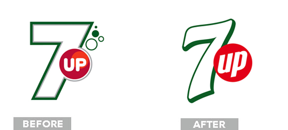
To our international readers, this one probably isn’t new. Due to some weird brand management – PepsiCo runs 7up everywhere else in the world – the US is just now getting the revised 7up logo. Losing the gradients and multiple stroke outlines, the new logo succeeds in maintaining an effervescent brand personality without actually having to show you bubbles. The lemons, limes, and bubbles in secondary versions are nice accents with a light color scheme and a small scale.
6. Black + Decker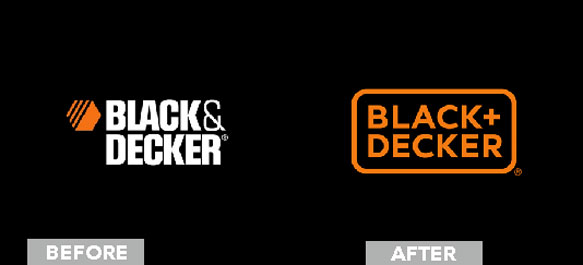
The new Black + Decker packaging would be right at home in a Target or a Bed, Bath & Beyond. The logo shaves off its previous machismo in favor of rounded corners and a neutral san-serif. Not including the iconic hexagonal shape that doubled as a nut was an odd choice. It was a quick way of communicating “Hey look, power tools,” and it would still have fit with the geometric quality of the new logo.
7. Airbnb
It was almost a game to see what other images you could find in the new airbnb logo when it first was released. A bird beak! Every part of the reproductive system! A cross section of some celery! Nicknamed the “Bélo,” the icon is a combination of a heart, the letter A, a person’s head, and a location symbol. Minds in the gutter aside, we think the mark is distinctive, clearly well thought out, and preserves airbnb’s light-hearted personality.
8. PayPal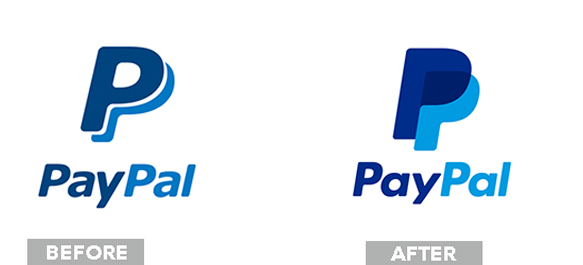
Not too much has changed here, although the tone has shifted to something more modern. The color scheme, type arrangement, and type choice are only slightly different, replacing a rounded Verdana with a rounded Futura. A solid if forgettable update, the most interesting part of the PayPal redesign is the over-print like interaction of the two P’s.
9. Bacardi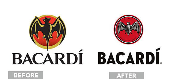
Drawing inspiration from their early 1900’s mark, the Bacardi logo is interesting because it takes a minimally designed graphic and replaces it with an intricate, stippled version. The trend lately, like we’ve seen in all other rebrands on this list, is to simplify, simplify, simplify. The continual simplification of the Bacardi bat over the years was getting way too much into mouse territory. The kerning of the logotype is a little widely spaced, but the font choice looks like a modern take on vintage travel poster san-serifs and the wavy dot on the “i” is a nice touch.
10. Monster![]()
Out with the grungy, off-kilter type of the Monster logo of old. Monster.com’s new promise is “Find Better,” and they found the best with an animated flag logo that flaps in the breeze. For real-world application, a still of the rippling purple flag hooks to the edge of business cards, stationary, and billboards. Memorable and innovative, the logo is an excellent reinforcement of Monster’s brand mission.
Brand updates via Brand New