
The 10 Best Comic Artists of 2018
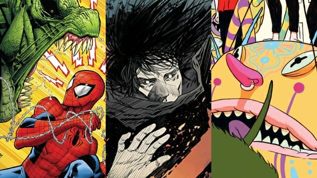
Main Art by Ryan Ottley/ Bilquis Evely/ Dilraj Mann
Ranking artists, or even trying to choose the “best,” is an impossible task. Art is subjective, and comics—a medium that allows or even encourages picking specific styles and sticking to them—invites endless debate over talent and skill. Certain fans find comfort in open, colorful cartooning, while others get giddy over crammed pages of intricate ink work. Photo-realism may drive some readers up the wall while communicating a cinematic experience to others. For every artist we might consider the “best,” you’ll find just as many fans looking for their opposite.
The list below, ordered alphabetically, highlights 10 new and veteran artists who blew us away in 2018. Their styles vary from updated versions of peak-‘90s action cartooning to seemingly simple pen and ink scratch marks—and everything in between. We may think calling anyone “THE BEST” is a little bit silly, but each and every artist below brought something undeniably unique to the page this year, and we’re thrilled to honor that.
![]()
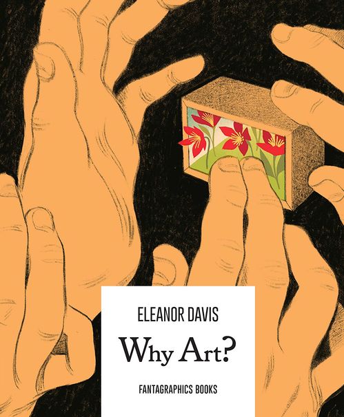
Eleanor Davis, Why Art?
I could pick a hand drawn by Eleanor Davis out of a whole pile of hands. There’s something about the way she draws that is utterly distinctive, with an emotional heft that comes through in the curve of an arm, the weight of a thigh, the arch of an eyebrow. You can see it on view not only in Why Art?, but also in Tomorrow, the new book she’s been rolling out chapters of on Gumroad before Drawn + Quarterly publishes the whole thing next year. Even tiny people seen from far away, framed by trees and other scenery, seem to communicate what’s going on inside them through strange vibrations. When they actually touch each other, the amount of feels is as loud as being next to the big amplifiers at a rock show. How does she do it? I don’t know, but I don’t need to. The point is that she does. Hillary Brown
![]()
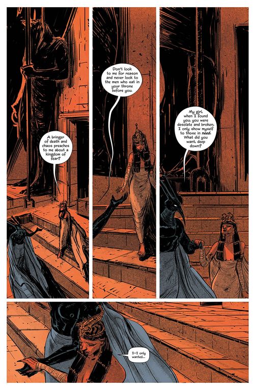
Vanesa R. Del Ray, Redlands
The comics industry is in the middle of a golden era when it comes to diversity of visual aesthetic. Vanesa R. Del Ray is one of the most interesting and skilled artists in a growing group of creators who think outside the box both literally and figuratively, breaking up panel construction and moving beyond traditional house styles to tell stunning stories. Del Ray’s painterly style is lush with texture and color, adaptive enough to portray more refined detail or to wash a story in shadows and the barest hints of shapes. Her work with Jordie Bellaire on Redlands has been stellar, conveying the oppressive wet heat of rural Florida and wrapping the characters in indulgent violence. The book is southern gothic horror in every sense of the word, humid mystery draping a thin veneer over a long history of war. Beyond Redlands, she also contributed to The Nib: Death, one of the best books of this year. Del Ray drew single-page illustrations of people like David Bowie and Audre Lorde in shades of black and gray and pink, with accompanying quotes about death and mortality. Especially in a book packed to the gills with information and color, these restrained color stories acted as much-needed breathing space—a palate cleanser between lessons. Caitlin Rosberg
![]()
Bilquis Evely, The Dreaming
It feels almost premature now to have honored Bilquis Evely in 2017 for her work on Greg Rucka’s Wonder Woman—not because her time spent on Themyscira was anything less than visually resplendent, but because The Dreaming proves just how far she has since raised that already high bar. Launching any new series set in the world of Neil Gaiman’s The Sandman is a high-pressure task, let alone the flagship book loaded to the gills with key characters from the original run. Yet from her framing sequence in the Sandman Universe one-shot on, Evely and colorist Mat Lopes have staked a claim as one of the strongest artistic teams to ever pass through Dream’s realm, thanks to Evely’s lithe figures, strong sense of visual acting, mastery of crowded pages and willingness to explore more experimental layouts when Simon Spurrier’s script calls for it. Each Sandman Universe title has something going for it, but Evely’s contribution to The Dreaming has put it head and pale shoulders above the rest. Steve Foxe
![]()
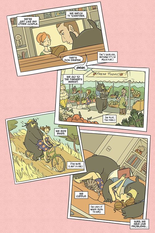
Cat Farris, My Boyfriend is a Bear
Nearing 30 years old and dissatisfied, Nora is directionless until Bear stumbles into her life. My Boyfriend is a Bear is a story told in short bursts, almost like an anthology. Nora retells the story of their relationship and each scene plays out like we’re reliving those memories right beside her thanks to Cat Farris’ artwork. She dabbles in traditional and abstract styles to show Nora and Bear in a way that sells the idea of a lady/literal bear couple, unafraid to experiment with the expected—much like Nora herself. Where many comics aim to show emotion through realism, Farris sidesteps and surpasses that approach. Instead, she pinpoints emotion through abstraction, and the effect is so much better. Her cartooning grabs hold of those endearing parts of being in love that feel like they can’t be described and communicates them with ease. Her art is malleable to each situation, but always consistent. My Boyfriend is a Bear is a story about loving who you want to love and being comfortable living the life you choose, all of which is communicated with Farris’ heartwarming, occasionally vulnerable and always self-assured art. Josh Hilgenberg
![]()
Jorge Fornes, Hot Lunch Special & Batman
Rather than one defining project, Jorge Fornes had what could best be described as his glow-up year—or breakout year, if you want to take the boring route. After several years of serviceable yet unremarkable short runs on X-Men titles and other assorted odds and ends, Fornes spent 2018 ratcheting up the tension of Eliot Rahal’s Midwestern noir Hot Lunch Special and making a brief yet memorable impact on Gotham City. In both Batman: Secret Files and portions of Batman #60, Fornes locked into a David Mazzucchelli/ Chris Samnee groove, proving that there’s plenty of life left in the nine-panel grid when you know how to pace a scene correctly. Fornes’ small, precise panels often carry more oomph than other artists’ full-page splashes, thanks to his curatorial eye for which moments deserve a beat of their own. If 2018 is any indication, Fornes is only on the way up. Steve Foxe
![]()
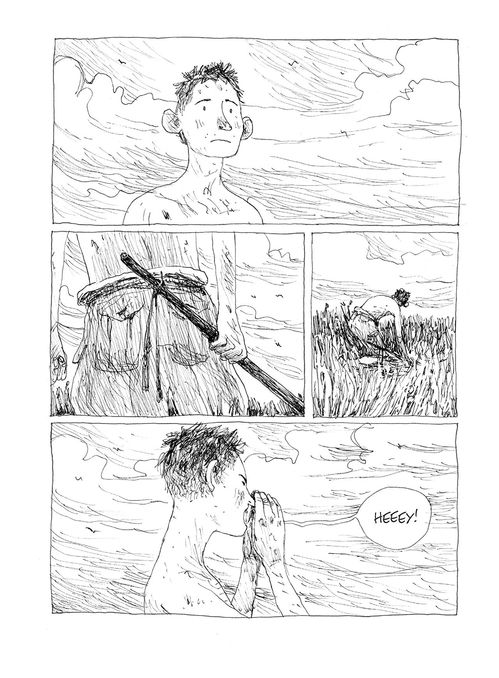
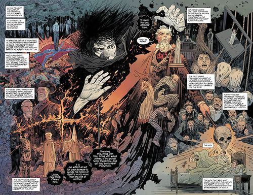
Gipi, Land of the Sons
How do you draw the apocalypse? It’s a question that a lot of artists are trying to answer these days. Matt Lubchansky, at The Nib, has opted for fixed smiles and staring eyes as their characters move through a recognizable but cartoony wasteland. Gianni Pacinotti (Gipi), on the other hand, isn’t trying to be topical. In Land of the Sons, he lays down scraggy line after scraggy line to create a world with far fewer humans and a lot less of the best of humanity. It’s as though a more refined way of drawing doesn’t work anymore in this poisoned hellscape and the only way in which one can build up something substantial is through desperate, pained stabs at meaning. It takes 12 separate lines or so to shade the side of a nose, dozens to create a skinny back with its visible shoulder blades and hundreds to put down a grassy field or a pile of rocks. The effort is the point. Communication is hard and it’s not getting easier. The only way we get there is one step (or one pen mark) at a time. Hillary Brown
![]()
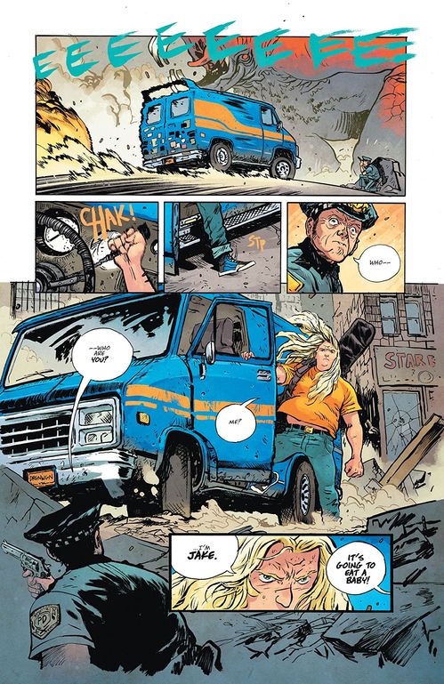
Daniel Warren Johnson, Murder Falcon & Extremity
Daniel Warren Johnson is a repeat appearance on this list for good reason. Early this year, he wrapped up his breakout fantasy series, Extremity and he steps into 2019 several issues deep into his death-metal monster-hunting comic, Murder Falcon. Conceptually, the two books are miles apart, but they share some deep-rooted similarities thanks to Johnson’s inimitable approach uniting the best parts of Eastern and Western art styles. His loose inks turn otherwise traditional action scenes into dramatic, relentless frenzies with loads of momentum. Johnson’s pages are a trip to an iMAX movie. Panels in Johnson’s books expand and contract with the action, so a small square before a ludicrous punch from Murder Falcon or a stirring emotional moment from Jake explodes into a three-quarter-page image, or, when the moment’s right, even a double-page spread. It’s a small touch that makes his already action-packed books undeniably visceral. The pacing that results from those swelling layouts makes a 22-page issue feel like a complete story on its own. Even if we only went off of his famously bombastic commissions, Daniel Warren Johnson has once again cemented himself as one of the year’s best artists. Josh Hilgenberg
![]()
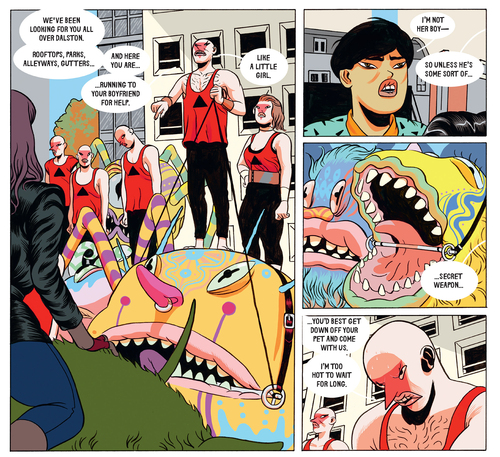
Dilraj Mann, Dalston Monsterzz
Dilraj Mann’s Dalston Monsterzz is a mess as a narrative, but it’s quite good as a series of colorful paneled pages. Full of large, squishy people who bulge here and there, spiky bits that contrast with plush lips, hyperactive patterns and cityscapes that make you dizzy, it reminds one of the interesting things about Frank Miller, like his commitment to ugliness that can make the reader physically uncomfortable. The color palette rarely makes sense and seems to change from spread to spread, but the range of hues is really something else. Mann’s book is more an art product than a story, and even as an art product it’s kind of Jeff Koons-y (brassy, cheap, focused on evoking sensation through whatever means necessary), but that doesn’t mean it’s uninteresting. Hillary Brown
![]()
Tradd Moore, The New World
Tradd Moore has done a slew of covers at Marvel as well as the first arc of All-New Ghost Rider, an oversized Venom anniversary issue and all three volumes of the Image Comics series Luther Strode. But his collaboration with Aleš Kot on this year’s The New World saw him taking on ambitious backgrounds and remarkable new character designs—some very hefty world-building for a neon-cyberpunk story that wouldn’t have worked half as well without him. His work on The New World was elevated by colors from his Heather Moore, who kept the palette bright and poppy. The book is swathed with liquid gore familiar from his days on Luther Strode, but along with more detailed, colorful interiors and broad, adventurous landscapes, Moore also tackles psychedelic parties and drug-fueled visions. What really jumps off every page is the vast variation of characters who populate The New World. Each one is distinct and easy to read through body language and clothing, with saturated colors and futuristic fashion trends making everything look like a better lit Blade Runner, or the heir to stories like Ghost in the Shell and Judge Dredd that warn us of the flawed world we’re building. If that world looks like what Moore has drawn though, it wouldn’t be all bad. Caitlin Rosberg
![]()
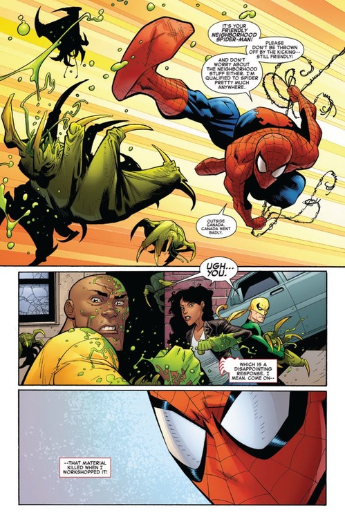
Ryan Ottley, Amazing Spider-Man
By my conservative estimate, Ryan Ottley spent approximately one trillion years drawing Invincible with writer Robert Kirkman, and while corporate comics will always represent a step back in the eyes of some fans, Ottley on Amazing Spider-Man felt like destiny fulfilled. Whether or not you care for writer Nick Spencer’s regression of Peter Parker to more of a down-on-his-luck loser than the established tech magnate of prior runs, Ottley’s time on Invincible perfectly prepared him for the balance of interpersonal drama and acrobatic combat required on AMS. Ottley nails every flirtatious interaction between Peter and MJ, his trademark killer grins look right at home on Parker’s mug and his angular figures and hard black lines recall the ‘90s heyday of webcrawler action. Fingers and arachnid appendages crossed that Ottley’s run at Marvel is just as long as his tenure at Image Comics. Steve Foxe