
Manuele Fior’s The Interview Puts Aliens & Emotions in Soft Focus
Art by Manuele Fior
Writer/Artist: Manuele Fior
Translator: Jamie Richards
Publisher: Fantagraphics
Release Date: April 11, 2017
 Manuele Fior’s second book in as many years from publisher Fantagraphics provokes interesting comparisons, not only to previous graphic novel, 5,000 km Per Second, but also with last year’s arty sci-fi film Arrival. Both The Interview and Denis Villeneuve’s intellectual sci-fi film focus on contact with extraterrestrials, whose ships appear mysteriously and whose methods of communication differ considerably from those of humanity. Both works also fall on the dreamy side, the Stanley Kubrick school of sci-fi rather than the hard-edged Ridley Scott approach—more concerned with the way human relationships are affected by interstellar contact than with the nuts and bolts of new technology. Neither offers much in the way of exposition. We’re thrown in and left to figure out what the heck is going on. Sometimes this method is a bit frustrating.
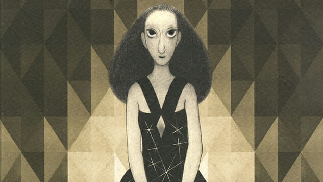
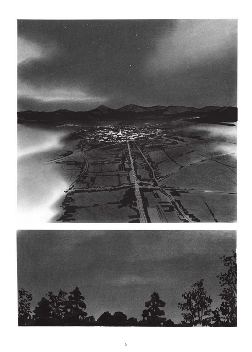
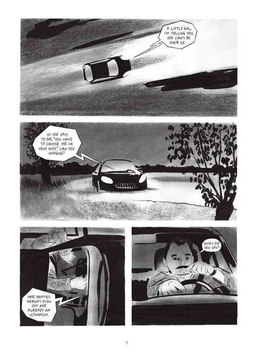
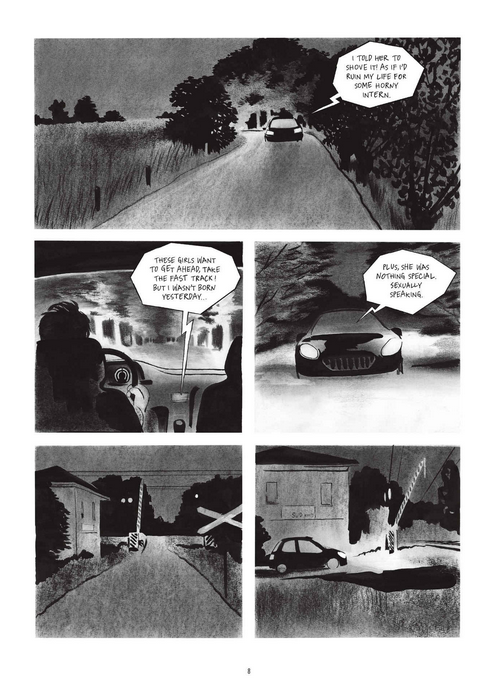
Fior’s illustrations are soft and rounded in this book, more muted than in 5,000 km Per Second. It makes sense: his protagonist, Raniero, is middle-aged, whereas the actors in the earlier work started young and spiky. The Interview is all black and white and gray in comparison to Fior’s previous bright colors that evoked so much emotion. He combines smudgy pencils with beautiful, dark ink that stands out sharply by contrast, casting shadows and directing eyes to his singular flow. He doesn’t like to draw a line around his panels, which (mostly) stay separate from one another through negative space. The cartoonist also likes to draw rain, and he’s good at evoking what it’s like to exist in the environments he creates, whether hot, dry and urban or humid and natural.
The Interview Interior Art by Manuele Fior
Fior also makes a place for sex, which is a concern that runs throughout the book. Raniero is estranged from his wife, who wants to move back to the city from their country house. He meets a beautiful, young patient at the psychiatric institute where he works, and they are drawn together, perhaps through their mutual experiences with something that may have been an alien spaceship. She espouses the philosophy that many young people embrace in the book’s nearish future: polyamory without jealousy. He doesn’t. Can he get over it? Will the appeal of youth’s tautness win out? Fior handles all of these questions with delicacy, making ample room for shades of gray, just as he does with his visuals. The spiky intrusions that invade softer areas are both literal (ships that appear in the sky) and more metaphorical (contrasts between generations). It’s all very European, the equivalent of an art film in comics form. It doesn’t fit together like a well-constructed puzzle box, but it’s reasonably successful at prodding your brain in new directions.
The Interview Interior Art by Manuele Fior
The Interview Interior Art by Manuele Fior