

The recording is done, the producing and post producing is done, so now what? Sometimes it seems artists get so hyped about an album that they forget to sweat the big stuff, like the actual cover.
Musicians: Need tips on how to make your cover art stick out from the rest? Avoid these five design cliches, and you’ll be golden.
5. Justified Text
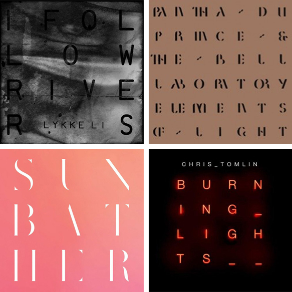
Worried about trying to fill the frame of an otherwise boring cover? Just highlight the text and press the button that formats letters in the style of your grandmother as she deciphered Microsoft Word. People love squares, right?
4. Double Exposure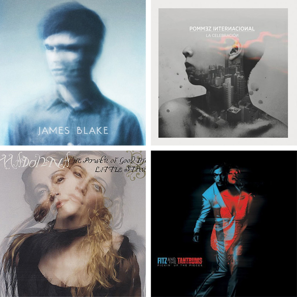
Double exposure was invented almost immediately after photography itself, and people have abused it ever since. Simply overlaying two images isn’t a jarring artistic statement anymore—it just looks indecisive. To see a better example of this technique, check out practically any frame of the True Detective intro sequence. That’s double exposure done right.
3. Painted Portraits
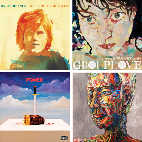
This is overdone, but also not the worst idea ever, as long as the paintings are actually good. For the most part, painted album covers have embodied the handmade-in-a-hurry vibe, which isn’t how you want your music to come off. The four examples above look like a combination of bad Photoshop filters and portraits purchased in a subway tunnel—both of which should be avoided forever.
2. Facing Sideways
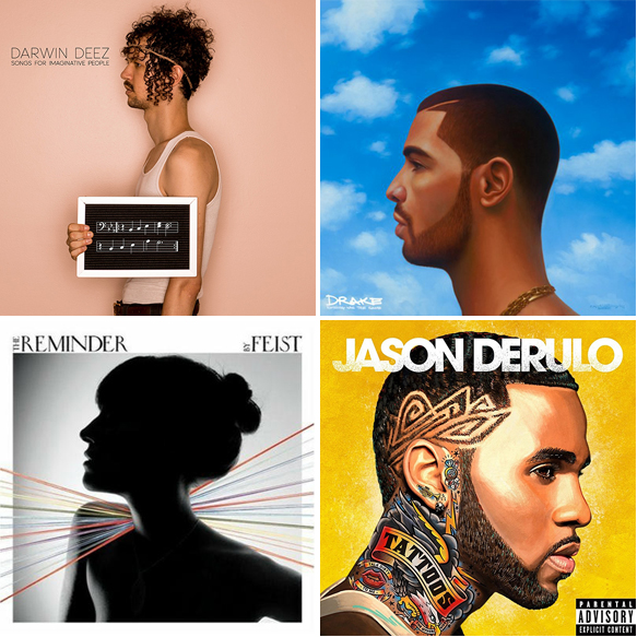
Sideways-facing albums have become something of a joke in the internet community, spawning single-serving websites such as DRAKE WEATHER. None of these albums are dramatic enough to warrant a pose like this. Where are they looking, anyway? Back to a time when their album art was better?
1. Obscured Duo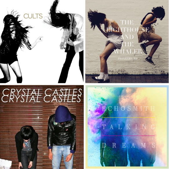
Where did this trend start? Here are some theories behind this stylistic decision: A) Faces burned off by acid B) Enjoy smelling their own hair C) So underground they can’t reveal their identities. We welcome guesses on this one, because it’s a mystery.