Olivier Schrauwen on his grandfather, Werner Herzog, and Creating One of the Best Graphic Novels of the Year
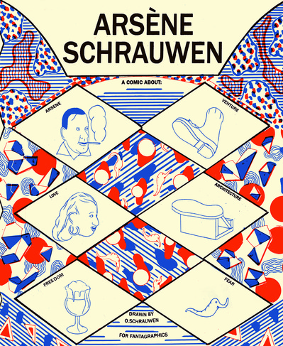
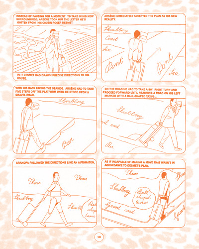
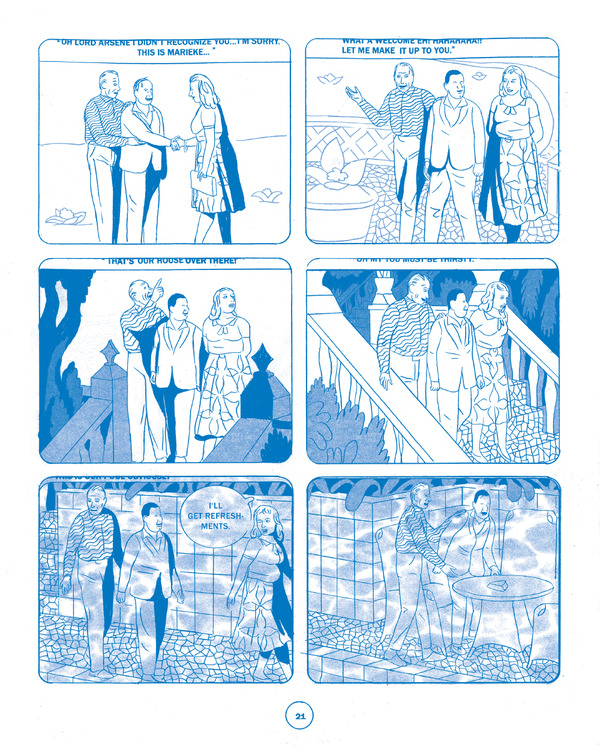
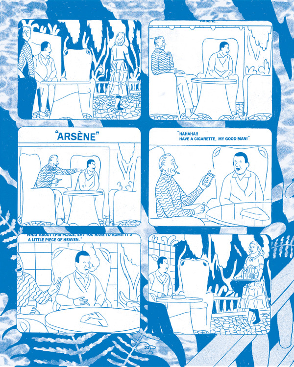
Published by the indie stalwarts at Fantagraphics, Olivier Schrauwen’s Arsène Schrauwen is one of the most complex, and simply best, comics released this year. Ostensibly the story of the author’s Grandfather, Arsène, and his adventures in an unnamed African country, the graphic novel self describes as “a comic about Arsene, venture, love, architecture, freedom, fear, lust, the unknown, nothing, projection, expectation, new acquaintances, bullshit-artistry, entrapment.” That description sounds about right, yet also fails to capture the full scope of the book, which uses simplified drawings, collage-like text and two colors (red and blue) to convey a narrative that moves between the real and the fantastic with grace and facility. The result is an experience both utterly original and strangely familiar, like a dream.
Although English isn’t his first language, Schrauwen emailed with Paste from his home in Berlin, providing new insight on a modern classic.
Paste: Let’s start with a brief history of your work in comics. You’re still not that well known in the U.S., so some background about where you started — I know that you studied comics at school and have worked in animation — would be helpful.
Olivier Schrauwen: When I was 21, I was asked by the Franco Belgian magazine Spirou to come and work for them. I did a few strips, but found the work extremely frustrating; there were just too many restrictions. In the following years, my work only appeared in alternative small-press zines until I was asked by Bries, a Flemish comics publisher, to do a book. That book became My Boy. It was published in 2006. After that, I did three more “official” books: The Man Who Grew His Beard, Mowgli’s Mirror and Arsène. The rest of my work appeared in anthologies and self-published zines.
Paste: Arsène Schrauwen seems strongly informed by graphic design, with repeating visual elements throughout (the cover is a great example). Do you have a background in design?
Schrauwen: I don’t really have a background in design. I studied animation, and the emphasis there was on “nuts and bolts” technique. For the most part I taught myself how to do things, like many comic-artists I guess, through trial and error. The graphical style, drawing style, book design and so on is mostly derived from the general idea of the story. Sometimes there’s no general idea; then I’m in trouble.
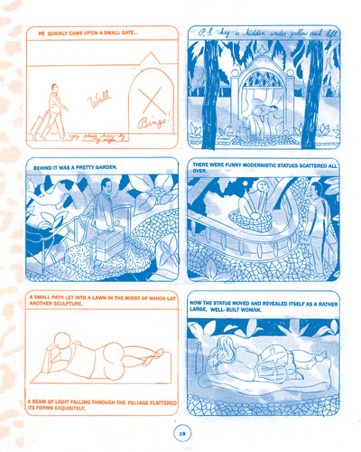
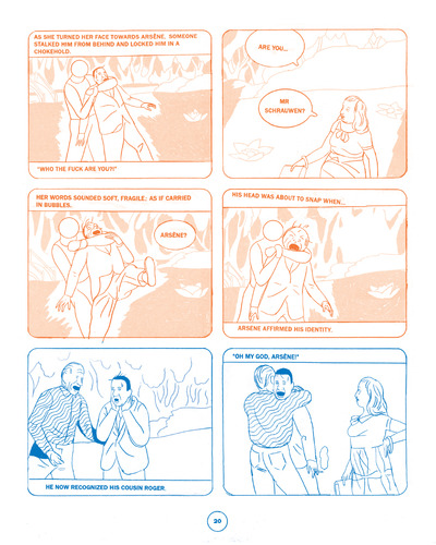
Paste: The story moves between reality and fantasy. Do the different colors represent more realistic and more fantastic elements? If not, how did you choose which panels were red and which blue?
Schrauwen: The meaning of the color changes is not fixed; it depends on the context. For instance, the red can suggest a sweet and romantic feeling, but it can also illustrate hellish torment. The choice to work with two colors comes from the fact that I printed it first by myself, on a printer that can only print two different colors at a time. When you overlap the colors you can have quite a rich palette, but I figured it was more appropriate for the story to just juxtapose the colors. It’s a bit crude and brusque, but so is the story.
Paste: Tell me more about printing the book yourself. Was it screen printed? Did you hand bind the pages, too?
Schrauwen: I’m printing it in three parts. I still have to do the last part. It’s done on a Riso printer. It looks and works like a photocopy machine, but the printing looks much nicer. I do the folding, stapling and thumb splitting on my own, mostly because I don’t want to bother anyone else with it.
Paste: The full-color section at the very end seems to be the most straightforward part of the narrative. Is that why you drew/colored it the way you did?
Schrauwen: That’s right. I wanted it to feel more conventional, as if you wake up from some illusion. It’s still the same two colors, but the blacks you get in the overlap make everything look more like a “regular comic.”
Paste: It seems like there is a movement in comics at the moment that focuses more strongly on innovative coloring — for example, Dash Shaw’s work in New School and Doctors; Asterios Polyp. Do you think that’s true? Do you consider yourself part of it?
Schrauwen: The coloring has an enormous impact on how the art is perceived. It’s easily underestimated though, a bit like music in film. We have the luck and luxury that we can consider this aspect. Photoshop has made everything more manageable, printing techniques got more sophisticated. It’s maybe also more commonplace for the author to take care of the colors himself.
That said, I often have a very clear vision on what the page should look like formally, but no clue what the colors should look like. I just try different things until I get it right. I’m also slightly color blind, which doesn’t help.
-

-

-

-

-

-

-

-

-

-

-

-

-

-

-

-

-

-

-

-

-

-

-

-

-

-

-

-

-

-

-

-

-

-

-

-

-

-

-

-

