
Exclusive: Tongues Cartoonist Anders Nilsen Offers Sketch Commentary on his Mythical, Bold Graphic Novel

Anders Nilsen’s work carefully evades description. His marquee 658-page graphic novel, Big Questions, united bombs, planes and birds in an enigmatic stream-of-conscious masterwork that we’re still unpacking. But the Portland-based artist’s mark is unmistakable; elaborate panels that spit in the face of conventional rectangles, designs that segue between the organic and mechanical, and shifting patterns that wind and ebb into the molecular. Nilsen writes excellent dialogue and characterization, but his output feels like pure subconscious melody devoid of superego interference. And this makes sense—in an interview with Hillary Brown for his mesmerizing sketchbook, Poetry Is Useless, Nilsen explained that, “The more thought that goes into [my comics] the worse they come out, probably. The best ones unfold intuitively. And usually I am playing with a certain constellation of shapes and associations, which changes a bit over time. Symmetry is usually more compelling when it is broken in some subtle way.”
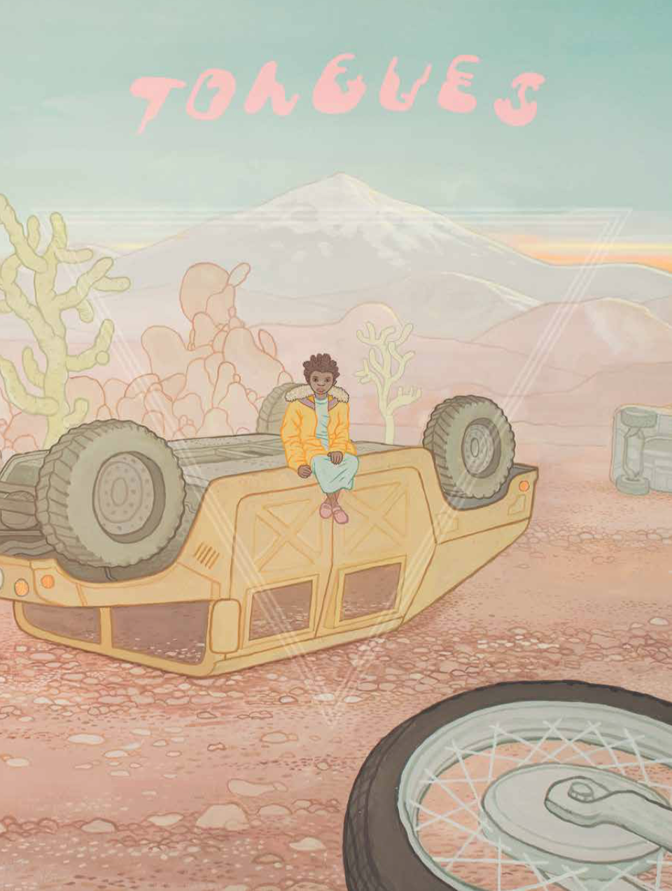
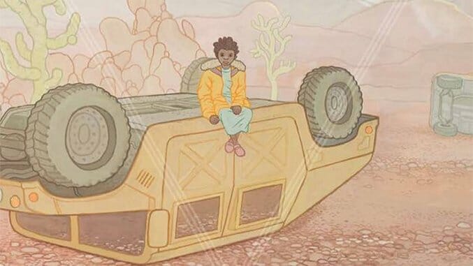
In his new project Tongues, the comic appropriately opens in a primordial dream, the cosmic fugue state that seems to course through Nilsen’s oeuvre. Without wandering into spoiler territory, the narrative involves a deity chained to a mountainside in Central Asia, a backpacking wanderer making a cameo from a previous book and an East African orphan set on a Joseph Campbell quest. Nilsen sought inspiration from the Greek yarn of Prometheus and the plays of Aeschylus, but these achingly big, nuanced vistas drown into a surreality all their own. Tongues is being self-published into serialized collections, with Pantheon Books compiling the affair in one hardback upon completion.
The first collection of Tongues releases later this month, and Nilsen was kind enough to provide commentary on the sketches that led to the book’s creation.
![]()
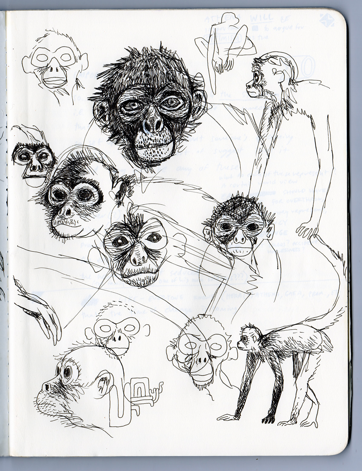
“I had to learn a bunch of new stuff for this book. One thing was how to convincingly draw a monkey, which seems like it should be easy, but isn’t. What I arrived at with the assistance of Google Images search, was a sort of cross between a spider monkey and a capuchin.”![]()
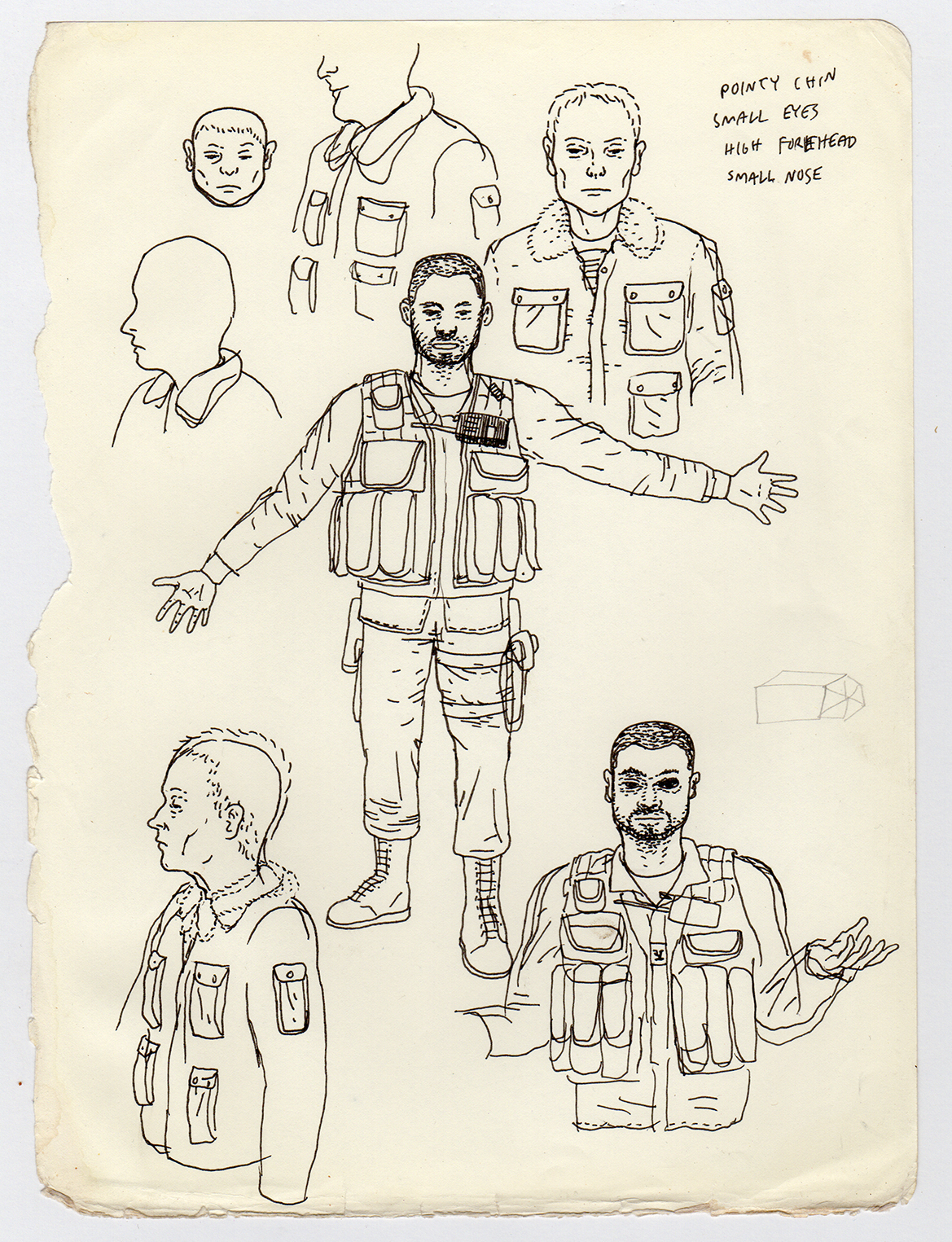
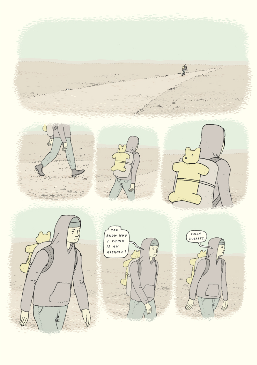
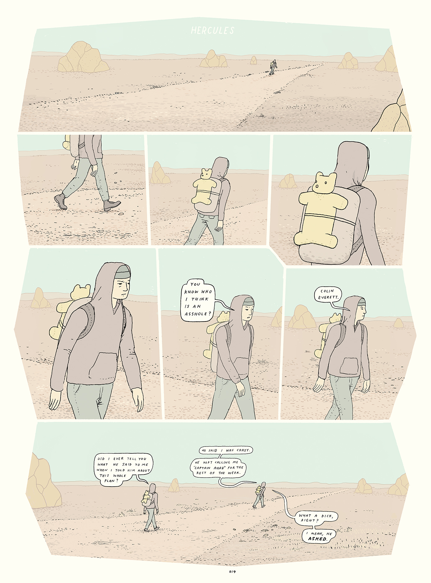
“These two characters are from a sequence I drew several years ago. Once upon a time I was asked to turn my book Dogs and Water into a screenplay (nothing ever came of this in case anyone’s wondering). To fill the story out to feature length, I had to add some scenes. These two characters, and the scene they appear in in the book, came out of that screenplay and were one of two or three little stray ideas that slowly came together over time and accreted into Tongues. Some ideas are very insistent in wanting to come to life, not just sit in a sketchbook on a shelf, or filed away in a hard drive.”![]()

“I did more preparatory sketches of this character, Astrid (AH-stree) than any other in the book. It felt very important to get her affect and particular look just right. I have a bunch more versions in other notebooks.”![]()
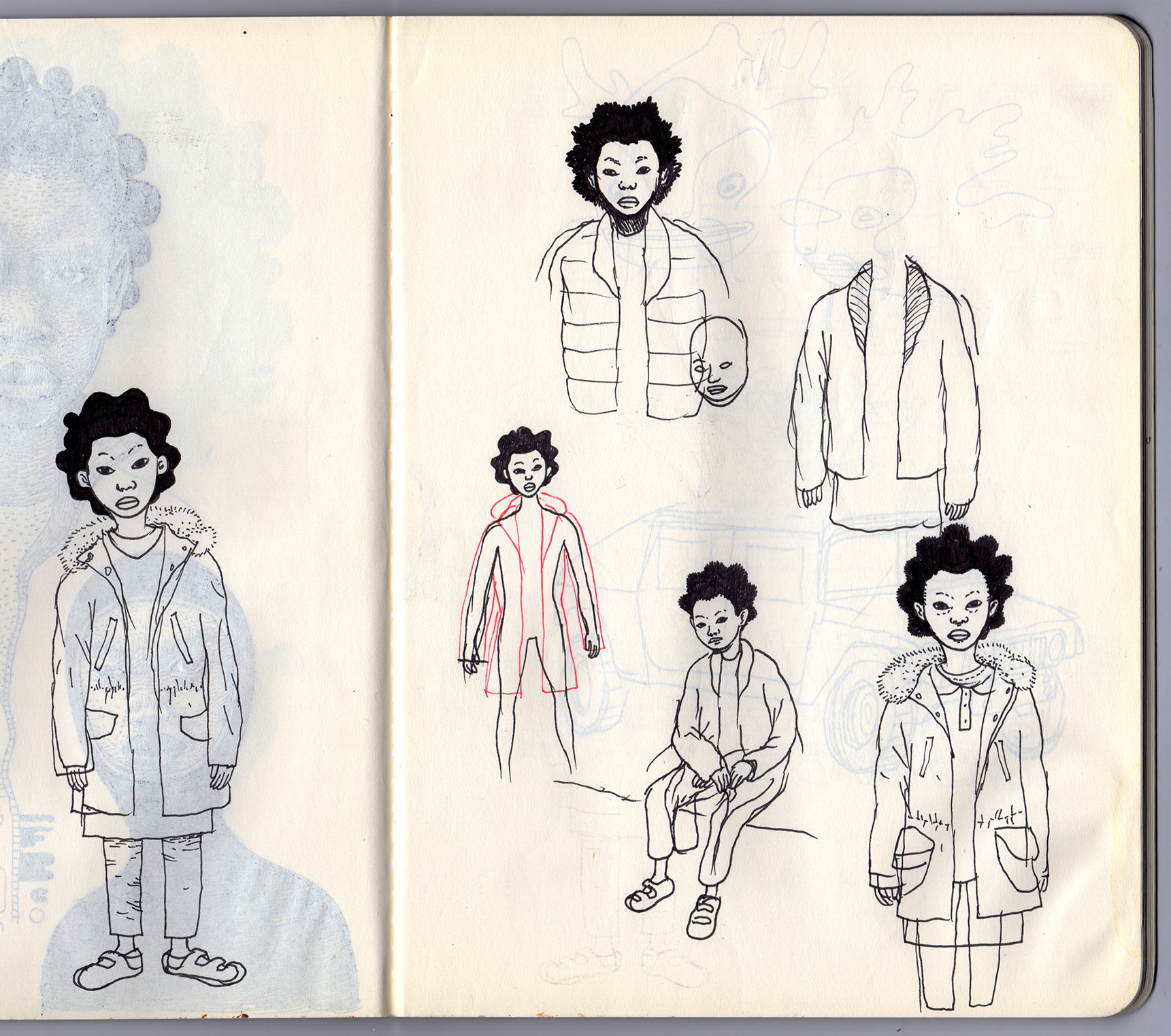
“More drawings of Astrid.”![]()
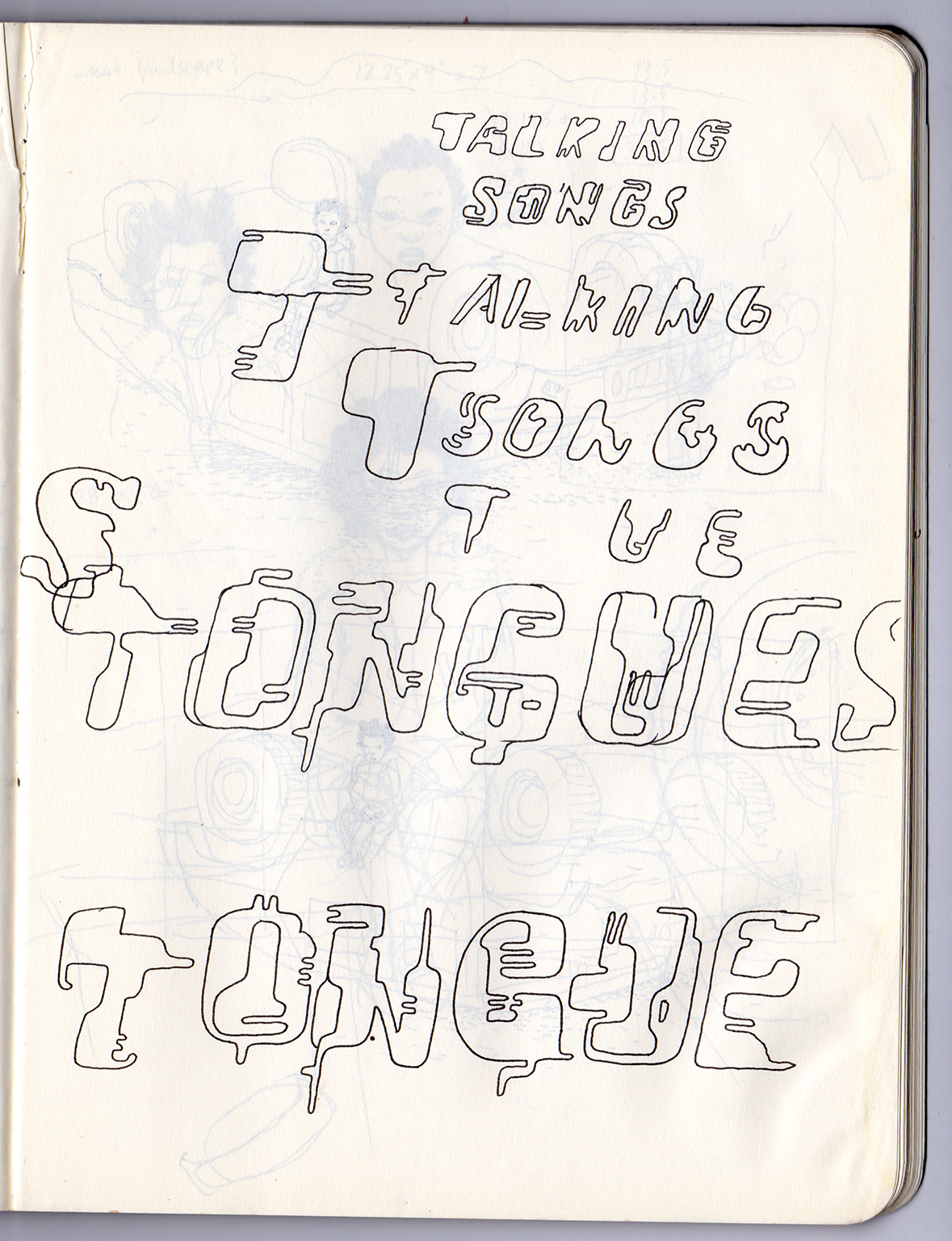
“Sketches of typography for the title. As is often the case, simpler is better, and the actual examples I used are various letters from lines four and five on this page—the O, N, G and S from “songs” and the extra T, U and E from below that. This notebook is filled with examples and attempts of trying to get the type just right and usually overdoing it.”![]()

“A working sketch of the final cover.” ![]()

“Panel design and structure matter a lot to me. I did a bit of teaching from 2012 to 2015 or so and one of the things I found myself focusing on with certain students was how panels work and what happens to storytelling when they change in various ways. Some cartoonists do great things with a simple grid. My two biggest comics influences, Hergé and Chester Brown, use very simple panel structures in their comics, and they were brilliant with it. But I can’t keep from playing around with panels. Partly it’s because I find measuring out rectangles very boring, but it’s also, I think, partly because I studied painting, and so I can’t help but think about the visual composition of a page as more than just a collection of rectangles. It was something I wanted to explore in this book from the outset and so this small sketch is my original idea for how to structure the panels in this opening dream sequence.”![]()
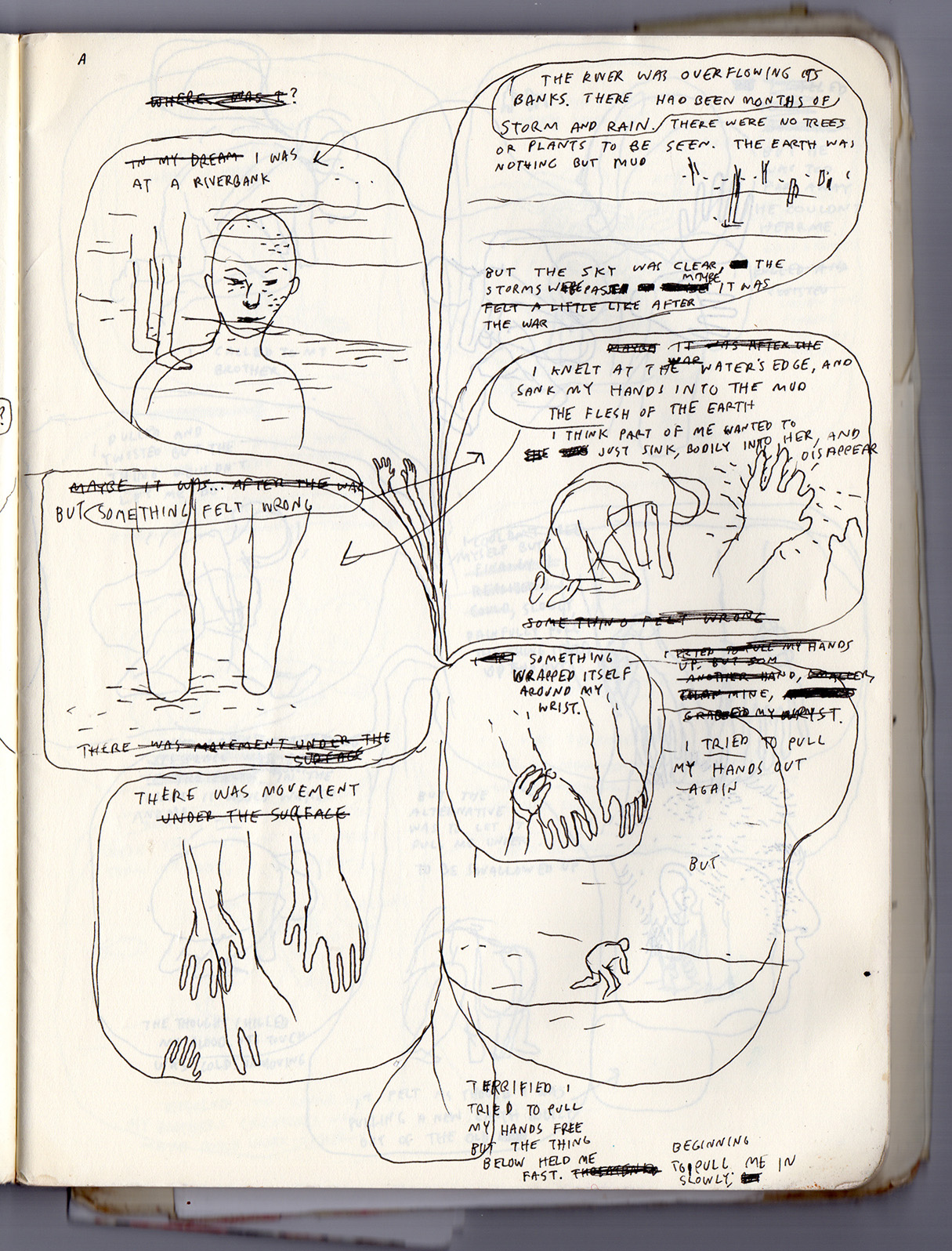
“This is a thumbnail for page 11 (or bits of 10 and 11, really) to plan out how the narration and action would unfold on the page.” ![]()
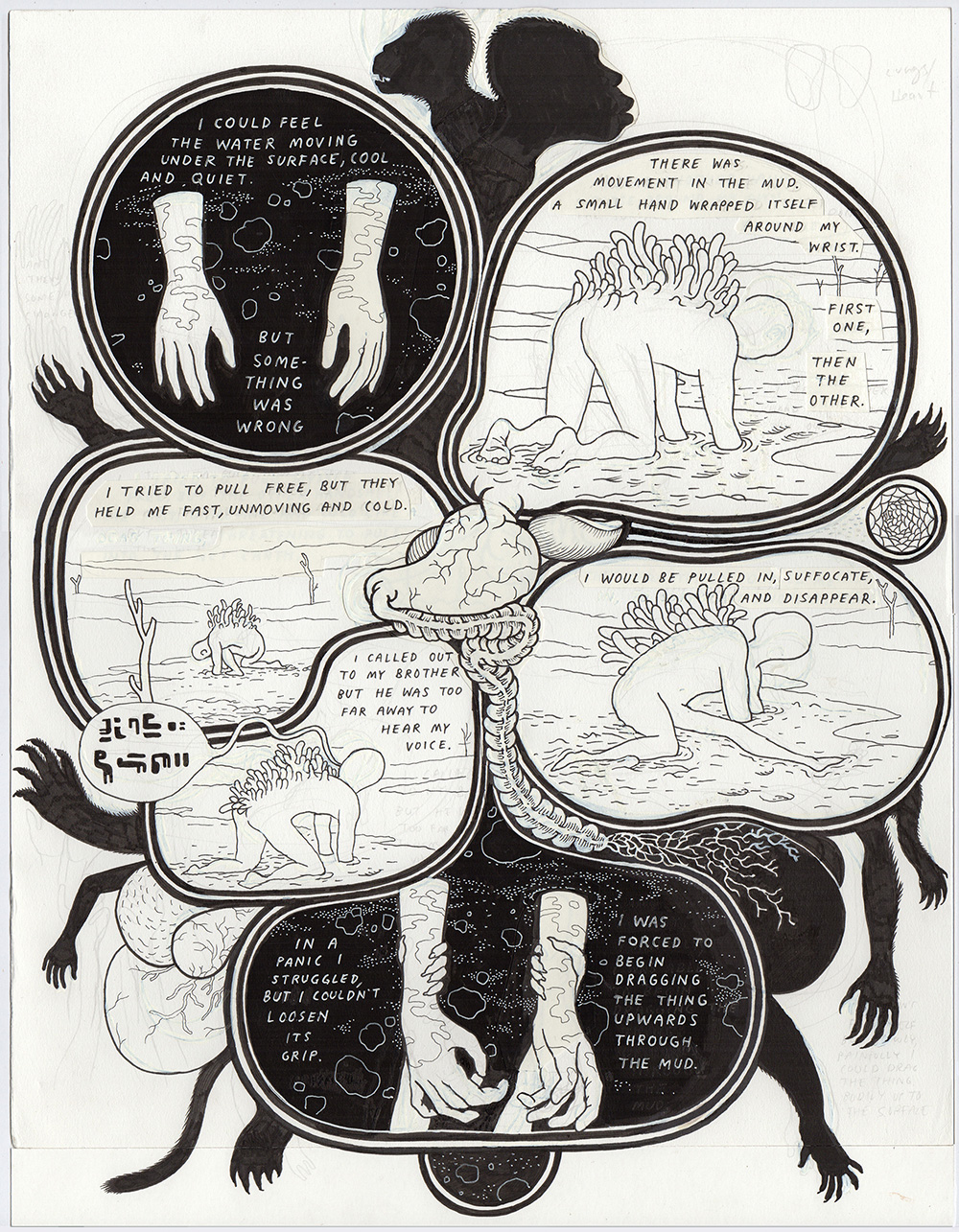
“This is a straight scan of the original drawing of page 11 showing, if you look closely, the many areas where I’ve whited stuff out and cut and pasted corrections. My originals are a mess. I’m editing before, during and after this stage, and the originals show it.”![]()
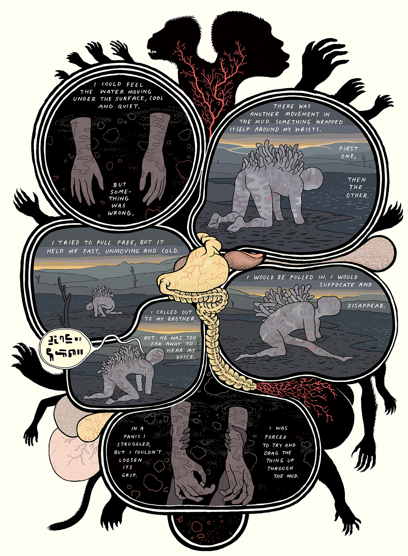
“The finished page.” ![]()
“This is an early example of the way I was planning to handle panels in the book. This is a sort of logical extension of the way I handled panels in Dogs and Water and in many parts of Big Questions, that being simply forgoing the use of panel borders altogether. But those books were both black and white. Color kind of forces your hand regarding borders. This was one early idea of how to handle the problem.”![]()
“This is the same page in its final version (the pages also got larger, allowing four tiers of panels in many cases).” ![]()

“Drawings of hands with stuff growing out of them. I can’t really say what this is, yet, sorry. But some of these ended up in the book.”![]()
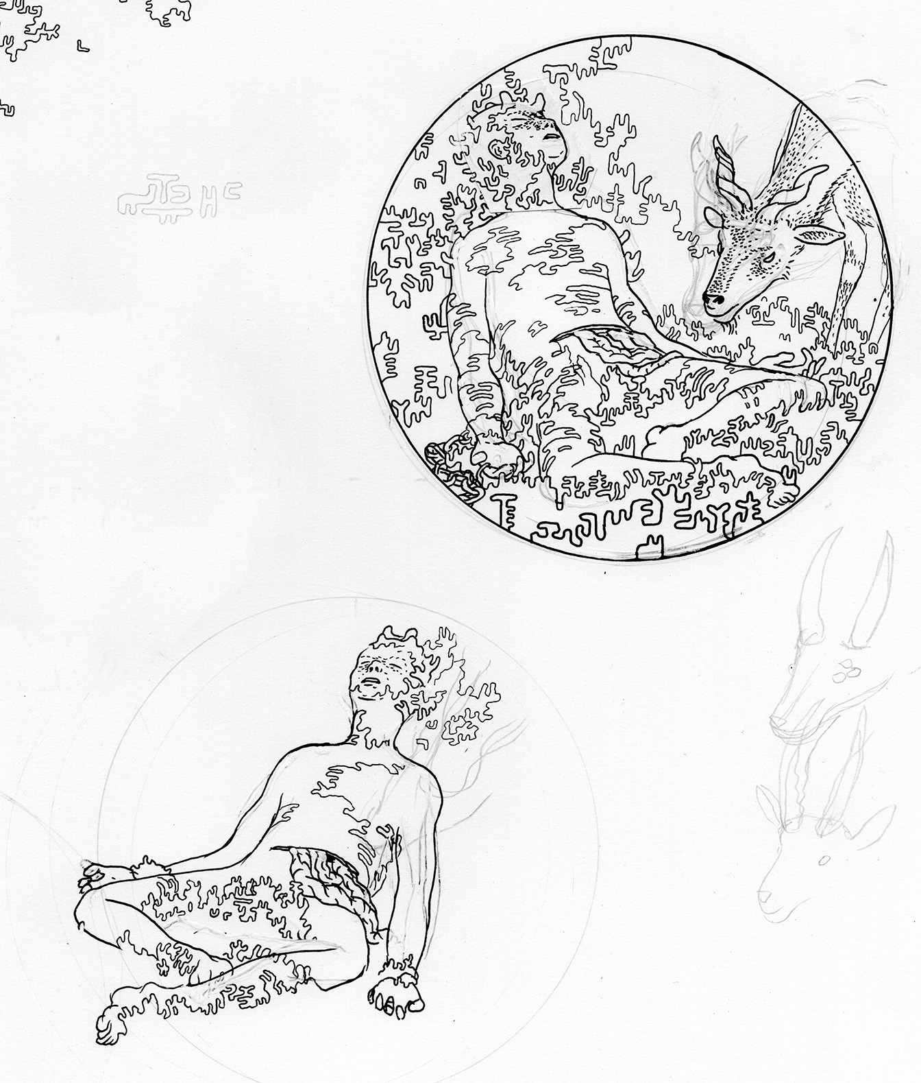
“Some drawings of our captive god protagonist that ended up getting cut.” ![]()
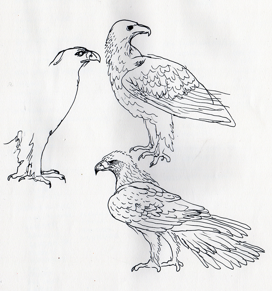
“Sketches of an eagle. It was surprising to me how hard it is to draw an eagle. Their feathers puff out a lot, so understanding the actual structure of their bodies is hard, and making that structure relatable for the viewer, making its gesture and posture and expression feel real, was hard. I’m still learning. There’s also a chicken in the book, and she was also surprisingly hard to get just right. She’s not supposed to be a comedic presence… but it’s actually harder than I imagined to draw a chicken that doesn’t look ridiculous.”