

Writer & Artist: Kat Leyh
Release Date: June 10, 2015
Publisher: Yeti Press
There are more reasons why people read superhero comics than there are superhero comics. Some readers find themselves enraptured by the decades of continuity and mythos. Others revel in the nostalgia. Creators like Grant Morrison innovate under the pretense that superheroes are our modern myths—Superman and Batman standing in for figures like Hercules and Hades. But regardless of reason, DC and Marvel have the superhero market on lock. Third-party entrants (at least in the U.S.) have, for the most part, failed to capitalize on the current popularity of the genre. They aren’t able to appeal to the nostalgia or debut with fully-realized parallel universes.
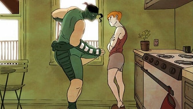
With SuperCakes, a print collection of the webcomic of the same name, writer and artist Kat Leyh avoids these pitfalls, which typically befuddle third-party superheroes. She doesn’t try to entice readers with a dense mythology or the promise of multiversal adventures. Instead, she chooses to focus on the social lives of two heroes—lovers May Ai and Molly LaMarck. Leyh examines their relationship and the way they navigate the facets of each other’s lives—what’s it like to meet your partner’s family for the first time?; what’s it like to ask your partner to move in with you? The superheroics are compartmentalized, largely relegated to ‘How was your day, dear?’ anecdotes. She smartly includes the capes and cowls as a facade, and she avoids the difficulty of the genre by turning into a simple pretense. In that way, SuperCakes is a love story couched in the language of superheroes moreso than a straightforward superhero comic.

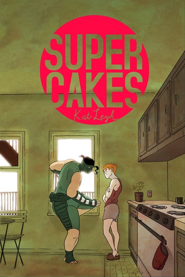
Supercakes art by Kat Leyh
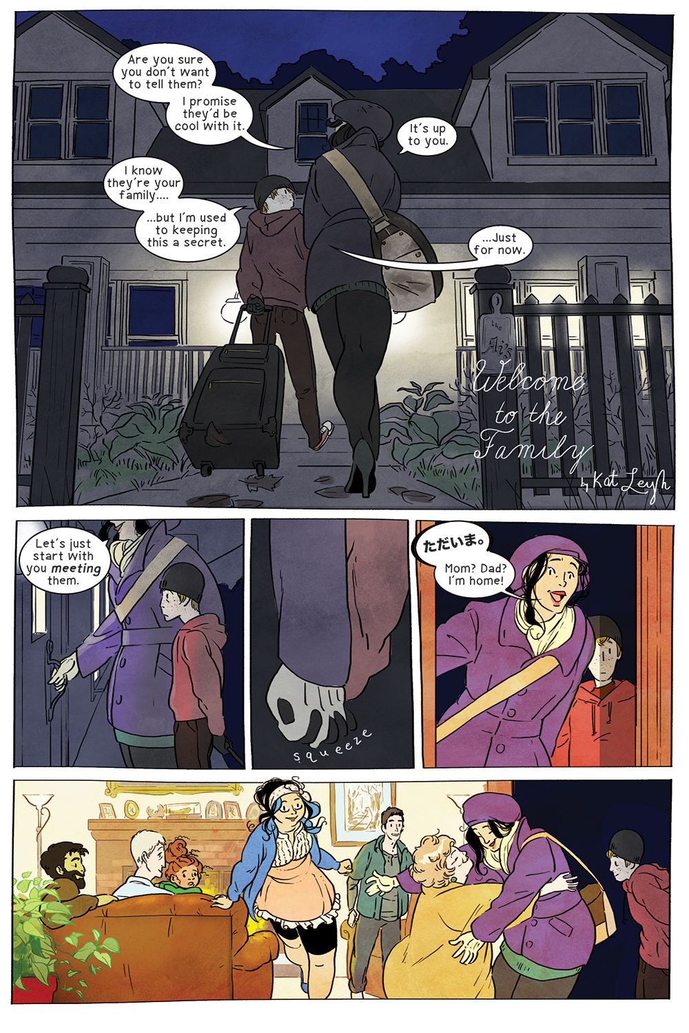
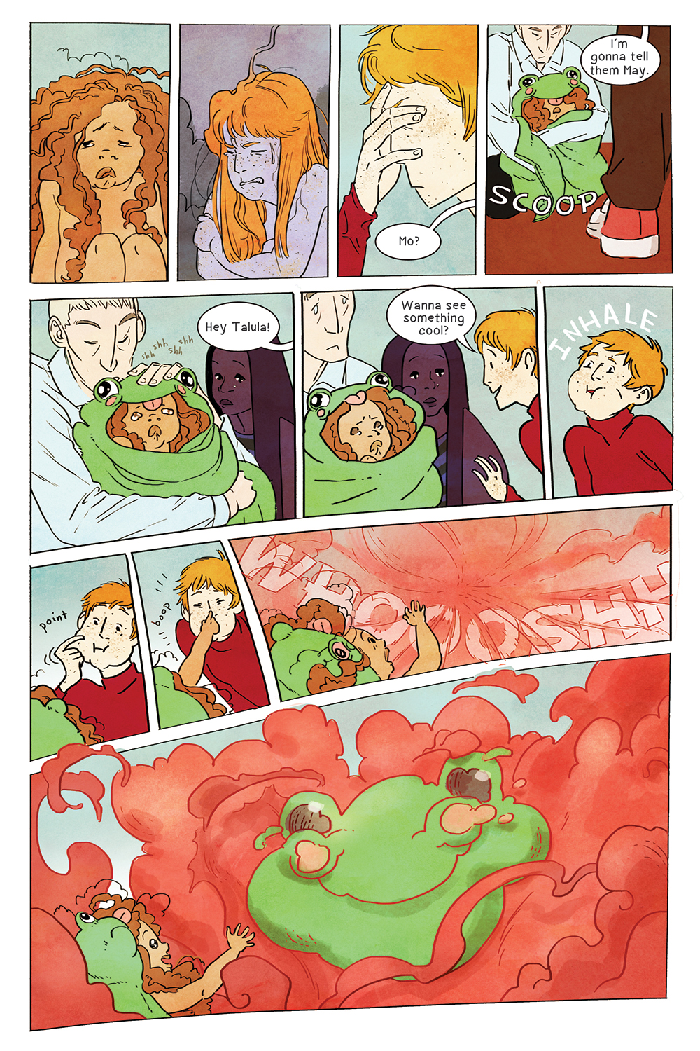
The series is comprised entirely of vignettes, and one of those in particular, “Welcome to the Family,” highlights the series’ best aspects. The story concerns Molly meeting May’s family for the first time and all the anxiety that goes along with that high-strung scenario. But Leyh introduces us, in a few sparing pages, to the entire family (it’s a big, extended family) and delivers a great sense of the clan’s dynamics. She informs us via body language and allusion, glances and facial expressions. The sequence conveys the characters’ interiority based on their dress and posture. Every line is geared towards exposing these characters, of splaying out their complexities and humanness in the most endearing way possible.
For example, May Ai’s Japanese heritage is presented as an integral part of how she navigates the world; she speaks Japanese and loves the tempura her dad makes for Thanksgiving, This cultural foundation is evident in the short “Manifest” and the lengthier ‘Welcome to the Family’ through dialogue and visual exposition—but May’s never made into a representative of her ethnic group (similarly, Leyh avoids essentializing May and Molly’s relationship). She is a particular, not a universal, and Leyh allows her these wonderful moments, simple actions that occur in the background of panels or off to the side that convey multitudes. These characters are fully realized as such.
Similarly, Molly’s strongest character moment comes when she and May’s teenage cousin band together to avoid the group of people downstairs. So little is said, but Leyh reveals Molly’s core with the slightest visual deviations—a furrowed brow, an elusive eye dart. The reader gains a tangible sense of what drives her. This storytelling through facial expression, or acting, is one of Leyh’s strongest areas as a cartoonist.
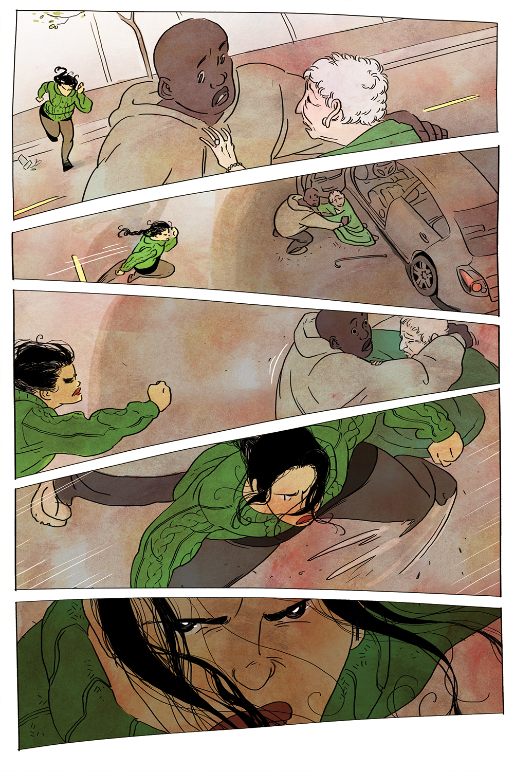
Supercakes art by Kat Leyh
The art favors a wispier, thin line, and the series’ action is defined by a pliability, with every curve is like a rubber band pulled back. This lends the figures a looser definition; they move and emote more fluidly than a more realistically rendered character might. Leyh’s aesthetic is a cultivated dynamism, and this is based primarily on that loose, curvilinear line.
In addition to the superb acting, this aesthetic also comes in handy during the comics’ brief spurts of action. Leyh’s wavy lines render everything with a palpable sense of movement. Molly’s power turns her into a gas, and the way she contracts and expands and drifts from place to place exudes energy and grace.
Supercakes art by Kat Leyh
This fluid rendering is underscored by Leyh’s highly-stylized color choices. Her palette is realistic, but she favors bright color combinations that clearly delineate her figures, making them pop. Leyh also uses her colors to texture shapes, and her choices lend everything a heightened softness, the same kind of texture that a tapestry might have.
Her avoidance of rectilinearity and reliance on diffuse, poppy colors unify the book’s aesthetic, and there’s never any sort of artistic dissonance. It feels like a gestalt, not overlaid component parts—the colors add to the line art but don’t draw attention away from it; a tricky balance to maintain. Fortunately, this aesthetic is perfectly suited to the stories that Kat Leyh tells, and her authorial voice appears to have emerged fully-formed.
Supercakes art by Kat Leyh