

For the freelance designer or developer, getting enough paid practice to hone your skills isn’t easy. Sometimes creating your own work is the only solution.
That’s where the concept redesign comes in. Take an existing website, interface or application and show off your skills by making improvements, while maintaining the entity’s initial purpose. That might mean overhauling style elements, like typography or color scheme, making a website more responsive, or improving an application’s user experience.
We’ve put together a list of our favorite redesigns of some of your favorite websites and applications. Work your way down the list and check out the designers/developers behind the projects, then see how you feel about the real thing. Let us know which apps and websites should take notice in the comments!
10. WhatsApp
WhatsApp Redesign | VinfoTech
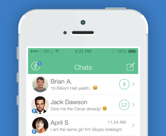
Facebook’s enormous purchase of WhatsApp sent shockwaves through the tech world, but left the design world wondering how the Social Media giant would update the WhatsApp interface. VinfoTech, a design and development agency from Indore, India, beat Facebook to the punch and redesigned the application top to bottom. VinfoTech set out to maintain the usual WhatsApp interface, while accommodating a number of Facebook features. The redesigned WhatsApp ‘Chats’ interface, incorporates a feature to swipe a WhatsApp contact to reveal a one-click link to that contact’s Facebook wall. The redesign also suggests VoIP voice and video calls through the WhatsApp interface, to take the chat experience to a whole new level. We’re sure that Facebook will continue to have tricks up their sleeves when it comes to the future of WhatsApp, but it never hurts to think about the features we’d love included. See what you think!
9. Instagram
Instagram Redesign | Shadman Ahmed
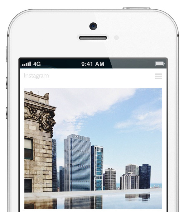
We find some of our favorite content on Instagram (check out all these awesome Cow Appreciation Day costumes), but Shadman Ahmed from New Delhi, India, felt the the app needed to focus on its bread-and-butter, so he redesigned the Instagram interface by emphasizing the power of the image. Ahmed hides the comments and text that tend to clutter the Instagram feed, allowing users to swipe text into, and out of, the display. Finally, sliders to adjust number of images displayed on a page and improved profile pages round out the application face-lift and user experience improvement. We like it, check it out for yourself!
8. Shazam
Shazam Redesign | French Toast
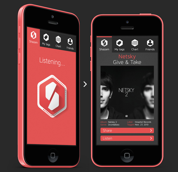
Not much is more impressive than opening up Shazam, putting your phone next to a speaker and watching the tech magic happen. Setting aside the technological brilliance of the Shazam App, French Toast, a design agency from Liège, Belgium, decided the app and the brand could use a design overhaul. They replaced Shazam’s blue color profile with a flat red and tweaked Shazam’s curled ’S’ logo with a more boxy take, including a nice little drop shadow. More importantly, the redesign includes a tweaked interface that emphasizes clean, uncluttered ‘My Tags’, ‘Chart’, and ‘Friends’ lists. Finally, the concept redesign has done away with Shazam’s crazy, pulsing ‘Listening’ button, and replaced it with a less intrusive rotating animation. Shazam’s pulsing ‘Listening’ button is pretty entertaining, but we think you’ll still love French Toast’s tight and clean interface. Take a look!
7. The New York Times
The New York Times Redesign | Steve Franschini
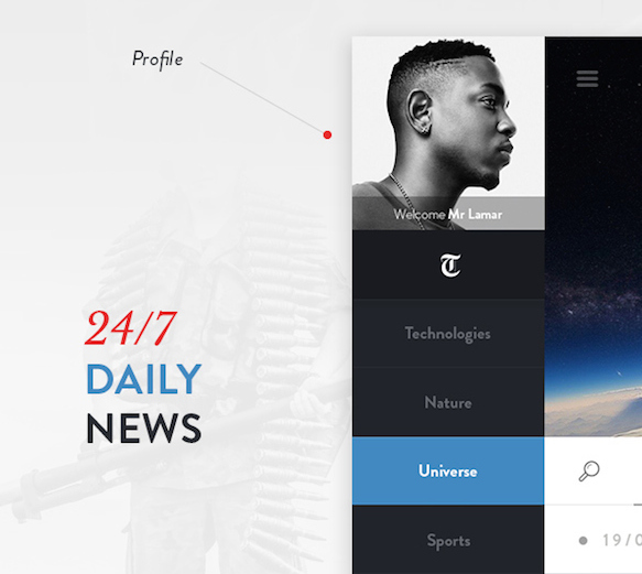
The shift from print to digital has hit traditional news outlets like The New York Times especially hard, so Steve Fraschini, a designer from Paris, France, gave the NYTimes App a facelift. Fraschini’s redesign incorporates an expandable menu that adapts horizontally for devices in portrait mode and vertically for devices in landscape mode. This adaptable menu leaves plenty of central space to focus on important content and the redesign places an emphasis on visual content display, important for news on-the-go. Finally, Fraschini’s take on The New York Times App seeks to ensure that users have the tools to efficiently and effectively locate content through improved search and chronology filters. Even if there’s no good news these days, there no reason the news can’t at least look good. See for yourself!
6. Gmail
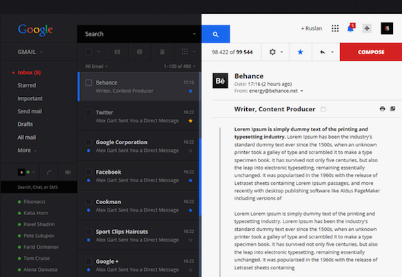
Gmail Redesign | Ruslan Aliev
Many of us spend large portions of the day staring at Google’s marquee email service, but the Gmail interface is nothing if not confusing. There are sidebars on the left and right, a horizontal menu, inputs squished into every available crevice, and, whatever you do, don’t click anything you don’t recognize, because you will likely end up at Google+ (and nobody wants that). So Ruslan Aliev, a designer from Simferopol, Ukraine, set out to clean up the Gmail look and his new take on the interface manages space brilliantly. Aliev’s take on the Gmail mailbox uses the height of the Google logo as a basis and calculates the proportions of the other page elements based on The Golden Ratio. This responsive design couples with improved user control over themes and data management produce a user experience that might actually be able to organize the mess that is your inbox. What do you think?
5. Twitter
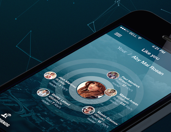
Twitter Redesign | Maxim Eriomov
Twitter recently implemented an update of their interface with lots of clean space and plenty to be happy about, but Maxim Eriomov of Minsk, Belarus, has taken the social media interface to a new level. Eriomov’s redesign includes an overhauled menu that is designed to improve the user’s accessibility to Twitter functions and features. The vertical menu expands and collapses from the left side of the display and stays clear of an new-look profile page that is designed to give users a more professional experience. Eriomov has chosen a bit of a darker blue to replace that iconic Twitter Blue and highlights content with a clean, uncluttered feed. Finally, the redesign introduces a completely visually and functionally redesigned ‘Like you’ feature for finding new sources of information and potential contacts. We think a professional up-do might be good for Twitter, how about you?
4. Facebook
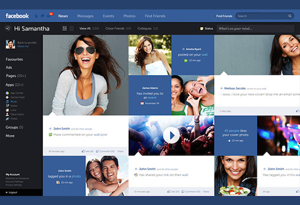
Facebook Redesign | Fred Nurby
Notoriously slow to adapt to mobile, Facebook finally has their act together, but Swedish Designer and Developer Fred Nerby took Facebook’s look to a new level with this concept redesign. The new design centers around a responsive panel dashboard, that encourages increased user engagement and greater control of data. Nerby’s redesign of the Facebook news and activity feed introduces primary and secondary columns to filter posts based on importance to you. The new take on the social giant’s interface emphasizes a more controlled and nuanced user experience. Take a look and maybe Facebook will take notice!
3. Wikipedia
Wikipedia Redesign | Moe Salih
It’s hard not to love Wikipedia, but designer/developer Moe Salih decided the information hub deserves a better and more delightful design. Salih’s clean take on the Wikipedia interface boasts better typography, no more clunky sidebar, less clutter, improved contrast and clarity, and lots of white space. The minimalist redesign allows the user to focus directly on the information they came to see, without dealing with unsolicited detail squeezed into every nook and cranny of the browser. Check it out for yourself, we think you’ll love the simplicity. (Let’s hope Wikipedia takes the hint!)
2. IMDb
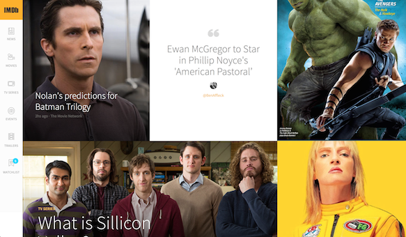
IMDb Redesign | JP Teixeira
There is no better place than IMDb to settle a bet on Halle Berry’s first film credit (Jungle Fever, 1991), or see how many times Leonardo DeCaprio has come up short at the Oscars (4 times). But Amazon’s Internet Movie Database is no design masterpiece. That’s why JP Teixeira set out to redesign and prototype a cleaner take on the IMDb platform. Teixeira’s design replaces the cluttered IMDb landing page with a clean, image-heavy interface. IMDb’s messy horizontal menu, is replaced with an expanding vertical menu that hugs the left side of the page, removed from the visitor’s center-of-focus. Take the prototype for a test-drive.
1. The Apple Store
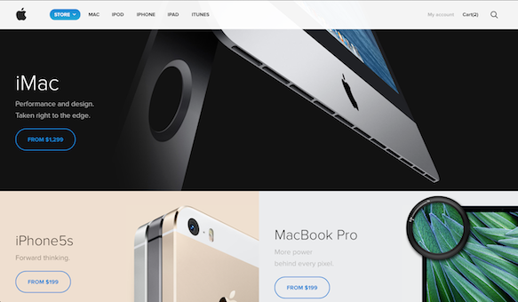
Apple Store Redesign | Amber Creative
Apple is nearly untouchable when it comes to design, but that’s what makes Amber Creative’s redesign of the Apple Store so special. Once you peruse the clean, beautiful concept redesign of Amber Creative’s coding gurus Claudia Romano and Sebastiano Guerrierro, Apple’s handiwork starts to look a little stale. The redesign features the crisp images that we have come to intimately associate with the Apple brand, and highlights the color contrasts Apple designs into its product lines. The redesign is clean, user-friendly and finally gets rid of the hideous steel-gray menu bar that Apple still sports at the top of the Apple Store. Why? We don’t know, but we do know you’ll love Amber Creative’s redesign. Have a look!