


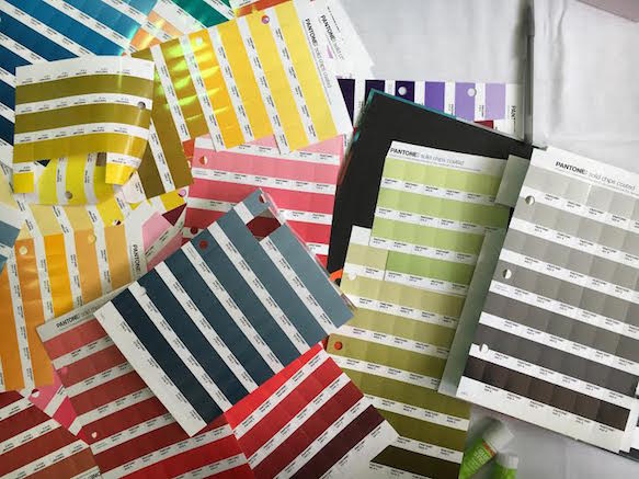
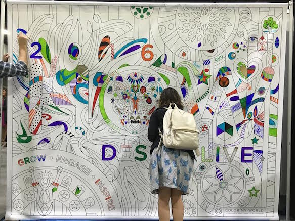
Let the design festivities begin! HOW Design Live is a yearly conference praised for bringing designers together to network, share knowledge and experience and, well, geek out about that new redesign, and we are so excited to be here this year in Atlanta. For the next five days, we’ll be digging into design, via all the keynotes, panels and speakers the conference has to offer, and posting daily recaps and design news here. Divided into seven categories including design and creativity, in-house management, vision and leadership, creative entrepreneurship, branding and packaging, interactive design and tools and resources, we’ll be learning a lot… If we can pull ourselves away from the Chick-fil-a kiosk and table covered in Pantone chips. Pantone chips, you guys.
Day 1
A DAM Case of the Blues with House of Blues Entertainment’s David Fortin and WebDAM’s Mike Waite
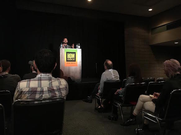
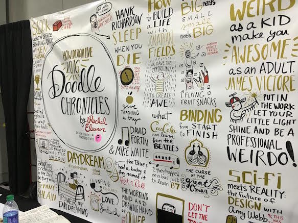
Alright, I have a confession to make. As a kid, I went to House of Blues. A lot. My dad loved taking me there, and we’d always preface whatever concert was happening with all you can eat cornbread in their restaurant Crossroads (shout-out to Britney). It was always the whole House of Blues experience, but that’s just the thing. The House of Blues is an experience, and it’s marketed that way. That’s what this talk was all about. Since House of Blues’ formation in 1994, the company’s worked hard to become what they have. To do so, their design has had to evolve… Greatly. As WebDAM’s Mike Waite pointed out, there’s been a major shift in the music industry when it comes to marketing. With the Internet, venues have been forced to trade in their tape and posters for strong web presence with captivating design. It affects everything, especially the pace in which creative work now has to happen. That’s one of the things that stuck out to me the most when David Fortin took the stage—House of Blues has 40 clubs and around 7,000 shows a year, and you know how many graphic designers they have? Four. Four! How does this still work in 2016? House of Blues’ design ethic grew out of a two person grassroots marketing effort. One half of this team was Fortin, who delivered food and bar backed when he wasn’t scheming marketing efforts for the newly developed brand founded on all things blues and southern. He’s still at the helm today, but, if there’s one thing I took away, it’s that we can’t shy away from collaboration, especially as designers. At the level they are now, House of Blues works with WebDAM to keep all their creative in one place, and it works.
Trend Vetting for Trendsetting: The LogoLounge Logo Trend Report with Gardner Design’s Bill Gardner
First of all, Bill Gardner is very funny. Secondly, my nerdiness has never felt more accepted than sitting in a room full of people also excited to analyze logo trends. But think about it, it’s important. As Gardner put it, “We live by trends.” From our clothes to eating habits, what we buy is greatly influenced by how it looks. And Gardner has been analyzing this for 14 years. Every year, he sifts through roughly 12,000 logos submitted to LogoLounge, grouping them by similarity and, eventually, coming up with the 25 trends that speak louder than the rest. At the HOW Design Live Dieline Awards, it was pointed out that consumers feel overwhelmed more than anything today, and that’s exemplified in the report. Logos are turning towards simplicity. As Google, Lenovo and Verizon, as well as Hobby Lobby and VICELAND have demonstrated, it’s the austere that’s working. This also shows up in Instagram’s redesign via chroma, which, by the way, Gardner actually likes (!!!). You can view the complete report here, but trends include bars, which reassert that pattern and rhythm that we learned in design school, circles, which Gardner explained as either being “audaciously brilliant, or ‘is that the best you’ve got?’” and ombré, which is, you know, basically the new Instagram logo plus everything that’s happened with hair. Big picture, what he’s found is that these trends, like many others, evolve by trajectory. Bring it, 2017.
Adapting Creativity in the 21st Century with Filmmaker and Author Tiffany Shlain
Tiffany Shlain is so cool. Not only is she a celebrated filmmaker and author, but she founded The Webby Awards and is pretty amazing when it comes to connecting our world through technology and film. Shlain’s keynote was a lot about her path, from understanding the importance of computers at an early age to her love and eventually study of film. But Shlain is not one to take a degree and simply hang it on the wall. She has explored everything film and web from the inside out and back again, and she’s done it all from an interesting perspective—the edge. When she created The Webby Awards, she said it was like “riding a rocket,” and it turns out that it’s a rocket that has yet to slow down. Understanding the importance of the Internet, Shlain turned her attention to creating The Moxie Institute, where she continued to combine film and the power of the web through cloud films, short films created by combining people’s video submissions on various topics. The nonprofit which this birthed, Let it Ripple, produces “mobile films for global change,” sparking another thing important to Shlain, and that’s discussion. It’s all kind of wrapped up into Character Day, a global day for discussion on, that’s right, character. It gives us a moment to step back and breathe, which is especially important since technology doesn’t seem to be slowing down either. Arguably the most inspiring talk of the day, I’ll leave you with what she left us: unplug regularly, [eat the] love sandwich (aka sandwich negativity with good when giving creative feedback), experience the cloud (aka the Internet and all it has to offer when it comes to human connection) and, maybe most of all, leave room for daydreaming.
Day 2
From Icon to Iconic with Lippincott’s Su Matthews Hale
Do you ever wonder where iconic logos come from? Chances are the answer is Lippincott. A New York-based brand strategy and design firm founded in 1945, they are responsible for iconic logos including Coca-Cola, Starbucks and Southwest. But how do you turn an icon iconic? Lippincott’s Su Matthews Hale discussed it in five steps. I’m just going to give them to you straight like a good bourbon.
1. Design for a deeper purpose. Redesigns never start from scratch. I mean, the brand does something, and designing for a deeper purpose just means taking that into account and combining the old with the new. Hale gave the example of Southwest, which, at the time of the redesign, had an established brand, but wanted to appeal to a larger group of people. Lippincott worked to keep the brand’s already bright aesthetic, but to also build an experience around it, appealing to leisure travelers and businessmen alike.
2. Craft the whole experience. Consumers respond 25% to a brand’s story, but the other 75% is all experience. This step is all about crafting that—from scent to sound. Hale used hotel brands like Hyatt Place as an example here, talking a lot about immersing customers in signature moments (aka that’s why every time I smell green tea I want to jump into a Westin bed).
3. Design for an on-demand culture. This idea goes back to House of Blues Entertainment’s David Fortin and WebDAM’s Mike Waite’s talk yesterday—designers have to create a lot, and they have to do it fast. Hale also talked a lot about Twitter here and the importance of brands talking back. No, they’re not just illusive entities anymore.
4. Celebrate the small and the unexpected. You should do this with anything, but there’s something especially sweet when it happens in design. Hale talked about empathizes with customers here, which is always a winning move.
5. Simplify and seduce. Bingo, y’all! As we learned yesterday, design is turning towards simplicity noso more than ever. When tackling a redesign, Lippincott hones in on behavioral science. The example here was Starbucks and the green lady behind it all. By keeping the brand consistent, it’s instantly recognizable and, well, iconic.
Hale left us by saying, “design can’t stand still.” And it’s true, the best thing we can do as designers is grow.
Punk’s Not Dead with Facebook’s Josh Higgins
I was waiting for this one, and it did not disappoint. Josh Higgins spent 15 years touring with MCA-signed band Fluf, designed Obama’s campaign and is now a creative director at Facebook. And he contributes it all to being punk as f. But while punk meant Minor Treat’s Out of Step and avoiding jocks when he was young, it’s transformed into everything but anger. For Higgins, punk is all about personal expression and thinking for yourself, and it’s what’s gotten him here. His path is obviously interesting, but what stood out to me is how effortless it was for him. How’d it happen? When his friend told him he should be a designer, he said, “how’s that possible?” She said, “remember the flyers you made for your band?” From there, he went back to school for design and got his first gig designing a shirt for Fender, who he already had a relationship with via music. After that, he got into designing for projects he believed in like Haiti efforts and the Obama campaign. It didn’t take long until an email reading, “you should work for Obama,” arrived in his inbox. It wasn’t a joke! Higgins became the design director for the Obama campaign and absolutely killed it. Facebook sought him out after that, and he’s still there today, designing everything from logos to those fun personalized videos. It blew my mind, but also encouraged hope (get it?). “Punk isn’t a thing, it’s a mentality,” he said, and I think we all just have to trust that.
The Things That Made You Weird as a Kid Make You Great Today with James Victore
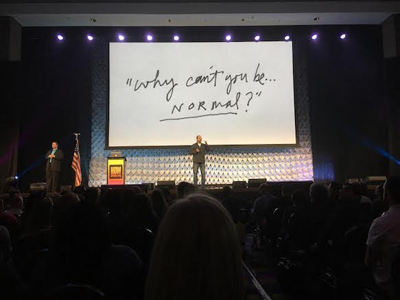
James Victore knows the rules well enough to break them, and that’s one of the things that makes him such an incredible designer… And speaker. I 100% feel like I could do anything right now. Actually, there’s not much to say here except give you the single best piece of design advice I’ve ever been given, and that’s to be weird. While Victore pointed out that we’re all born to be creative, few of us actually hone in on that, aching to fit in from an early age. But don’t do it, be weird! Of course, this is harder than just saying it. It’s as easy to say, “it’s too easy,” not being able to take a compliment, as it is to say, “it’s too hard,” for the fear that someone may not like it when it comes to creative work. But seriously, guys, if I took anything away from Victore’s talk, it’s to be weird.
Day 3
Panel: Winning a Seat at the Table Part 1 with Nielsen’s Steve Lamoureux, SC Johnson’s Peter Borowski, Colgate Palmolive’s Yves Briantais, ABinBev’s Keenan Thompson and Diageo North America’s James Thompson
I liked this morning’s panel because it readdressed some interesting ideas from yesterday. Focused on the intersection of business and design, one of the first ideas that was brought up was the idea that businessmen think of design as decoration, therefore discounting it. But the worlds aren’t so black and white. Like Lippincott pointed out yesterday, design is having a bit of a red carpet moment. Not only are designers moving into CEO positions, but design is becoming more and more crucial to a successful business. The panel discussed how to get businessmen to see that, and visa versa. Like many things do, it comes down to communication, but also about designers being business savvy, which James Victore also discussed. A+.
Take the Fork Already: It’s Not Just Good for Design, It’s Good for Living with Savannah College of Art and Design’s Scott Boylston
Alright, as a SCAD grad, I admit I got to this talk almost 30 minutes early without even knowing what it was about, and I’m so glad I did. Scott Boylston brought a new angle to the conference by talking about design and sustainability. While Boylston’s graphic design work started in package and surf design, his path, which we’ll get to in a second, landed him as a graphic design professor at SCAD (!!!), where he developed their design for sustainability program. His talk had a lot to do with how he got there, introducing perhaps my new favorite term, Ikigai. It means waking up with a sense of purpose, but, in today’s world, that’s not always easy. We have to make money, but we should also love what we do, be good at it and feel like the world needs it. It may come off as idealistic, but, really, what else is there? Boylston’s let these ideas guide him, and, in his free time, he’s developed another program called Emergent Structures. Complimenting his sustainability work at SCAD, Emergent Structures reinterprets waste, taking all those broken boards from construction sites, etc. and turning them into things the community can use and enjoy. It’s not only a reinvigorating story, but illustrates something we should all aspire to.
Day 4
Goat Heads, Ostrich Eggs and Rainbow Unicorns with Cartoon Network/Adult Swim/Boomerang’s Jacob Escobedo
When I walked into Jacob Escobedo’s talk, he was showing a clip from Rick and Morty, and the audience was enthralled. But it’s not only the content, or the network, that makes a show like Rick and Morty popular—it’s the design and marketing surrounding it, and that’s something Escobedo is good at. He flipped through slides of Rick and Morty installations and ads that they’ve installed across the States, as well as introduced the first Instagram game, or shall we say Insta-game. Escobedo designed a world within Instagram, with tags leading to secret worlds and easter eggs giving behind-the-scenes looks at the show, which basically further demonstrates that design runs the world. But his relationship with design isn’t limited to Adult Swim. Escobedo has personal projects including album covers (Danger Mouse, The Shins and Ghostly to name a few) and a children’s book he illustrated for My Morning Jacket’s Jim James. Essentially, he’s living the dream life when it comes to design, but, what stood out to me was how tremendous humble he’s stayed. He left us with something David Lynch (David Lynch!) emailed to him, and that’s, “try harder.” Because we all always should. Oh, that, and “don’t be dead.”
Chip Kidd in Conversation with Debbie Millman with Graphic Designer and Writer Chip Kidd
I use Haruki Murakami books as decor after I read them, so I was super excited for Chip Kidd’s keynote. While the man seems to do it all, the conversation focused on his career in book cover design. Well, after he took the stage with a charming rendition of his favorite New Order song. In conversation with Debbie Millman, they first talked about his early fascination with Batman and Star Wars, which he even made a scrapbook for containing a very special autograph from Darth Vader that he acquired at the mall. But this conversation wasn’t just about superheros, it was about passion, something Kidd is full of. After deciding he wanted a career in design in high school, he moved to New York after college to pursue his dreams. After some common freelance frustration, he snagged a position at Knopf, where he still is today. Not to mention in the same apartment in Williamsburg, Brooklyn. 30 years, you guys, and I’m convinced he’s the coolest. But really, it’s that he started doing what he was meant to do then, and is simply still doing it today. “Everything’s timing and luck,” he said. His covers are more than that, though. While he and Millman discussed covers for authors including Katherine Dunn, Cormac McCarthy and Murakami, things that stuck out to me were dealing with rejection, which, while he doesn’t deal with it often, he deals with it extremely well, building relationships with these authors (even if it’s mainly through their agents) and, again, simplicity in design, always asking how much is just enough. But I also took away from this one to just keep going. He recently gave that Star Wars scrapbook he made as a kid to J.J. Abrams on the set of the new film, so, hey, dreams do come true.
Day 5
Sterling Brands, School of Visual Arts and Design Matters podcast’s Debbie Millman
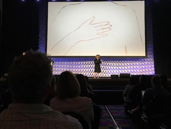
Before I ramble, let me just say that HOW knew what they were doing when they scheduled Debbie Millman and Stefan Sagmeister as the last keynotes. My passion and nerdiness for design is in full effect, and I’m pretty sure everyone else here feels the same way. The most amazing thing about both of these talks was how honest they were. Millman, for example, talked about rejection. It’s something we all deal with. Some of us handle it well, some of us don’t, but Millman’s talk illustrated that rejection isn’t always a bad thing. She started her talk with a James Joyce quote: The longest way round is the shortest way home. And it couldn’t be more true. Like all of us, Millman’s dealt with a lot of rejection in her career (Vanity Fair, Columbia, the Whitney’s independent study program, AIGA, etc.), but she’s also had a lot of success. From Rockbill to Sterling Brands to Design Matters, PRINT and AIGA, where she’s now president of an institution she was previously rejected from, Millman reminded me that things take time, and, maybe most importantly, without rejection, there’d be so gain.
Sagmeister & Walsh’s Stefan Sagmeister
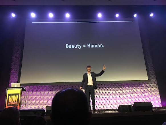
All hail Stefan Sagmeister. I mean, the man has designed album covers for everyone from Lou Reed to OK Go, David Byrne to Jay Z. He’s also the co-founder of Sagmeister & Walsh Inc., where he designs just about everything. But his talk today wasn’t so much a talk about his accomplishments as it was an investigation of beauty and why it matters. As illustrated by architecture, Sagmeister first explored the divide between visuals considered and pure function. Austrian himself, he blames Austrian and Czechoslovak architect Adolf Loos, who associated 19th century ornamentation and crime and strived for what Sagmeister referred to as “psychotic sameness.” Read: public housing, airports, subway stations, you know, boxes. So, while we’ve rejected beauty throughout history, it’s also an innate part of being human, and he reminded us of this. But why does beauty matter? Sagmeister broke it down into five parts:
1. We’re humans.
2. “The beauty contest” has been going on for, well, forever.
3. Artificial beauty > natural beauty. This isn’t to say that natural beauty isn’t beautiful (of course!), but Sagmeister used the interesting example of a Van Gogh painting of a field of dandelions may be perceived as more beautiful than a real field of dandelions, and that’s because of the intellect behind it.
4. Beauty can change our mood.
5. Even when we lose our mind, we can still recognize beauty.
6. Beauty matters even when it’s invisible. It’s in our subconscious, guys!
But Sagmeister also believes that beauty’s on the rise again. It’s not simplicity vs. complexity, but, when things are not beautiful, it’s simply carelessness, designers not giving a shit. So, hey, let’s give a shit. As Sagmeister left us, “now is better.”
And, with that, HOW Design Live is a wrap. I’m actually writing this while watching Sagmeister sign books right now. How cool! More than anything, the conference brings designers together to encourage and help each other. Which we especially needed this week sharing the conference hall with a Crossfit conference. As I talked about with VitaminWater’s Alex Center, there should perhaps of been a venn diagram of designers, crossfitters (?) and, well, buff designers, but I guess that’s just us thinking like… designers.
Were you at HOW Design Live this year? Let us know your favorite takeaway in the comment section below.