


Paste editors, staffers, writers and interns voted on the best album covers of 2016 after reviewing a field of over 350 designs. Album design trends in 2016 included horizons both terrestrial and celestial, intimate portraits of embracing couples, and lots of grainy childhood snapshots. We also saw lots of solid mono-color borders, intricate collage work, and hand-drawn block letters. These are just a few of our favorite album cover designs – please share your top picks in the comments.
25. Margo Price, Midwest Farmer’s Daughter
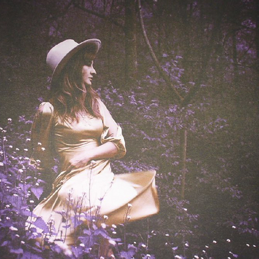
Margo Price’s breakout debut album made an immediate impression on Paste contributor Eric Luecking, who wrote in his review that he was floored by its very first song. The cover of Midwest Farmer’s Daughter, a stunning image of Price captured by Danielle Holbert, may very well have the same effect on you, assuming you have a pulse. The photograph is deep and dark, yet inviting; Price poses in a cream-colored ensemble, her dress twirling while her in-profile expression is stoic. She’s surrounded by the soft, perfect purple of flowers and the shadows of the forest. There is a bravery and vulnerability to this tableau, a woman alone with nothing but her thoughts and the wild world that surrounds her, depending only on herself to tame the two. Sadness and joy, freedom and fear each make their presences felt, just like on the record itself. Margo Price is here to stay—we can only hope this is the first of many beautiful album covers from this Midwest Farmer’s Daughter. —Scott Russell
24. Dylan LeBlanc, Cautionary Tale

Dylan LeBlanc mentions none other than the recently departed Merle Haggard when describing the coming-of-age wisdom he drops on this honest and deeply reflective Americana delight. The legend once said “the singer is secondary to the song”. These insightful words, along with support from producer and friend John Paul White, helped LeBlanc move beyond habitual self-doubt into crafting his most striped down release yet. The album cover could be considered tertiary to the singer. But it takes nearly an hour to listen to an album like Cautionary Tale, where a cover takes only moments to reveal itself. It is an instantaneous reflection of both the singer and the songs within. (Merle had an extremely specific album artwork aesthetic himself, and surely would have agreed that album cover art it is nearly as important as the music itself.) LeBlanc credits Birmingham-based Art Director Aaron Gresham with combining the bold yellow color and black snake, scales, floral and celestial motifs. He told Paste the cover represents “a story of a life in chapters and moments. The balance of happiness and fulfillment swayed by temptation and chance. A beauty and elegance displayed in even the most trying moments – that serve as the story of life.” — Emily Ray
23. Vince Staples, Prima Donna
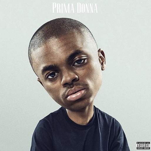
A prima donna is a person whose ego outstrips their potential, and if there’s any artist who seems to incessantly, temperamentally tackle the reality of his own emerging importance, it’s rapper Vince Staples. The cover to his latest EP may be too easily literalizing its title, but between Staples’ low-lidded stare and his transformation into a bobblehead, there really is no better image to sum up his music. Big-brained but blockbusting, both callous and kind, commercial but cult-ish, continually questioning but fully committed to placating a record label—the Prima Donna EP is a stark, minimal reminder of the kind of heart-stopping art that can come from stoking one’s psyche. —Dom Sinacola
22. Rihanna, ANTI
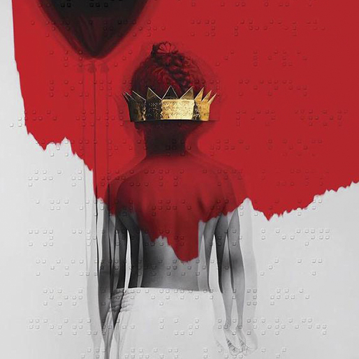
For an album that found success through brash singles like “Bitch Better Have My Money” and “Work,” the artwork to Anti offers surprising depth and metaphors. Rihanna discovered Israeli-born artist Roy Nachum while perusing Jay-Z’s private collection, and later commissioned him to design the art for her eighth LP. Entitled “If They Let Us, Part I,” Nachum’s work depicts a young Rihanna in stark monochromatic schemes with a bold splash of red. Little Robyn Fenty holds a balloon, which represents escapism, while wearing with a golden crown that covers her eyes. While the crown itself symbolizes Rihanna’s pop stardom, its placement also shows the blinders that success can bring. Most interestingly, Nachum—who included this as part of his “Blind” series—regularly uses Braille as a pointillistic, stylistic, and narrative fixture in his works. The dot-like imagery across the Anti cover is actually an entire poem called “If They Let Us” written by Chloe Mitchell especially for Rihanna. Read the full poem here. —Hilary Saunders
21. Paul Simon, Stranger to Stranger
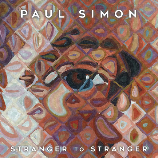
Artist Chuck Close is perhaps best known for his photorealist portraits. He’s depicted many famous faces, including musicians like Philip Glass, Lou Reed, and recently, Paul Simon. His rendering of Simon is made of colorful, experimental pieces that together form a cohesive whole, making his portrait a fitting cover for Stranger to Stranger, a record that shares those qualities. Simon has suggested that this may be his final release ever. He’s given us music for almost 60 years, but in spite of sharing artistic intimacy he remains a “stranger” to us, as we listeners are to him. Again the cover offers a poignant parallel: in both the songs and on the cover itself, Simon appears to privilege us with close, personal glimpses of him, when they’re ultimately just collections of artful inventions. —Monica Hunter-Hart
20. Okkervil River, Away

Frontman Will Sheff has described the eighth studio album by American rock band Okkervil River as something of a death story. It was written in response to the loss of loved ones, and to a certain degree, a loss of sense of self. “I was just like an animal reacting to his environment. I literally was in a time when I was unsettled and not even living in my home and kind of licking my wounds a little bit in seclusion,” he told Paste writer Eric Swedlund earlier this fall. Based on Nin Maminawendam, a work by the famed American landscape painter Tom Uttech, the outstretched cover scene is garish candy swirl sunset against the decay and vultures of fall. Like the melancholy melodies on songs from “Okkervil River R.I.P.” to “Days Spent Floating” the moody album art draws no clear conclusions. It simply explores the unyielding euphony of it all. —Emily Ray
19. Sleigh Bells, Jessica Rabbit
It’s Monday night. And you’re high as a kite watching Lion King. —Emily Ray
18. David Bowie, Blackstar
`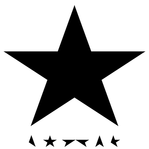
Blackstar is David Bowie’s 25th and final studio album. The artwork was created by Jonathan Barnbrook, the British designer behind several of Bowie’s other albums — Heathen, Reality, and The Next Day among them. The cover is minimalist, but it holds many meanings. The title and design are symbolic of a black star legion, the name of a certain type of tissue damage usually indicating cancer. Bowie died from liver cancer two days after the album was released, and his medical condition was kept a secret until his death. Fans have found many hidden secrets embedded in the album cover and vinyl LP, including a small image of a bird casted when in direct light, a blue glow when placed under a blacklight, and a hidden constellation on the inside cover forming the shape of a Star Man, a frequent Bowie moniker. If you look closely, the segments of 5 pointed stars near the bottom of the cover spell out ‘Bowie’ in a stylized way. A fan noted that the font used on the back cover to name all the tracks is a font titled Terminal), likely used as a way for Bowie to discreetly tell his fans he was running out of time. —Lily Guthrie
17. PUP, The Dream Is Over
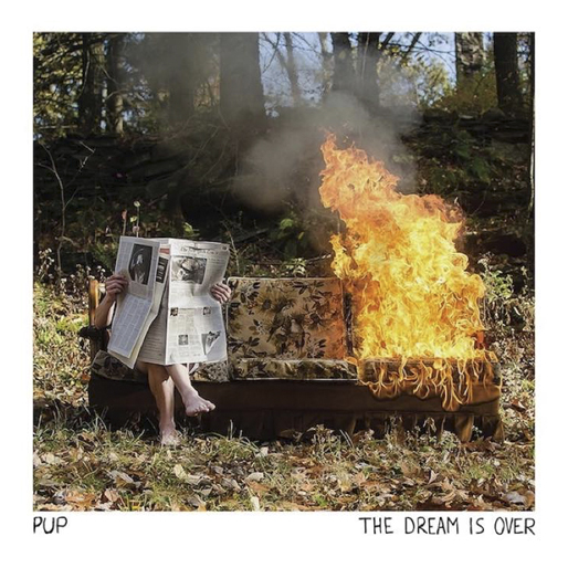
If this is not the embodiment of 2016, I dunno what is. —Hilary Saunders
16. Lambchop, FLOTUS
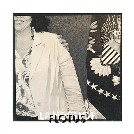
That’s Kurt Wagner’s wife on the cover of Lambchop’s latest album, FLOTUS. And that’s President Obama’s hand on her shoulder. She’s the chair of the Democratic Party in the notoriously red state of Tennessee, which means she has a demanding job, to say the least. But this image—a painting of a detail of an official White House photograph—conveys all the qualities that make her so good at her job: a sense of casual power and purpose, a supreme affability conjured by the most infectious smile of 2016. Wagner works in a rich black-and-white palette that has become his visual signature (see 2012’s Mr. M), caking paint on the canvas and then chipping away at to create a sculptural effect; even re-pressed at 12×12, the image is both photorealistic and almost three-dimensional. It’s a sweet valentine to the musician’s own First Lady and perhaps a humble suggestion that he is actually First Dude to a highly successful and important woman. —Stephen Deusner
15. Damien Jurado, Visions Of Us On The Land
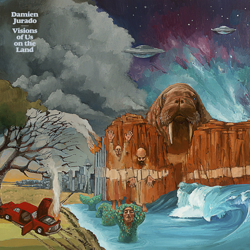
One of the great things to come out of singer-songwriter Damien Jurado’s collaboration with producer Richard Swift, aside from a trio of great albums, is some truly amazing cover art. After the night-vision collage of 2012’s Maraqopa and the geodesic dome on 2014’s Brothers and Sisters of the Eternal Sun comes this trippy watercolor by Salt Lake City painter Brian Koch, which resembles an especially Dadaist Far Side panel decorating the side of a 1973 Dodge van. Part of a larger and thoroughly fantastical triptych, the cover depicts an automobile evolving out of the primordial soup and crashing into a tree, a sea monster with the face of Isabella Rosselini, a rock cliff topped with an enormous walrus head, and flying saucers descending on Seattle. It’s a perfect visual counterpart to the album itself, in which Jurado takes us on a road trip deep into the scarred heart of a weird, new America. —Stephen Deusner
14. D.R.A.M., Big Baby D.R.A.M.

Much like his take on the kind of fringe-flaunting hip-hop that in 2016 demands any rapper must seek melody as incessantly as they do incisive, in-the-pocket wordplay, the cover to D.R.A.M. debut LP trades all sense of irony or pretention for straight-to-the-heart sincerity. That being D.R.A.M.’s golden doodle Idnit, there is love and joy and—eschewing anything besides their mutually grinning grills—nothing else on the face of the album, just two creatures pleased to be there, sharing some affection and promoting some responsible oral hygiene. It works: If you aren’t immediately drawn to the warmth and welcome of their cuddle pile, then chances are Big Baby D.R.A.M. has nothing else for you. —Dom Sinacola
13. Bon Iver, 22, A Million

Brooklyn-based artist Eric Timothy Carlson was responsible for far more than 22, A Million’s cover art—he was also an integral part of the record’s rollout, designing the album packaging, promotional newspapers, and even the lyric videos for its 10 tracks. Per Carlson’s description of the recording process, discussed in an interview with Emmet Byrne of Minneapolis’ Walker Art Center, 22, A Million’s musical and visual creation went hand-in-hand: “The songs were all numbers from the start, multiple numbers at first. So we would listen to each song, talk about the numbers, talk about the song, watch the lyrics take form, makes lists, make drawings,” Carlson explained. “I was able to interview and interrogate each song—digging into weird cores—and by the end of each visit, each song would develop a matrix of new notes and symbols.” 22, A Million’s dense musical complexity is reflected on its front cover, a cloud of said notes and symbols that resembles a grouping of futuristic hieroglyphics. Carlson’s cover is exactly what a piece of album art should be: an undeniable invitation to explore the album’s (and the artist’s) world. —Scott Russell
12. Solange, A Seat At The Table
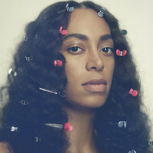
So much of Solange’s standout A Seat at the Table is both an homage to her roots as well as a pushback against those who would seek to control her narrative (see: the stern “Don’t Touch My Hair,” among others). As if to signify her defiance, Solange appears equally austere on the cover of her third full-length album. With her shoulders uncovered and a bare face, Solange’s only adornments are the many clips in her hair, possibly representing the ongoing cultural stigma of a black woman’s unrelaxed, free-flowing mane. Knowles’ collaborated on the album cover artwork with Barcelona-based photographer Carlota Guerrero, who also art directed the singer’s performance for the reopening of London art gallery Tate Modern earlier this year. But it’s the younger Knowles’ expression that really completes the circle: It’s bold and it’s knowing; it’s a look of a person who’s seen her share of inequities and been conditioned into silence. But no more. —Rachel Brodsky
11. Kanye West, Life of Pablo
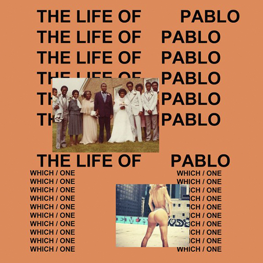
‘Ye’s seventh studio album went through a number of changed before (and actually, even after) its release. Rumors abounded as buzz built around the idea of a new Kanye West album. We thought it would be called SWISH. We heard it might be So Help Me God or Waves. But when The Life of Pablo dropped in February, the minimalistic album cover designed by Belgian artist Peter De Potter proclaimed its identity with “The Life of Pablo” spelled out a myriad of times. The printed name is written repeatedly in three columns, sometimes overlapping on top of each other, spreading out across the peach-colored square of a cover. While the meanings of the cover photo(s) are debated, leave it to Kanye to make sure everyone knows his album’s name—in text, in buzz, and in spirit. —Hilary Saunders
10. Blood Orange, Freetown Sound
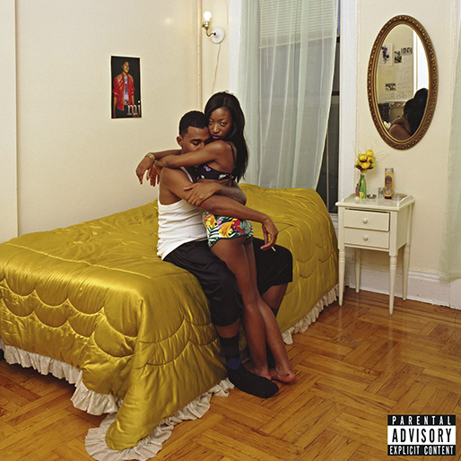
Cultural vivisectionist and MoMA New Photography artist Deana Lawson worked with Blood Orange to create this intimate portrait for the cover of Freetown Sound. Lawson described the idea behind her photograph “Binky & Tony Forever” as the synthesis of young love and the need to embrace “intimacy and support, physically, between young people, particularly young black people.” Her work is deeply confrontational but ultimately focused on healing, a perfect fit for the complex themes R&B producer Dev Hynes explores on the project. —Emily Ray
9. Explosions In The Sky, The Wilderness
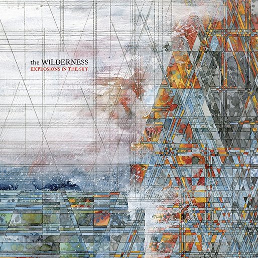
The cover of Explosions in the Sky’s latest looks like a stained glass window in the coolest church imaginable. Jacob van Loon’s geometric design is a gloriously intricate composition that, true to the album’s title, appears to depict an erupting volcano at the edge of an ocean, with waves crashing against its side. Van Loon’s use of watercolor makes for a delicate, organic array of colors, with gossamer strands of white and tranquil blue-greens offsetting the warm red and orange accents. The piece achieves a singular contrast, with the abstraction of its colors opposing the precision of its lines, yet the differing elements combined form something more transfixing than either could have achieved alone. “The appearance of the finished painting doesn’t point to a specific place,” Van Loon told The Creators Project. “It’s a synthesis of experience and memory that translates to a landscape with its own ecotones.” Specific or no, Van Loon’s vision of The Wilderness is as engrossing as the album it accompanies. —Scott Russell
8. Anderson.Paak, Malibu
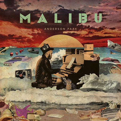
For years, Malibu designer Dewey Saunders has collaborated with Anderson.Paak on some gorgeous tour posters and on .Paak’s debut LP, Venice. But the most staggering collaboration comes with the release of .Paak’s Malibu, which utilizes Saunders’ gift for collage art into a stunning album cover. Inspired by classic albums from the ‘60s and ‘70s, Saunders wanted an oil painting style to Malibu. Like .Paak’s music, Saunders’ cover is a mishmash of styles and ideas, from the blood-red sky that evokes oncoming doom, to the goofiness of .Paak playing piano in the ocean while wearing boxers. Saunders creates a cover that’s almost as if Sgt. Pepper’s Lonely Hearts Club Band’s album had been taken over by a hurricane, with .Paak playing in its wake amongst the remaining wreckage. —Ross Bonaime
7. Sturgill Simpson, A Sailor’s Guide To Earth
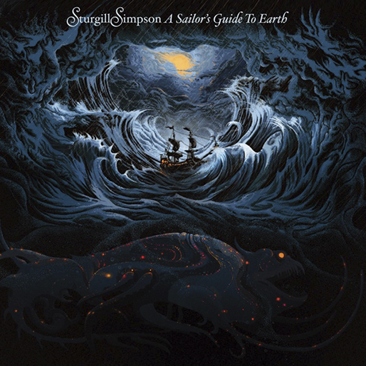
Though it is beset on all sides by towering waves, black clouds and a menacing leviathan lurking in the depths below, the ship at the center of A Sailor’s Guide to Earth’s artwork is steady and undisturbed. Even amidst the fiercest storm, its cabins feel like home, illuminated from the inside, and from above, where the faintest hint of sunlight shines through. Sturgill Simpson’s bold and eclectic third album, a song cycle written for his young son, seeks to provide the same kind of inextinguishable solace evoked by its gorgeous album art. The adventurous Kentucky-born country singer is also a U.S. Navy vet, making the album’s seafaring imagery all the more resonant. Kilian Eng’s illustration would be satisfying if only by virtue of its symmetry and use of light, but its detail and thematic alignment with Simpson’s music make it an album cover to remember. —Scott Russell
6. Chance the Rapper, Coloring Book
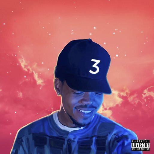
Coloring Book is Chance The Rapper’s third official mixtape, released this May. The cover art was designed by Brandon Breaux, who also designed the covers for 10 Day and Acid Rap. Taken together, the three releases chronicle the early dreams, harsh realities and strange pleasures of the rapper’s rise to fame. Where Chance was looking up to the stars on the cover of his debut album, and straight ahead for his sophomore release, he has now ascended into the surreal world of stardom and looks downright amused by it all. In the three years since his Acid Rap dropped, Chance had a daughter and, like his musical output, matured considerably. He was holding his newborn baby daughter when Breaux took the cover photo for Coloring Book . Chance references the positive impact becoming a parent has had on his life throughout the album. Even the title itself is likely also a reference to his new fatherhood. The Coloring Book cover art may seem simple and childlike at first glance, but Breaux and Chance are continuing to craft a musical memoir that colors way outside the lines. —Lily Guthrie
5. Frank Ocean, Blond/Blonde
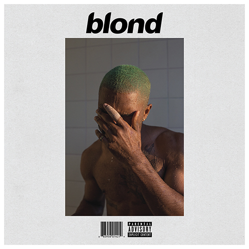
Frank Ocean has a long history of rejecting sexual and gender identity labels. Is it any surprise that the public hysteria over his first release in four years would result in a bit of controversy over the album art for Blonde. Or is it Blond? Originally an exclusive release on Apple Music with the feminine spelling “Blonde”, publications and other streaming services have since styled the album with the masculine spelling “Blond”. Wolfgang Tillmanns, who photographed the cover, revealed that Ocean text messaged his decision to drop the “e” only a few weeks prior to the album release. Along with his short neon green hair, obscured face and bandaged index finger, Ocean’s nonconformist tendencies go beyond the lyrics of songs like “Good Guy” to the album titling itself. —Emily Ray
4. Dinosaur Jr., Give A Glimpse Of What Yer Not
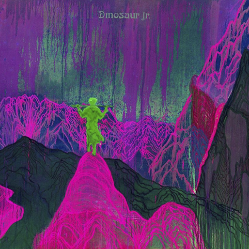
Dinosaur Jr.’s 11th album is a predictably powerful guitar-rock odyssey, and its vivid artwork, courtesy of German painter Daniel Richter, has the eye-catching psychedelia to match. Richter made his name designing punk record sleeves in the ‘80s—today, he’s a Saatchi-repped contemporary artist who nevertheless retains his penchant for hard-charging music. “I don’t believe in technique. For me, painting is a form of thinking, and I keep control over the things required for this form of thinking,” Richter has said. That kind of instinctive self-belief comes through in his Give A Glimpse of What Yer Not cover—the bright green figure stands out, and alone, atop what appears to be a mountain peak; the neon purple lines around him evoke everything from human veins to an equalizer meter, but the explorer is master of them all. He and Dinosaur Jr.—and Richter himself, for that matter—know exactly who they are, and what they are here to do. —Scott Russell
3. Wilco, Schmilco
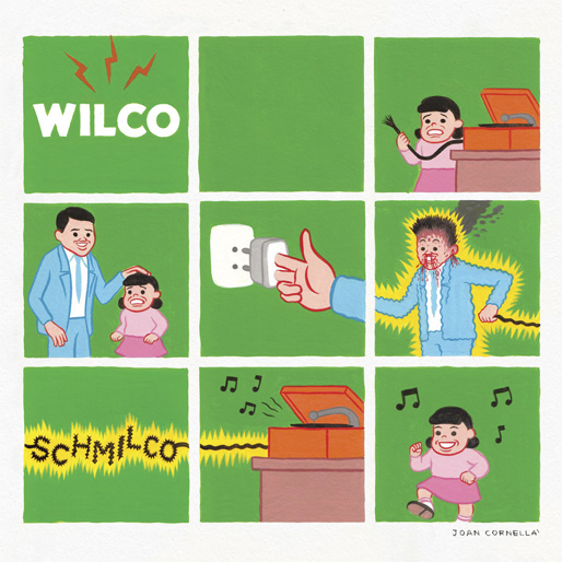
Schmilco might be the most low-key Wilco album in years, but their tenth album’s cover art presents the very literal idea that the experience will be electrifying. With artwork by disturbing comic genius Joan Cornella, we see as a man lets electricity surge from his body as he uses himself as a connector between a plug and a record player. As a girl dances to the music of Schmilco, the man bleeds from every orifice and steam flies out the back of his head. For Cornella, this is actually quite a tame interpretation of his work, as his strips usually remind of the comic Nancy, but filled with most depraved, violent and darkly hilarious ideas possible. Cornella’s aesthetic is quite a stark contrast from the playful silliness of Wilco, whose humor has led in recent years to naming an album Star Wars, or creating “Wilco (The Song).” For the mostly somber, acoustic affair of Schmilco, Cornella’s design brings a jolt of excitement to the album. —Ross Bonaime
2. Young Thug, Jeffery
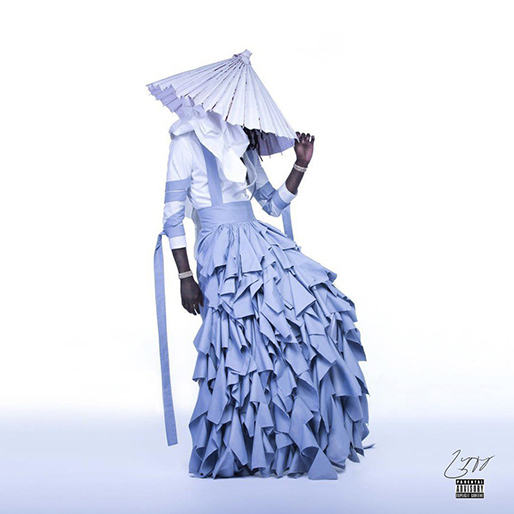
“Every time I dress myself, it go motherfuckin’ viral,” rapped Young Thug on last year’s hit “Halftime.” That it does. The 25-year-old artist is famous for wearing clothes that defy gender norms, but perhaps no outfit will live on like the distinctive periwinkle ruffle dress he donned for the cover of Jeffery. The traditions of rap, rock ‘n’ roll, and countless other music genres glamorize machismo. A presence like Young Thug’s, then—he openly maintains that “there’s no such thing as gender”—is not only refreshing, but essential. After releasing channel ORANGE in 2012, Frank Ocean told Tumblr that he’d fallen in love with a man; that news was met with public outcry that initially overshadowed the record itself. Four years later, Young Thug’s move didn’t draw that degree of negative backlash and has been appropriately upstaged by his album’s musical accolades. Of course, the cover—photographed by Garfield Larmond —does deserve its own, positive attention: the smooth, blue color palette, Young Thug’s strikingly angled body, and the stunning dress from Italian designer Alessandro Trincone make the image beautiful and singular. But most significantly, the cover artwork for Jeffery is an important, radical statement, and an indication that our social norms are (slowly) evolving for the better. —Monica Hunter-Hart
1. Beyonce, Lemonade
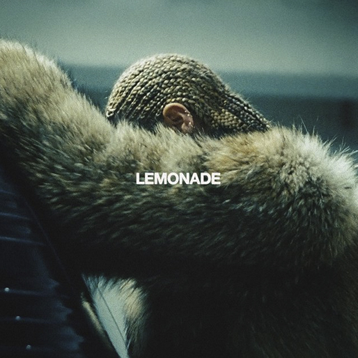
Earlier this year, Paste writer Robert Ham described Lemonade as an artful and devastating film with eye-popping visuals. Beyonce’s longtime stylist Marni Senofonte created the looks behind each of the twelve conceptual pieces featuring in the art short. The yellow Roberto Cavalli gown channeling the African goddess Oshun. Sacred Art of the Ori body paint by Nigerian visual artist Laolu Senbanjo. Majorettes. A Mardi Gras Indian. Senofonte put Bey in Yeezy athleisure wear for the video “Don’t Hurt Yourself”. The album cover is a quiet, anonymous shot captured during a break in filming. There haven’t been many of these moments over the last year. Lemonade is the most aesthetically influential album release of 2016 and it drove a loud and ongoing dialogue – not just about issues of power, status and relationships but about who is allowed to appreciate art created by black women. The visual metaphors and interpretation of Lemonade will be studied and debated by art and music historians – and fans – for years to come. One can only guess at what was going through the groundbreaking artist’s cornrowed head as she rested against her fur-clad arms between filming what is arguably the angriest song on the album. We can’t see her face but we don’t really need to. We already know she’s the baddest woman in the game. —Emily Ray
Emily Ray is Paste’s Assistant Design Editor. All she wants for Christmas is for you to to back Paste Quarterly on Indiegogo.