
Tacky Hot Sauce Labels Need a Rebrand
Photo by Mark/Creative Commons
From pop culture to politicians’ bags, hot sauce is everywhere, and like all condiments, it should be for everyone. Okay, maybe not everyone, as not everybody is keen on adding spice to their food, but isn’t it a bit weird that hot sauce bottles seem to be the one of the only places where the spirit of the awful artwork that saw fantasy-style bikini-clad women on motorbikes still exists?
You don’t like spicy? Fine. You don’t like weird names and clip art labels? We should be able to do something about that.
Hot sauce is a massive business, and it’s key to the cuisines of many cultures around the world. The popularity of hot sauce has skyrocketed in recent years, and it’s fair to say that like anything where the barrier for entry is low (chilies, vinegar, bottles and MS Publisher are cheap) and there is money to be made, it is also an easy way for opportunists to make a quick buck. It’s perhaps little wonder that so many modern hot sauce labels act more as a warning than an invitation.
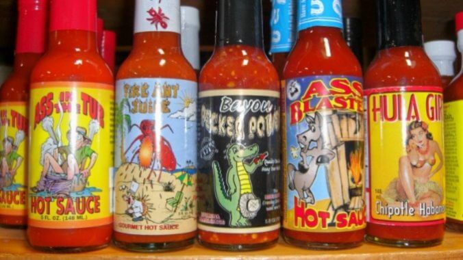
A look beyond your local grocery aisle gives a clear indication of this phenomenon. The world of hot sauce has tiers, and at the very bottom end lies the kind of imagery and design sensibility that you’d expect from that one weird uncle who lives in your grandma’s basement and who really likes swords. This is one where biohazard symbols, flames, venomous snakes and grim reapers coexist on labels that more often than not look like they were put together on MS Publisher with clipart.
Some of these are literally warning signs. Anything with a biohazard label is bad, and it seems even more off when you think of what most of the world has been through thanks to Covid-19. Bad vibes.
There’s no escaping the fact that there is a macho element to hot sauce—one that, much like the Scoville units contained within those bottles, has only grown in recent years. The arms race of chili heat has seen peppers grown solely for their heat and varietals such as the Carolina reaper and Ghost pepper become something close to household names.
Hotter can be better, depending on what you’re looking for. Hot wing challenges would certainly be less interesting without the most intense of heat levels on offer, as would the Paqui One Chip Challenge or chili-eating contests.
But even the idea of hotter being better is not always reflected in the accompanying branding. It’s fair to say that many hot sauce labels are at best ironic and at worst lazy. These sauces might stand a better chance on store shelves by toning it down. The most most-purchased hot sauces in the U.S. on Instacart are Huy Fong Sriracha, Frank’s, Cholula, Tapatio and Tabasco—not a scary or macho image in sight.
Maybe, like snake stripes, these labels are right to act as a warning sign, and maybe they actually are putting people off what might be a sub-optimal product, one where heat comes at the expense of any flavor or nuance. But what if there are great products hidden behind labelling that screams “don’t buy me” to everyone but those looking for last-gasp holiday gifts in the clearance aisles of TJ Maxx? It would be a shame if there were delicious hot sauces out there that consumers were ignoring due to their sub-optimal labelling.
Ultimately, hot sauce companies that wish to appeal to a wider audience may need to step up their game and make their labels more approachable. Or maybe just hire an actual graphic designer.